A kaleidoscope

The logo for the condos (and it’s sister logo for the apartments) was inspired by the idea of a kaleidoscope, from ancient Greek kalós (beautiful) and eîdos (shape). It is a fitting metaphor for The Sudbury as it suggests not only multiple lifestyle choices and activities but also ongoing change and transformation at Bulfinch Crossing.

the sudbury embossed logo on black background
the sudbury business-cards stacked
sudbury-white logo on blue green background
the sudbury color palette
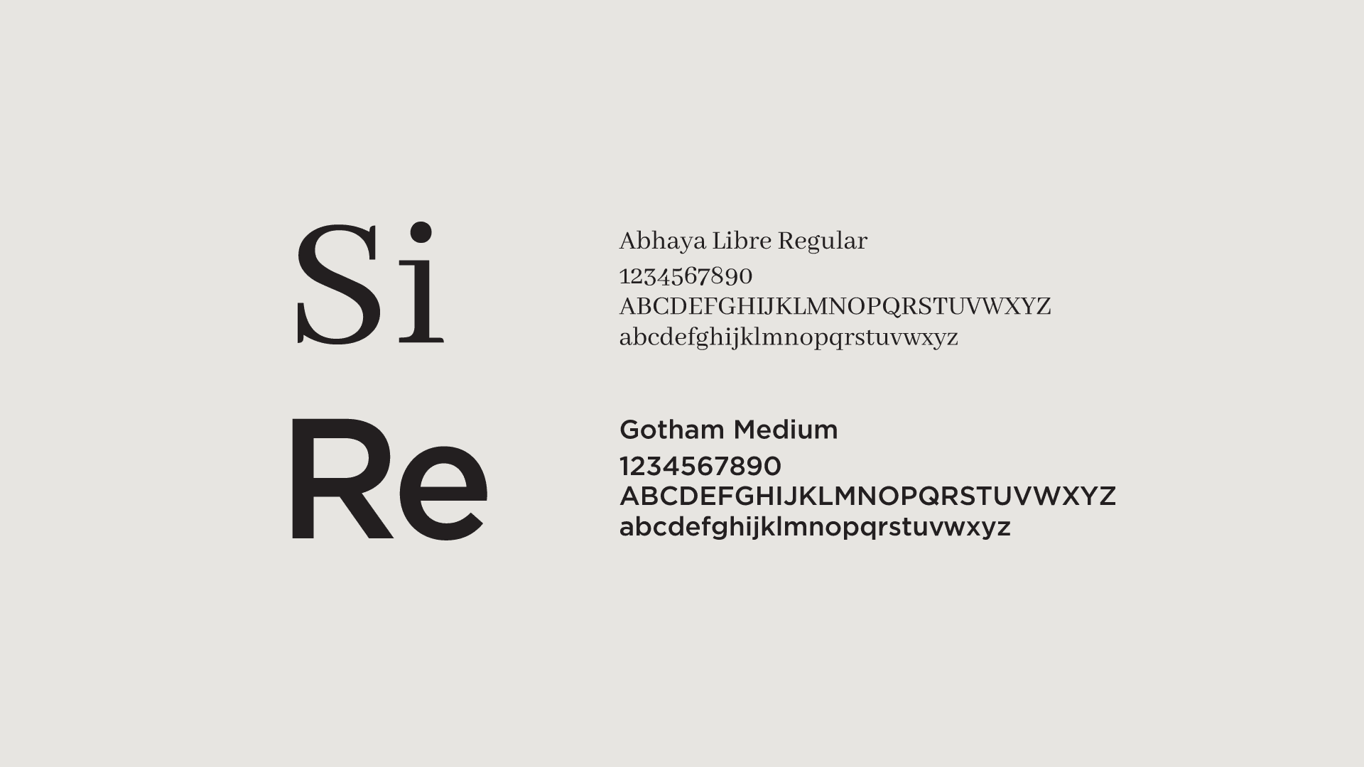
Signet brand fonts
sudbury-color logo on black background by best boston logo designer
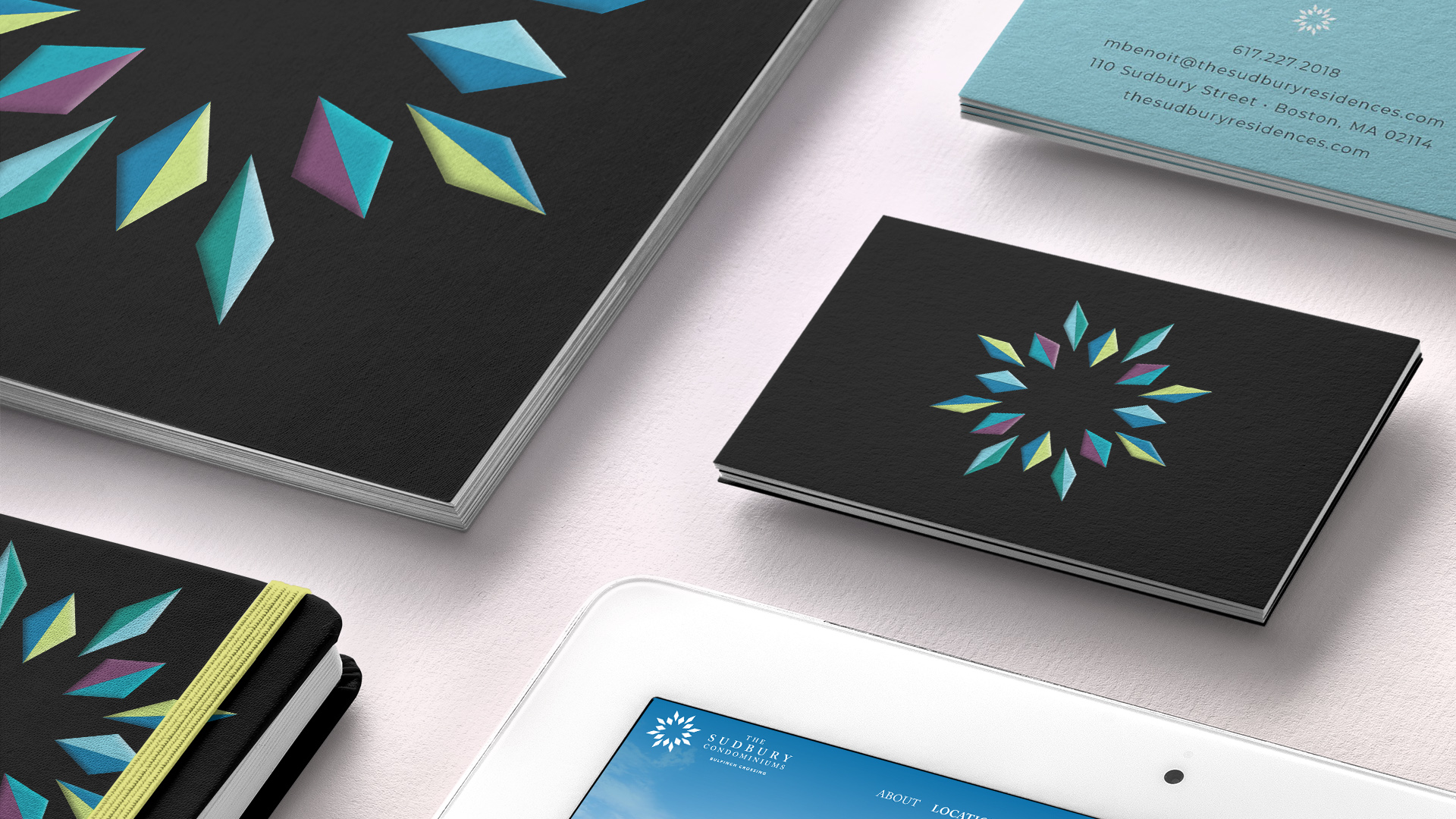
the sudbury brochure and business cards with ipad
sudbury shopping bag by boston best logo designer
the sudbury pattern on open brochure pages
sudbury apartments logo on black


Adams Design
20 Park Plaza
Boston, MA 02116

Let's Talk!