ViVO Apartments

We partnered with Aimco Apartment Homes to create the name, logo, tagline and brand graphics for this apartment building for trendy millennials working in biotech.
The Sudbury Apartments

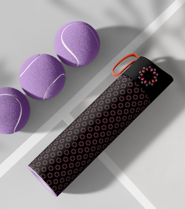
The logo for The Sudbury Apartments—and its sister logo for the condos—was inspired by the idea of a kaleidoscope, from the ancient Greek kalós (beautiful) and eîdos (shape). This concept captures the spirit of The Sudbury, suggesting a range of lifestyle choices and continuous transformation at Bulfinch Crossing. As part of our broader approach to design and branding in Boston, the identity reflects both the vibrancy of the city and the evolving nature of this landmark development.
Makor Capital & Makor Management

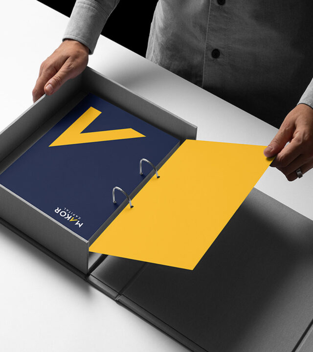
Makor Capital invests in and manages multi-family communities throughout New England. Makor sought a mark that spoke to the upward movement of the company, a look that would be easily recognized at the corporate level yet adaptable for its individual communities.
Grant McCarthy Gagnon

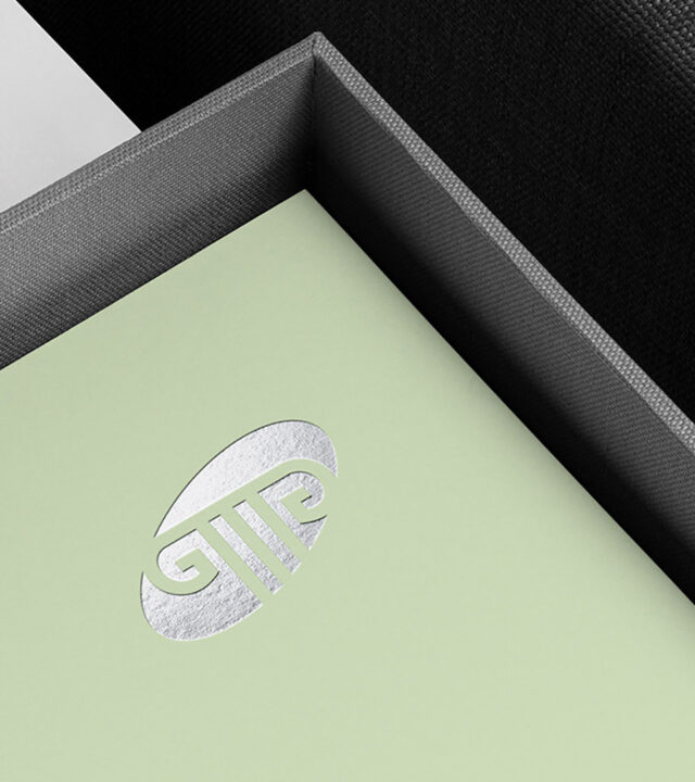
Many law firms use their partners’ initials in their logo, but few connote the strength, tradition, and ingenuity of the brand identity we created for Grant McCarthy Gagnon. The geometric lines of the ionic column were a perfect jumping off point for us to incorporate the proverbial initials into the circles and straight lines of the column form. Using a contemporary color palette and a silver foil emboss gave the mark even more distinction.
