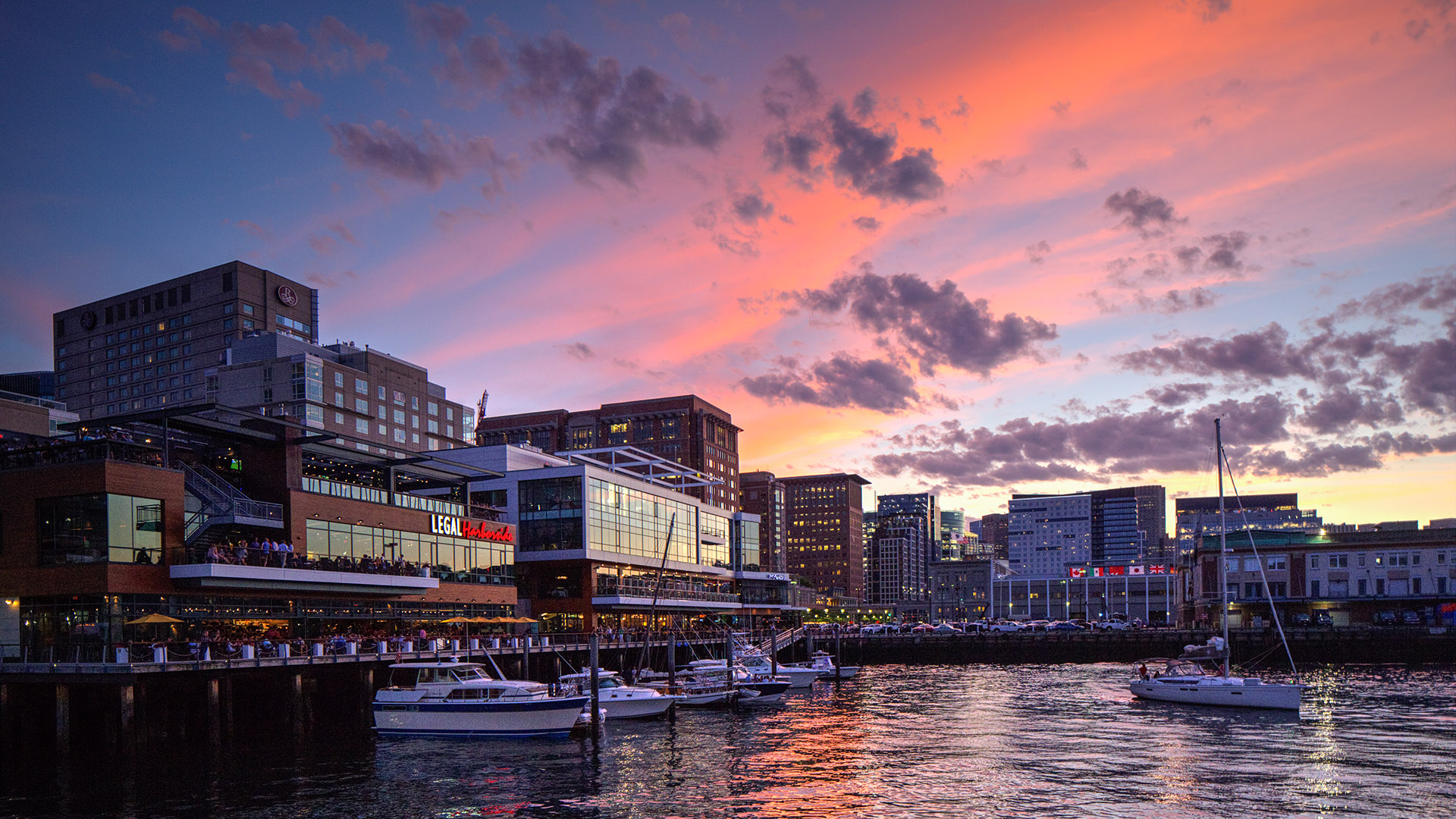
Adams Design worked with the Cresset Group to develop the identity and wayfinding for Liberty Wharf. We created a flexible system of signage and placemaking elements that unify the site and express its location right on Boston Harbor.
Identity
Wayfinding
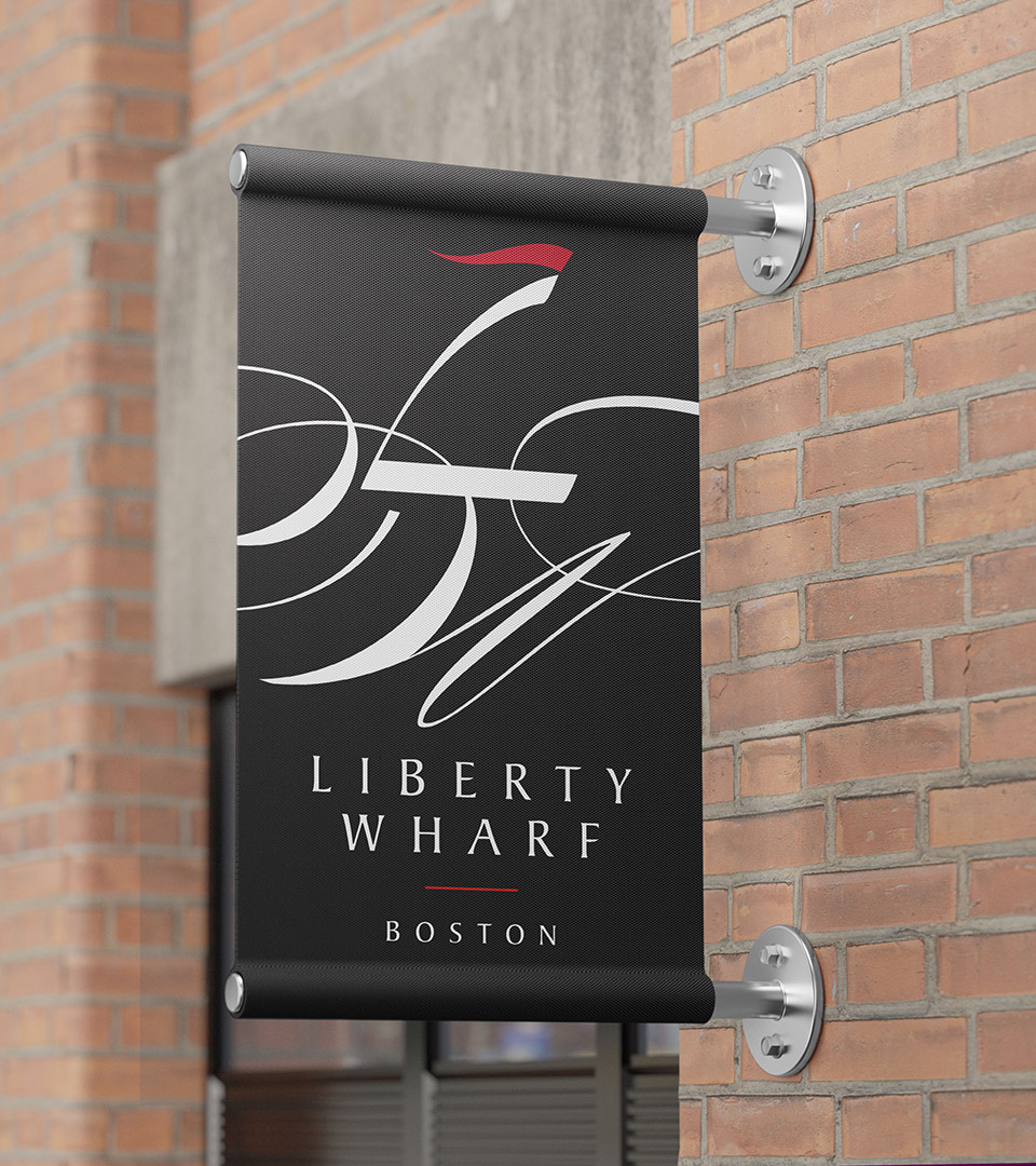
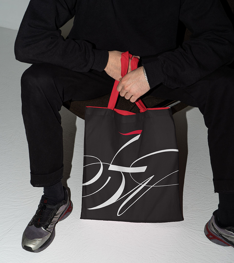
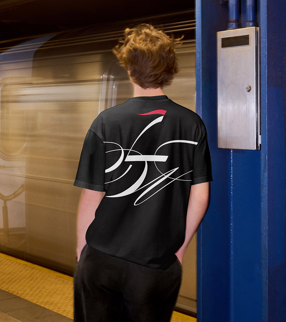
The Liberty Wharf identity transforms typography into place-making. The vertical stroke of the ‘L’ rises like a sail catching the wind, while the flowing curves of the ‘W’ echo the movement of waves along the waterfront.
The scalable mark balances elegance and energy with the flexibility of being contained within a circle or extending beyond its boundaries.
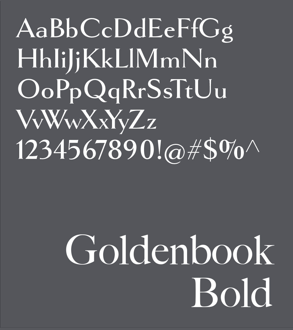
Goldenbook Bold is a serif typeface characterized by its clean lines, pronounced curves, and a slightly condensed structure. Its design is both contemporary and classic.
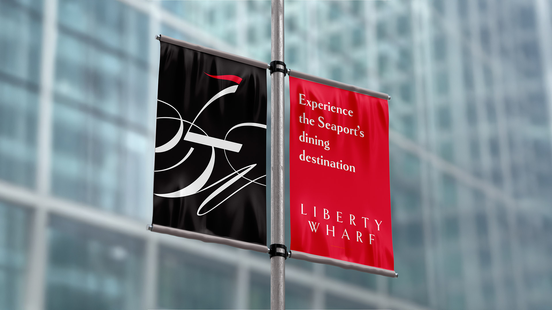
The Liberty Wharf palette is anchored in crisp black and gray for a timeless, minimal foundation, accented by a vivid red that adds a touch of energy and maritime signal-flag vibrancy
Wayfinding served as a critical strategy, establishing clarity and cohesion as the Seaport transitioned from a development site into a recognizable destination.
Today, Liberty Wharf is part of the Seaport’s dynamic mix of restaurants, contributing to its reputation as a vibrant, exciting waterfront neighborhood and dining destination.