Calda Vita 

Brand identity for a luxury soap company

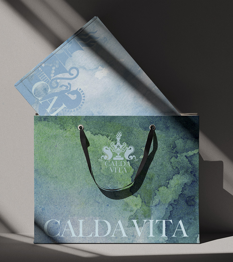
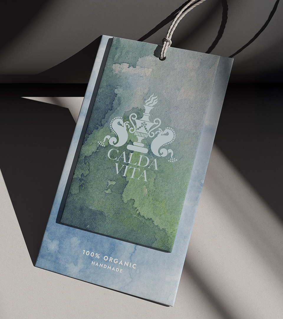
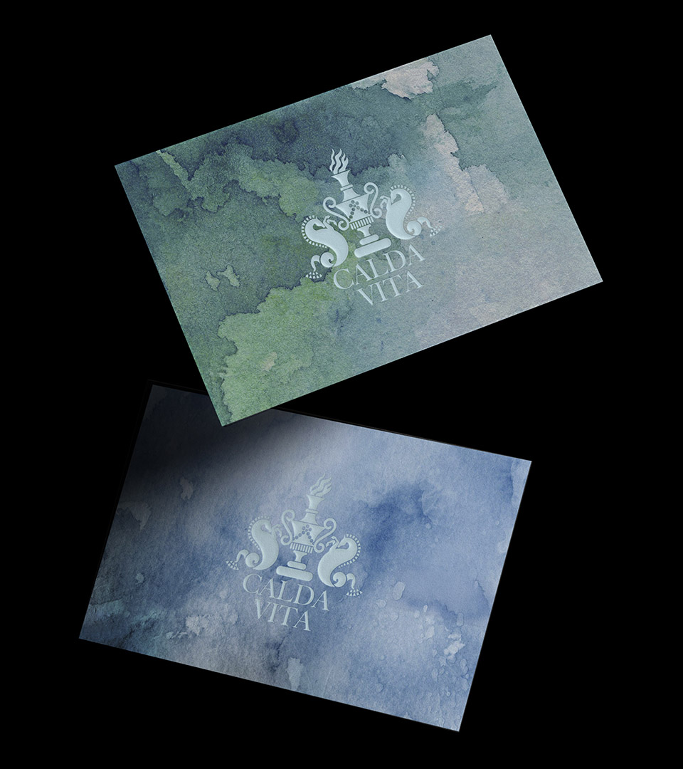
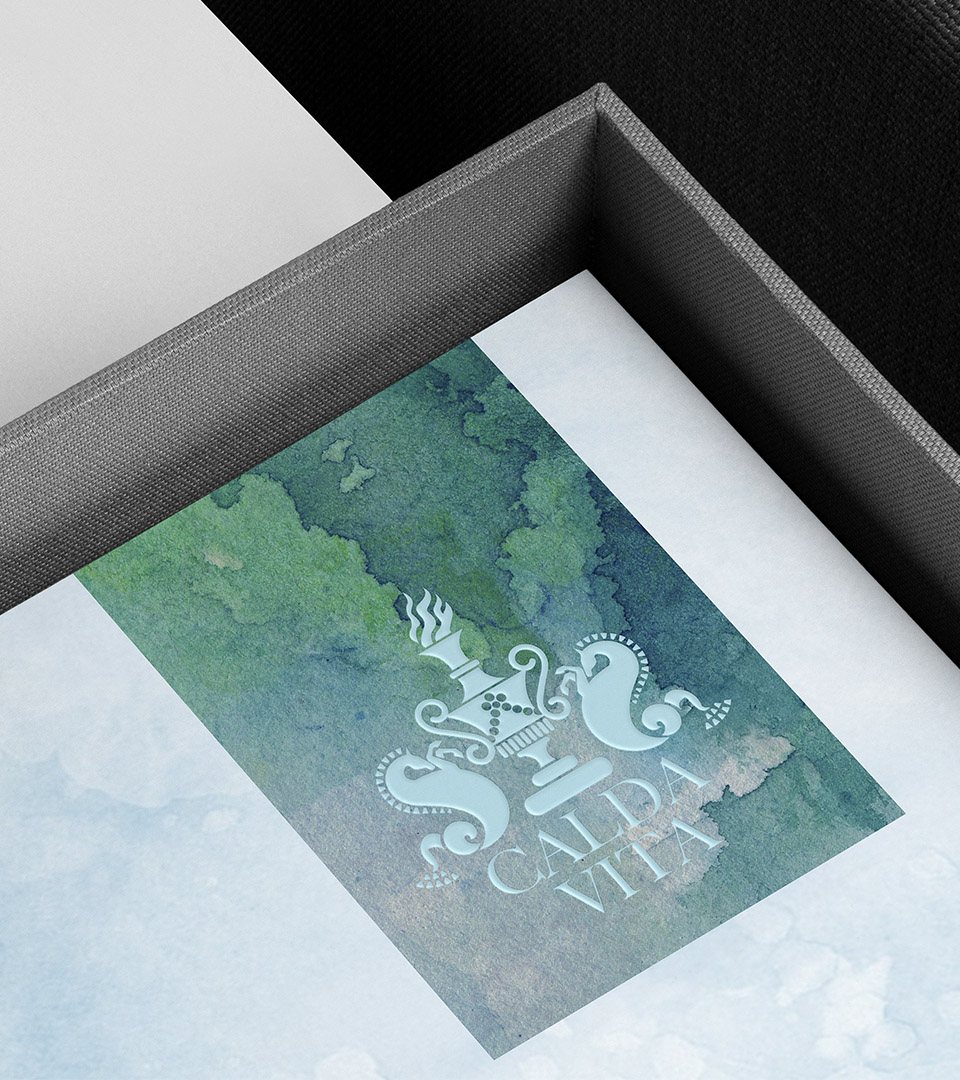
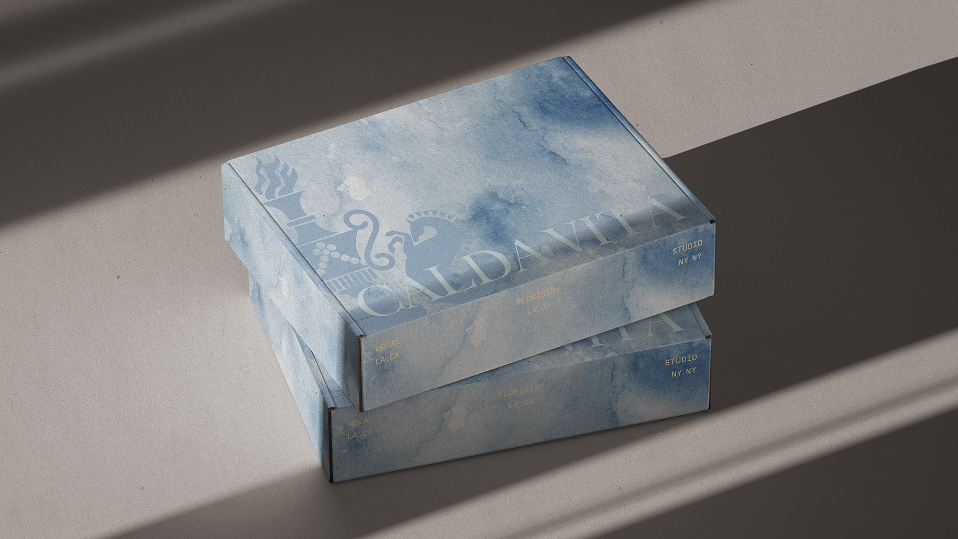
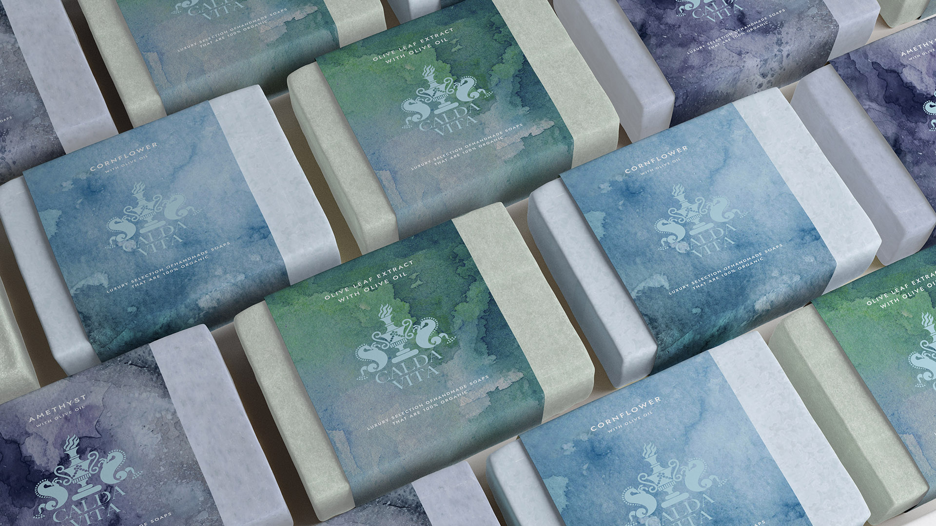
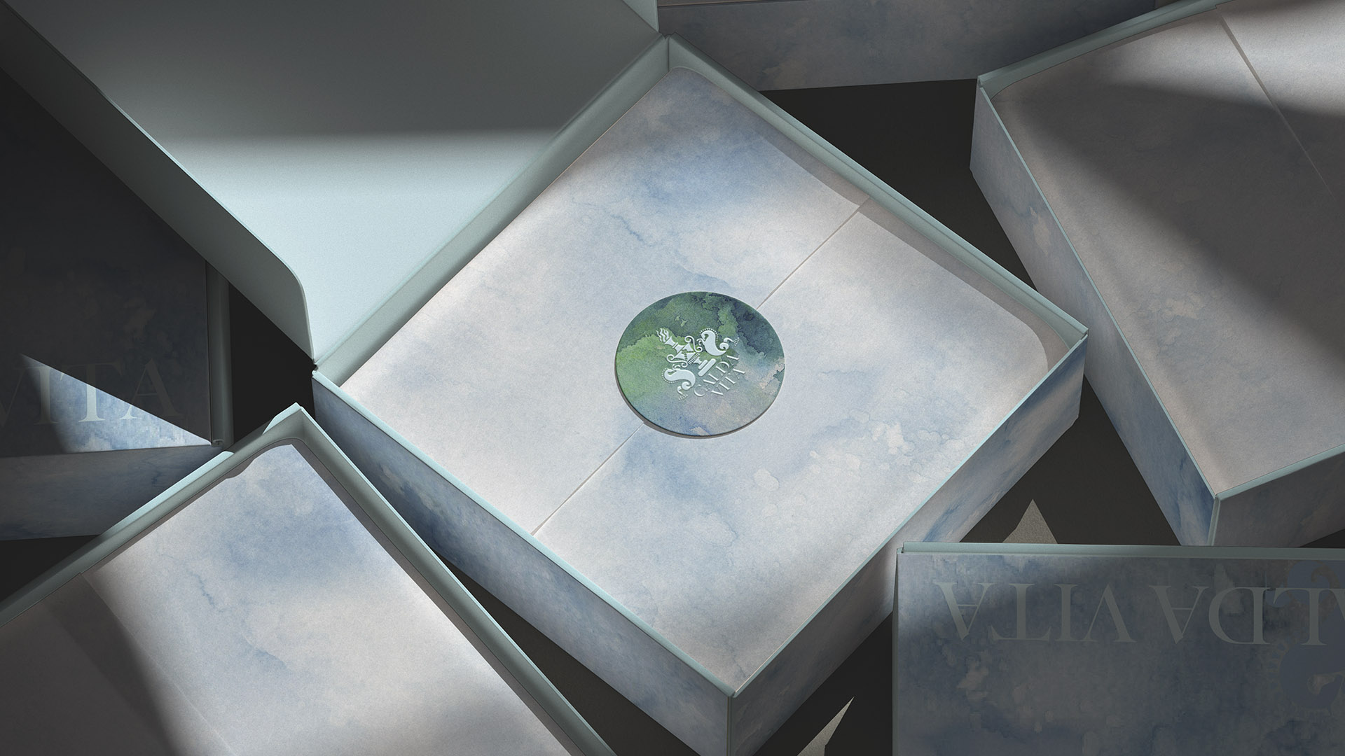
Adams Design created the name, logo, and full brand identity for Calda Vita, a luxury line of handmade organic soaps. Rooted in warmth and purity, the identity blends refined typography with soft, organic detailing to reflect the brand’s artisanal quality. The visual system extends across packaging and print, presenting Calda Vita as a modern, understated expression of natural luxury.

Client
Calda Vita Soaps
Industry 
Health and Beauty Branding
Services 
Brand Strategy, Brand Identity, Visual System, Packaging
Boston-based graphic design and branding studio delivering memorable logos, identity systems, created the visual identity for Calda Vita including this shopping bag and mailing box.
Boston-based graphic design and branding studio delivering memorable logos, identity systems, created the visual identity for Calda Vita including this hangtag with green and blue watercolor background for the blue logo.
We named the company Calda Vita, inspired by the Italian words for “warmth” and “life.” Drawing on the founder’s Italian heritage, we developed a name and identity that balance craft and clarity — expressing artisanal quality, natural luxury, and enduring simplicity.
Boston-based graphic design and branding studio delivering memorable logos, identity systems, created the visual identity for Calda Vita. Blue logo on green and blue watercolor.

The logo draws on ancient Italian and Greek motifs to express heritage, craftsmanship and timeless luxury. A central urn with a flame, flanked by the stylized hippocampus (half horse and half fish) symbolizes warmth, life and the purity of water.

Calda Vita handmade organic soap with luxury brand identity packaging.

The Calda Vita color palette blends blue and green tones with a pale blue accent. This combination evokes Mediterranean landscapes, water and natural ingredients, reinforcing the brand’s balance of warmth, purity and understated luxury.

Big Caslon Medium was used for the logo because its roots in 17th-century serif typography and its bold, sculpted letterforms evoke classical elegance and craftsmanship, aligning with the brand’s heritage-inspired identity.

Calda Vita organic soap packaging featuring elegant typography and refined identity design.

Using the watercolor backgrounds evoke an artisanal, handcrafted feel, reflecting the Italian-inspired, handmade nature soap.

calda vita business cards floating
calda vita leterhead in box
calda vita mailing boxes
Calda Vita luxury organic soap collection with cohesive packaging and brand system.
calda vita organic soaps stacked against black background
Calda Vita organic soap packaging featuring elegant typography and refined identity design.
The result is a cohesive, elevated identity that positions Calda Vita as a modern luxury soap brand—enhancing shelf presence, strengthening recognition, and expressing the purity and craftsmanship at the heart of the product.


Adams Design
20 Park Plaza
Boston, MA 02116

Let's Talk!