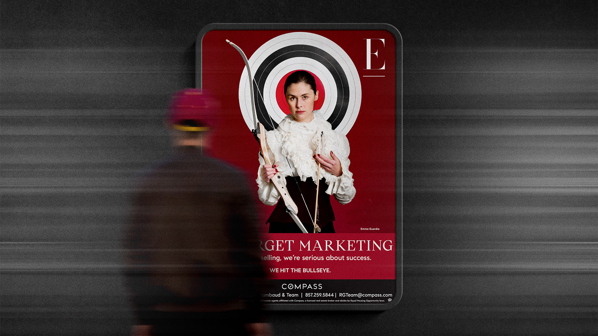
THE SOLUTION
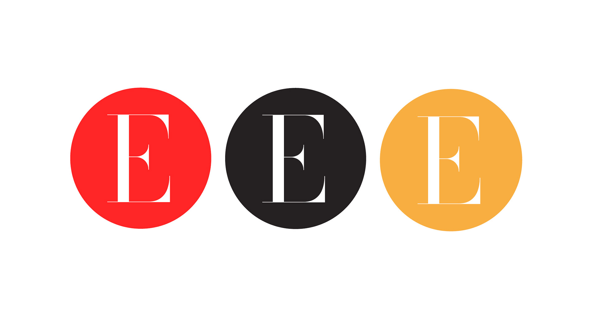
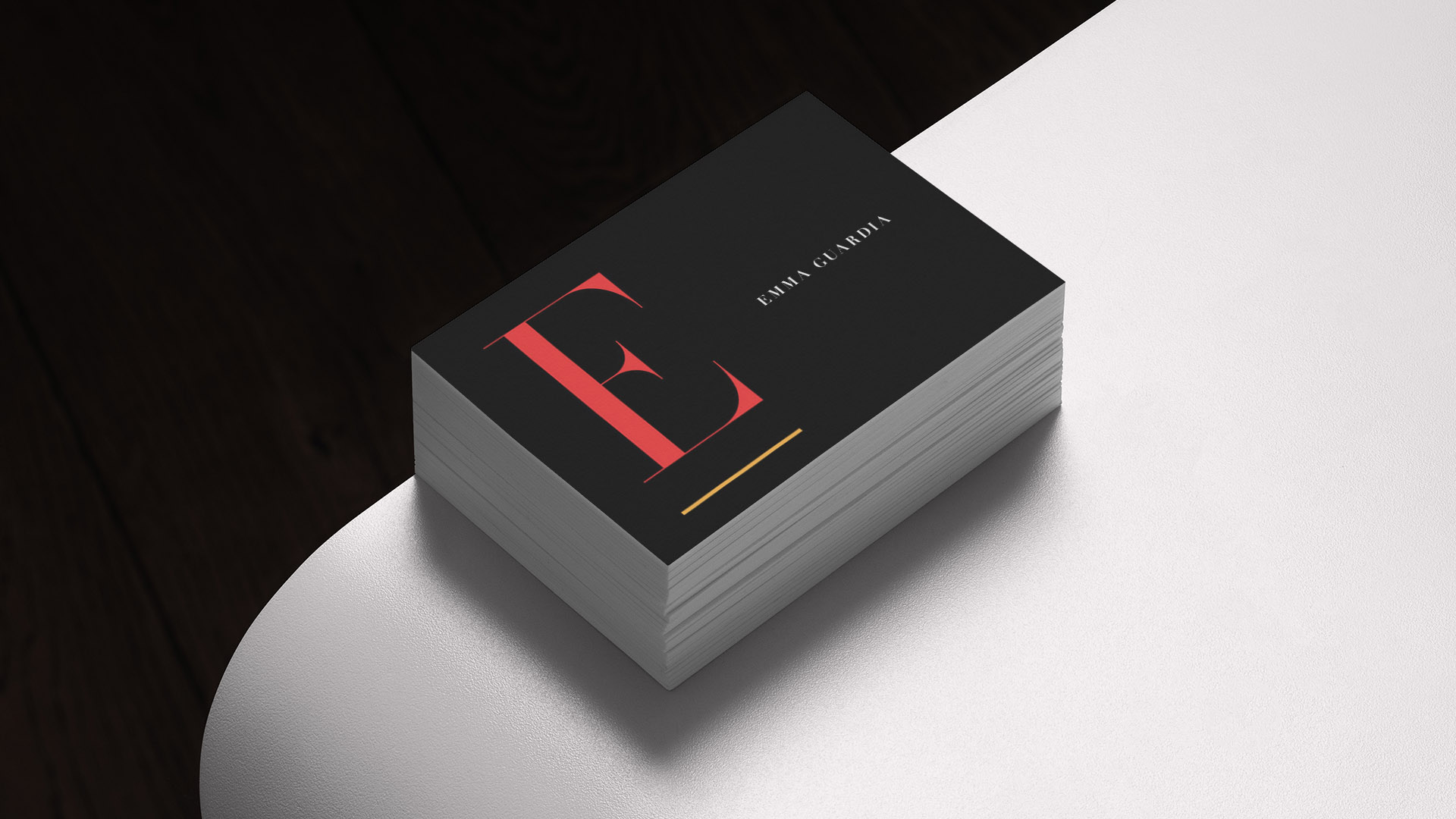
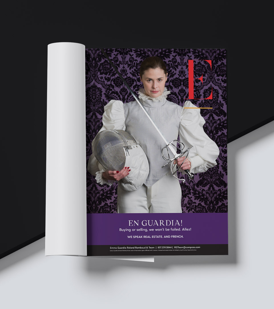
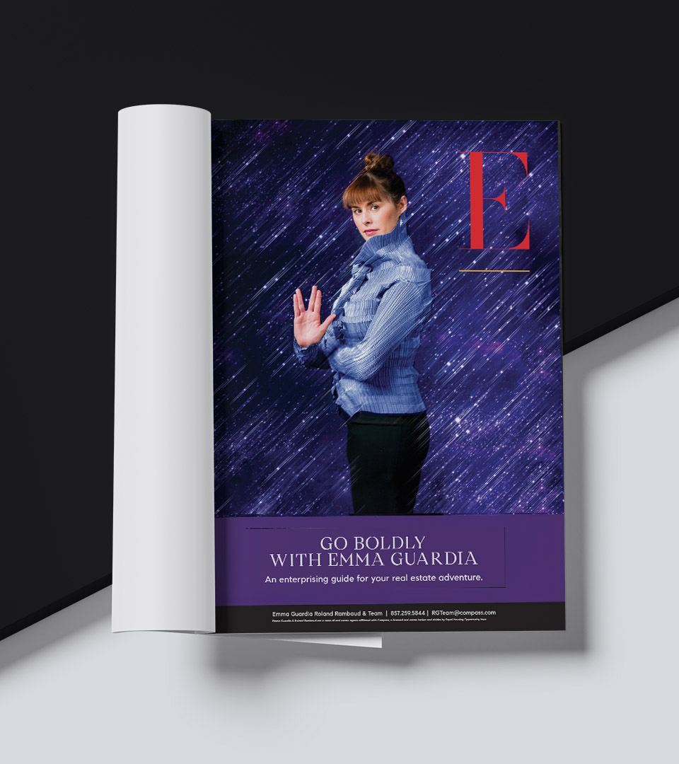
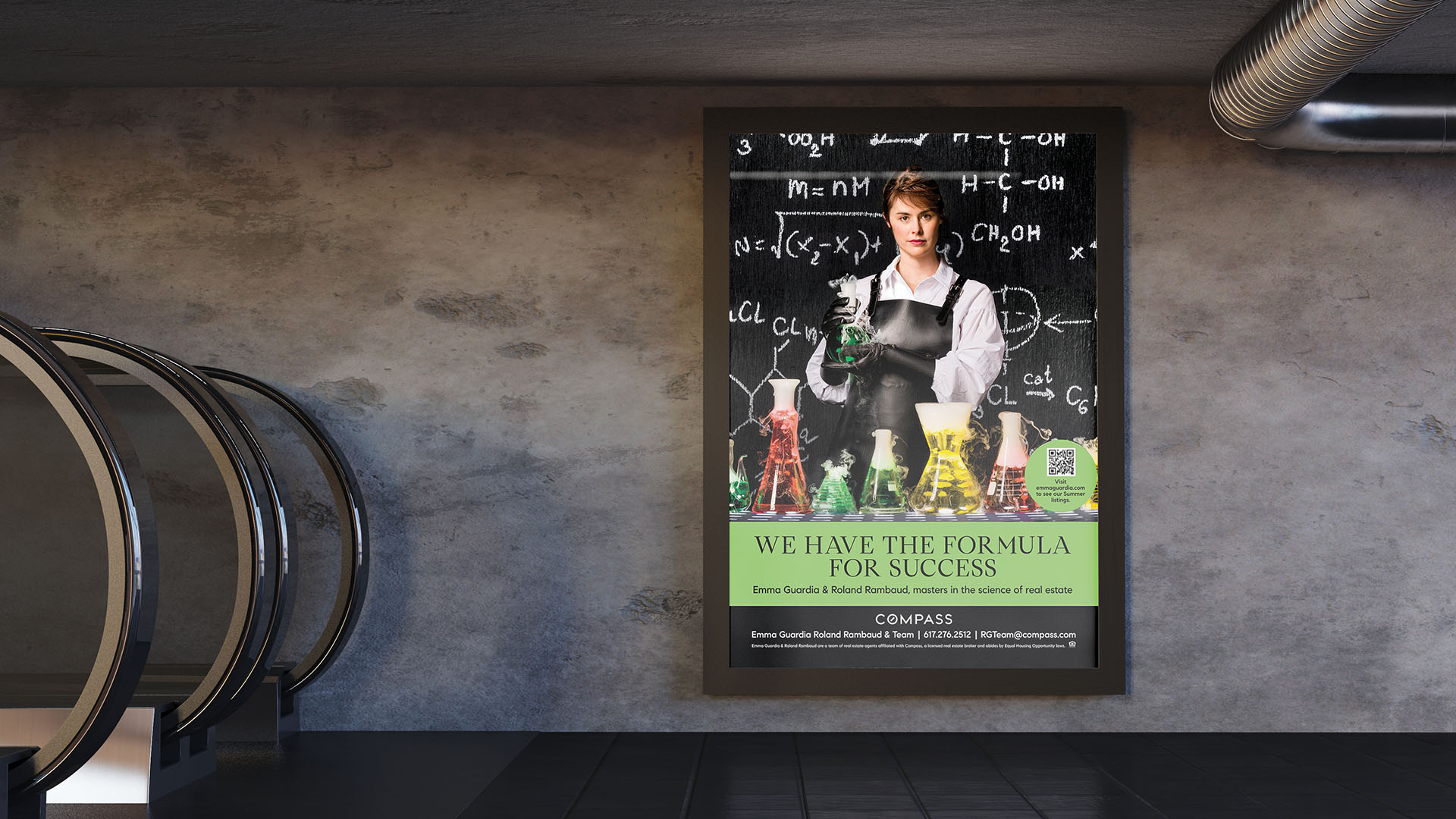
A single letter becomes the brand. The “E” is drawn as a bold, architectural form—simple, reductive, and unmistakable. Paired with a restrained palette of red, black, and white, the identity speaks with precision and directness.
The campaign centers on a series of conceptual portraits of Emma—graphic, stylized, and message-led. Each portrait becomes a vehicle for short, declarative lines (BUY. SELL. SMILE.), turning the agent into the brand’s primary medium rather than default real-estate clichés. The new red “E” mark anchors every execution; typography and composition stay reductive so the idea—and Emma—read instantly at street scale. The effect is a coherent system where logo, language, and portraiture work as one.