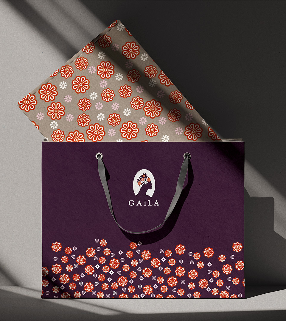
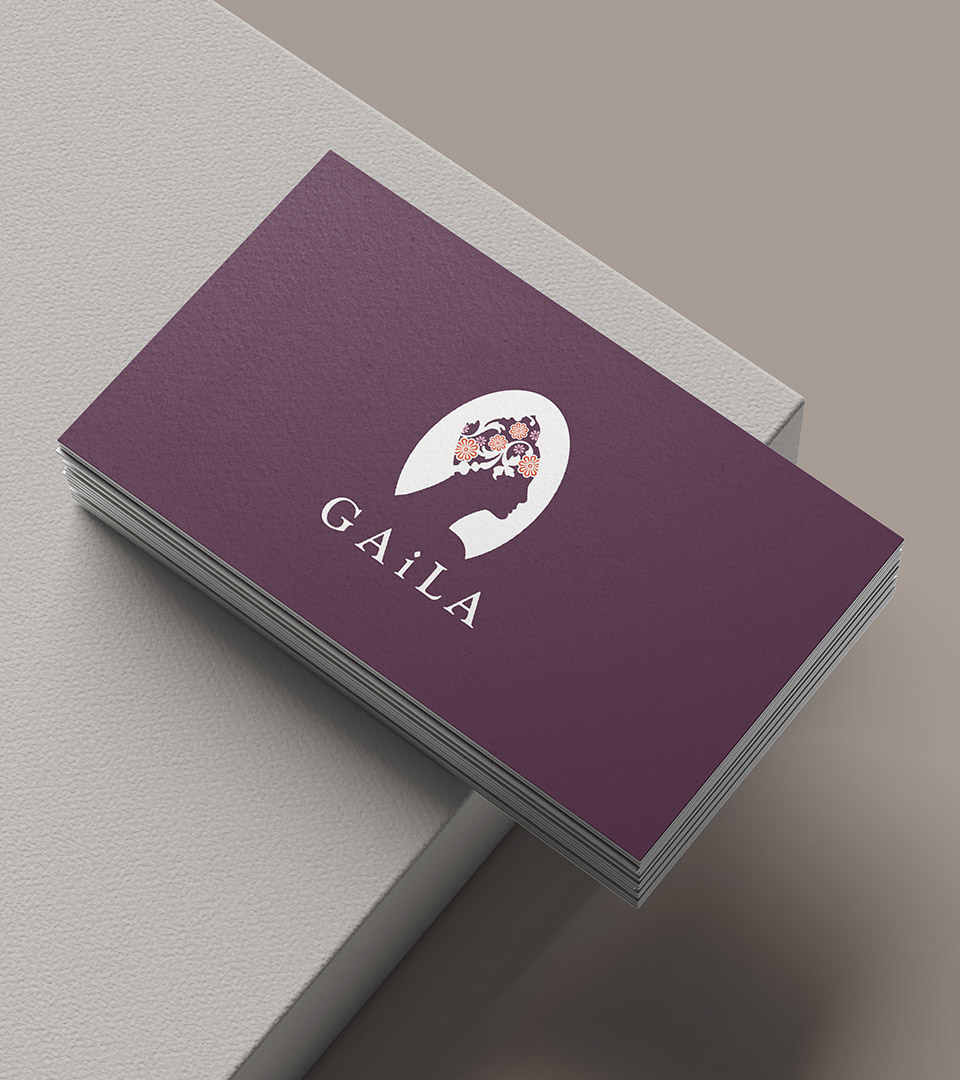
Gaila

Creating a compassionate brand identity for a nonprofit supporting cancer patients

We partnered with The Gaila Fund to name and develop the brand identity for Gaila, a nonprofit creating an innovative headdress designed to support patients undergoing cancer treatment. The visual system needed to balance compassion and dignity with a clean, contemporary aesthetic—reflecting the organization’s mission and the simple beauty of the product.

Client
The Gaila Fund
Industry 
Health & wellness / nonprofit / lifestyle product
Services 
Brand identity, logo design, print collateral, nonprofit communication materials
Gaila nonprofit brand identity logo for cancer patient support.
Print materials for Gaila showcasing the compassionate nonprofit brand identity.
We named Gaila which is a play on three words: gala, gele (the Nigerian headdress on which the Gaila is modeled) and Gail, the Milton professor of international business who designed the prototype.

THE CHALLENGE

Create a brand that communicates emotional support, confidence, and humanity for patients navigating treatment, while retaining a fashion-inspired sensibility that positions the headdress as a thoughtfully designed personal accessory—not a medical device.

THE SOLUTION

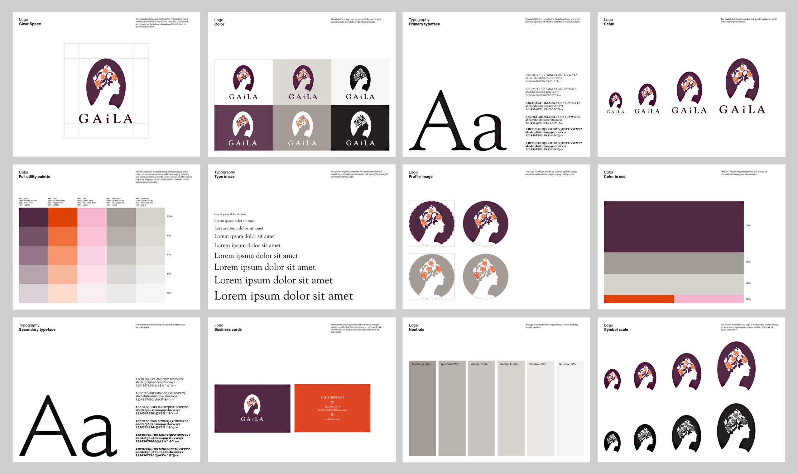
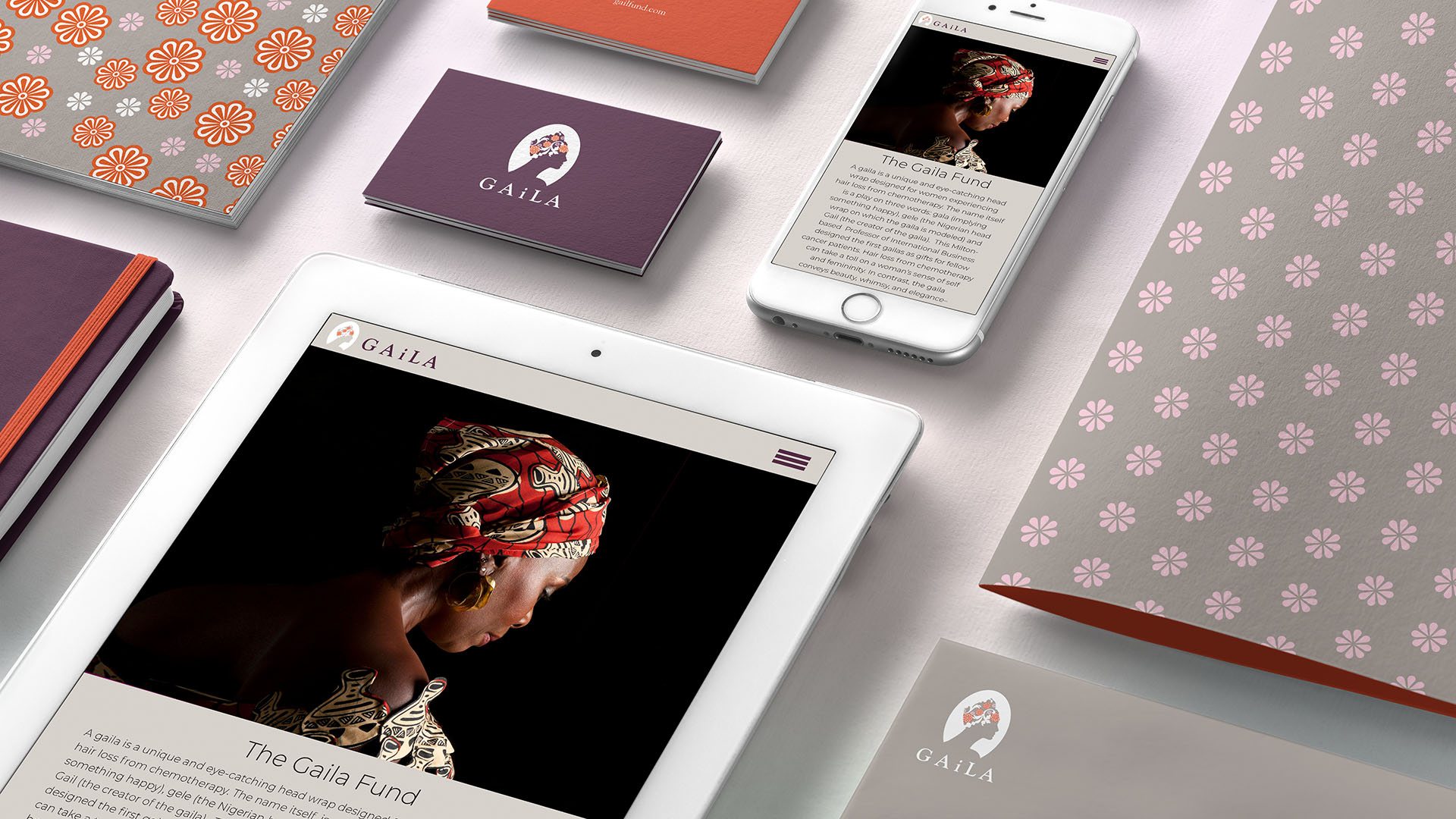
We began by developing the name Gaila, chosen for its softness, warmth, and approachable tone. The logo incorporates gentle curves and negative space to evoke protection and uplift—a subtle visual metaphor for comfort and care.

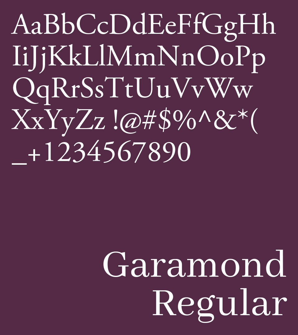
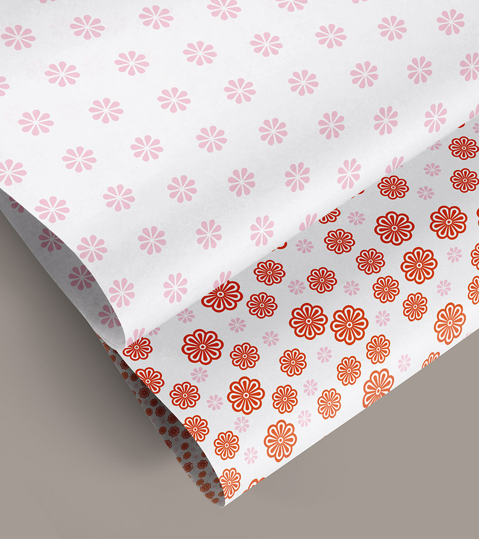
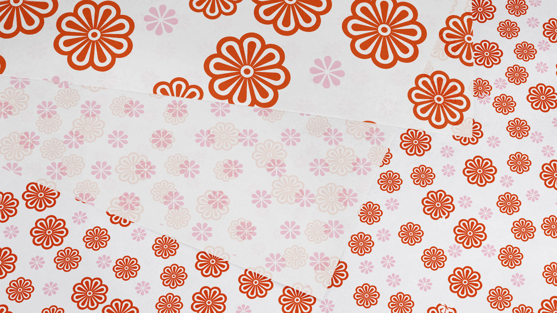
A soft, illustrative style and warm neutral palette reinforce a sense of calm and reassurance while allowing the brand to feel thoughtfully crafted. Elegant typography complements the product’s simplicity and communicates clarity across nonprofit messaging, print materials, and donor-facing collateral.

The overall identity system is intentionally minimal and human-centered, ensuring the product and its purpose remain at the forefront. Across applications, the brand conveys empathy, hope, and the power of design to support individuals through vulnerable moments.

Gaila nonprofit brand identity logo for cancer patient support.

Rooted in the elegance of the 19th-century cameo, the logo features a refined female profile as a symbol of enduring beauty. 

gaila fonts on purple background
gaila fund A on pink

Paired with restrained, contemporary typography, it creates a mark that feels both timeless and modern.

Gaila’s palette pairs vivid red and soft rose with warm gray and deep plum, balancing energy and warmth with depth and refinement for a timeless, contemporary feel.

gaila woman standing in front of rolls of fabrics

Patterned fabrics are curated and donated from various sources and made into individual head wraps. 

Print materials for Gaila showcasing the compassionate nonprofit brand identity.
gaila wrapping paper in rolls vertical
Soft illustration used in the Gaila brand identity system.
boston graphic design firm created the Gaila brand guidelines
the gaila fund branding page with iPad and business cards
The new identity provides Gaila with a distinctive, uplifting presence—helping the nonprofit communicate its mission, build awareness, and introduce its product in a way that feels both compassionate and design-forward.

The Challenge

Lorem ipsum dolor sit amet, consectetur adipiscing elit. Ut elit tellus, luctus nec ullamcorper mattis, pulvinar dapibus leo.

The Solution

Lorem ipsum dolor sit amet, consectetur adipiscing elit. Ut elit tellus, luctus nec ullamcorper mattis,


Adams Design
20 Park Plaza
Boston, MA 02116

Let's Talk!