We partnered with the Back Bay Association and its BID steering committee, led by President Meg Mainzer-Cohen, to deliver a standout logo design in Boston that captures the unique character of the district. Spanning from the vibrant, eclectic storefronts of Newbury Street to the iconic hotels, malls, and towers to the south, the Back Bay BID needed a visual identity as dynamic and distinctive as the neighborhood itself.
Brand Strategy
Identity
Website
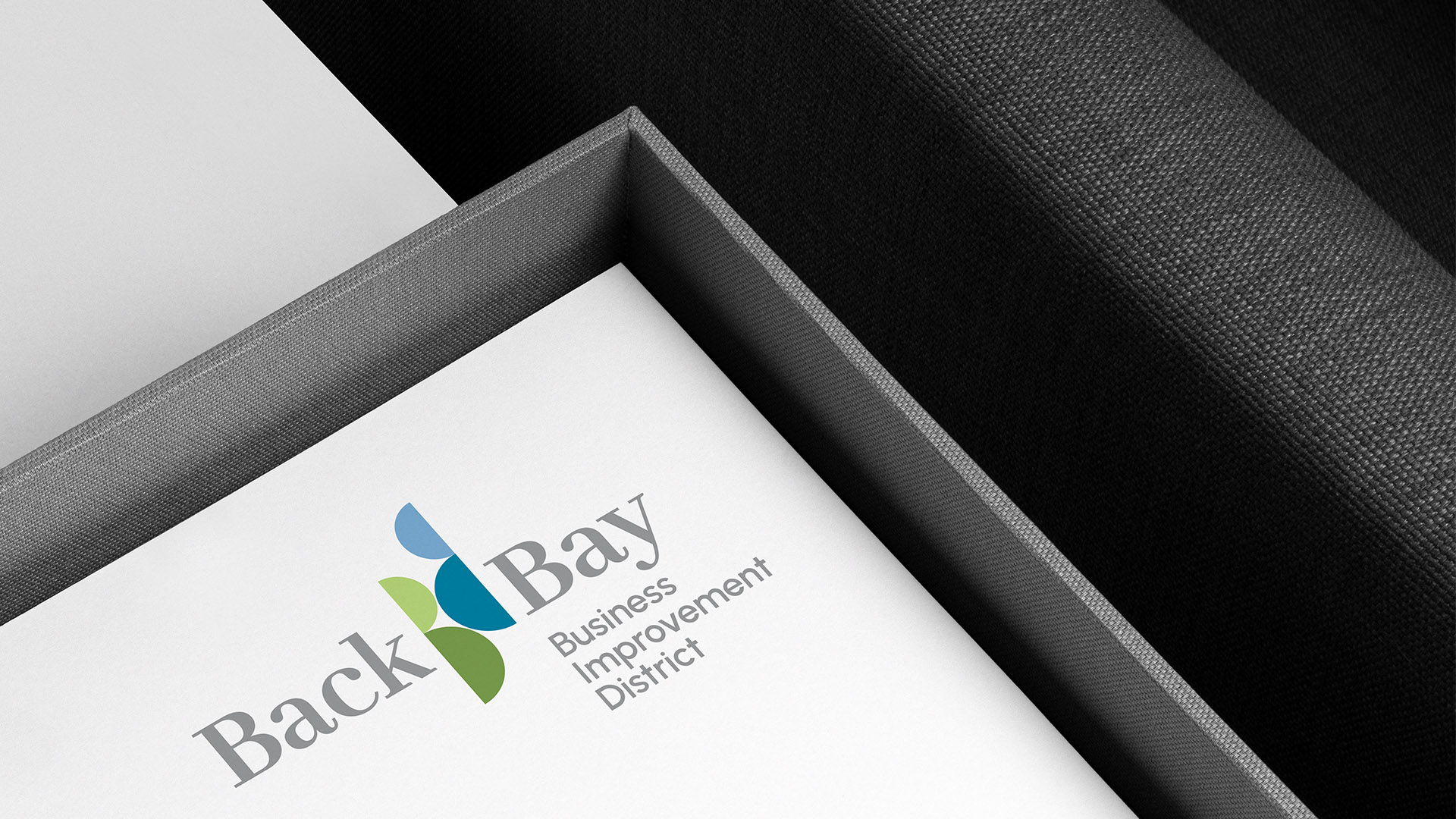
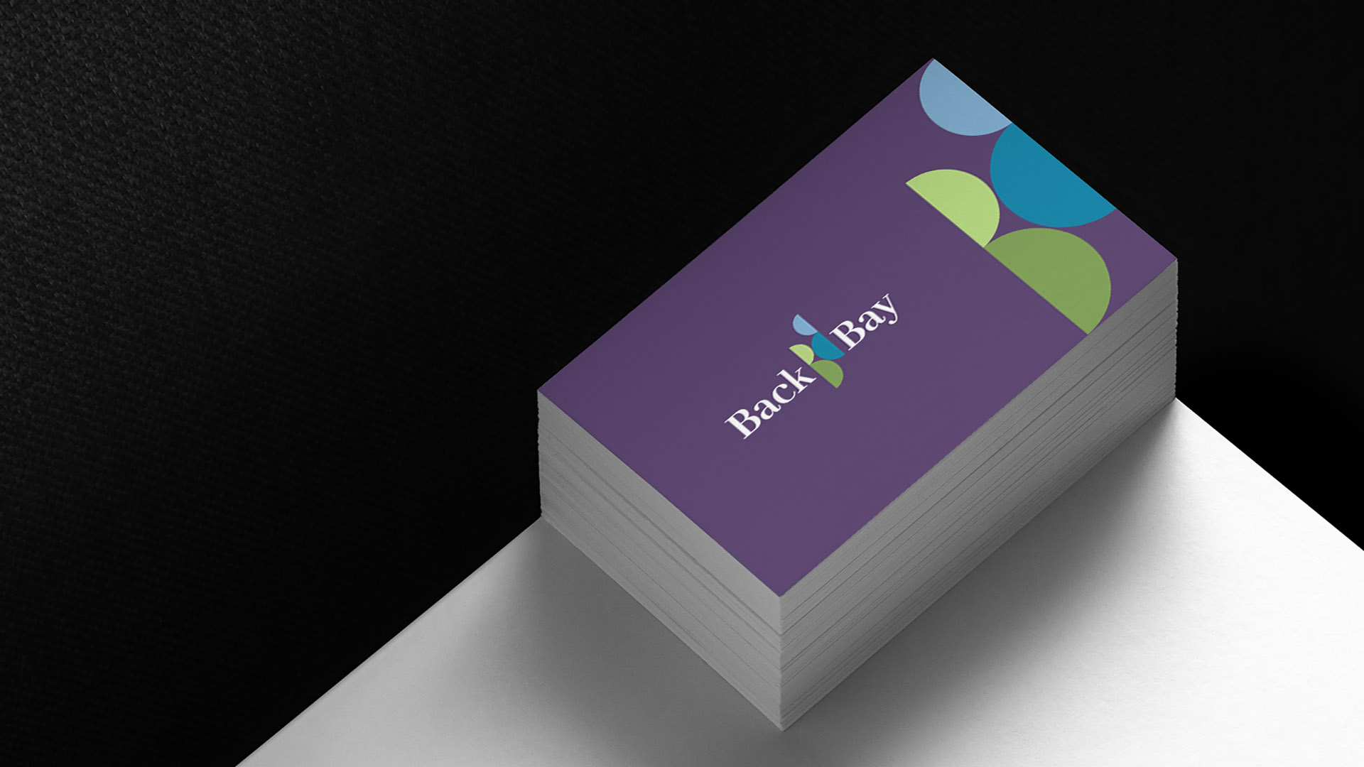
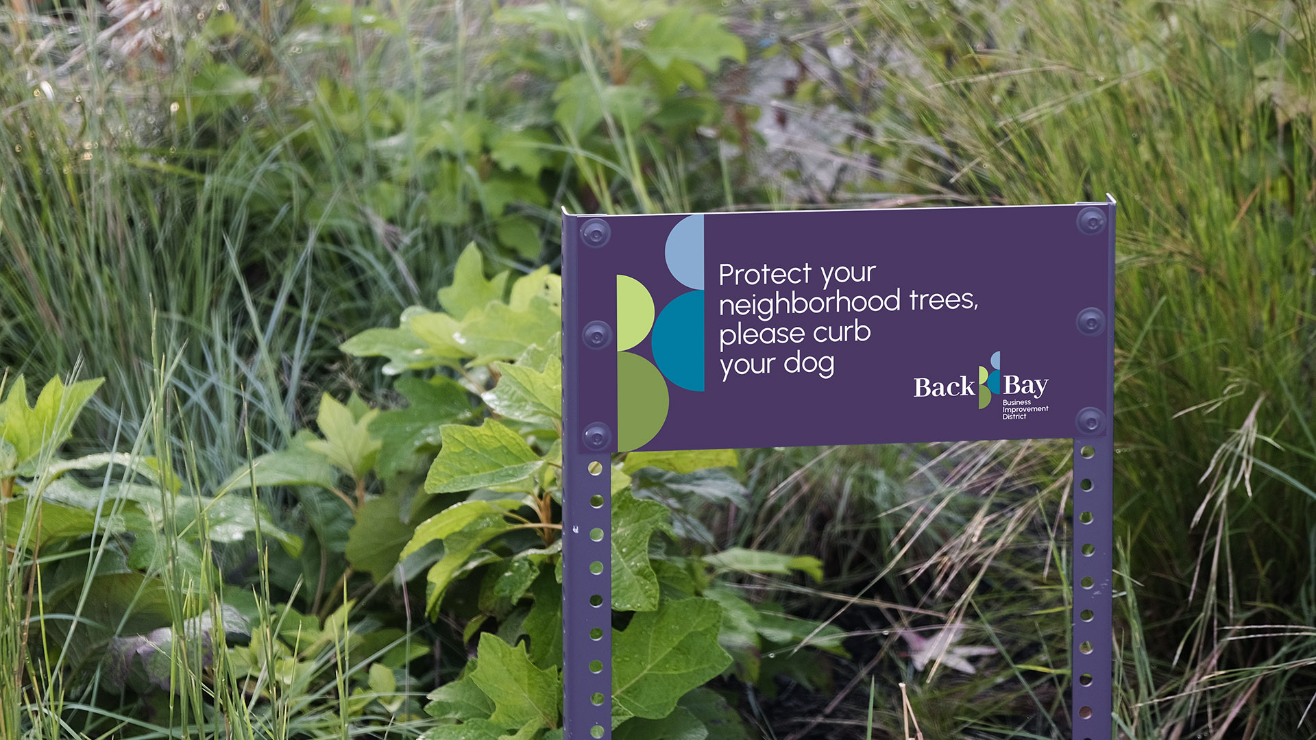
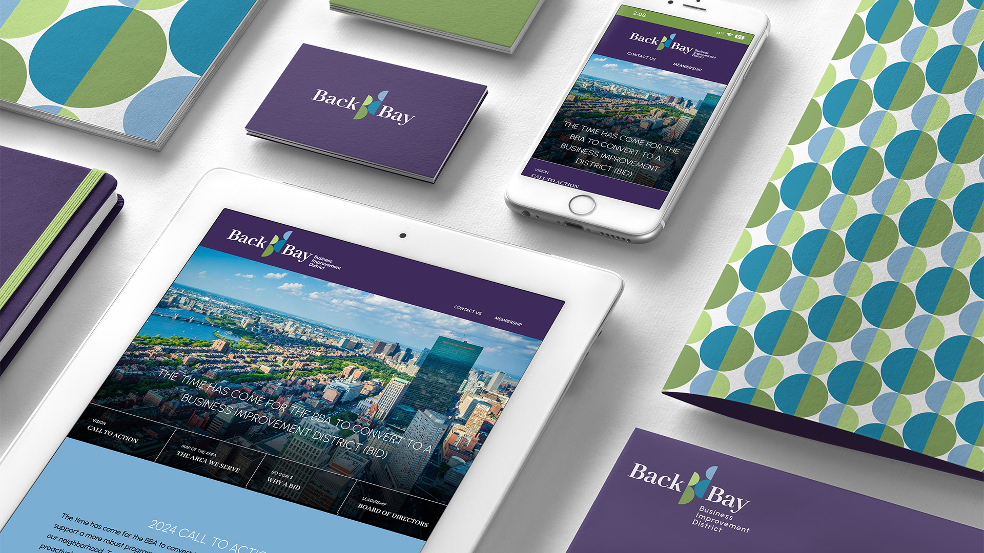
Seen from above, the district forms a B shape, bounded by Newbury Street’s small businesses and Commonwealth Mall’s greenery, extending to Boylston Street’s tall, blue glass towers. This design doubles as the initials “BB,” with multi-colored half circles reflecting a diverse, vibrant business hub, blending small enterprises with corporate towers.
The shape can be used on its own or as part of the larger “BB” monogram. The double B’s can also be used as a symbol on BID materials. On applications, the B’s can be cropped to play with the edges or wrapped around items like business cards, banners, and totes.