We partnered with the Back Bay Association to create a bold, flexible identity for the district—reflecting its eclectic mix, from Newbury Street to the skyline beyond.
Brand Strategy
Identity
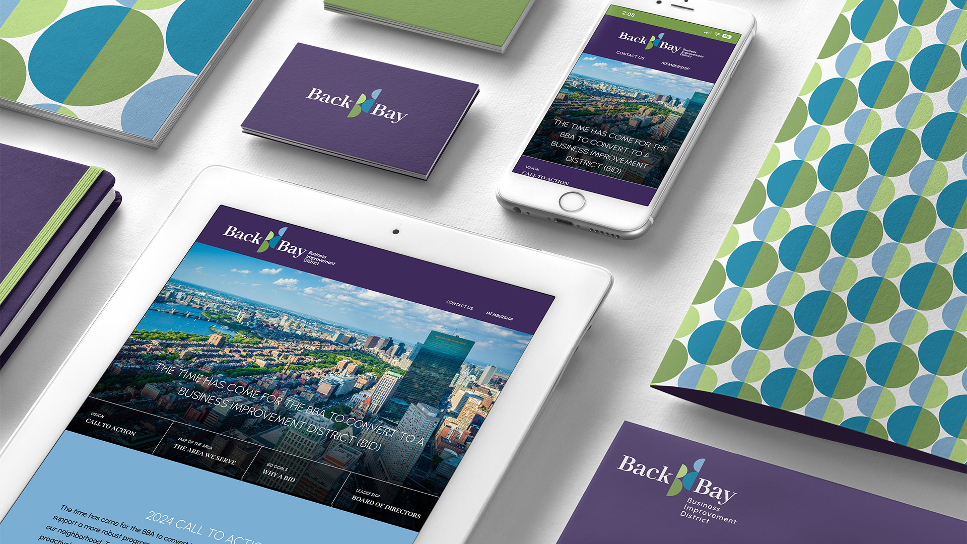
Website
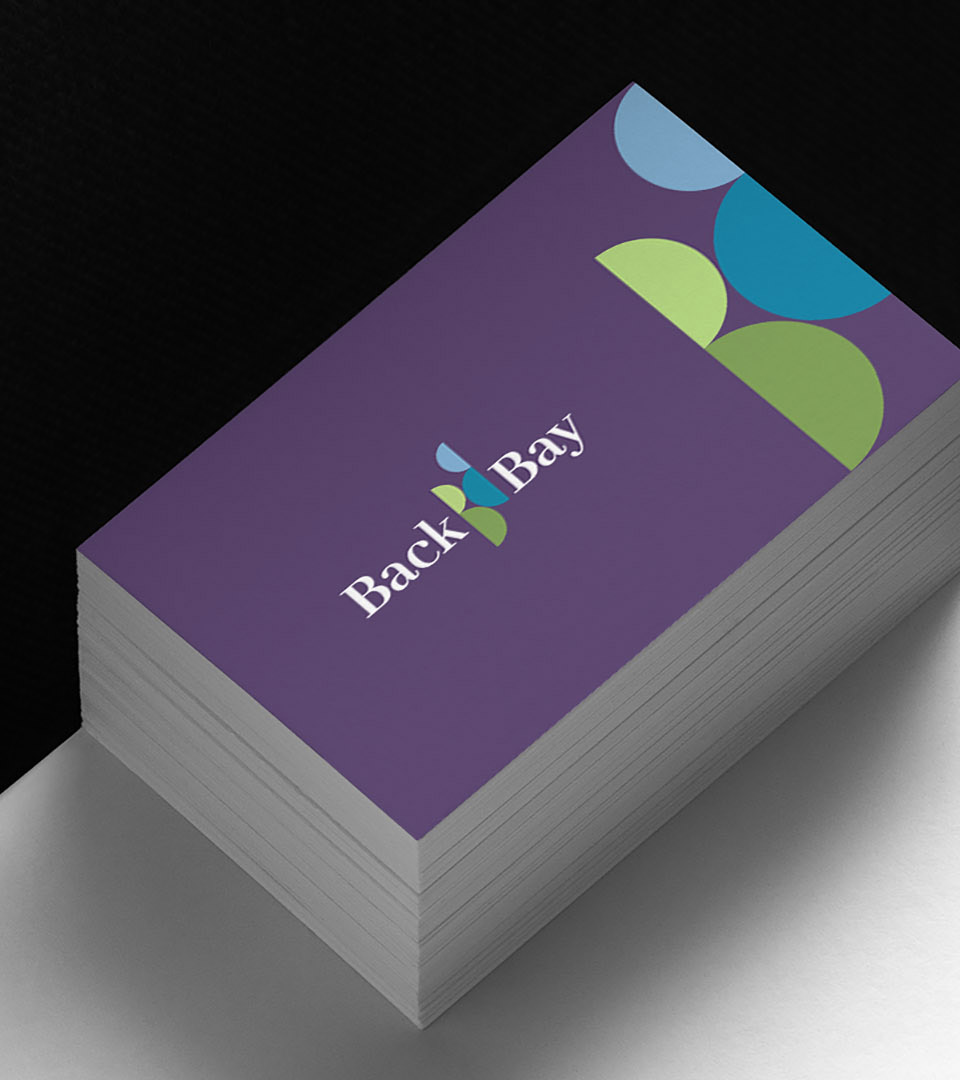
The identity mirrors the district from above: a “B” formed by streets, parks, and towers. Double Bs and colored arcs reflect Back Bay’s layered mix—local, corporate, vibrant.
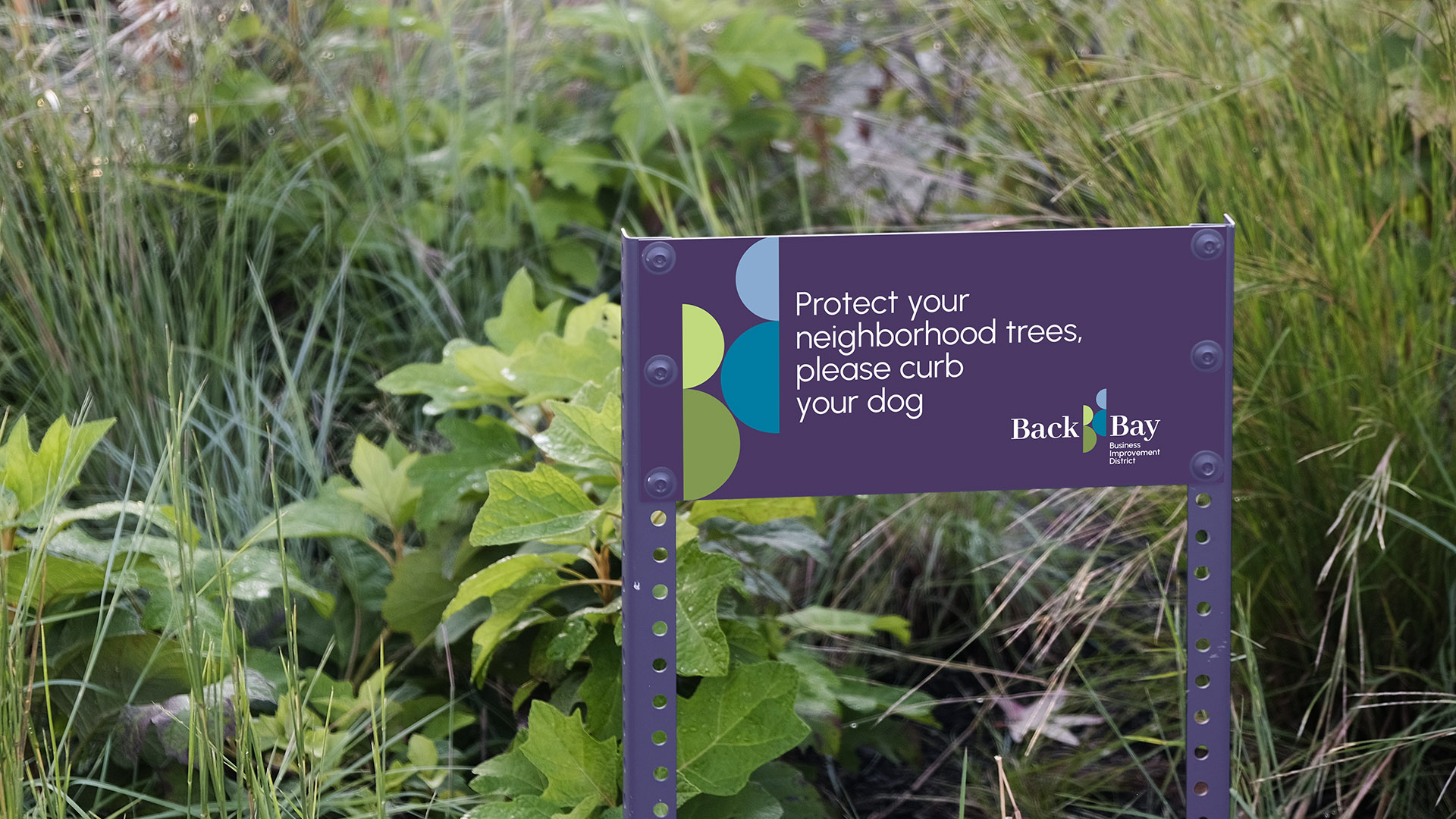
The double Bs adapt—used alone, cropped, or wrapped across touchpoints. A flexible mark built for banners, cards, totes, and more.
The color palette pairs cool blues and greens, reflecting Back Bay’s iconic glass towers and its vibrant green spaces.
The combination evokes a balance of urban energy and natural calm—central to the neighborhood’s identity.
The double Bs adapt—used alone, cropped, or wrapped across touchpoints. A flexible mark built for banners, cards, totes, and more.