The Cape Club

Brand identity for a mixed use community

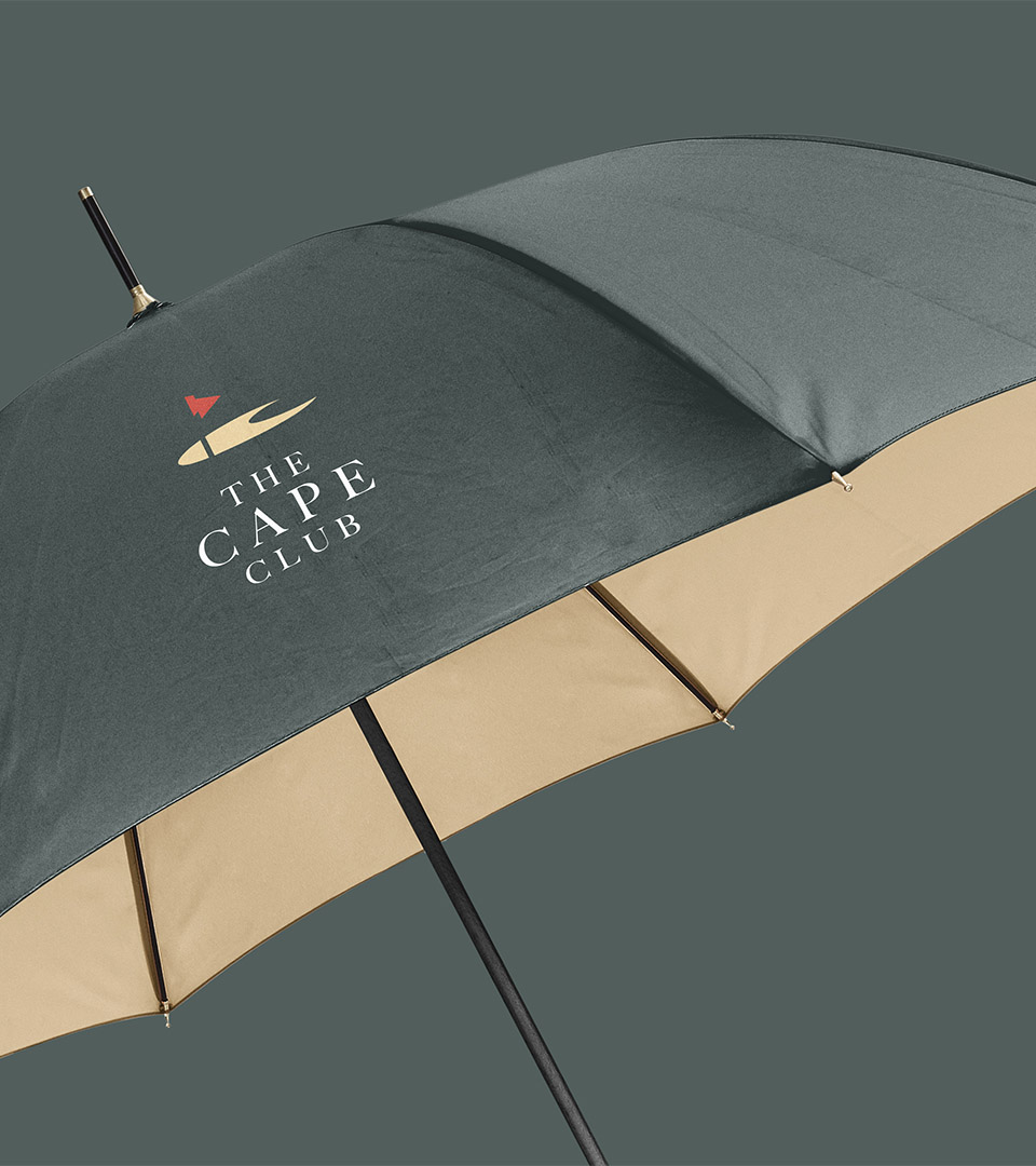
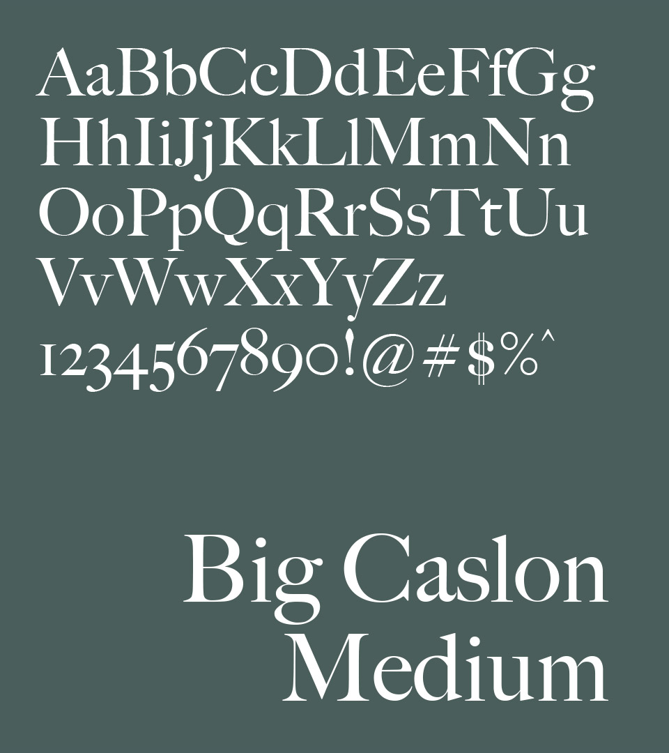
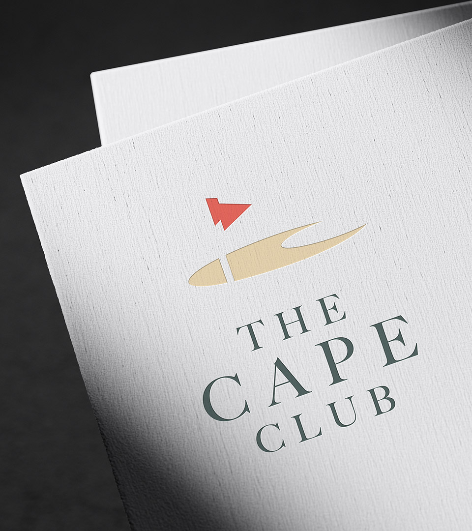
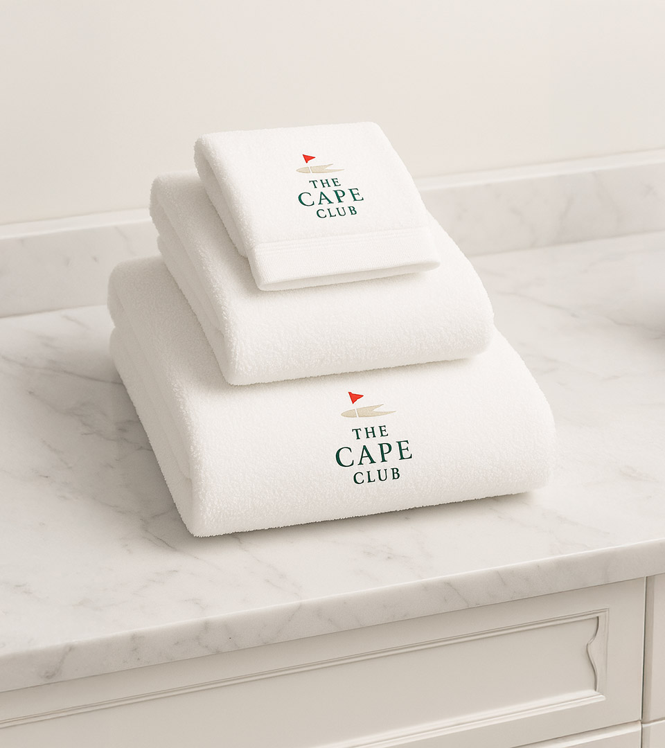
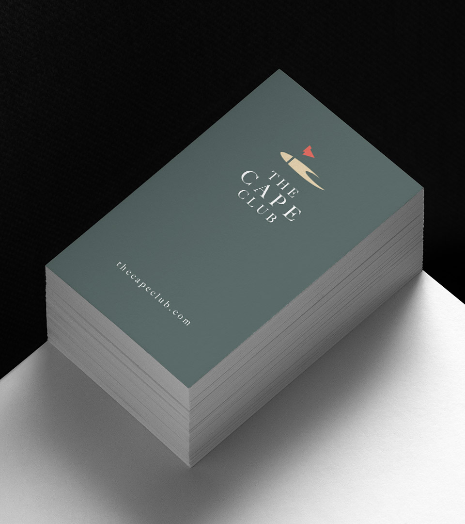
We created the brand identity for The Cape Club, a proposed mixed-use golf community on Cape Cod featuring townhomes, single-family residences, a members’ golf club, and a state-of-the-art course. The identity captures the spirit of coastal living with a refined, welcoming character that unites residential, golf, and hospitality experiences under one cohesive brand.

Client
Kelley & Cohorts
Industry 
Luxury Real Estate Branding
Services 
Brand Strategy, Brand Identity, Visual System, Print

The Cape Club logo featuring refined, coastal-inspired brand identity design.

THE CHALLENGE

The development needed an identity that could seamlessly connect its residential offerings, golf amenities, and hospitality components—while appealing to buyers seeking an elevated yet relaxed Cape Cod lifestyle.

THE SOLUTION

We developed a unified brand system anchored by a clean, coastal-inspired mark and a warm, sophisticated palette. The identity extends across print and environmental applications, balancing resort-style ease with polished design suited to both residents and club members.

the cape club logo on green with new red

The mark for The Cape Club abstracts a sandbar into a clean, modern form that also reveals a subtle “C.” This duality—landform and letter—anchors the identity in both place and name.

The palette blends soft coastal neutrals with warm, sun-washed tones—capturing the relaxed elegance of Cape Cod while providing a versatile foundation for both residential and golf-club applications.

the cape club big caslon medium on dark green
the cape club big caslon medium on light green

A refined serif typeface conveys tradition and craftsmanship, while a balanced sans serif provides clarity and modernity across applications.

the cape club letterhead
the cape club white towels on vanity
The Cape Club logo is symbolized by a golfer hitting the ball out of a sand trap.
the cape club hat on woman copy
cape club hand holding water bottle
Print collateral for The Cape Club showcasing the unified residential and golf community branding.
Brand identity applied to The Cape Club’s state-of-the-art Cape Cod golf course.
the cape club business cards on table
Hands of woman squeezing lemon juice to Irish oysters in plate with ice over glass of champagne by best boston ad agency
The brand positioned The Cape Club as a distinctive mixed-use community—strengthening its appeal to prospective homeowners and establishing a cohesive visual presence across residential, golf, and hospitality touchpoints.


Adams Design
20 Park Plaza
Boston, MA 02116

Let's Talk!