THE SOLUTION
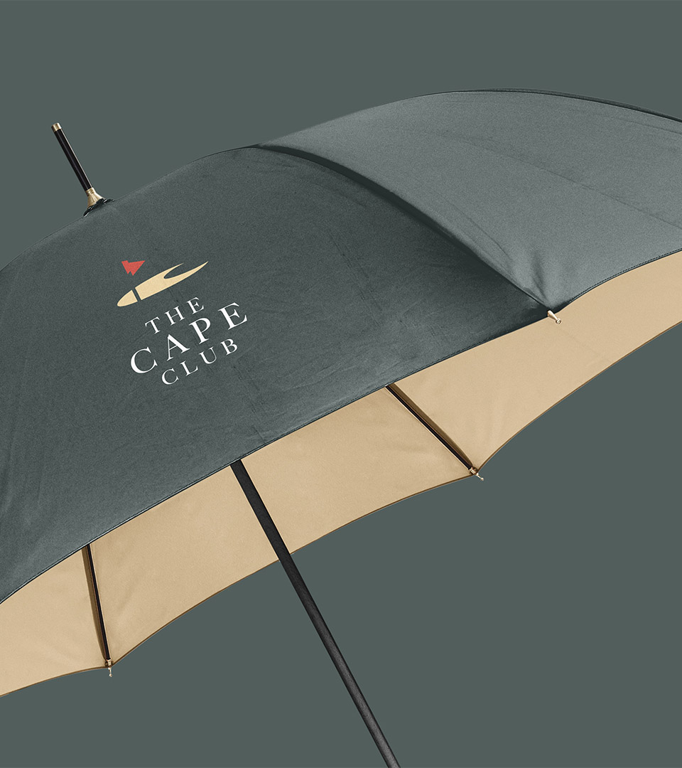
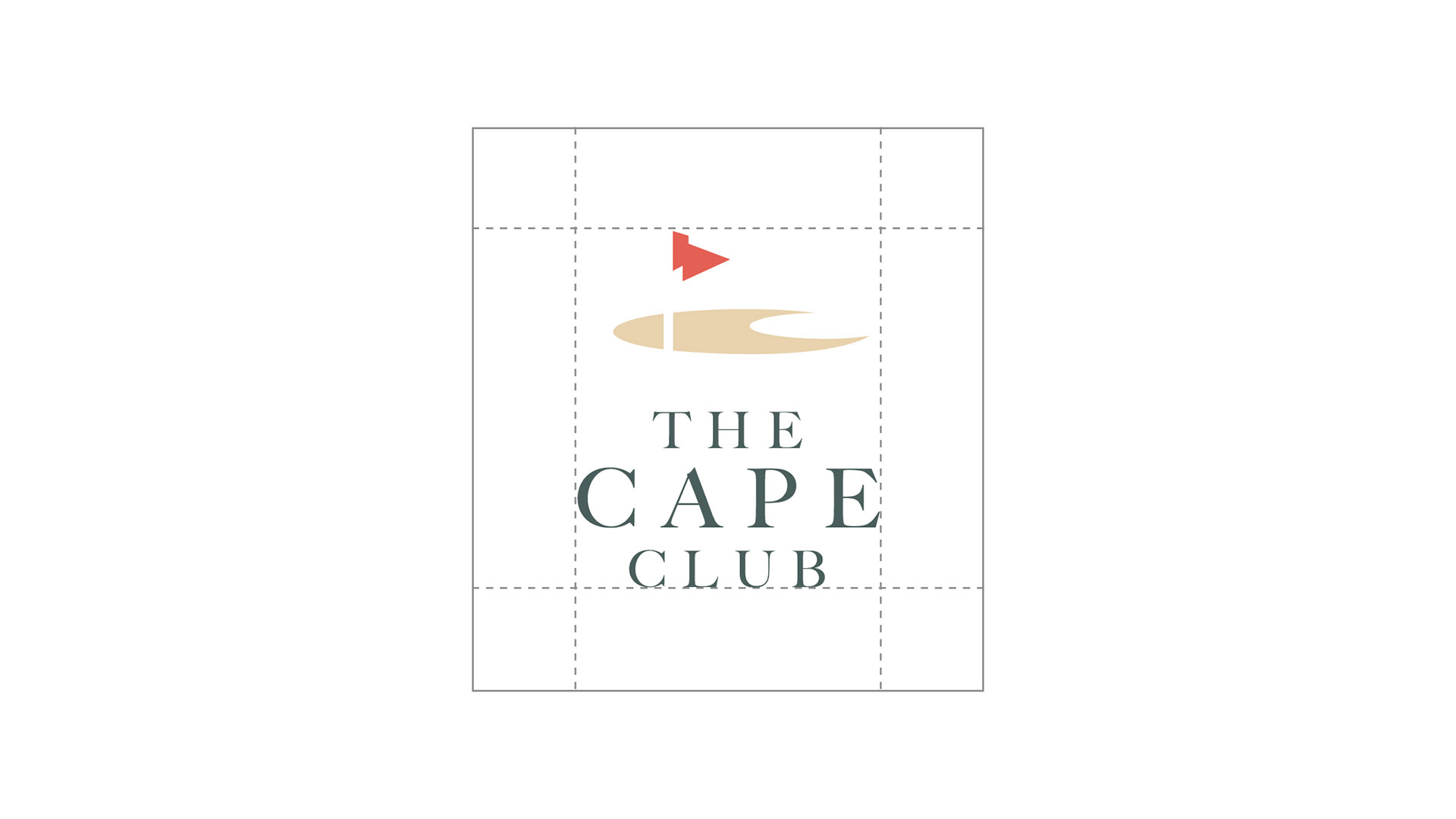
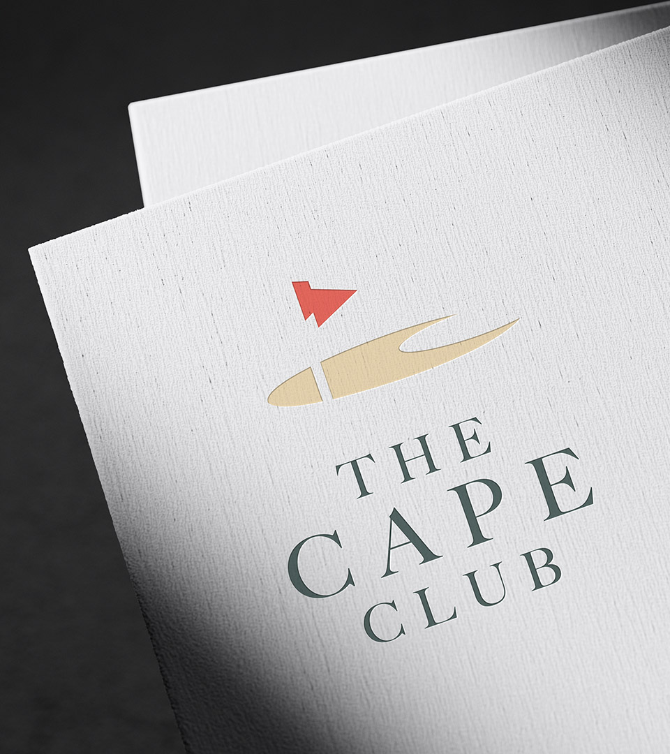
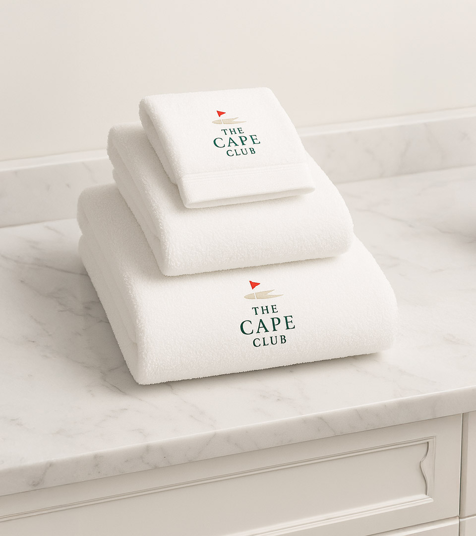
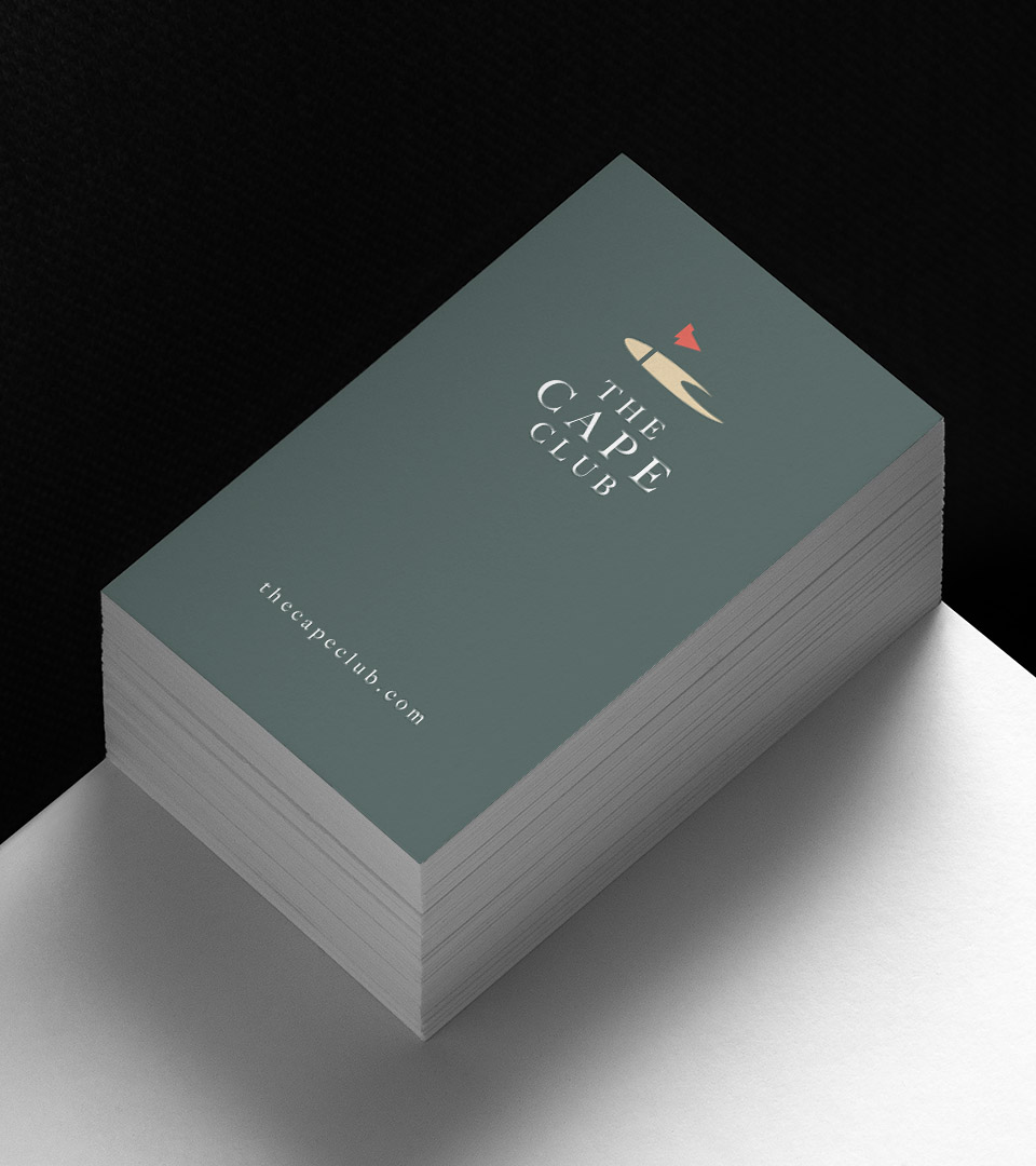
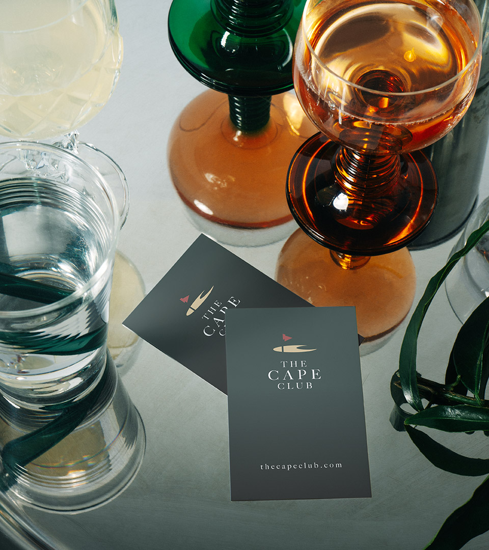
We built a clean, coastal-inspired identity anchored by a simple, elegant mark that captures the character of Cape Cod. The logo is paired with a sophisticated palette of soft neutrals and maritime blues, designed to evoke shoreline landscapes and relaxed coastal living.
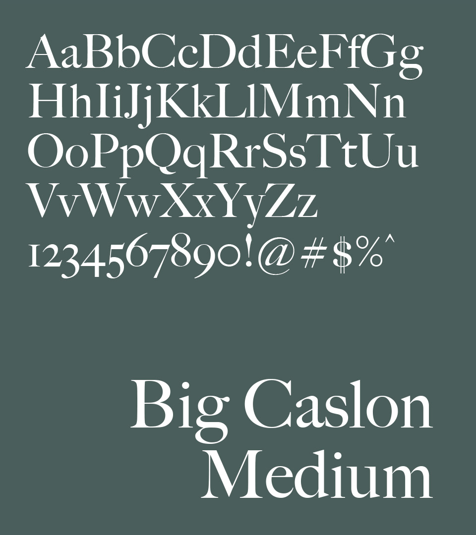
Typography choices reinforce this atmosphere—classic and approachable, suitable for both residential materials and golf-club applications. We extended the visual system into initial collateral, print layouts, and signage concepts to show how the brand would live across touchpoints throughout the community.
The result is a warm, flexible identity system that feels at home across real estate marketing, hospitality communication, and golf-oriented materials, allowing The Cape Club to present a unified brand experience from first impression to onsite engagement.