THE SOLUTION
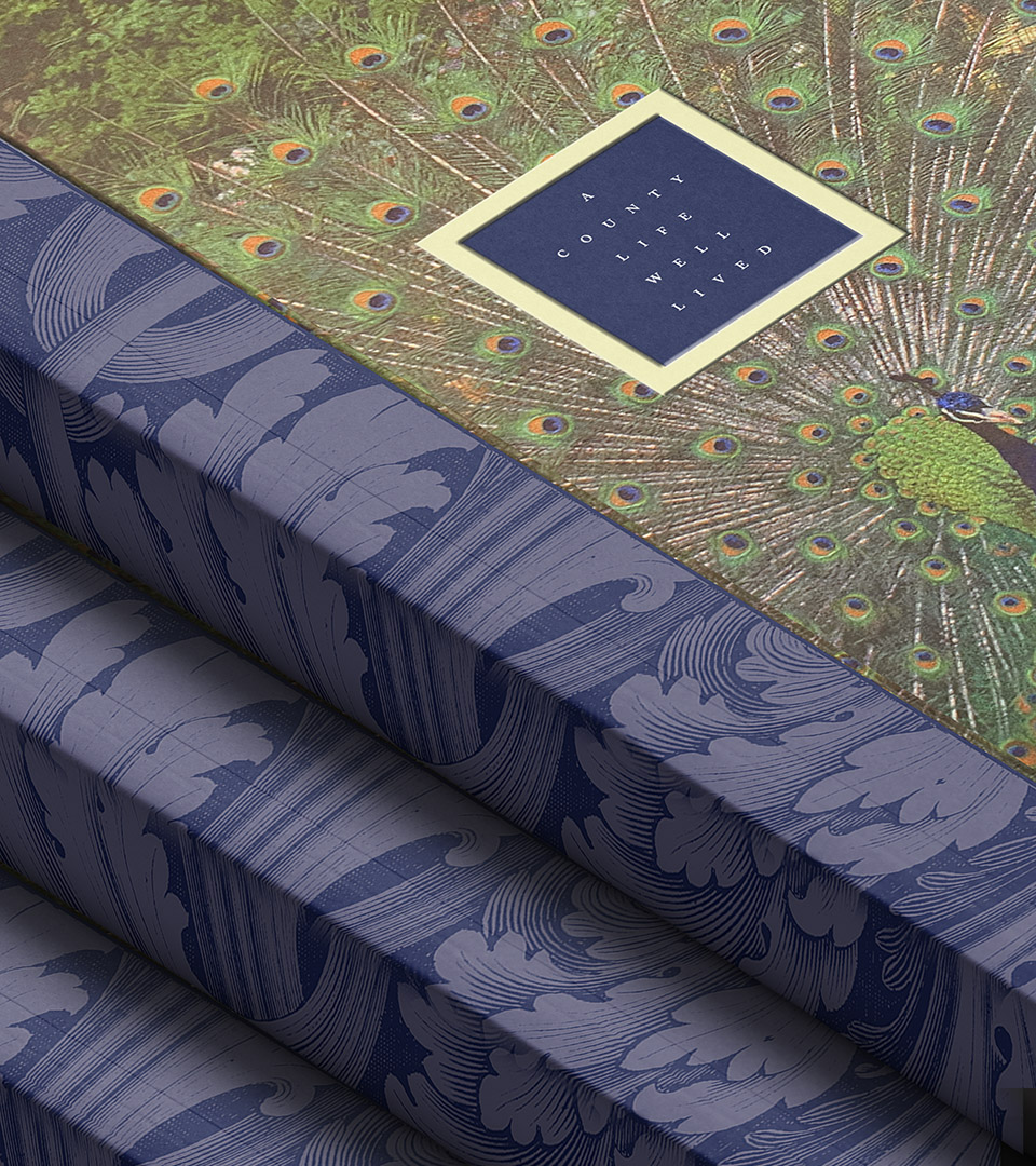
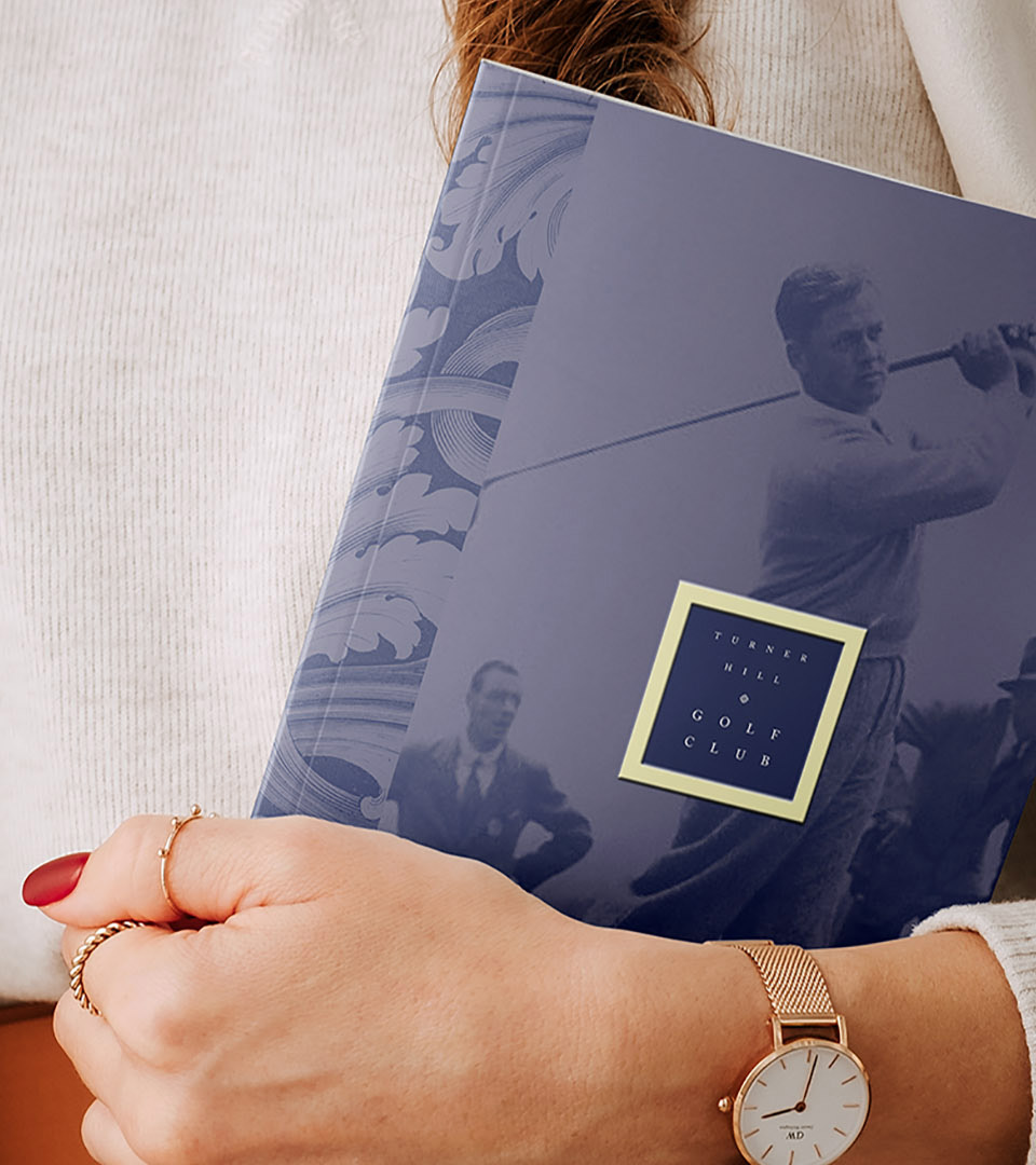
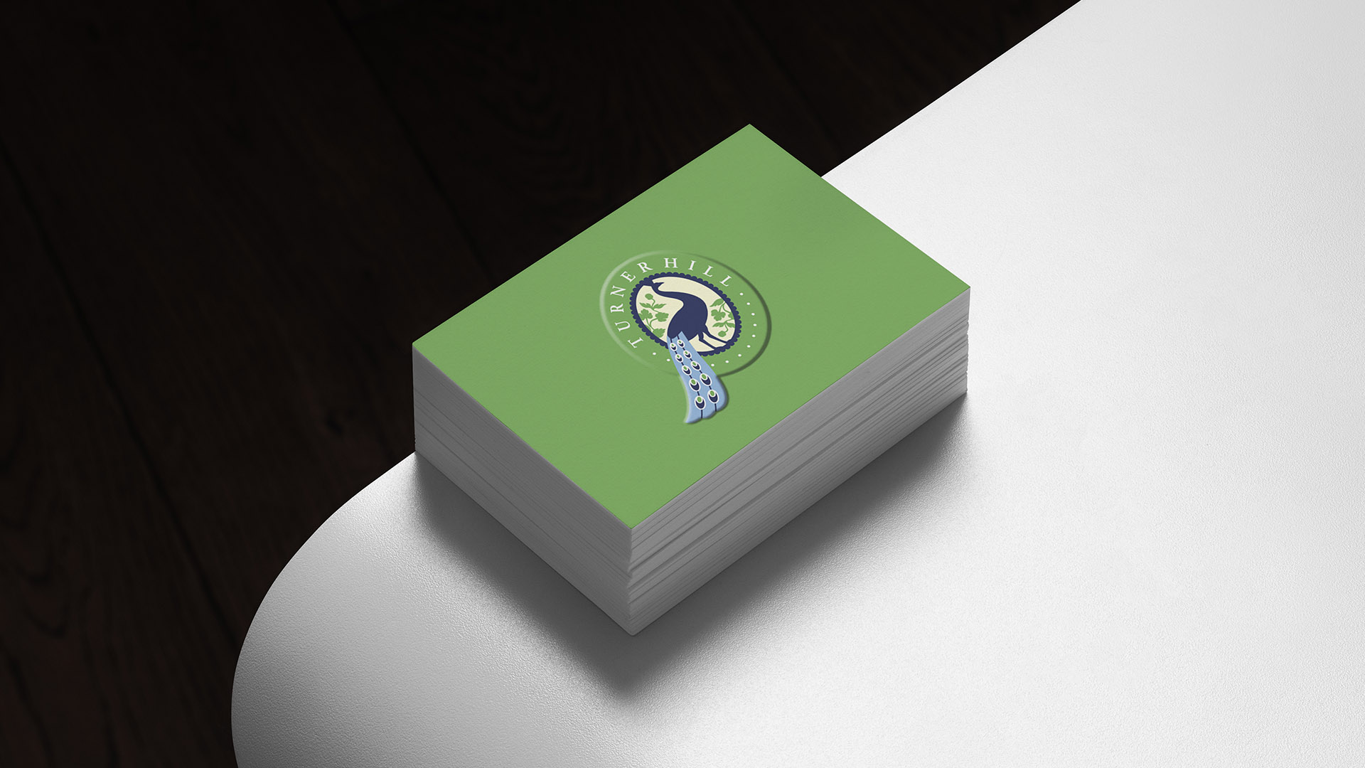
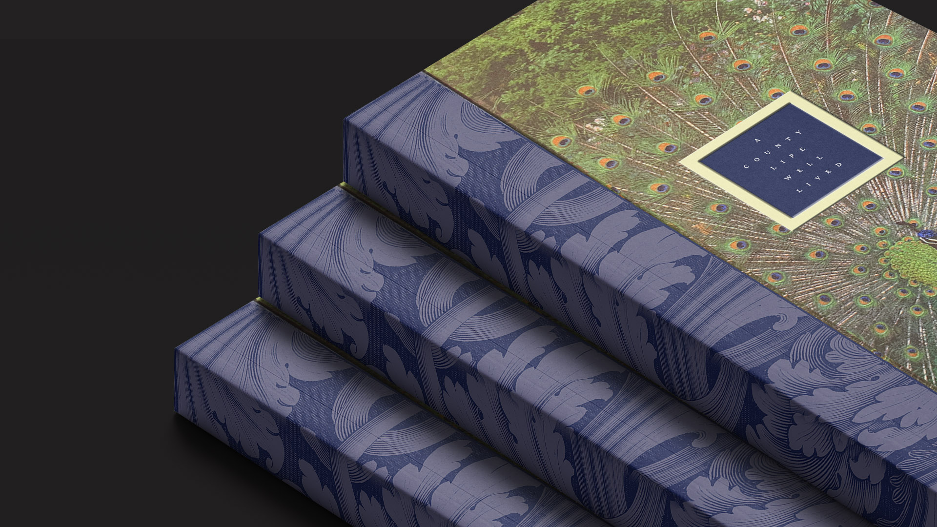
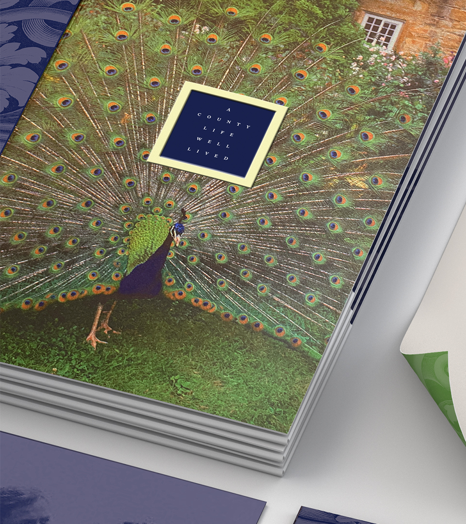
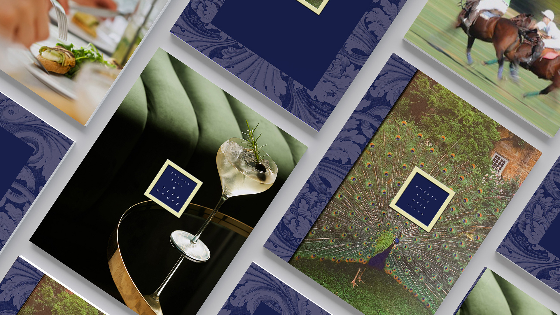
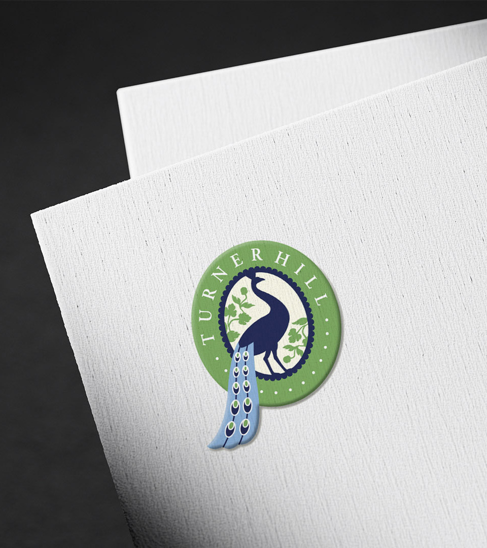
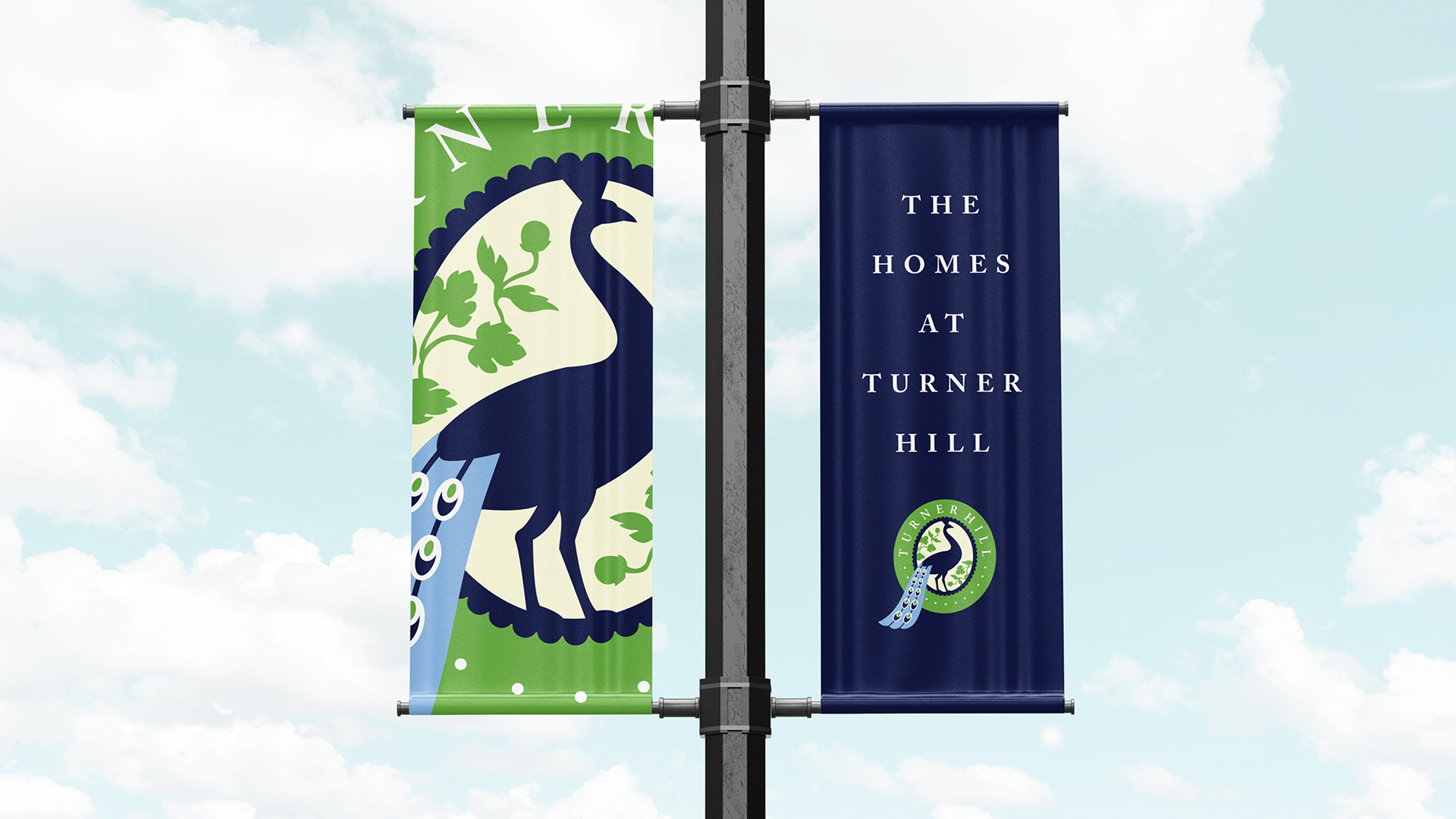
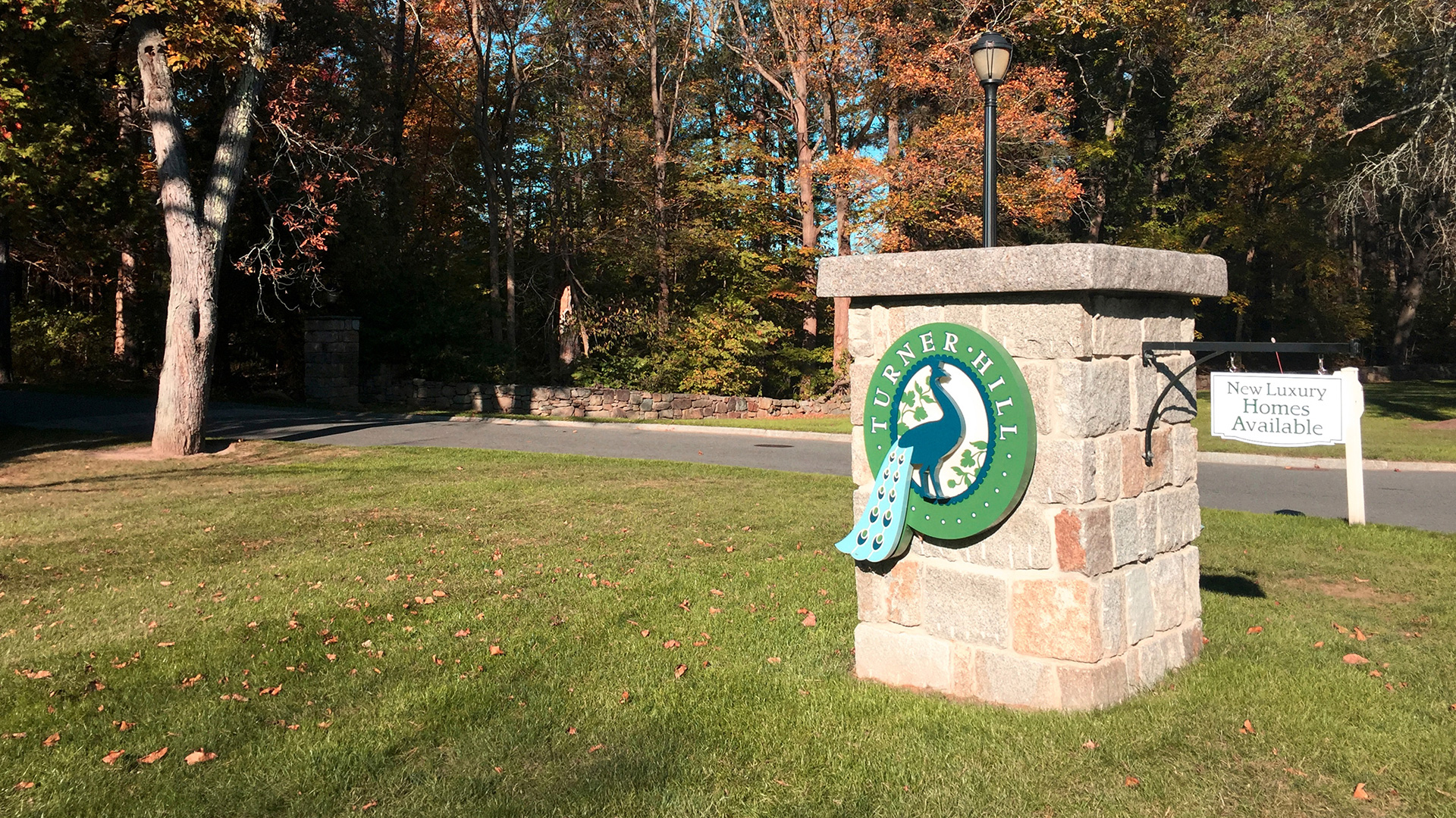
We built the identity around a modern interpretation of the peacock motif found throughout the estate’s original carved woodwork—an emblem that reflects the property’s history, artistry, and sense of occasion. The symbol is elegant and distinctive, elevating Turner Hill’s position as a luxury destination for golf, dining, and residential living.
The color palette draws directly from peacock plumage—deep teals, rich blues, and vibrant greens—giving the system a natural iridescence that feels both historic and refined. This palette reinforces the estate’s character while offering a sophisticated visual foundation across print and digital applications.
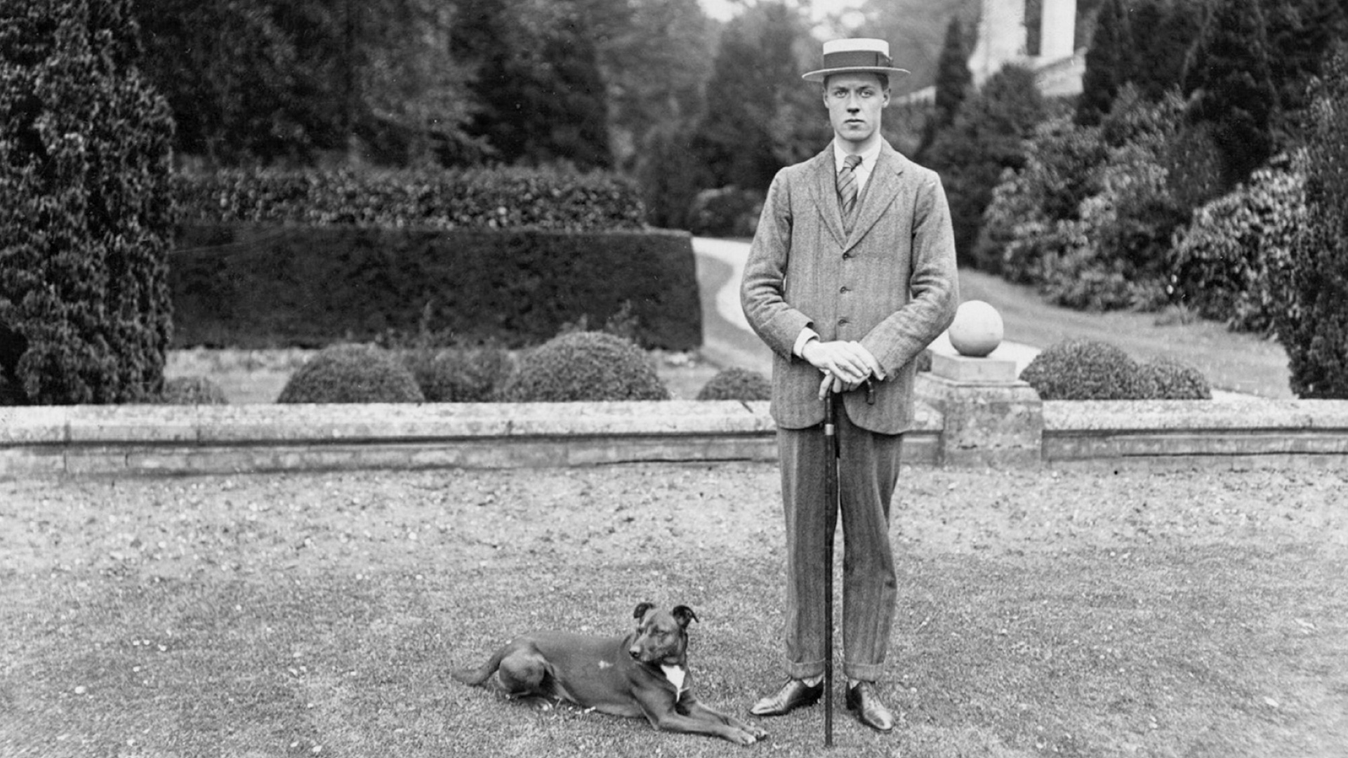
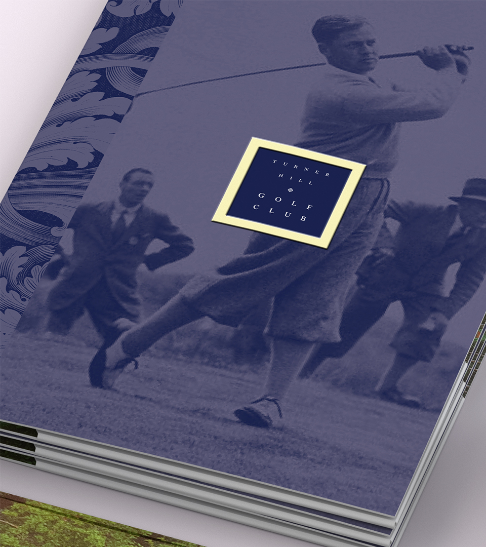
Typography is led by Abaya Libre, a serif with subtle calligraphic gestures that echo the craftsmanship of the 19th-century mansion. Paired with a clean supporting typeface, it brings structure and refinement to the brand.
The printed system takes cues from classic bookbinding. A custom folder holds individually bound booklets—one for the golf club, one for the inn, and one for the homes—creating a tactile, curated experience that mirrors the care and detail found on the estate itself.
Together, these elements form an identity that honors Turner Hill’s legacy while presenting it as a modern, elevated retreat.