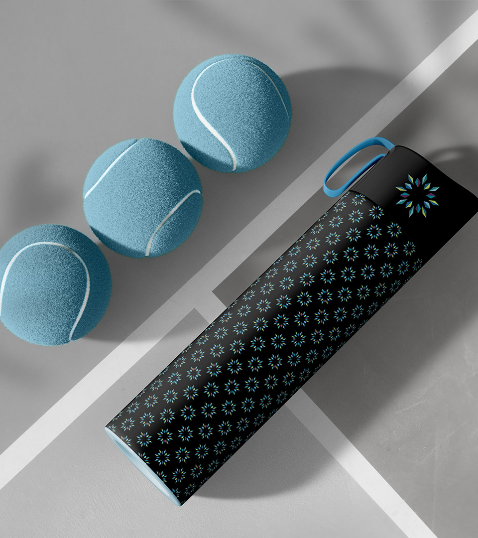
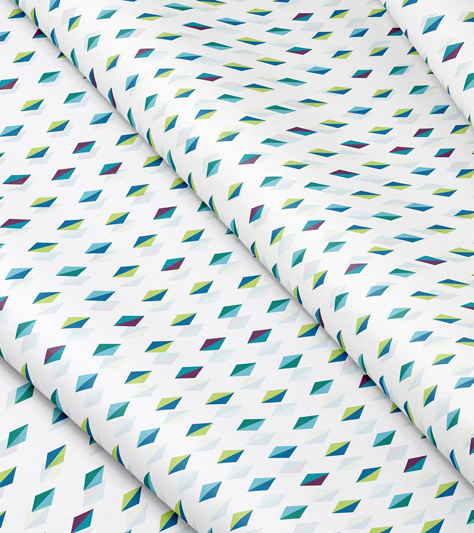
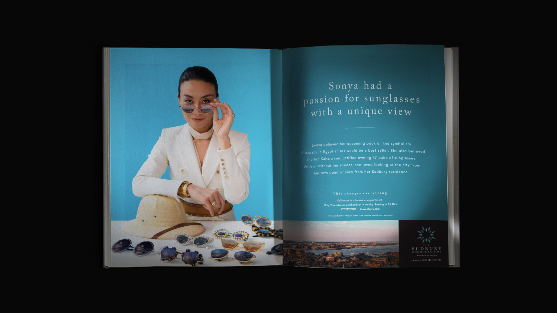
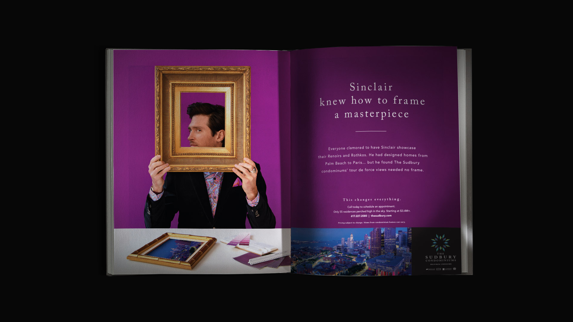
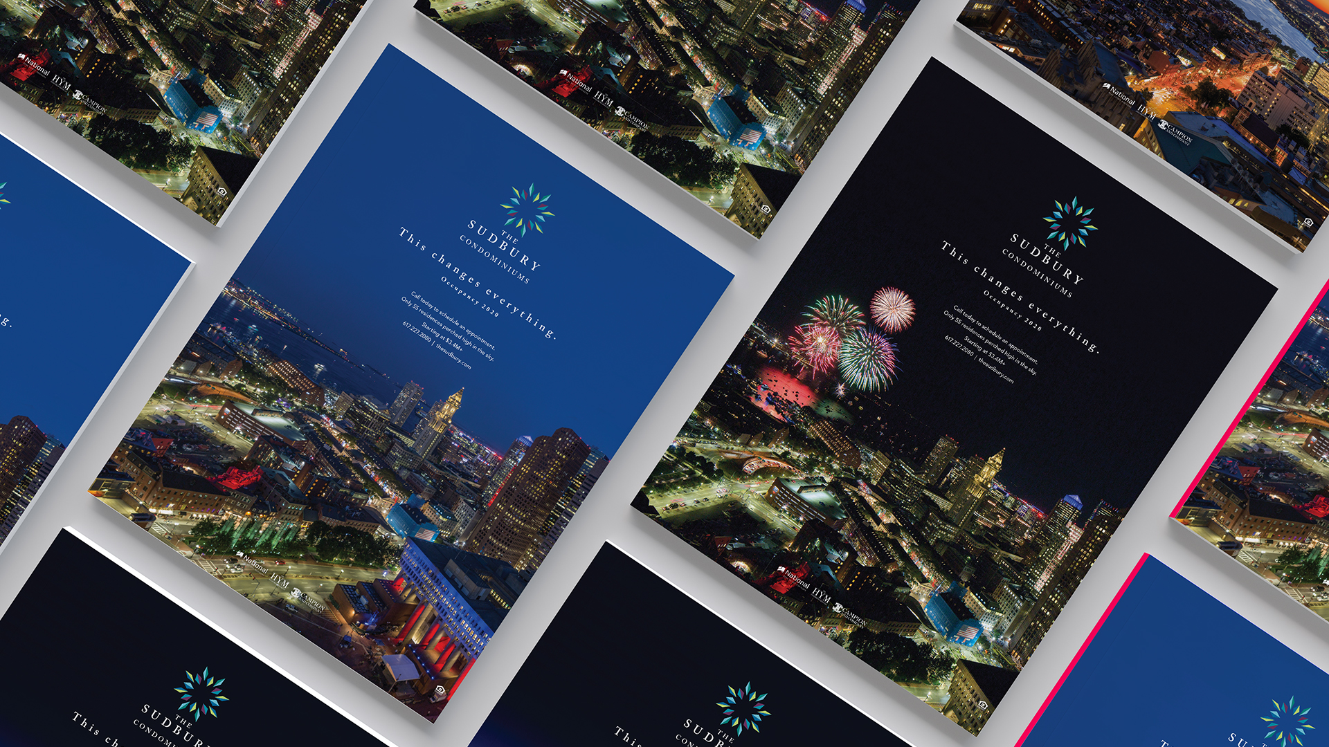
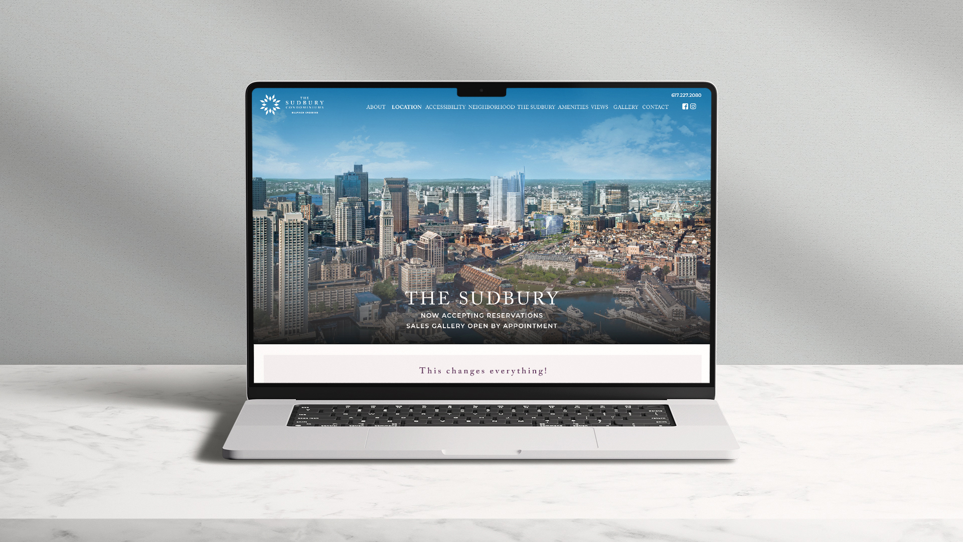
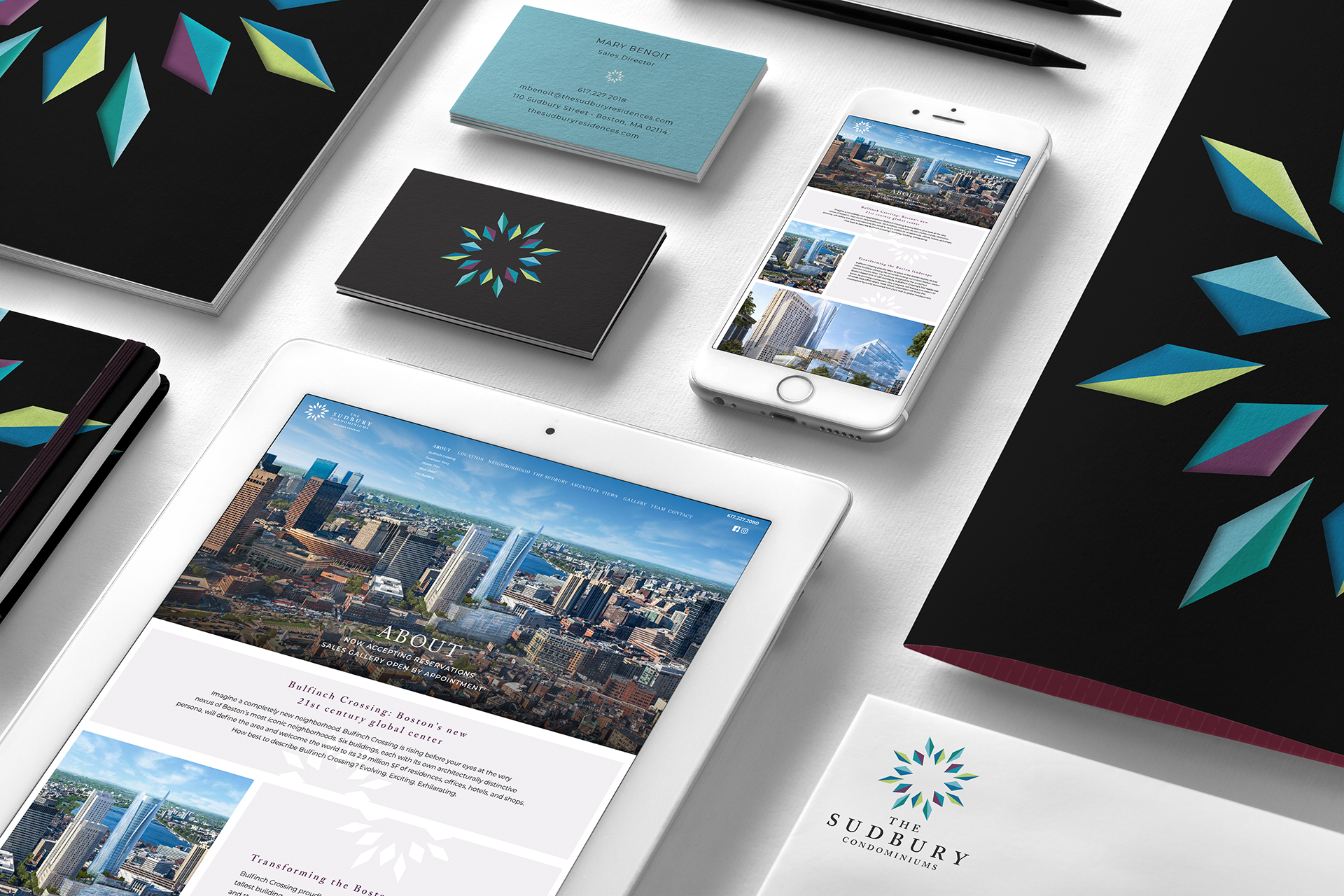
A refined palette of deep teals, plums, and warm neutrals mirrors the sophistication of the interiors and the atmosphere of sky-level living.
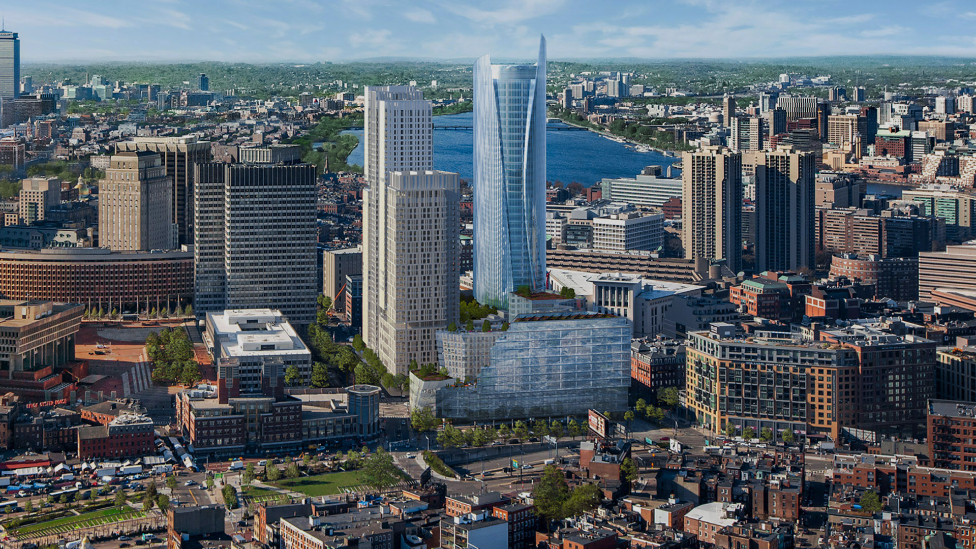
To reinforce this elevated point of view, we emphasized the idea of life “up among the clouds,” highlighting spacious floor plans, private, boutique exclusivity, and uninterrupted horizon lines.
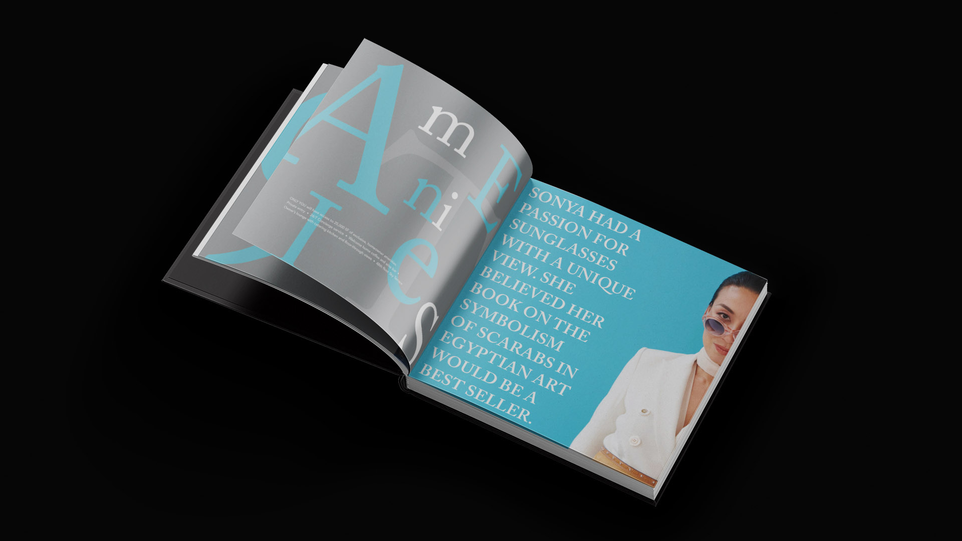
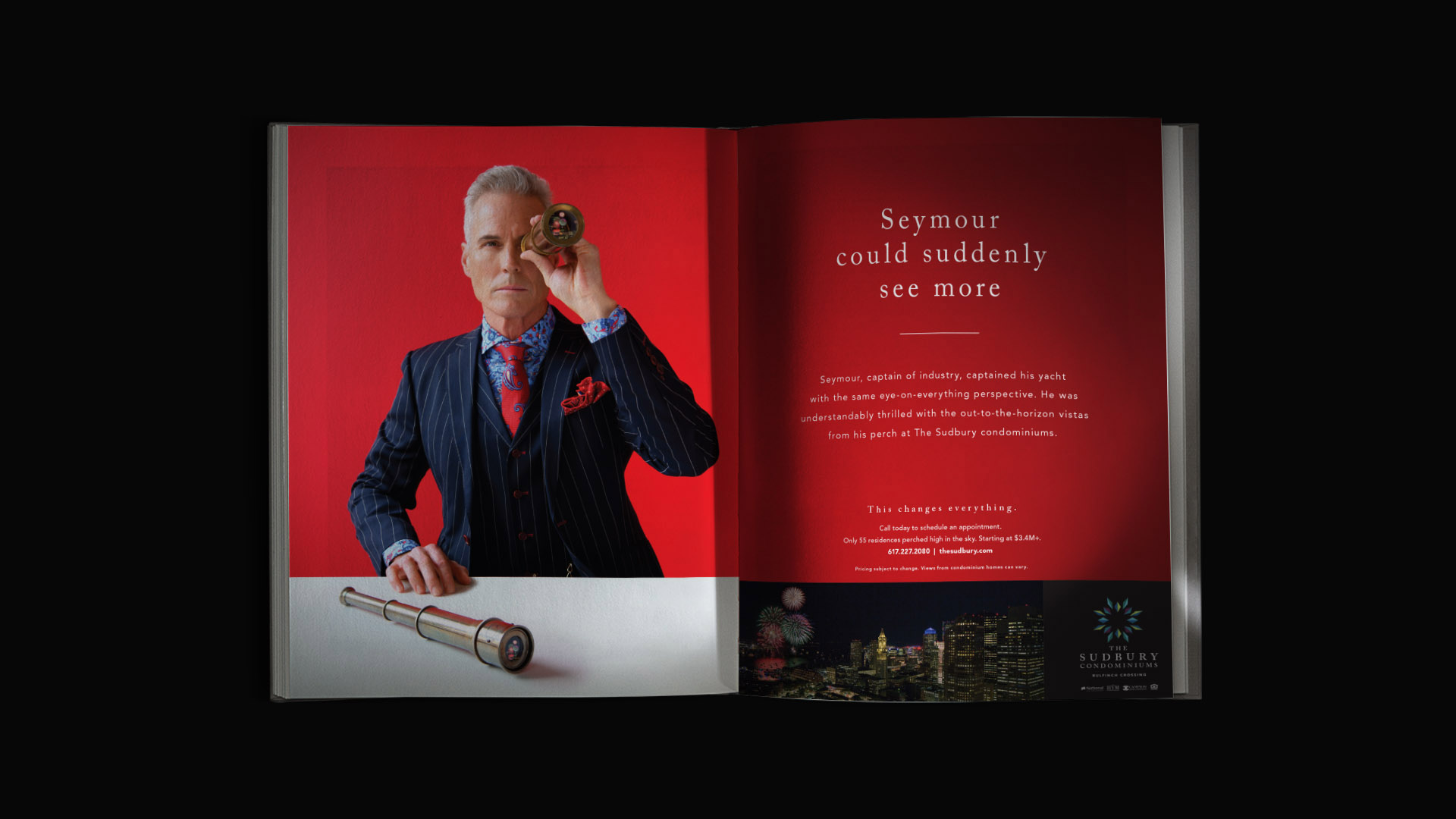
Photography captured both the dramatic verticality of the tower and the serene calm it offers above the bustle of the city. Print materials, signage, and digital touchpoints used generous space and restrained typography to create a sense of quiet luxury befitting a limited collection of only 55 homes.