About the work
The Cape Club was conceived as a new mixed-use residential and golf community, bringing together homes, hospitality, and a modern golf experience within a single, cohesive destination. Entering a market dominated by long-established clubs, the project required a brand that felt rooted in place while clearly signaling a contemporary point of view.
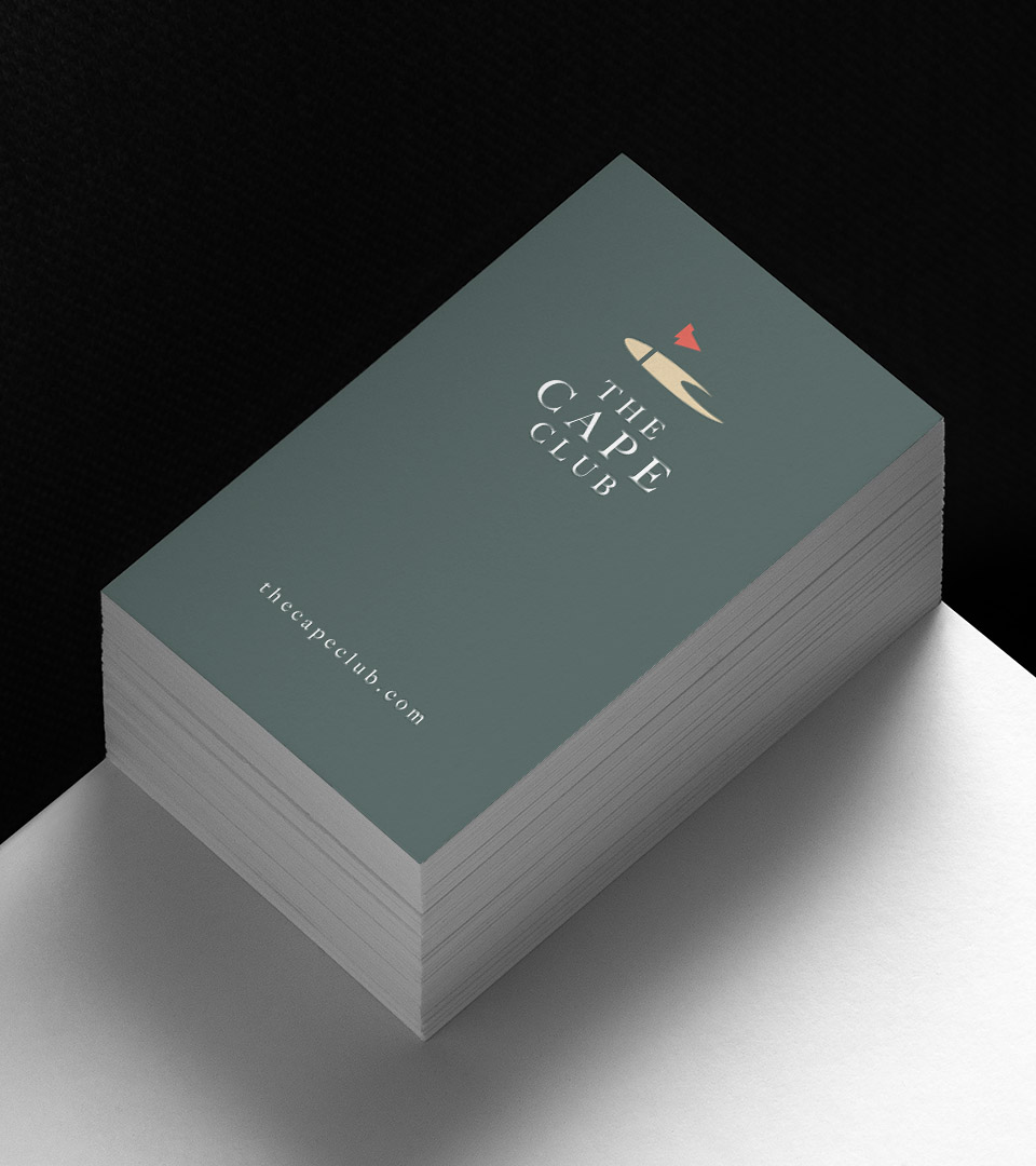
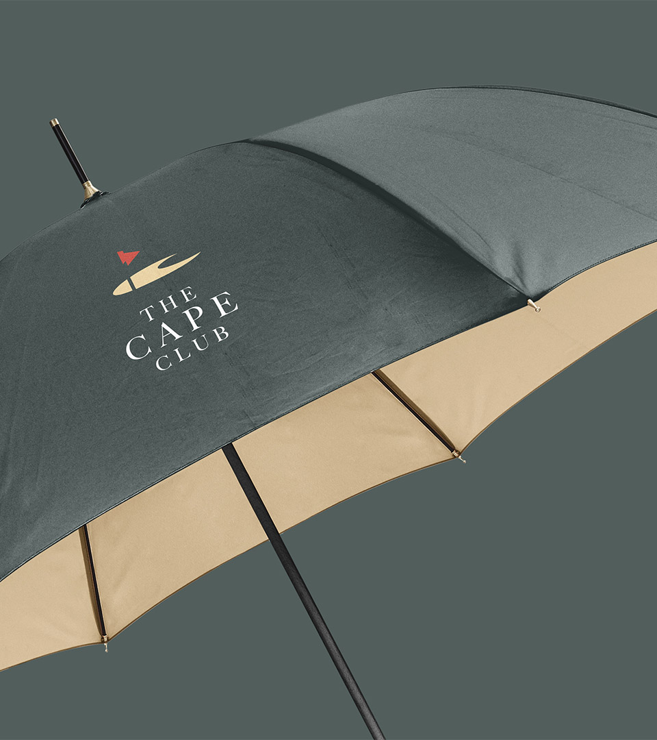
Our work focused on creating a unifying identity system that could seamlessly connect the community’s residential, lifestyle, and golf components. The mark is inspired directly by the site’s geography, an abstracted sandbar rendered in a clean, geometric form that subtly reveals a “C,” linking the identity to both name and landscape. This approach grounds the brand in its coastal setting without relying on traditional country-club iconography.
The color palette draws from the natural environment, sand, deep fairway greens, and the vivid orange-red of the course flag, introducing warmth and contrast while maintaining restraint. Understated typography and minimal layouts reinforce a design-forward sensibility, allowing the brand to feel calm, contemporary, and adaptable across applications. Together, the system presents The Cape Club as a modern coastal community shaped by land, light, and thoughtful design.