
About this project
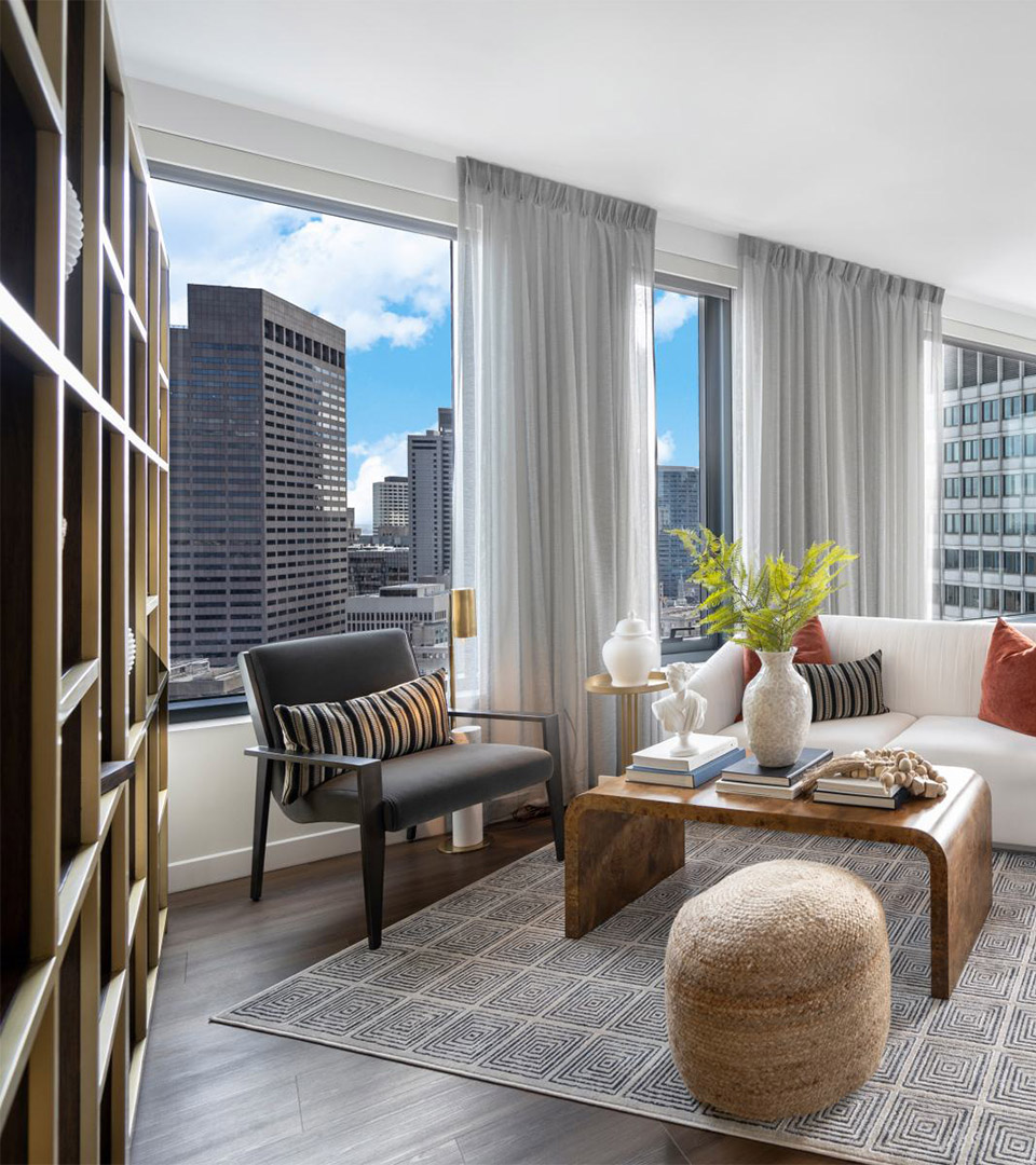
The Sudbury Apartments introduce a new rental experience within a landmark downtown development, offering young professionals an energetic, connected way to live at the crossroads of several Boston neighborhoods. As part of a larger community that also includes luxury condominiums, the apartments required an identity that felt youthful and approachable—while remaining visually linked to the broader Sudbury brand.
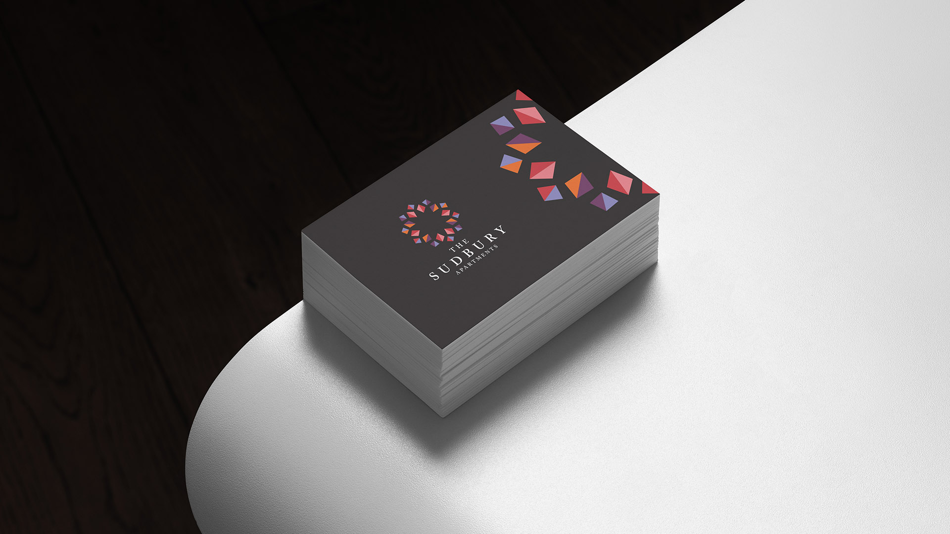
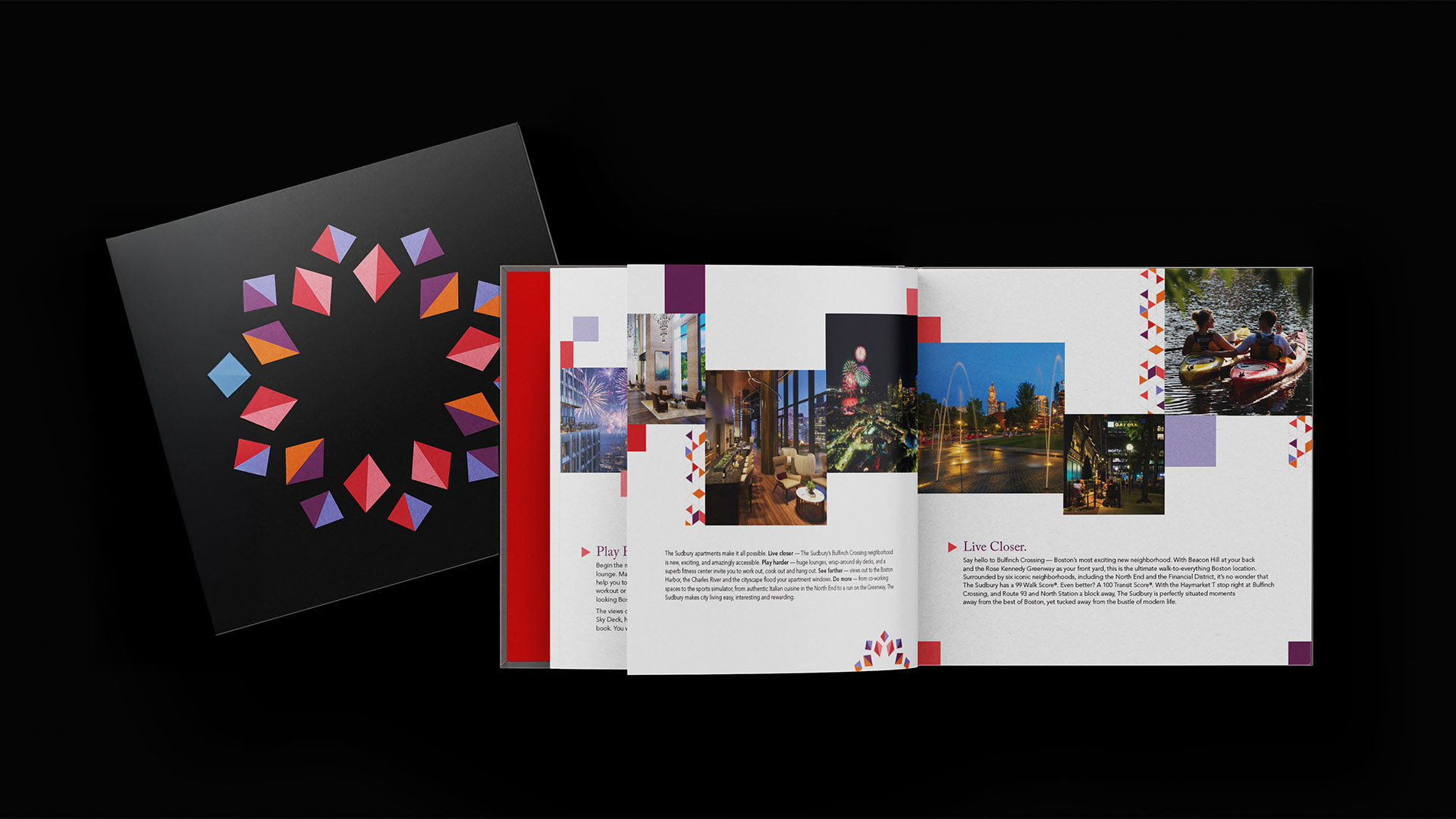
We developed a vibrant visual system inspired by the diversity, movement, and momentum of the surrounding neighborhood. A kaleidoscope-inspired graphic language and bold palette of orange, pink, red, and periwinkle express creativity and energy, while shared typography and logo structure maintain cohesion with the condominium identity. The result is a brand that feels related but clearly distinct—tailored to the lifestyle and expectations of a rental audience.
Placemaking played a central role in the messaging. By highlighting walkability, transit access, and proximity to the North End, Beacon Hill, and the West End, the brand positions The Sudbury Apartments as a connected hub within Boston’s evolving downtown landscape.