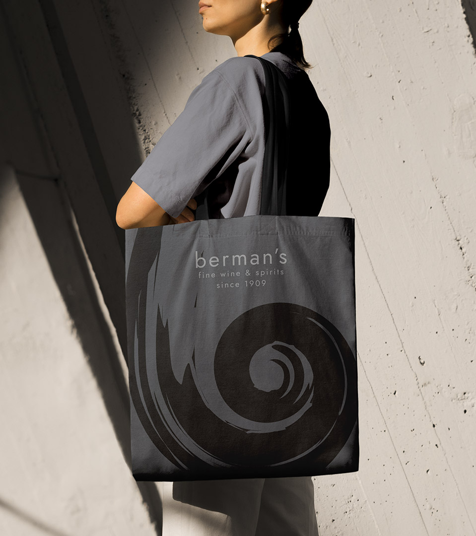
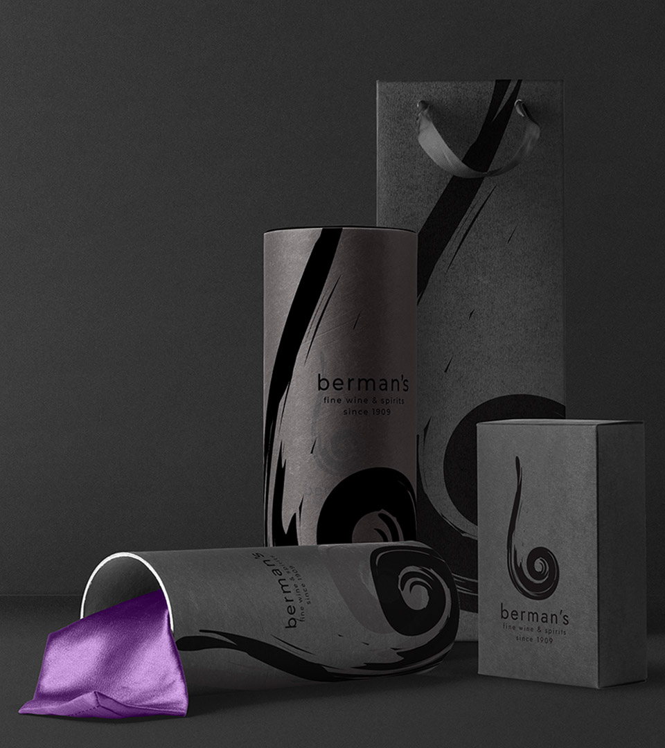
The Solution
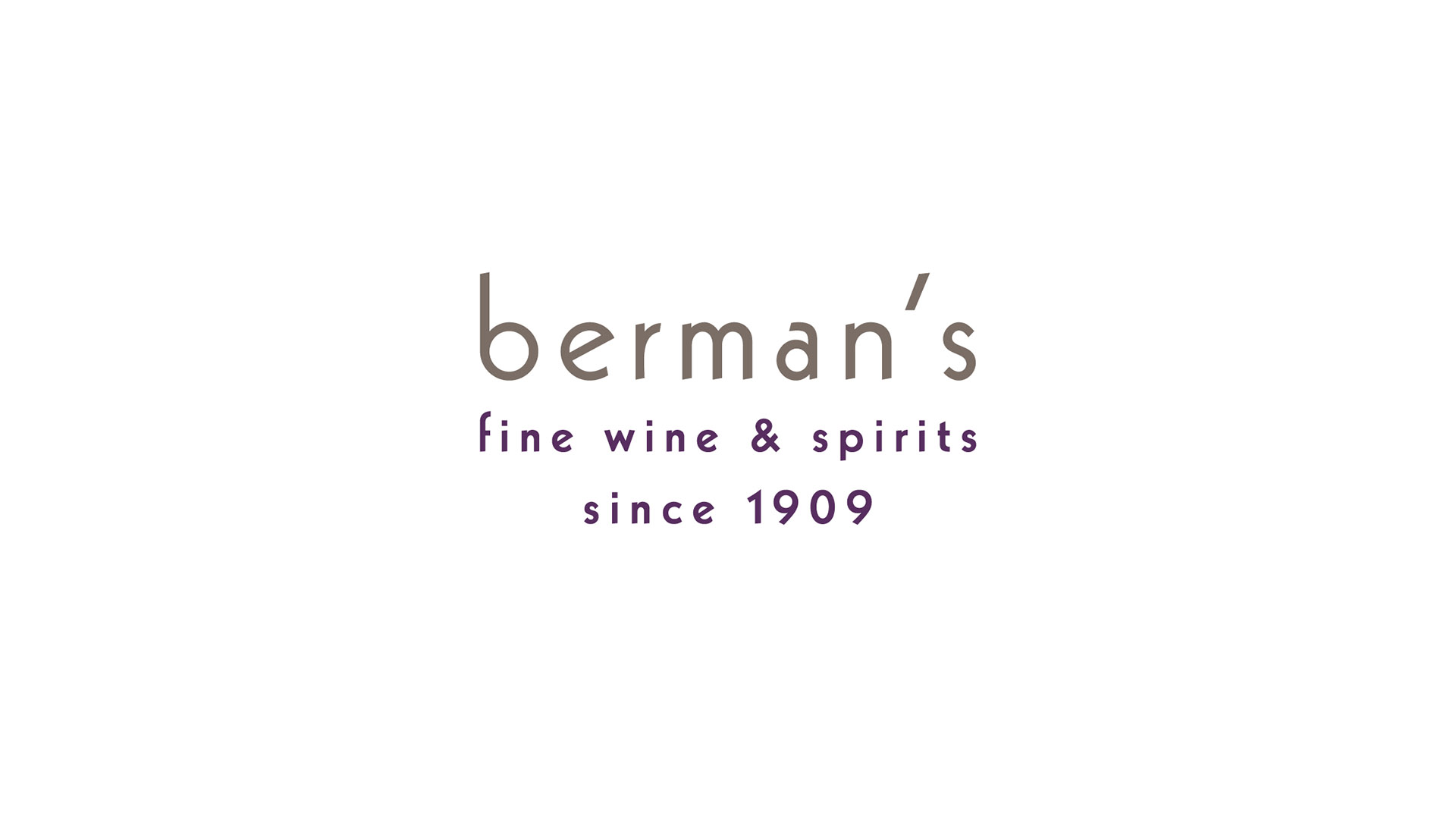
We developed a refreshed logo system anchored in simple, confident typography that communicates quality without pretension. The palette—rooted in warm neutrals and deep wine-inspired tones—reinforces the brand’s artisanal character while feeling contemporary and approachable.
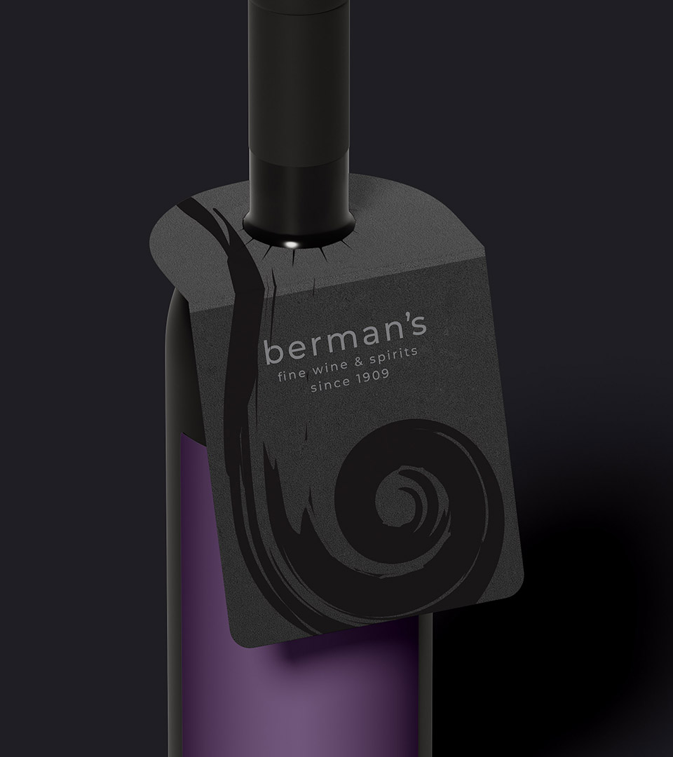
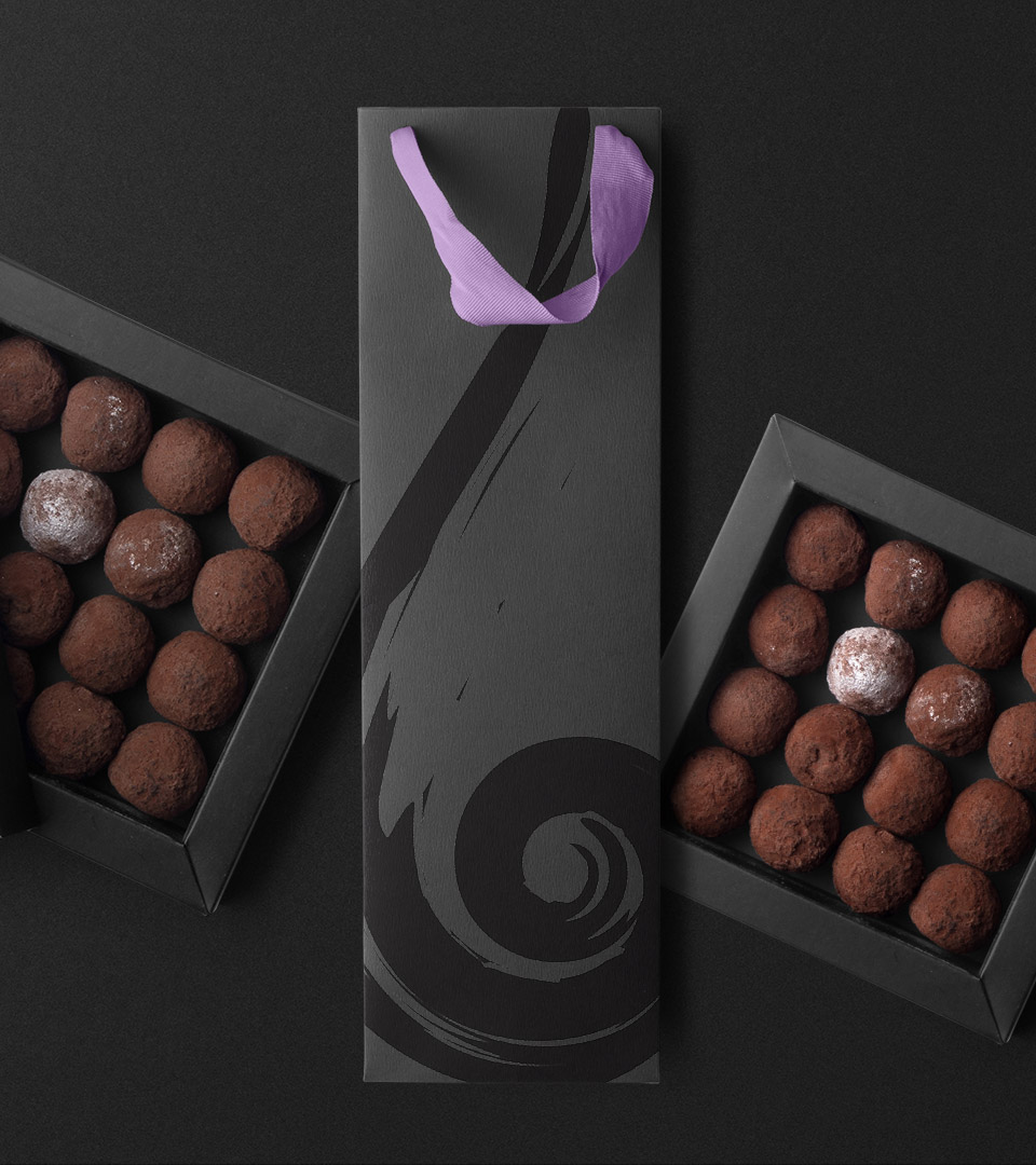
For the in-store experience, we created a flexible signage and labeling system that improves navigation, highlights product categories, and elevates everyday touchpoints such as shelf talkers, price signage, tasting notes, and gift packaging. These details enhance clarity and reinforce the brand’s knowledgeable, service-oriented personality.
Print materials and promotional pieces extend the visual language, giving Berman’s a consistent look and feel that supports both loyal customers and new visitors seeking a curated retail experience.