Larkwood

A warm, contemporary identity for a new condominium community surrounded by nature

Larkwood is a new-construction condominium community named for the wooded landscape that borders the property. We created a warm and contemporary brand identity that reflects the development’s connection to nature and its modern residential design. The result is an elevated visual system that feels calm, grounded, and beautifully aligned with the architectural experience.

Client
Thorndike Development
Industry 
Residential real estate / condominiums / new-construction branding
Services 
Brand identity, logo design, visual system, collateral, print materials, signage concepts, website.
larkwood logo on letterhead in box
larkwood birds facing each other on gray
The name “Larkwood” blends the lightness, freedom, and natural beauty evoked by “Lark” with the grounded, timeless strength and organic warmth of “wood,” suggesting an elevated yet serene living experience rooted in craftsmanship, authenticity, and high-end design.

THE CHALLENGE

Thorndike Development sought a brand that could express both the convenience of connected urban living and the beauty of the site’s river and woodland surroundings. The identity needed to feel approachable, family-friendly, and distinctly tied to place—while still conveying the modernity of the new construction.

THE SOLUTION

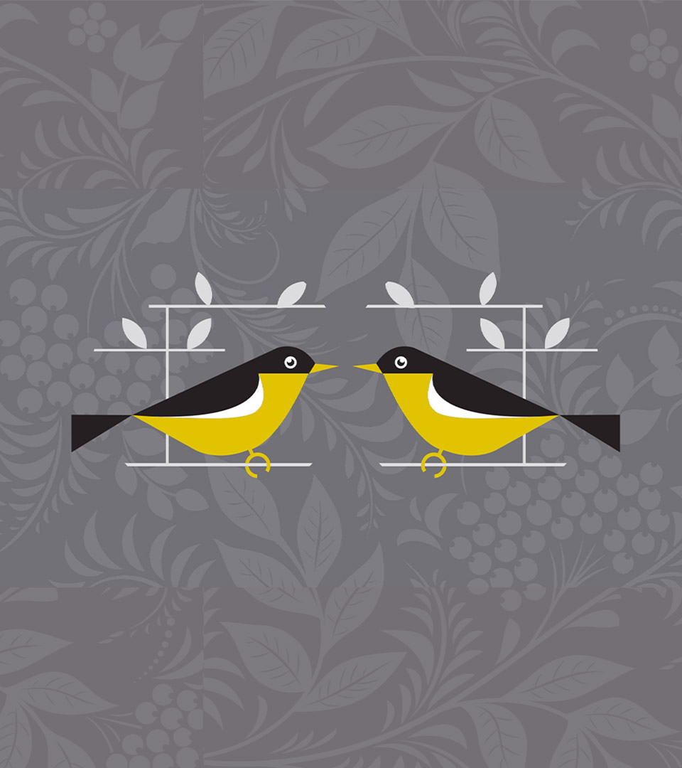
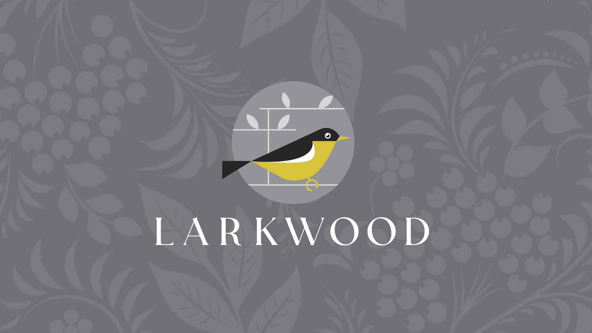
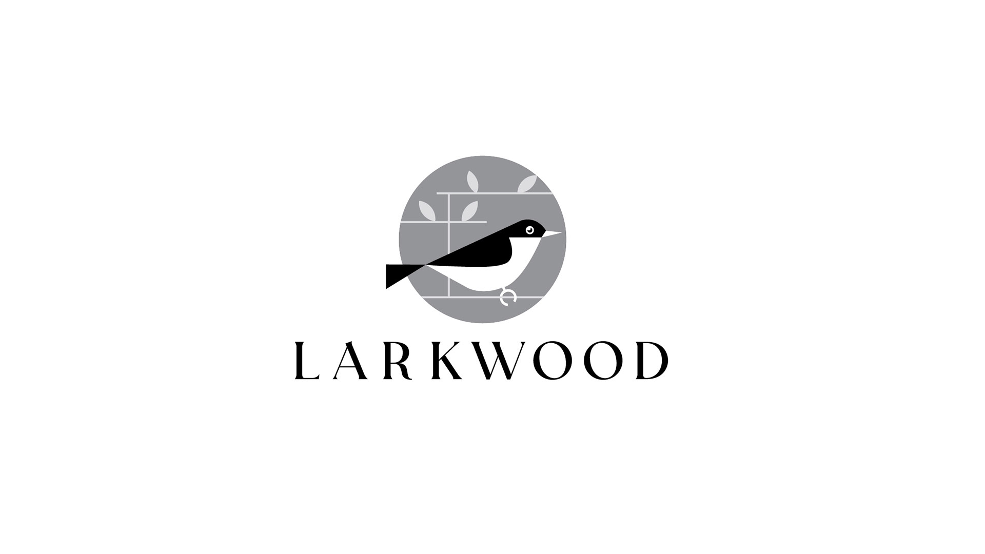
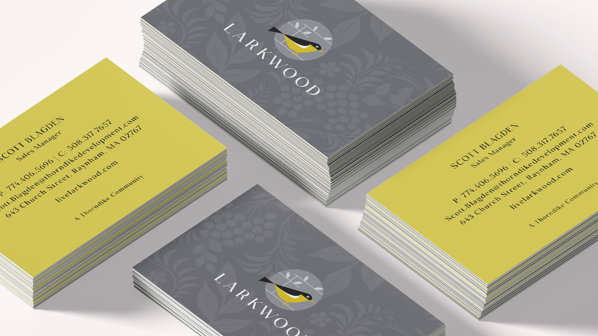
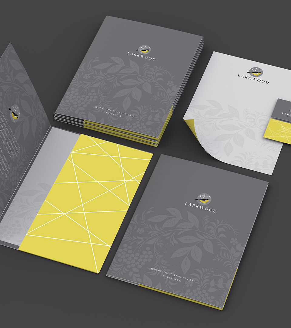
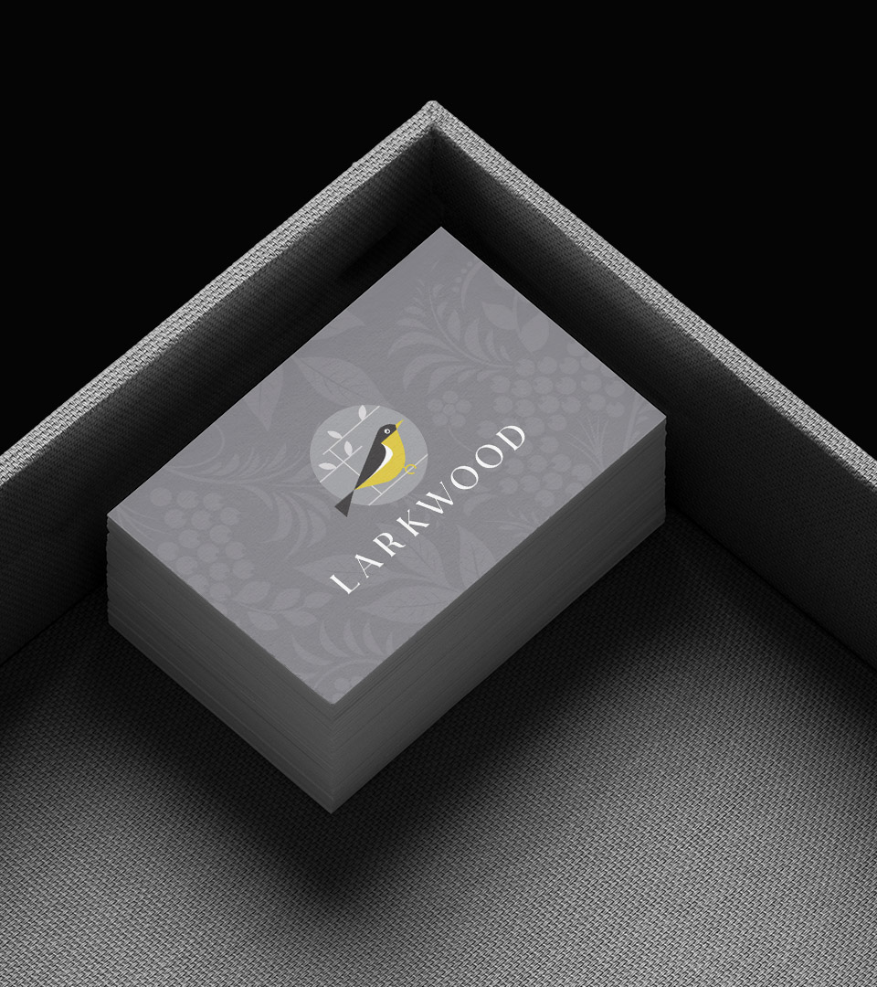
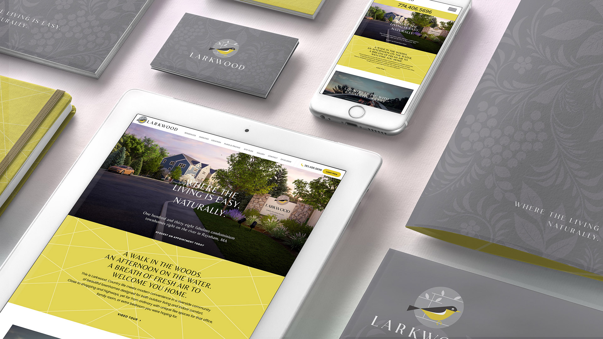
The logo combines modern charm with natural elegance. A stylized yellow songbird, perched within geometric branches, becomes the signature of the community. The mark captures the spirit of the river habitat and wooded landscape surrounding the property while maintaining a clean, contemporary character suitable for a residential brand.

This blend of softness and geometry reflects the balance at the heart of Larkwood: modern homes shaped by nature.

The color palette draws from woodland birds—yellow plumage, deep gray wings, and the soft neutral tones of bark and branches.
These shades reinforce the natural setting and bring warmth to the system while keeping it fresh and current.

Typography pairs the expressive contrast of Moneta Bold with the clean simplicity of Jost Regular.

Together, these components create an identity that feels grounded, welcoming, and perfectly aligned with Larkwood’s promise of easy, natural living.

larkwood business card front

The Larkwood logo blends modern charm with natural elegance. A stylized yellow songbird, framed by geometric branches, captures the community’s connection to river and woodland. 

Paired with refined serif typography and set against a soft, botanical backdrop, the identity feels both grounded and graceful—welcoming young families with warmth and quiet sophistication.

The Larkwood palette mirrors the colors of many small woodland birds—yellow plumage, dark wings, and soft gray surroundings. It evokes natural habitats like bark, branches, and sunlight filtering through trees.

larkwood gray pattern
larkwood white lines on yellow background pattern vertical
larkwood business cards horizontal
larkwood folder vertical
larkwood business card in black tray vertical

We created a website that showcases the lifestyle, location and floor plans for the development.

livelarkwood.com

larkwood on laptop with black background
Larkwood branding folder, iphone and ipad

THE SOLUTION

The brand system gives Larkwood a distinctive and memorable presence in the residential market. The songbird logo offers immediate recognition, the palette reinforces the development’s natural context, and the clean typographic system brings cohesion across print and digital applications.

The website extends the brand online, showcasing the lifestyle, location, and floor plans with clarity and ease.

Overall, the identity supports sales and storytelling for a community built around comfort, connection, and nature.


Adams Design
20 Park Plaza
Boston, MA 02116

Let's Talk!