A place-driven identity and campaign that merges East Boston’s working-wharf heritage with a fresh, millennial-focused lifestyle brand.
Boston East is a waterfront apartment community in East Boston, set on the HarborWalk with city views and direct kayak access. Our brief was to create a brand that honors the site’s working-wharf heritage while speaking to a new generation of renters seeking design-forward, authentic waterfront living. The result is an identity and campaign that feel rooted in place and fresh in tone.
Client Trinity Financial Industry Multifamily Residential / Real Estate Development Scope of Work Brand Strategy, Identity, Advertising, Print, Signage, Website
The Challenge
Boston East needed a brand that could bridge two worlds: the rugged, industrial character of East Boston’s shipyard past, and the expectations of a new generation of renters seeking authentic, design-forward waterfront living.
The development’s location—directly on the HarborWalk with kayak access and sweeping city views—offered rich storytelling potential, but only if the identity could feel both honest to the site and fresh to an audience saturated with luxury apartment marketing.
The Solution
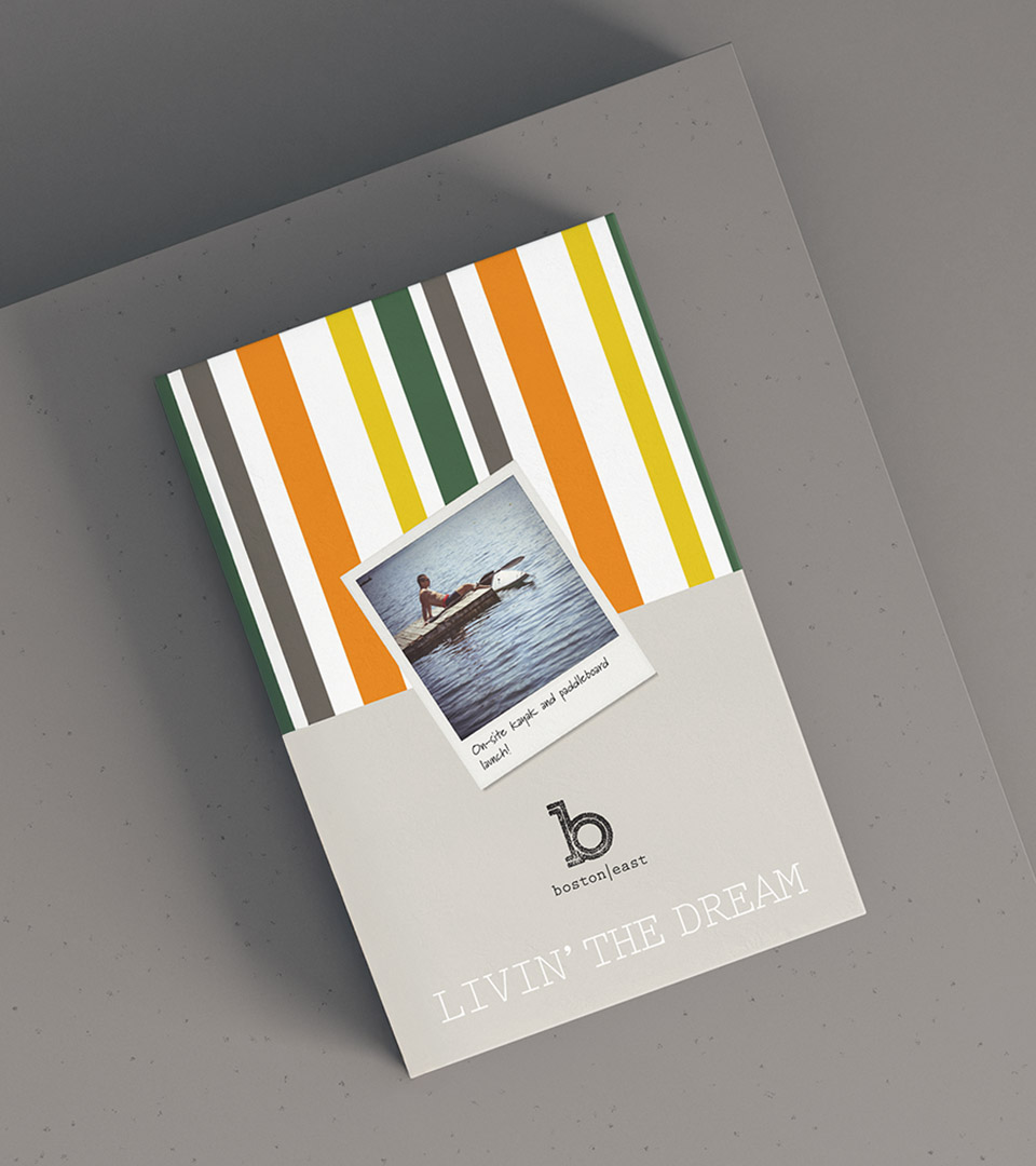
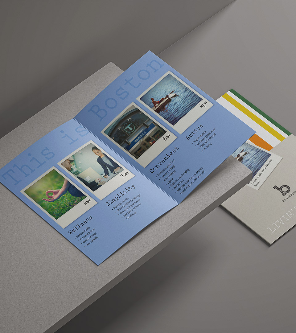
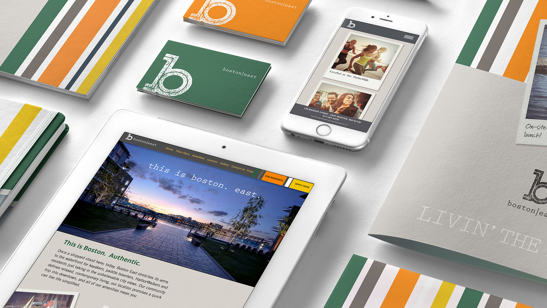
We grounded the Boston East identity in the character of East Boston’s industrial shoreline, using stenciled typography, bold graphic stripes, and a color palette inspired by the site’s kayaks, interiors, and waterfront views.
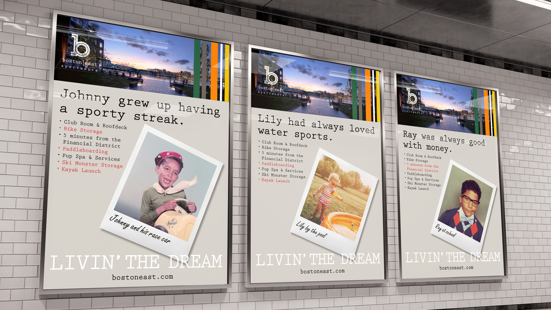
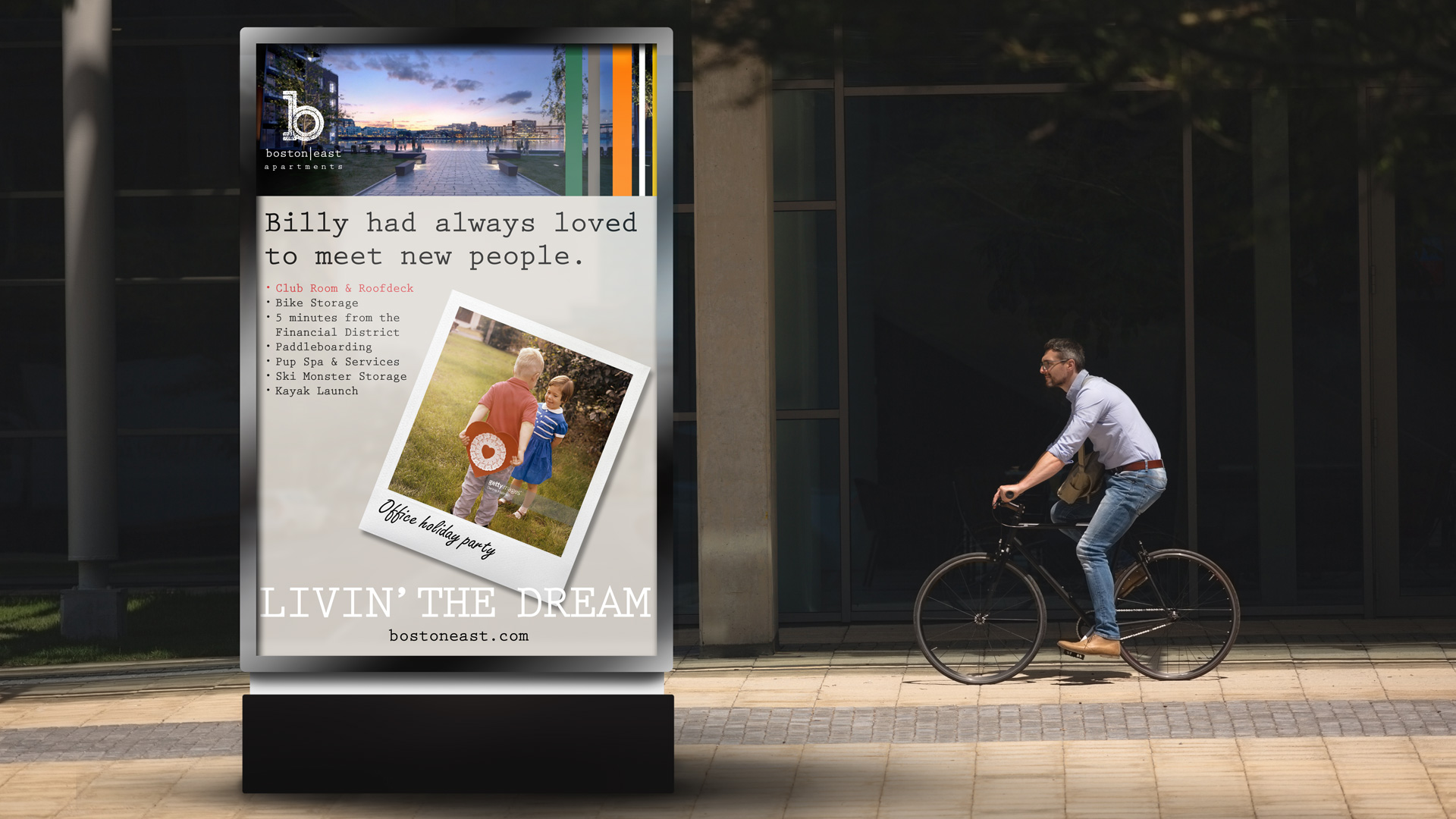
This gave the brand an immediate sense of place and authenticity. To connect with millennial renters, we developed a playful Polaroid-style campaign that transformed vintage family photos into humorous, aspirational lifestyle moments—an unexpected approach that set Boston East apart from standard apartment advertising.
The result was a cohesive, high-energy brand system that felt both rooted in history and fresh for a new audience.
A vibrant palette and modular stripe system echo the kayaks, waterfront energy, and bold interior design, giving the brand a dynamic visual rhythm.
Our inspiration was based on popular preppy colors used in the interior design as well as the gritty and bright colors of fishing boats and tugboats seen in the harbor.
Industrial, stenciled letterforms echo the working-wharf history of East Boston, while clean modern sans-serifs provide balance—pairing grit with clarity across the brand.
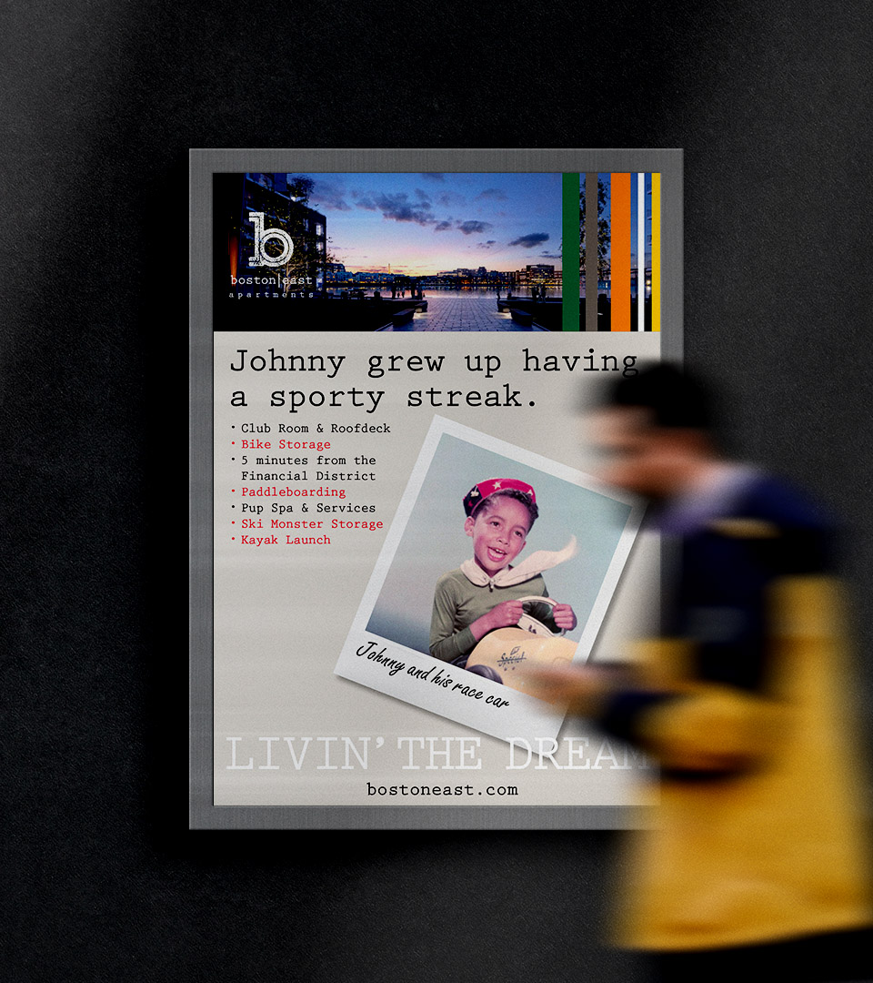
To connect with Millennials, vintage family snapshots reimagined as Polaroids transform nostalgia into lifestyle storytelling—warm, witty, and instantly memorable.
Large-scale transit ads apply the Polaroid concept with punchy headlines and vibrant stripes, creating quick-read, high-impact storytelling across the city.
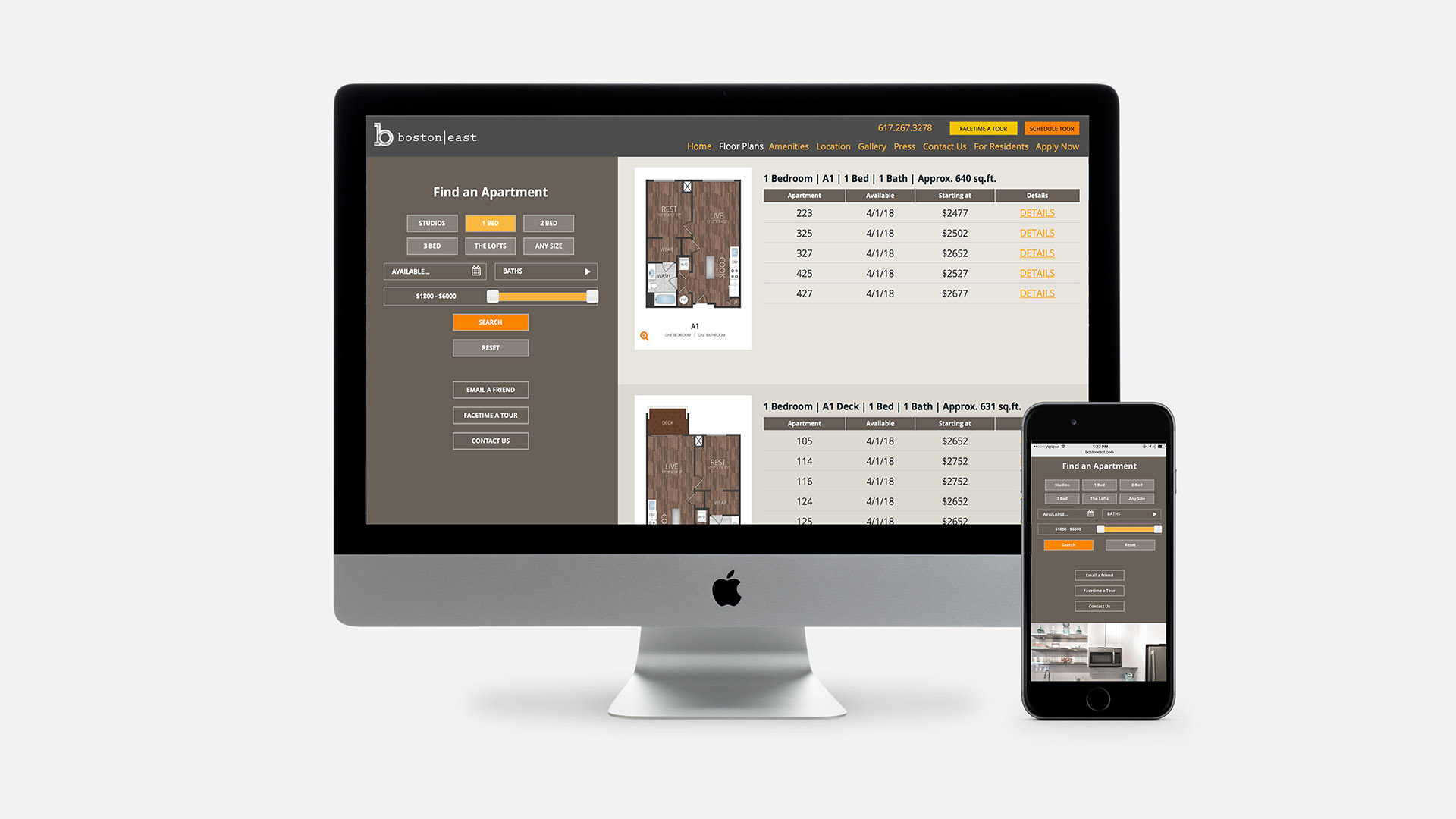
An intuitive website blends waterfront photography, playful colors, and clear navigation to capture the spirit of life on the harbor.
The Result
The identity and campaign positioned Boston East as one of East Boston’s standout waterfront properties—distinctive, memorable, and deeply rooted in place.
The combination of industrial authenticity, playful branding, and emotionally resonant advertising helped attract millennial prospects and supported strong lease-up momentum for Trinity Financial.