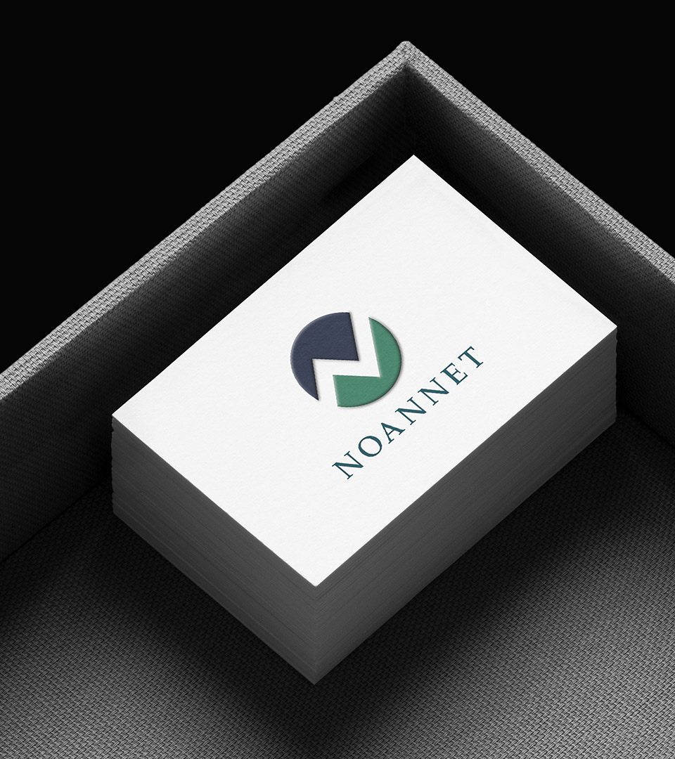
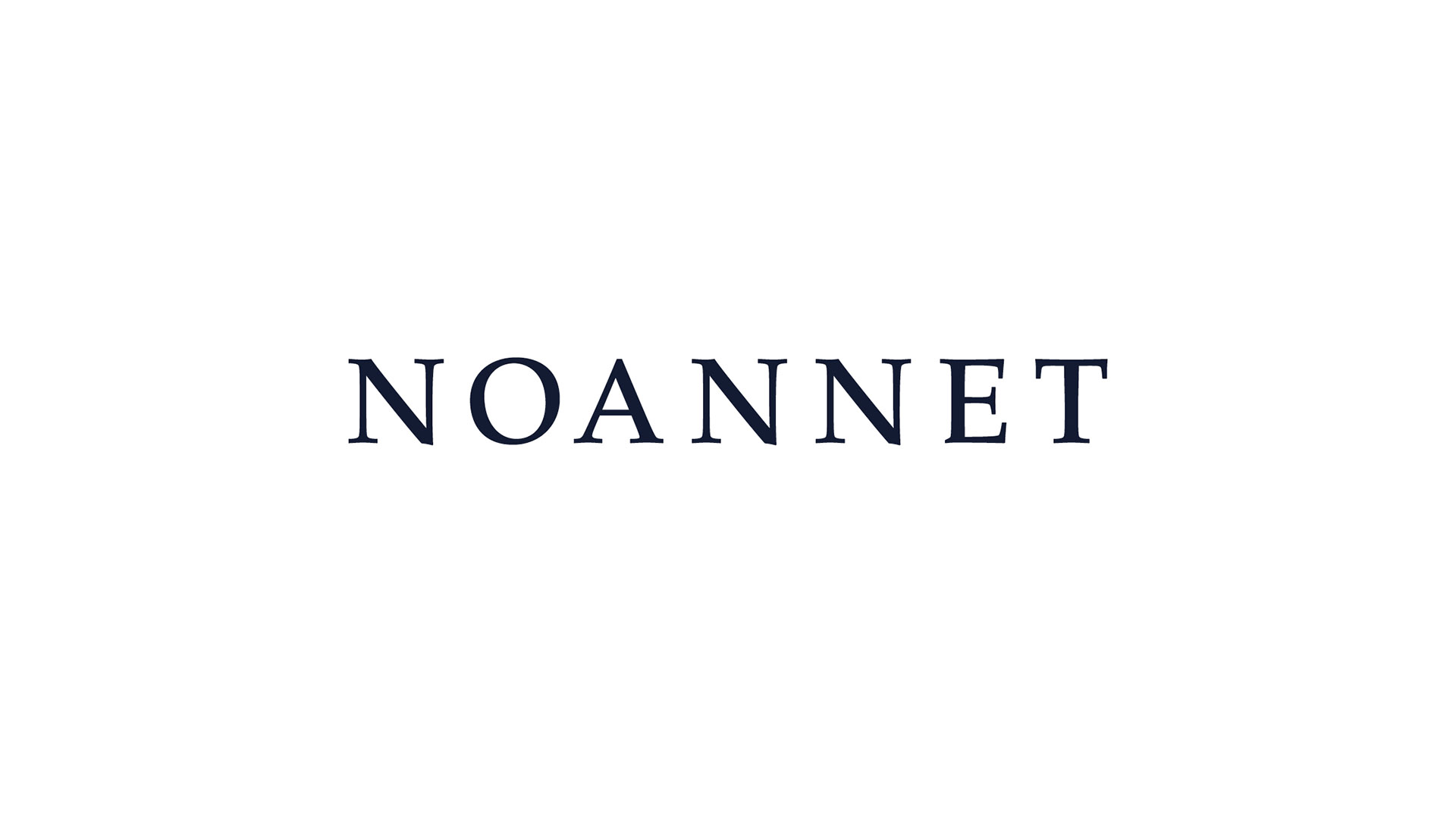
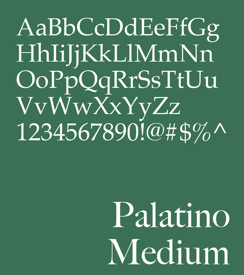
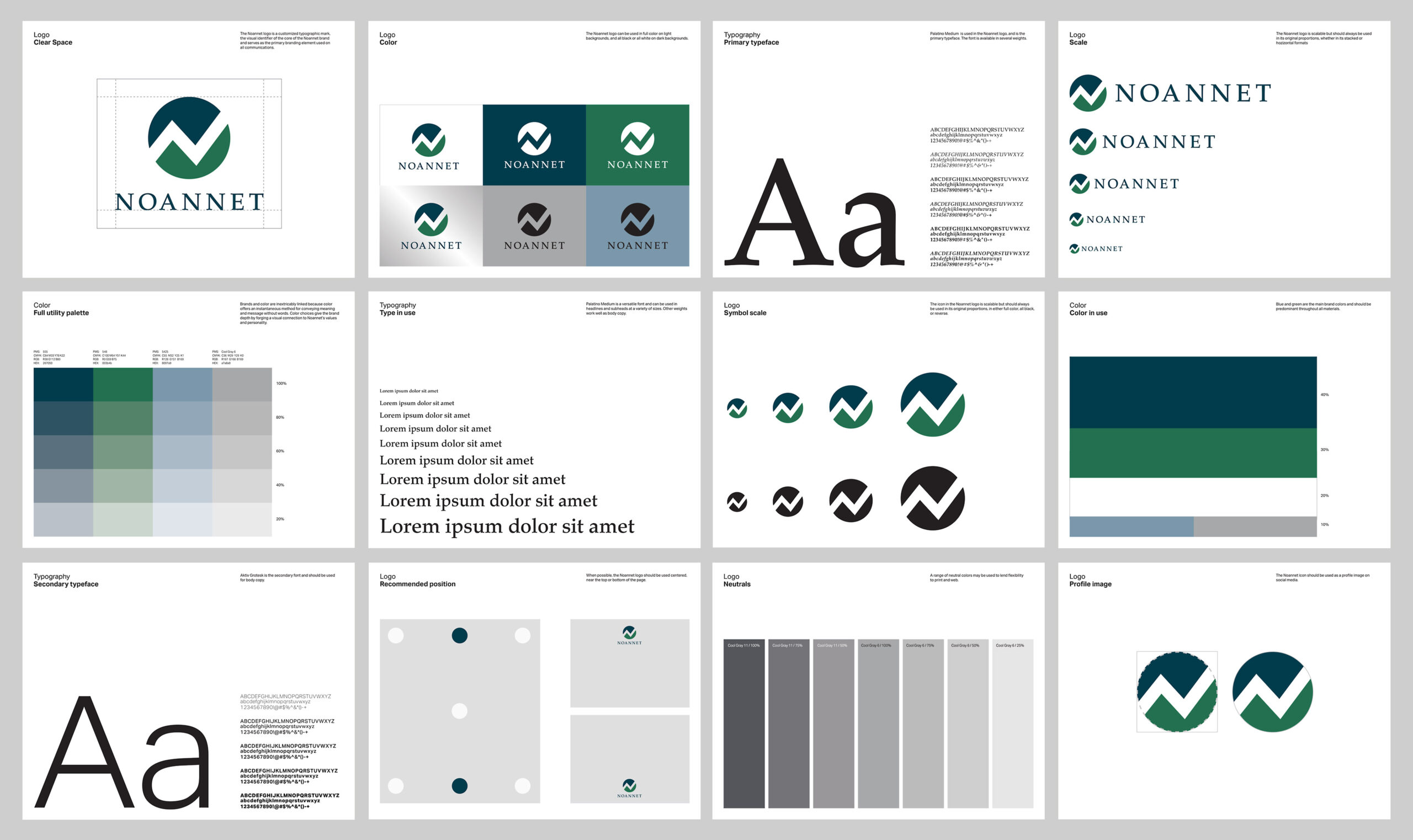
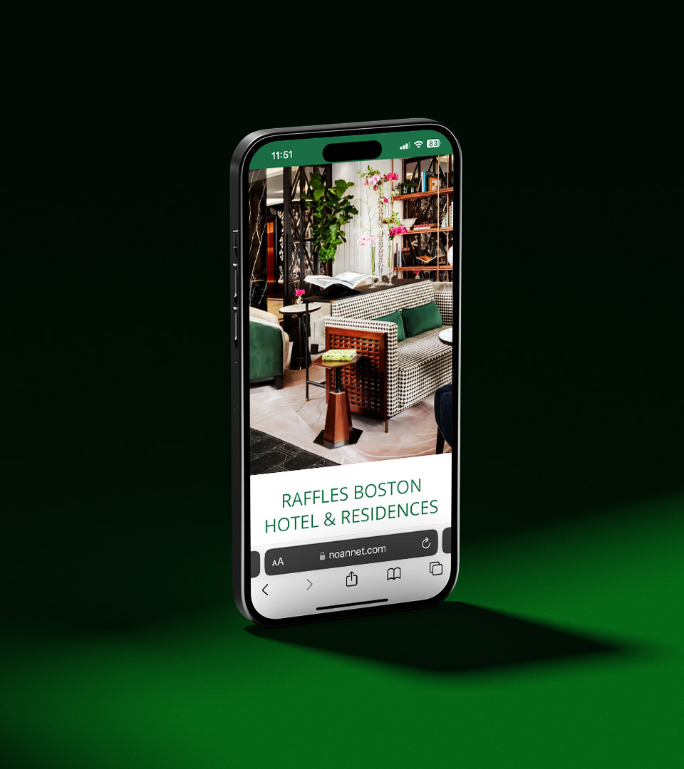
Named for the Noannet Woodlands and its skyline view, Noannet reflects a strong sense of place and purpose. We captured that in a logo built for clarity and longevity—rooted in the same thoughtful design that defines Boston’s best.
Brand Strategy
Identity
Print
Website
Inspired by Noannet’s wooded hills and skyline views, the abstract “N” suggests mountains, upward movement, and the meeting of earth and sky.
Templates for print and digital use created to support presentations that the developer might need.
Launched with the new logo, noannet.com offers company insights with pages describing various projects.