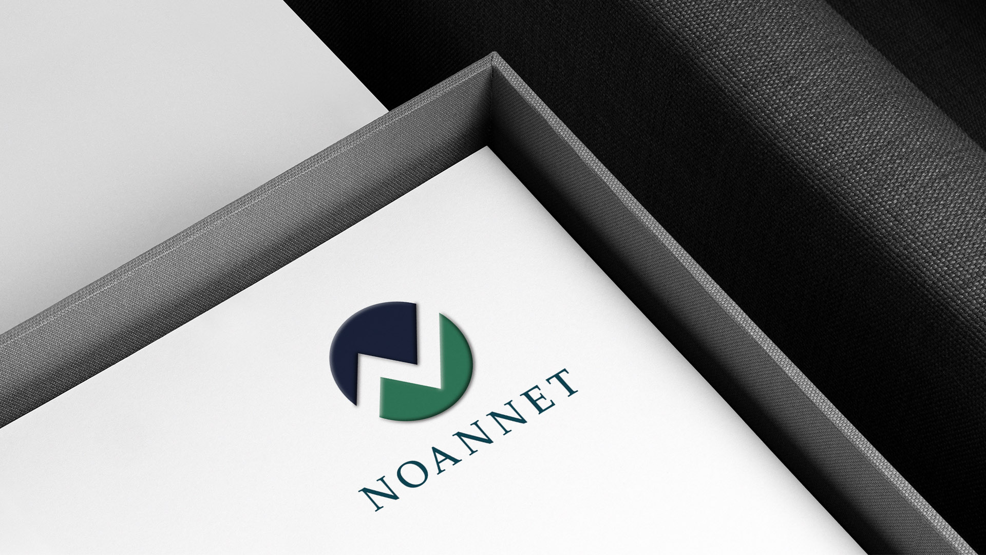
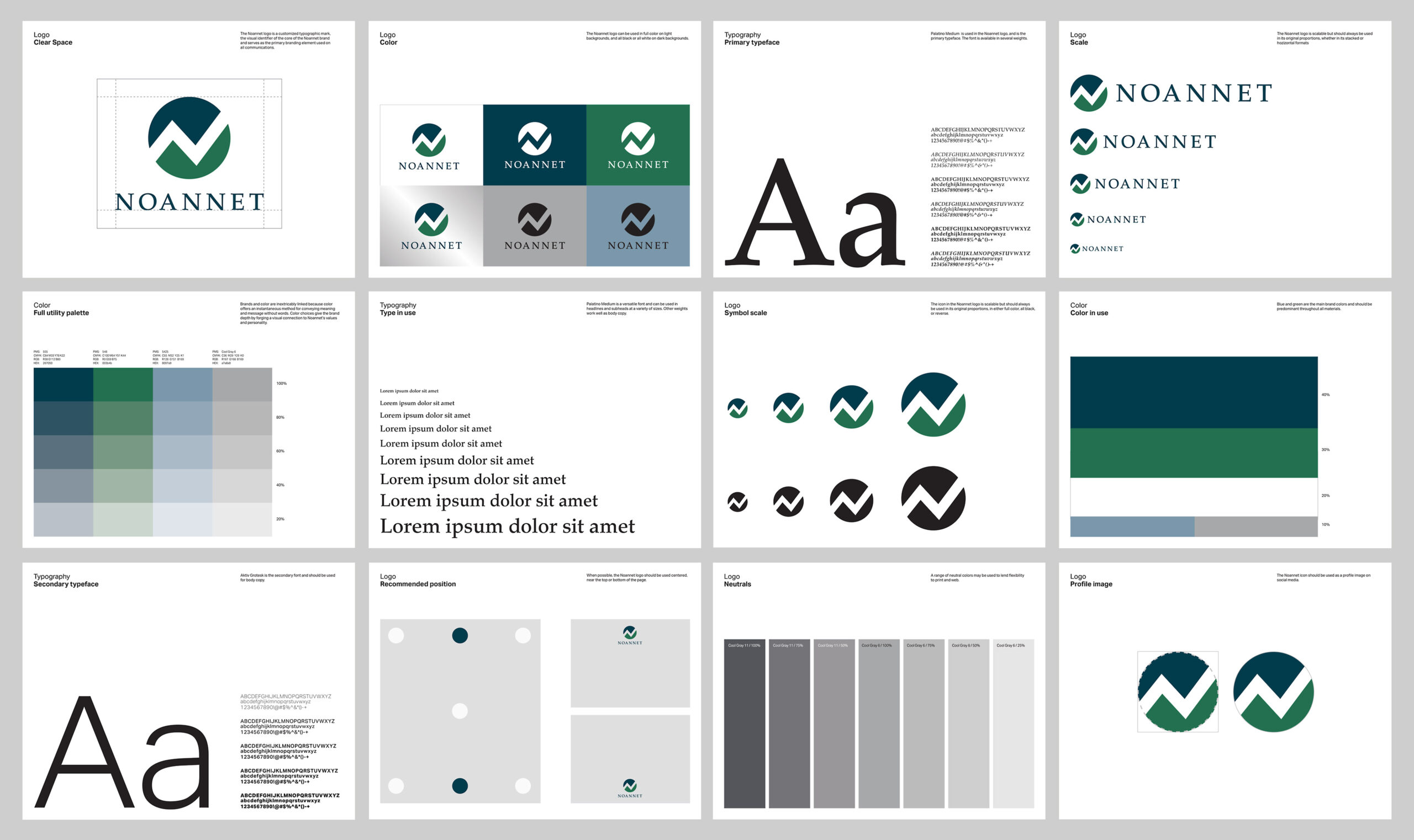
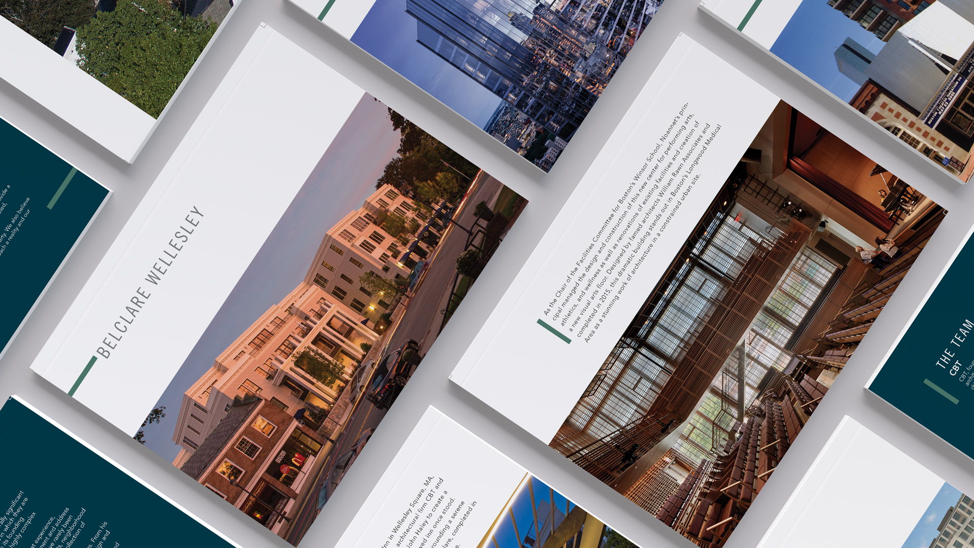
Inspired by the quiet strength of the Noannet Woodlands and the sweeping view of the Boston skyline from Noannet Pond, the company’s name reflects a deep connection to place and purpose. We brought that story to life through a logo that balances longevity and clarity—designed with the same thoughtful approach that defines Boston’s premier design firm.
Brand Strategy
Identity
Print
Website
The logo was inspired by the Noannet Woodlands and surrounding mountains with their view of the Boston skyline. The abstract “N” serves as a symbol for mountains and upward movement as well as a separator for earth and sky.
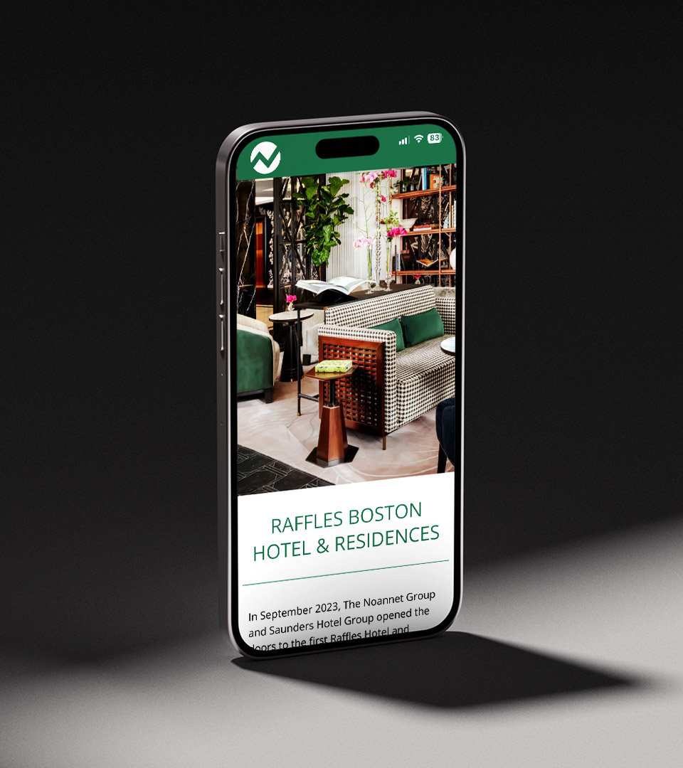
Dovetailing with the creation of the new company logo, the website is a destination for more in-depth company information and links to all the property websites.