Brio

Brand identity for boutique waterfront living.

Brio is a boutique waterfront condominium in the Hingham Shipyard, created for a discerning group of empty nesters—many of whom split their time between multiple homes and savor a life of travel, sailing, and ease. The branding needed to capture this effortless, salt-air sophistication while expressing the calm, high-quality lifestyle that defines living directly on the harbor.

Client
A.W. Perry
Industry 
Luxury Real Estate
Services 
Brand Strategy, Naming, Brand Identity, Illustration, Print Collateral, Website, Signage, Sales Center
Brio business card featuring the maritime signal–flag logo in white against a bold red background, emphasizing the brand’s nautical Art Deco identity.
Stack of Brio brochures showcasing bold red and blue covers with the signal-flag logo, representing the property’s energetic coastal branding.
Brio—meaning spirited energy and confidence—embodies a life of passion, elegance, and possibility. From setting sail at the Hingham Shipyard to hosting under a golden sunset, it captures the art of dynamic yet timeless living, inviting residents to embrace each moment with vitality and joie de vivre.

The Challenge

Position Brio as a premium but understated alternative to urban luxury condos—one that appeals to well-traveled empty nesters seeking elegance without excess.

The identity needed to reflect the harbor location, reinforce the effortless pace of life at the Shipyard, and stand apart from typical waterfront real estate branding.

Additionally, the brand had to be flexible enough to resonate with prospects who might be purchasing this as a second or third residence. 

The Solution

We created a refined brand identity built around Brio’s defining characteristics: waterfront serenity, nautical heritage, and a modern, uncluttered lifestyle.

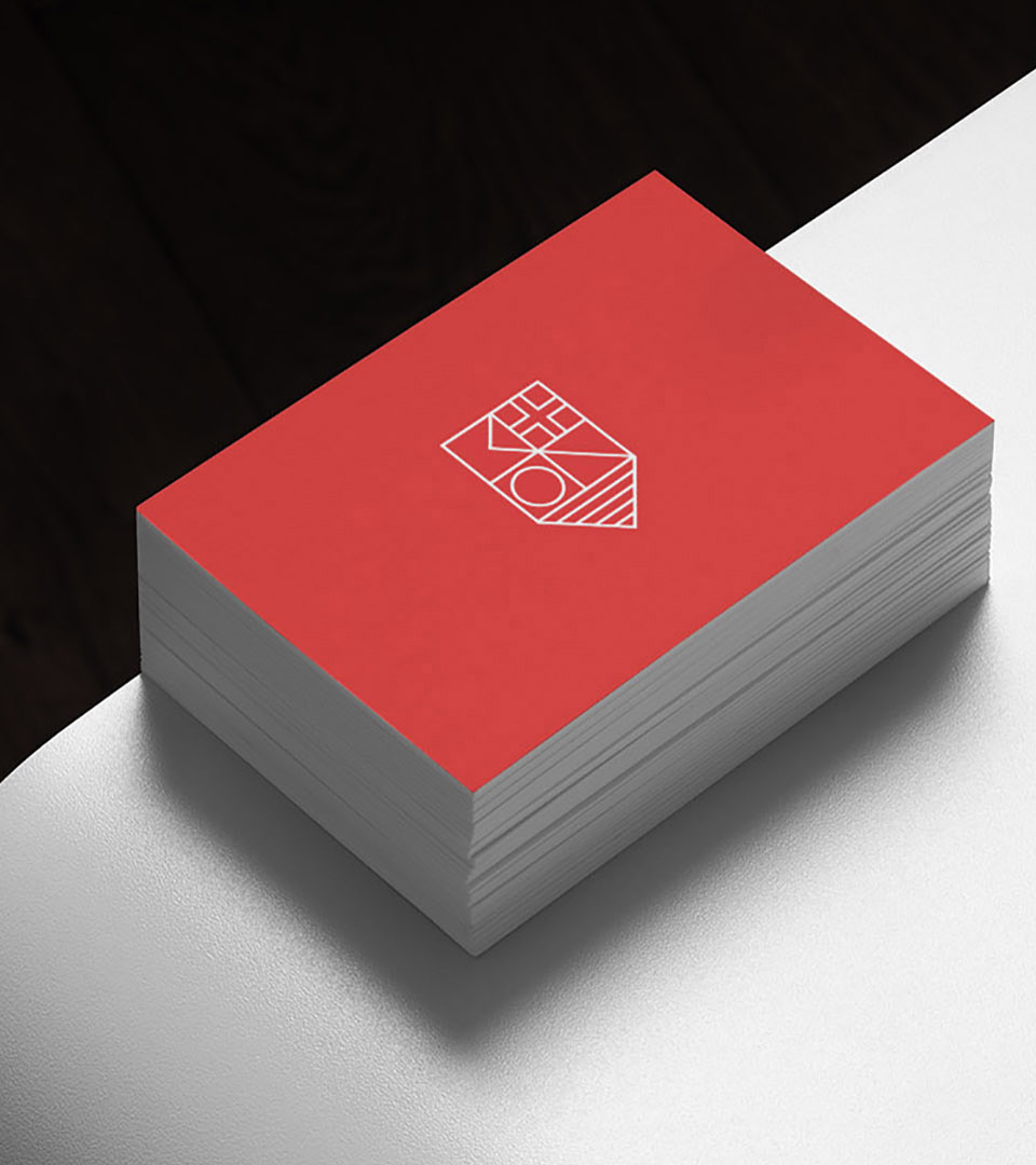
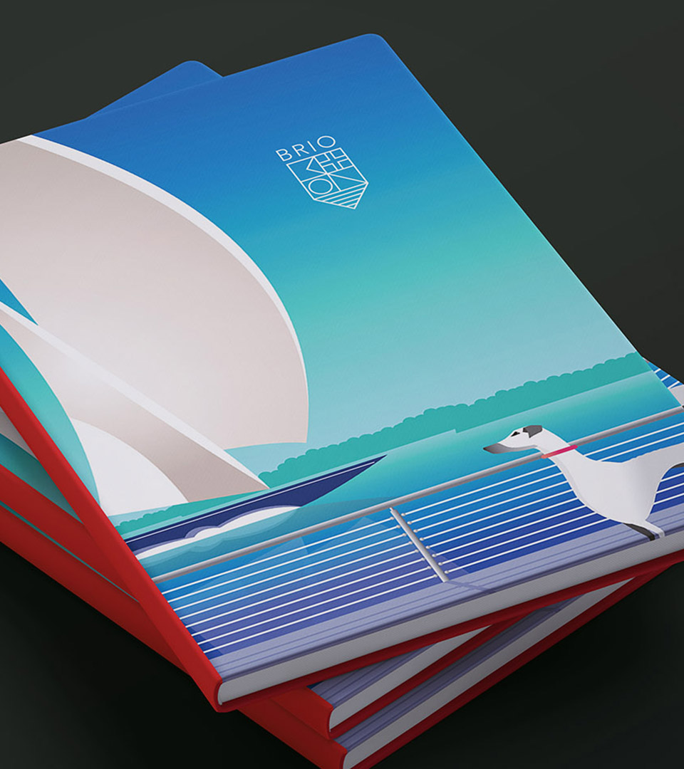
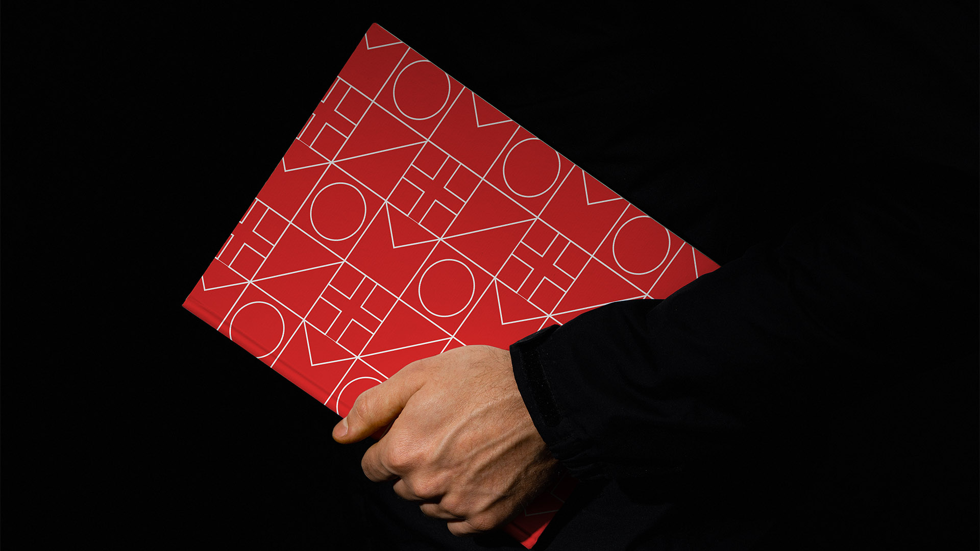
We developed a brand identity rooted in coastal elegance—timeless typography paired with a mark inspired by signal flags that spell out BRIO and yacht club crests, subtly evoking the sailing culture that resonates with Brio’s well-traveled audience. A palette of vivid blues, bright reds, and crisp whites mirror the sky and harbor, giving every touchpoint an easy, breezy clarity.

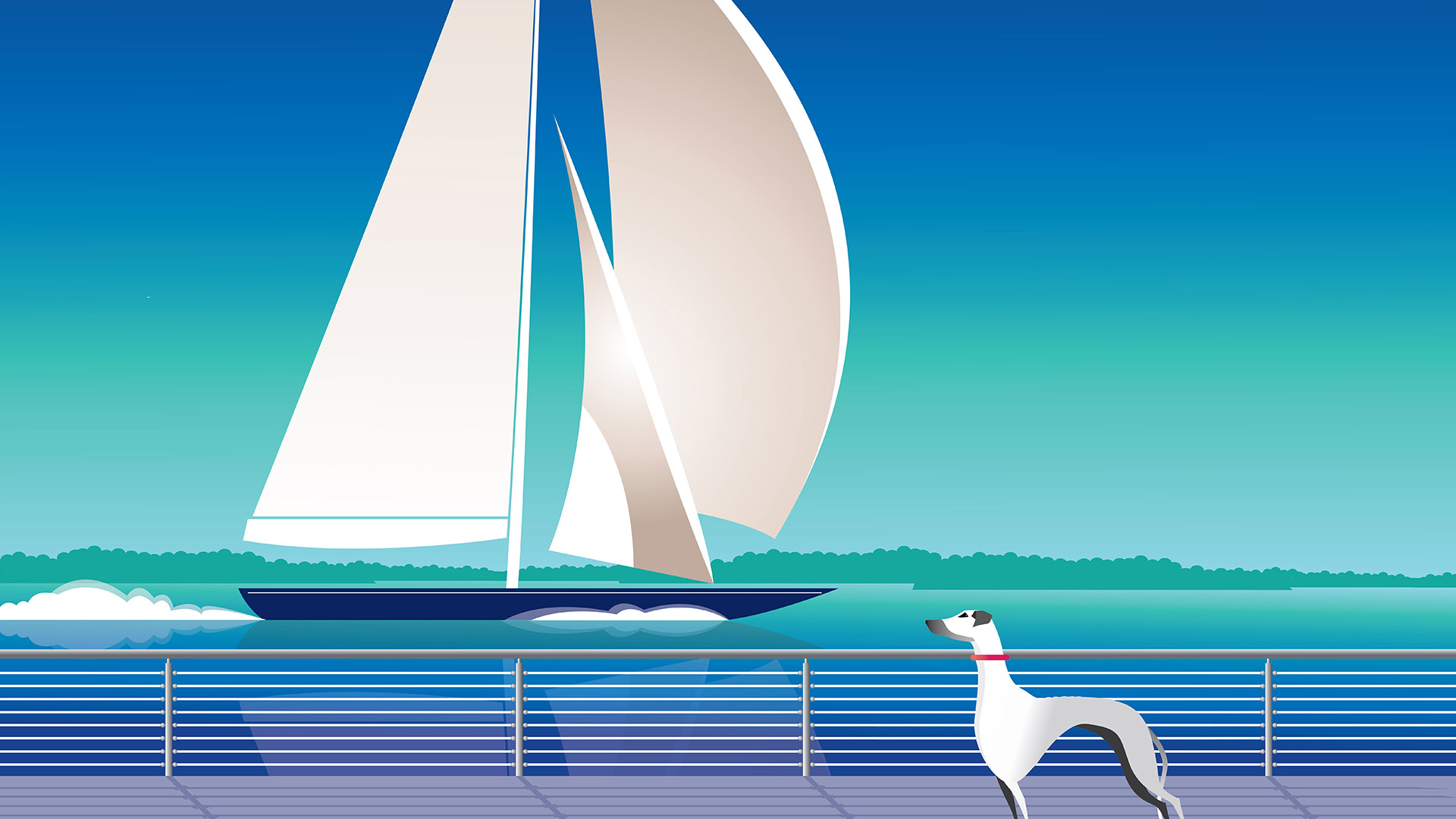
To deepen the sense of place and lifestyle, we introduced a custom illustration style inspired by vintage transatlantic travel posters. Sleek hulls, clean horizons, and saturated coastal tones create a refined, editorial look that speaks directly to empty nesters who love to travel and return to the water’s edge.

The website extends this tone digitally with calm navigation, elegant photography, and an inviting sense of coastal ease.

Our tagline “Explore the Possibilities”, speaks to all that is available when living at Brio.

A modern sans-serif font Avenir Light, express Brio’s balance of nautical heritage and contemporary refinement.

A vivid palette inspired by maritime signal flags and the shifting tones of the ocean—crisp red for nautical visibility, bright aqua for sunlit water, and deep blue-violet for the harbor at dusk—giving the identity a bold, unmistakably coastal character.

brio man holding book in hand against black background

The brochure cover incorporates a repeat pattern of the logo with it’s signal flag lines that spell BRIO.

We created an illustration that spoke to the grand age of travel as well as highlighting how the project was right on the water.

Custom Art Deco–style illustration of a sailboat on vibrant teal water, reflecting Brio’s waterfront location and spirited aesthetic
Stack of Brio brochures showcasing bold red and blue covers with the signal-flag logo, representing the property’s energetic coastal branding.
brio hingham logo on ipad and iphone wtih folder by boston graphic design studio

The Results

The Brio identity brought clarity and distinction to the project, helping the development stand out in a competitive coastal market.

The refined, nautical-influenced brand resonated strongly with the target empty-nester demographic, reinforcing the appeal of effortless waterfront living.

Brio established a cohesive, aspirational presence across print, signage, and digital channels—supporting sales momentum and elevating perception of the Hingham Shipyard as a premium residential destination.


Adams Design
20 Park Plaza
Boston, MA 02116

Let's Talk!