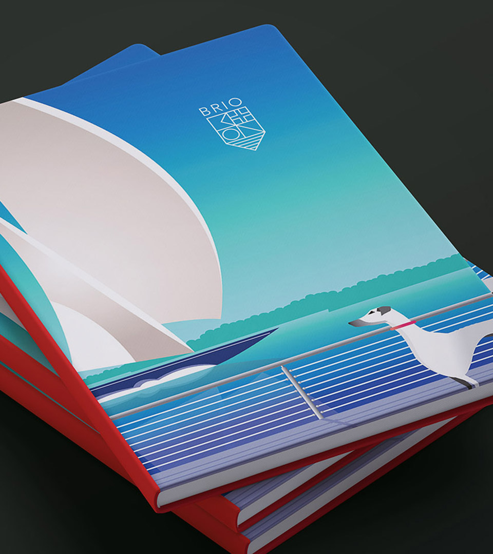
For this project, we drew upon the iconic luxury of the grand age of Transatlantic travel, powerfully captured in Art Deco posters and created a vibrant brand identity and visual language that captures the lifestyle of Brio’s demographic.
Client: A.W. Perry Industry: Real Estate
Brand Strategy
Naming
Identity
Illustration
Advertising
Print
Website
EXPLORE THE POSSIBILITIES
Brio—meaning spirited energy and confidence—embodies a life of passion, elegance, and possibility. From setting sail at the Hingham Shipyard to hosting under a golden sunset, it captures the art of dynamic yet timeless living, inviting residents to embrace each moment with vitality and joie de vivre.
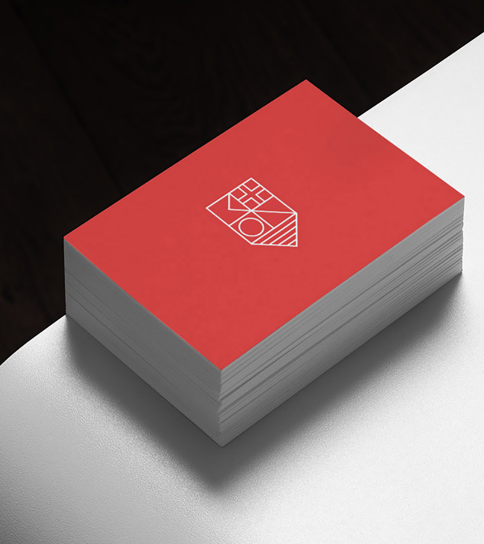
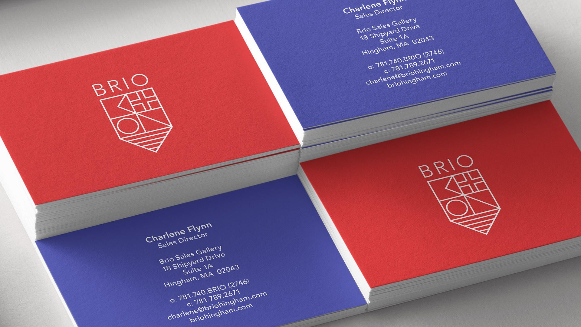
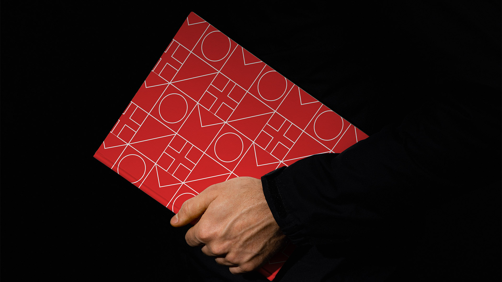
The logo is crafted from signal flags spelling “Brio” as well as a nod to the traditional crests on yacht club jackets.
We created an illustration that spoke to the grand age of travel as well as highlighting how the project was right on the water.