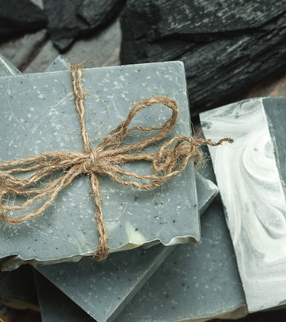
Postioned to appeal to an audience that loves natural, luxurious products.
Beginning with a love of natural ingredients and a rich Italian and Greek legacy, the client challenged us to come up with a brand identity for her line of natural soaps that was rooted in her own family heritage.
Brand Strategy
Naming
Identity
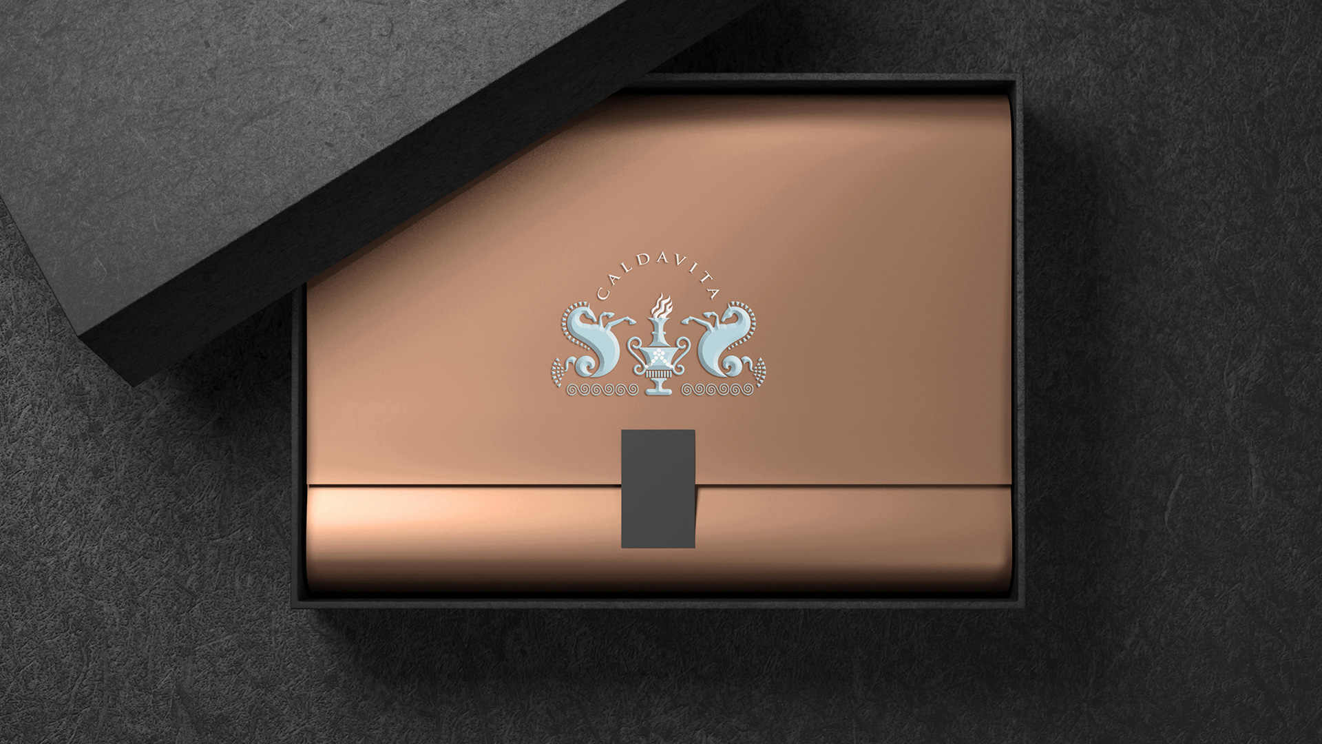
Packaging
The research into 18th century Italian water creatures seen on carvings and in paintings provided a jumping off point for the Calda Vita identity and logo. It was important to play to the client’s Italian heritage without restricting the brand to soaps should she wish to explore related products in the future.
Tactile and elegant. We incorporated the brand color palette into all the packaging and print materials used throughout the marketing.