THE SOLUTION
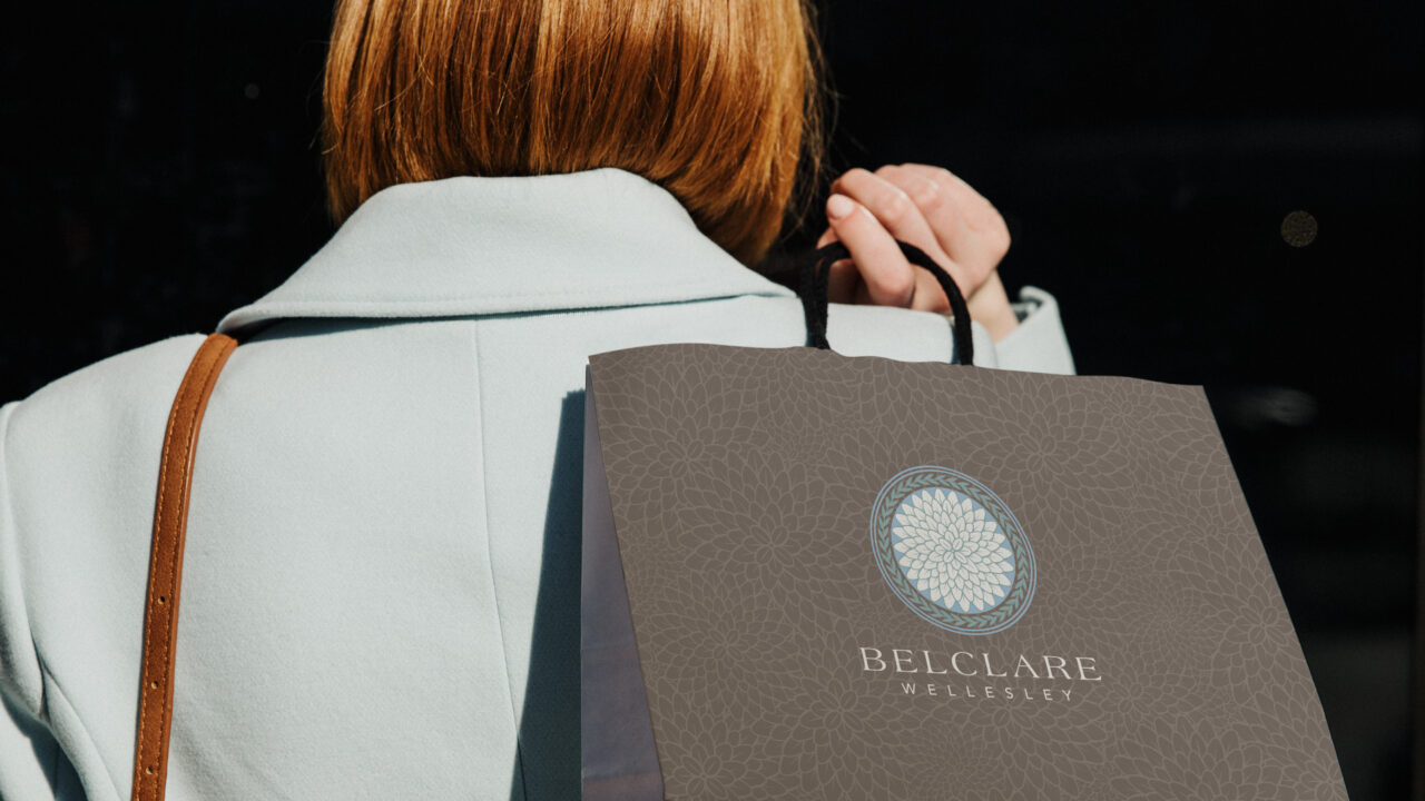
We developed a clean, elegant identity anchored by a classic serif logotype that conveys permanence and quiet luxury. The visual system draws inspiration from traditional New England materials—stone, natural textures, and warm architectural details—translated into a contemporary palette of soft neutrals and deep, refined tones.
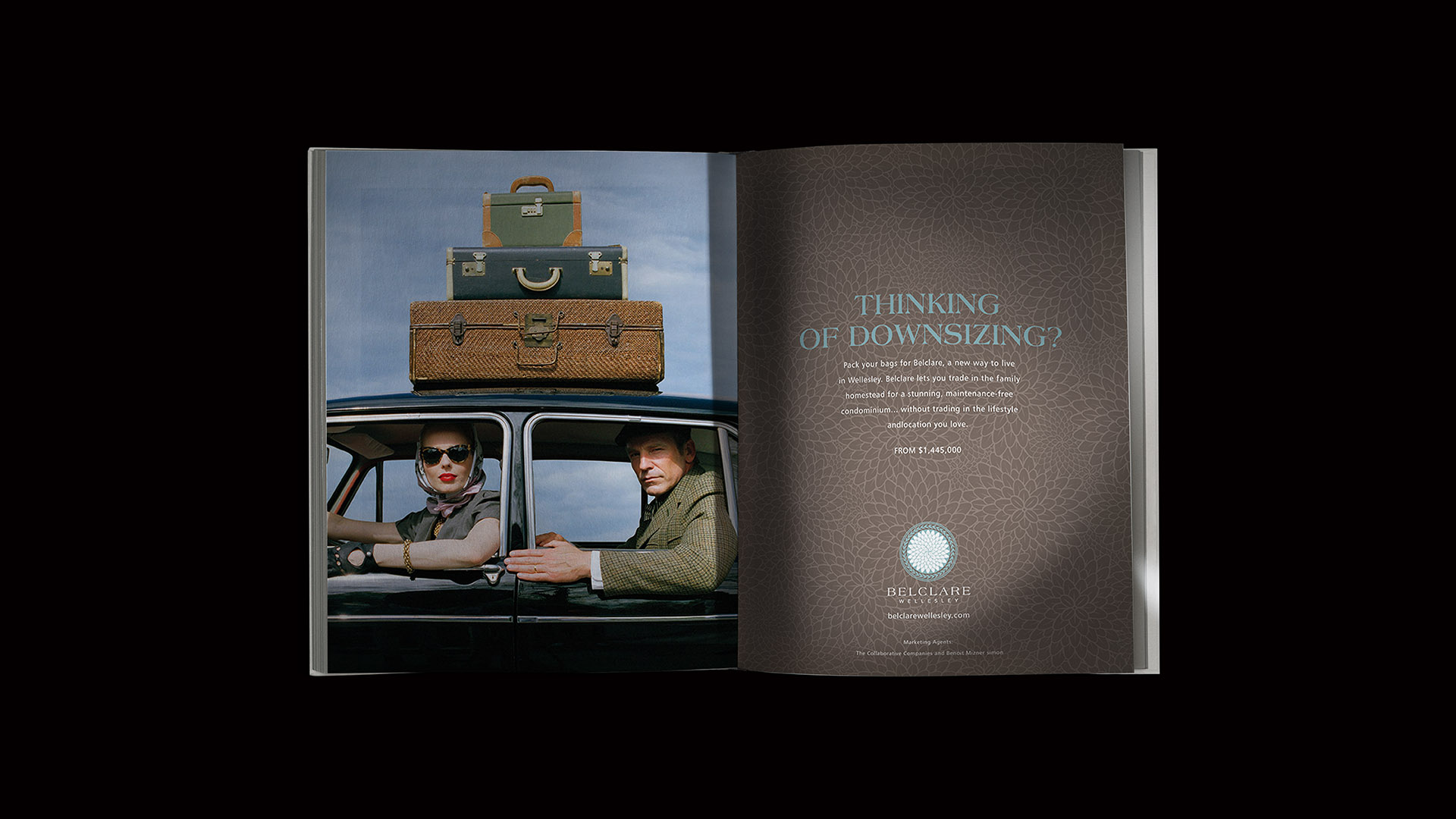
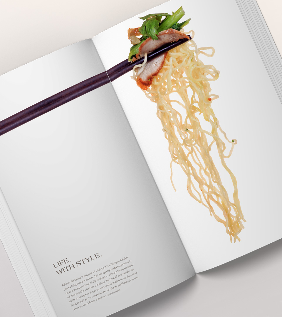
Typography plays a key role, pairing a timeless serif for the logo with a modern supporting typeface to keep materials light, legible, and upscale. Brochures, floor plan materials, and signage concepts highlight the property’s craftsmanship, its walkable location, and its connection to the village’s retail and dining.
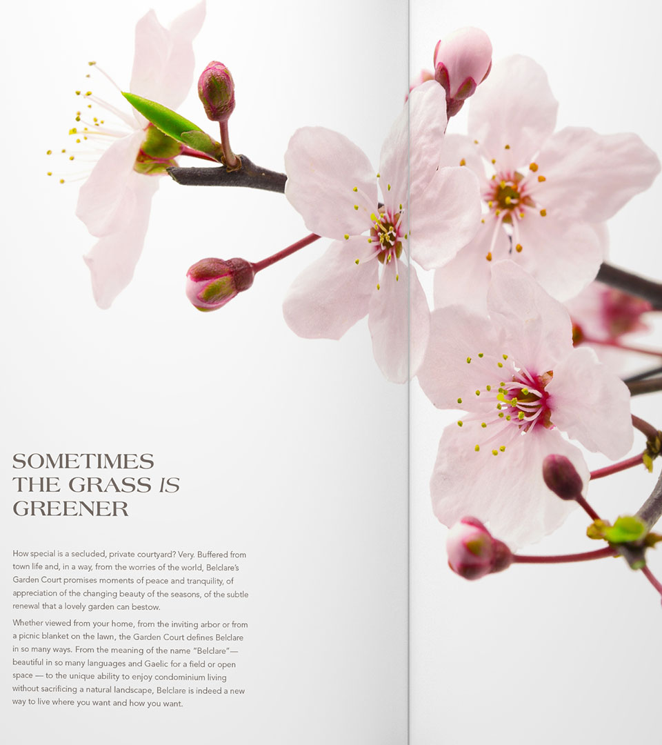
Placemaking elements—maps, neighborhood photography, and lifestyle cues—reinforce the appeal of Wellesley as an everyday luxury, helping prospective buyers envision themselves within the community.