Creating community

We closely collaborated with our developer partner—Thorndike Development—to meticulously craft a name and memorable identity for Featherwinds.

Featherwinds embodies the essence of serene countryside living, where strong community bonds and effortless life transitions prevail. The name evokes a feeling of lightness and freedom, symbolizing simplicity and tranquility. It represents progress and personal growth, alongside a shift towards a more fulfilling lifestyle for senior adults. In essence, Featherwinds offers a vision of harmonious living amidst rural beauty, where peace, support, and belonging flourish.

featherwinds logo on black
featherwinds white fluffy seeds of a dandelion flower gently float in the breeze
featherwinds home positioning
featherwinds tagline on black
featherwinds home naming
featherwinds quilts in a basket

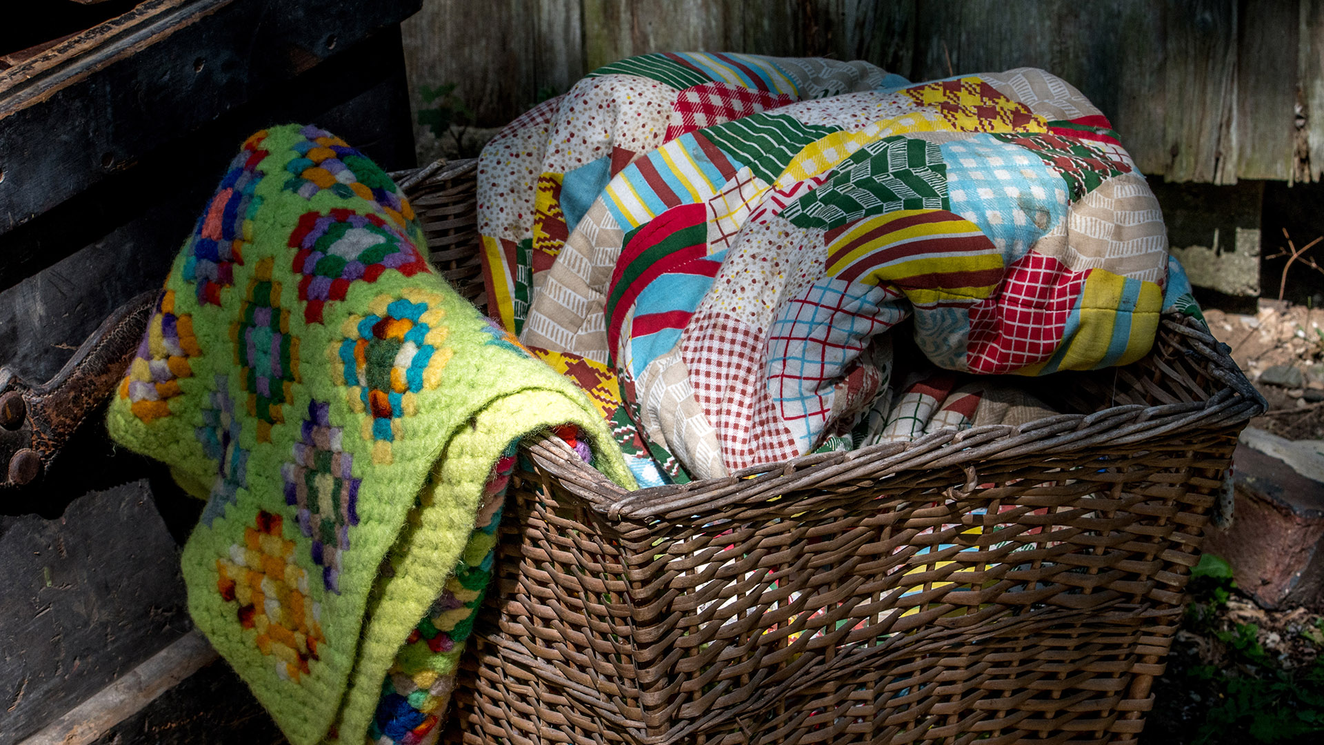
Quilts speak to America’s history, particularly its rural past.
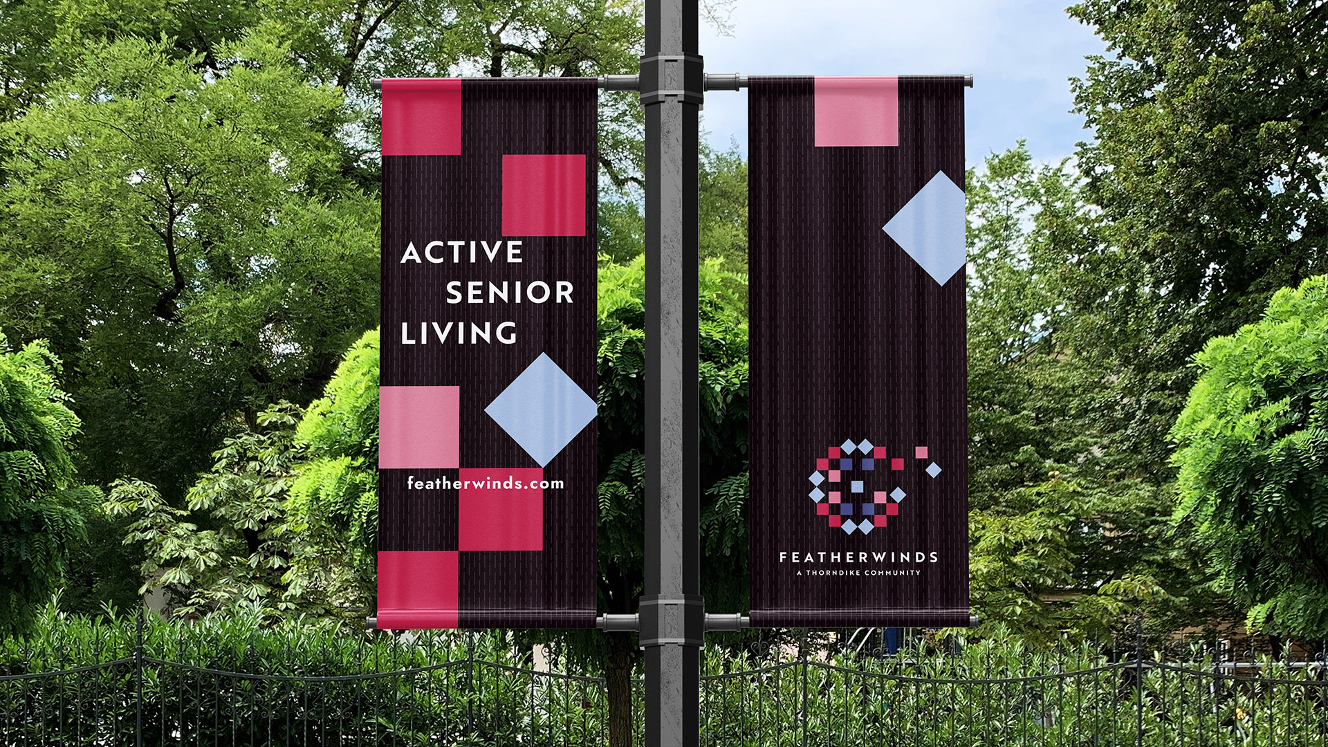
Quilts are symbolic of home, comfort, and community, as everyone came together to share the final work of putting a quilt together. The dandelion suggests country living and soft breezes and upward movement. This concept evokes the warmth of home and the Featherwinds community.

featherwinds white logo on purple
featherwinds white logo on red
featherwinds white logo on pink
featherwinds fonts
featherwinds color palette with 5 colors
featherwinds white logo on black

We crafted a pattern reminiscent of the stitched lines often found on quilts, adding a subtle pattern to the background.

featherwinds large logo cropped

Our scope of work extended to brand strategy and brand identity, furthermore, we crafted print materials, detailed floor plans, and a dynamic website to provide a comprehensive brand presence.

featherwinds active adult living pole flags

Our brand identity used pattern and a bright, warm red throughout all materials.

featherwinds iphone, business card and ipad


Adams Design
20 Park Plaza
Boston, MA 02116

Let's Talk!