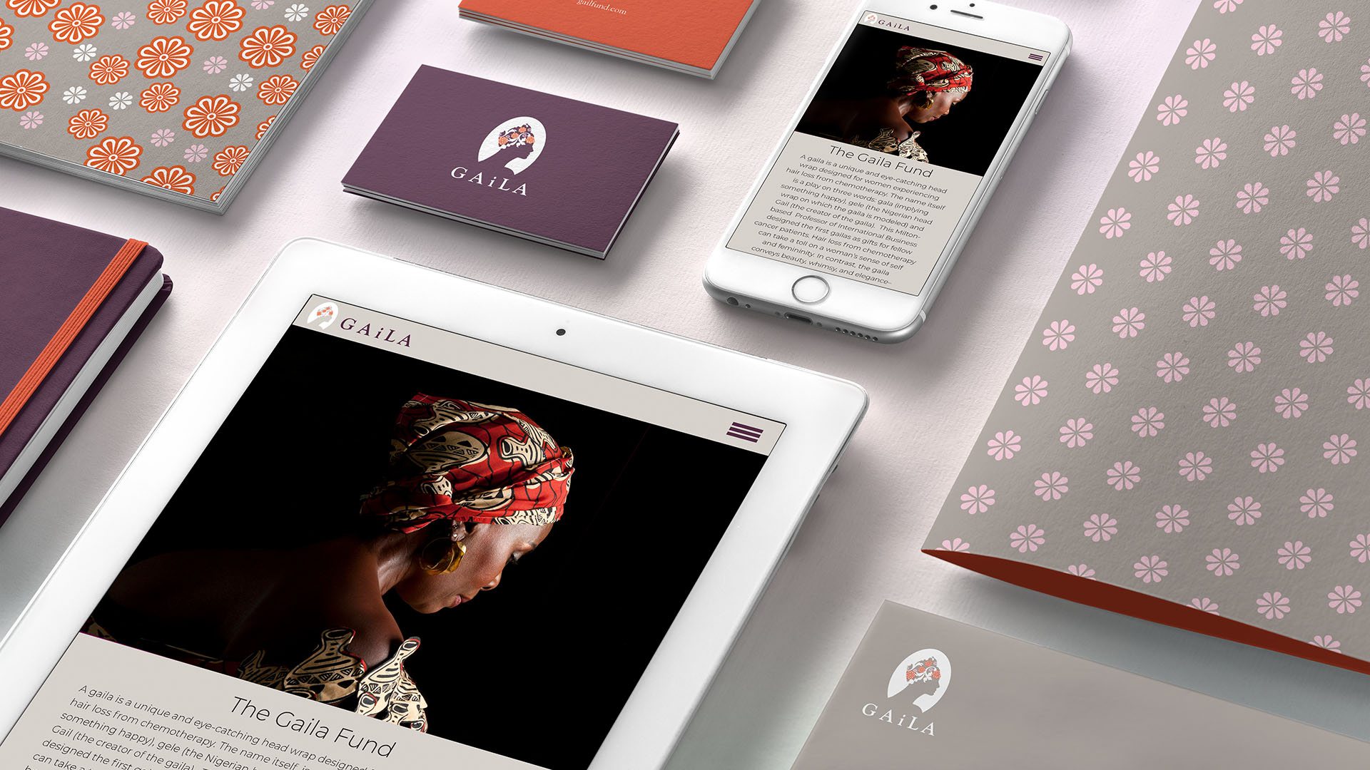
About this project
Gaila was founded by a woman named Gail after her own experience with cancer, when she discovered how difficult it was to find headwear that felt beautiful, expressive, and affirming.
Rather than creating something designed merely to conceal hair loss, the goal was to restore confidence and a sense of self. The name Gaila reflects that origin, combining Gail’s name with the Gaela, an African headwrap traditionally worn as both adornment and expression.
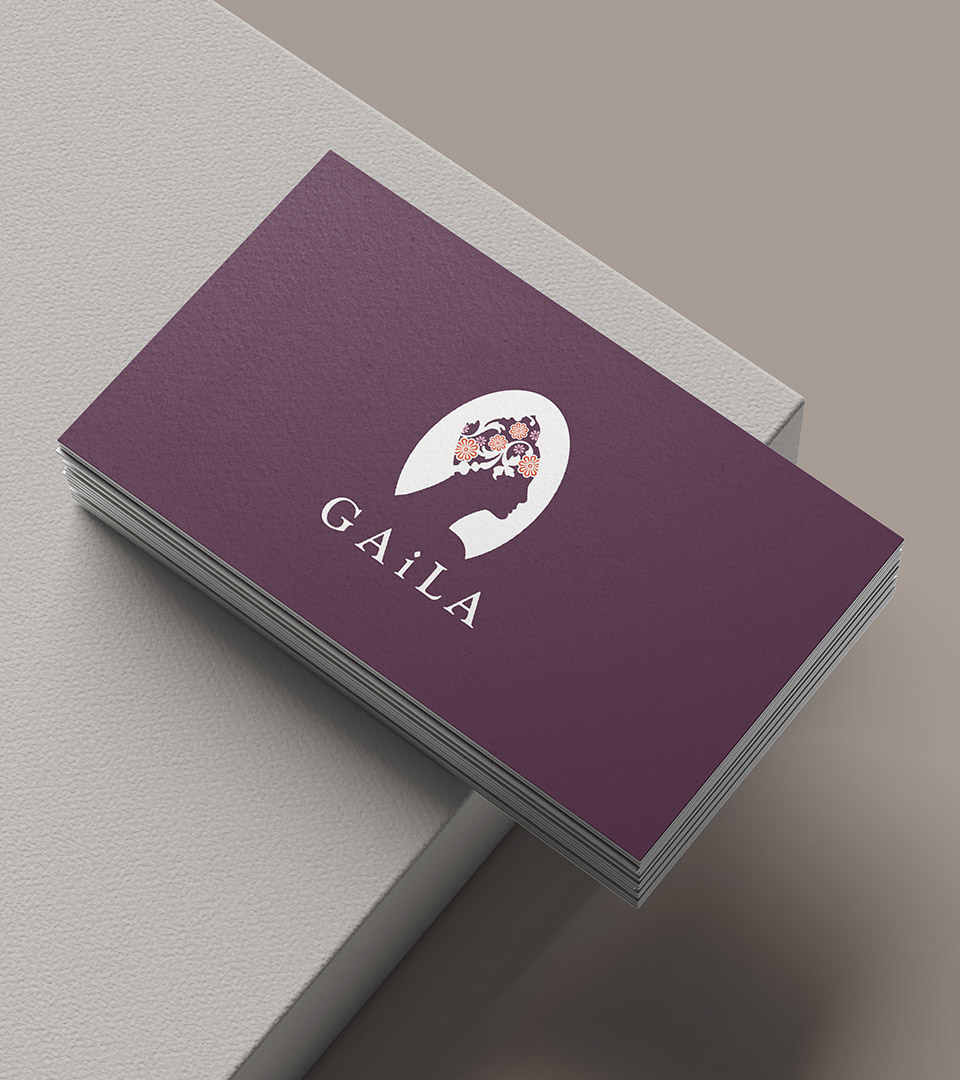
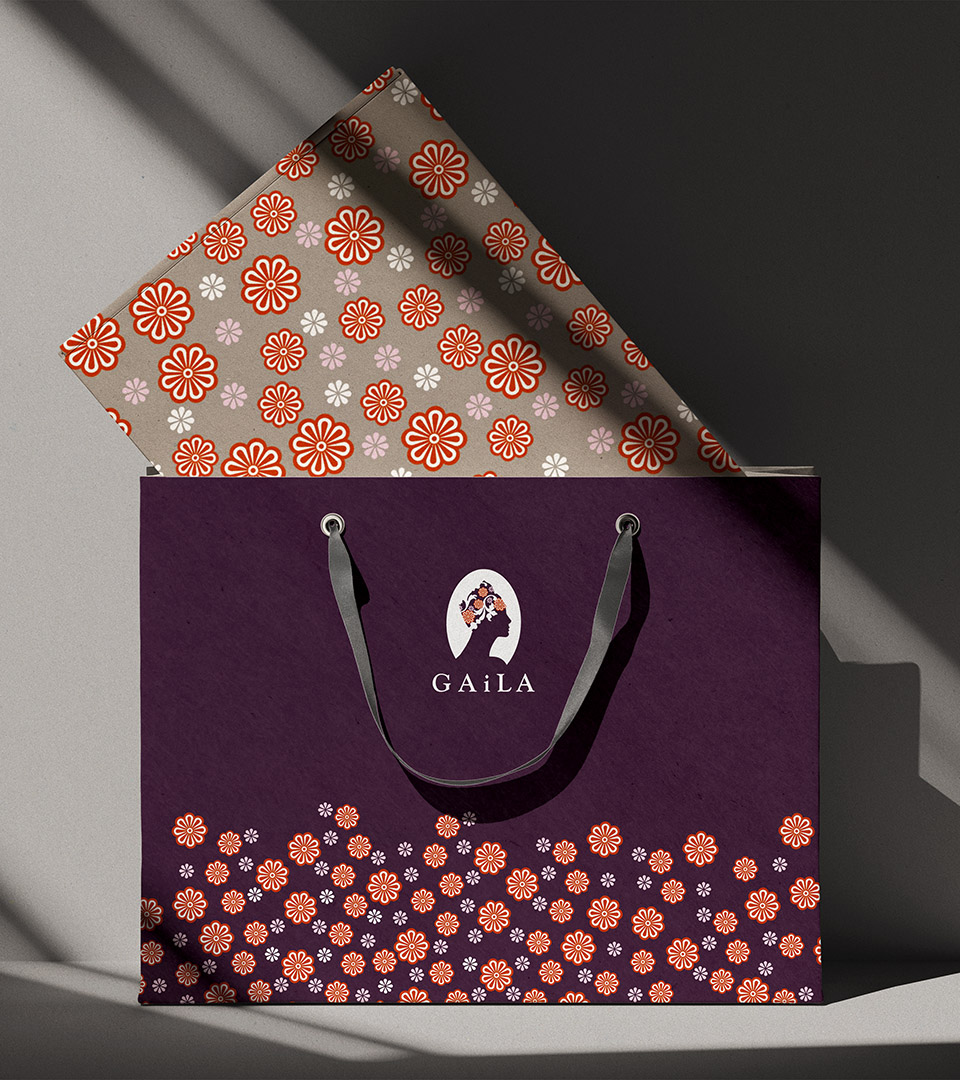
The brand concept draws directly from this idea of beauty as identity. The identity centers on a cameo-inspired mark, referencing 19th-century portrait objects once used to celebrate women through idealized silhouettes.
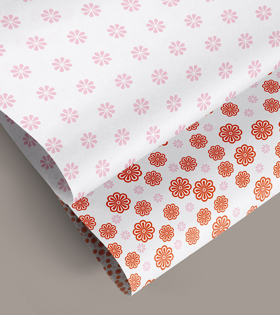
Reinterpreted in a contemporary way, the cameo becomes a symbol of dignity, femininity, and self-regard. This is paired with pattern and color systems influenced by the Gaela, honoring the headwrap as a cultural and personal statement rather than a medical necessity.
Messaging and visual language were developed to position Gaila as warm, confident, and beauty-forward, intentionally avoiding the clinical tone often associated with illness. Across packaging, print, and digital applications, the brand invites women to feel seen, celebrated, and empowered during a moment when those qualities are often taken away.