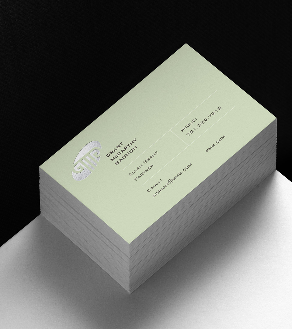
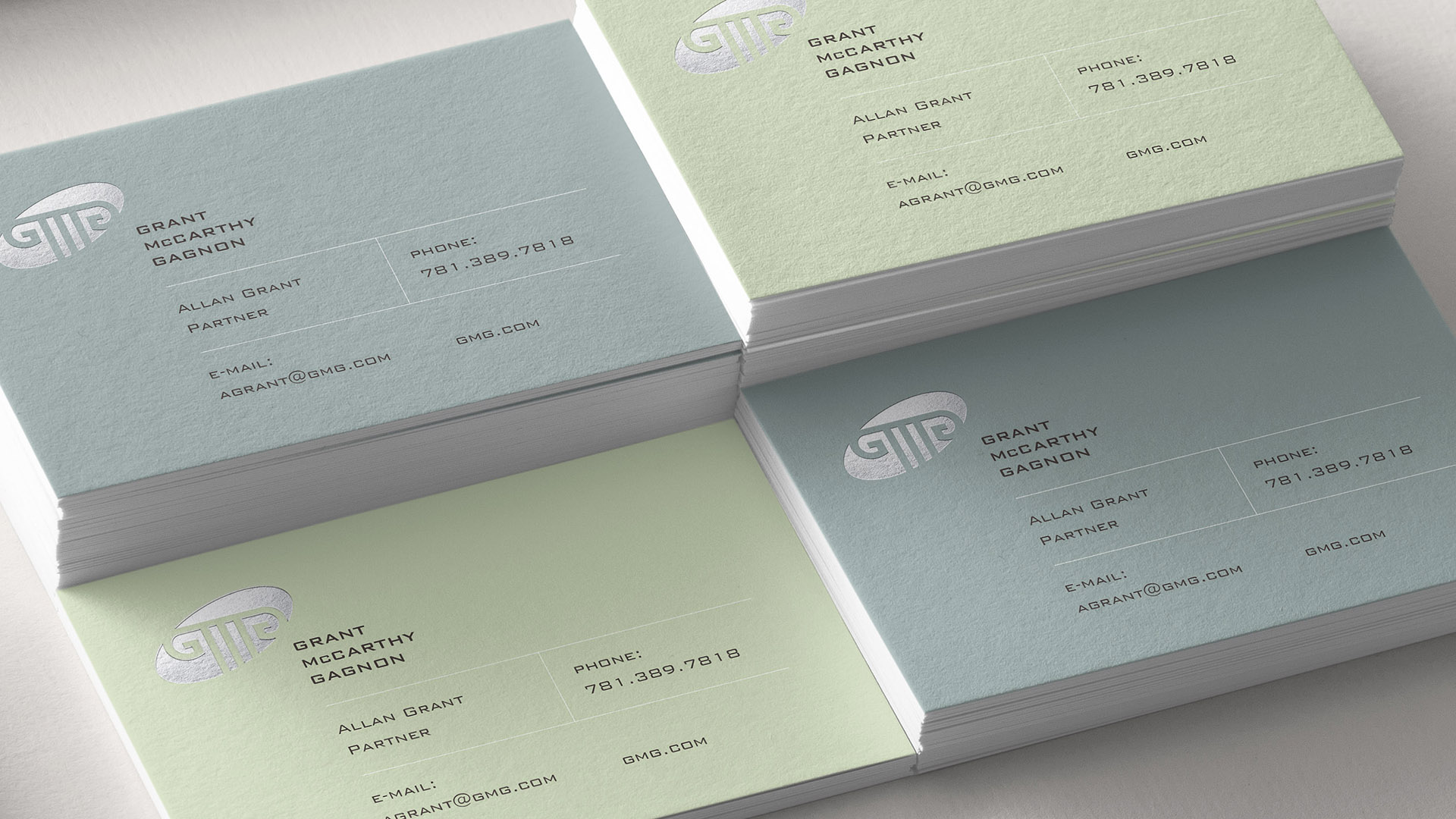
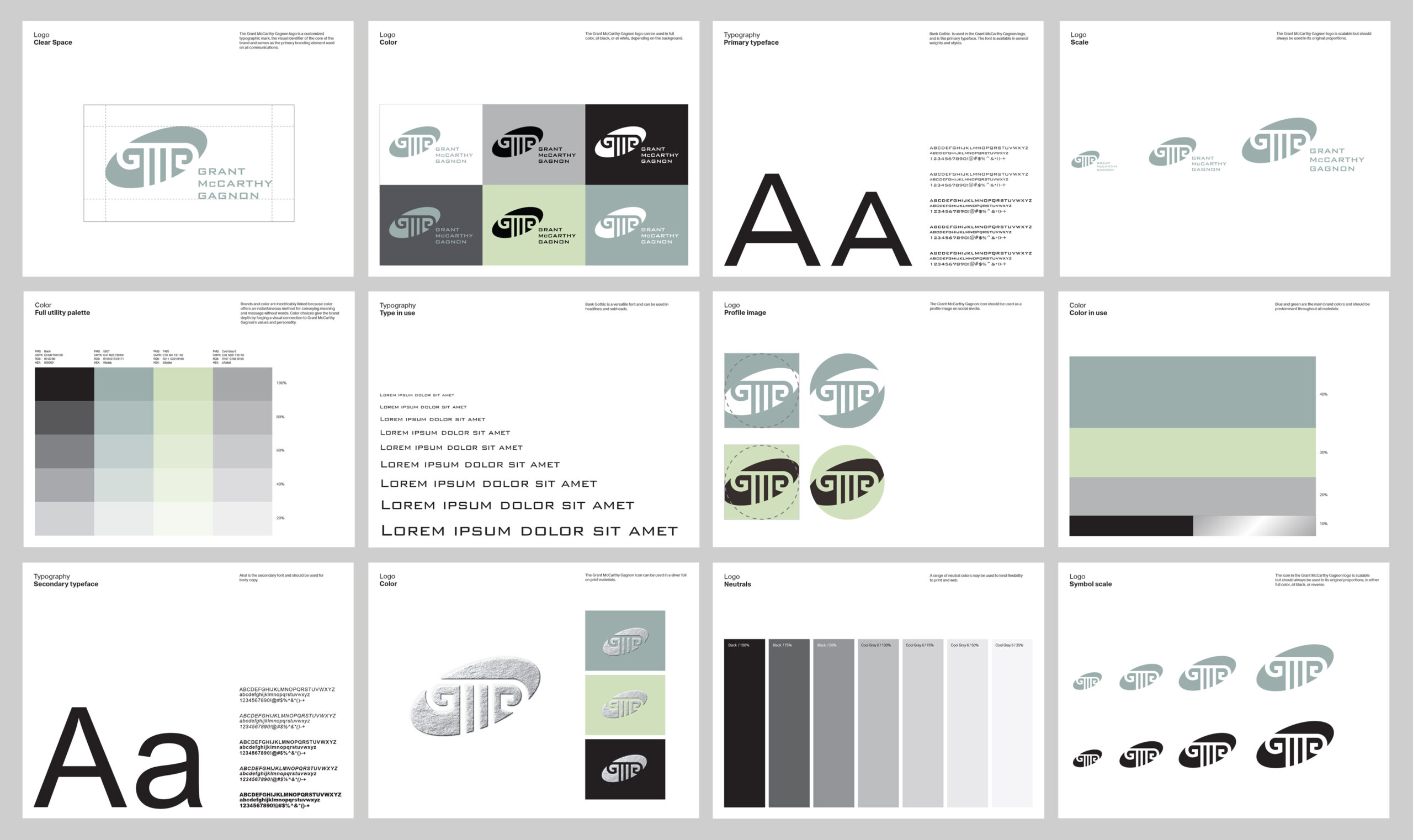
Many law firms use their partners' initials in their logo, but few connote the strength, tradition, and ingenuity of the brand identity we created for Grant McCarthy Gagnon. The geometric lines of the ionic column were a perfect jumping off point for us to incorporate the proverbial initials into the circles and straight lines of the column form.
The logo draws direct inspiration from the form of the Corinthian column—a symbol of refined elegance and lasting support in architecture. Just as the Corinthian column combines structural integrity with decorative sophistication, Bank Gothic balances modern sharpness with a sense of timeless authority. The font’s square proportions and solid stance mirror the weight and grace of these classical pillars, underscoring our firm’s foundation of stability, resilience, and trusted guidance.
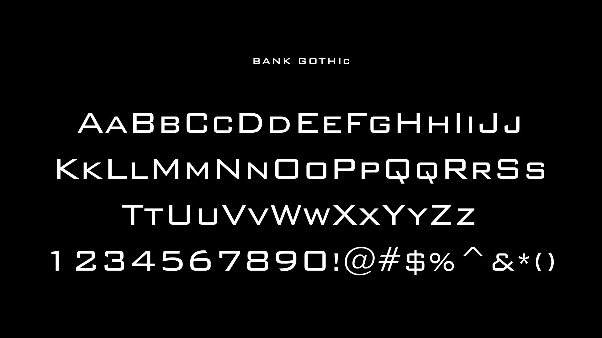
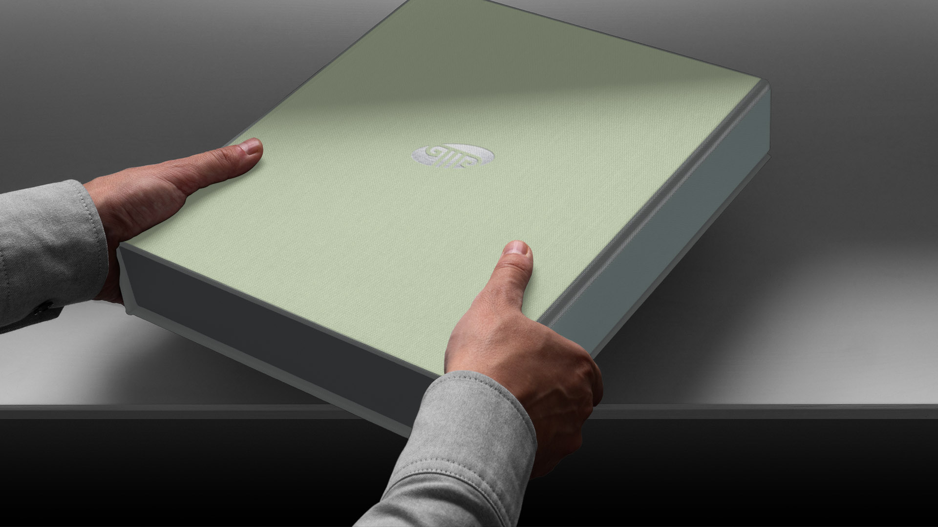
 Through this careful selection, our logo communicates a message of confidence and permanence.
When designing the law firm’s logo, we sought a visual language that would reflect both tradition and strength—core values in the practice of law. The Bank Gothic typeface was chosen specifically for its bold, architectural character. Its clean lines, strong geometry, and timeless presence evoke the enduring strength and stability found in classical structures. Using a contemporary color palette and a silver foil emboss gave the mark even more distinction.
Adams Design
20 Park Plaza
Boston, MA 02116