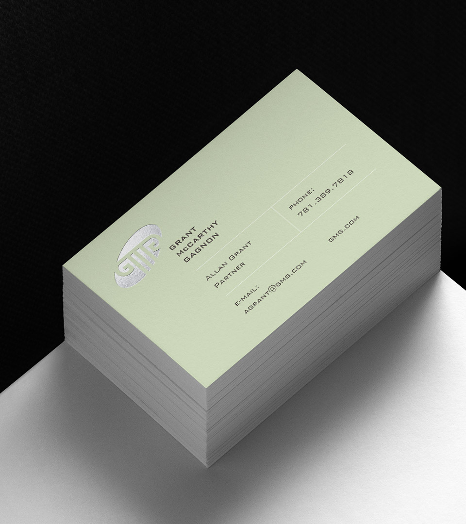
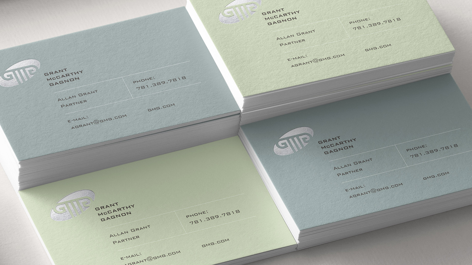
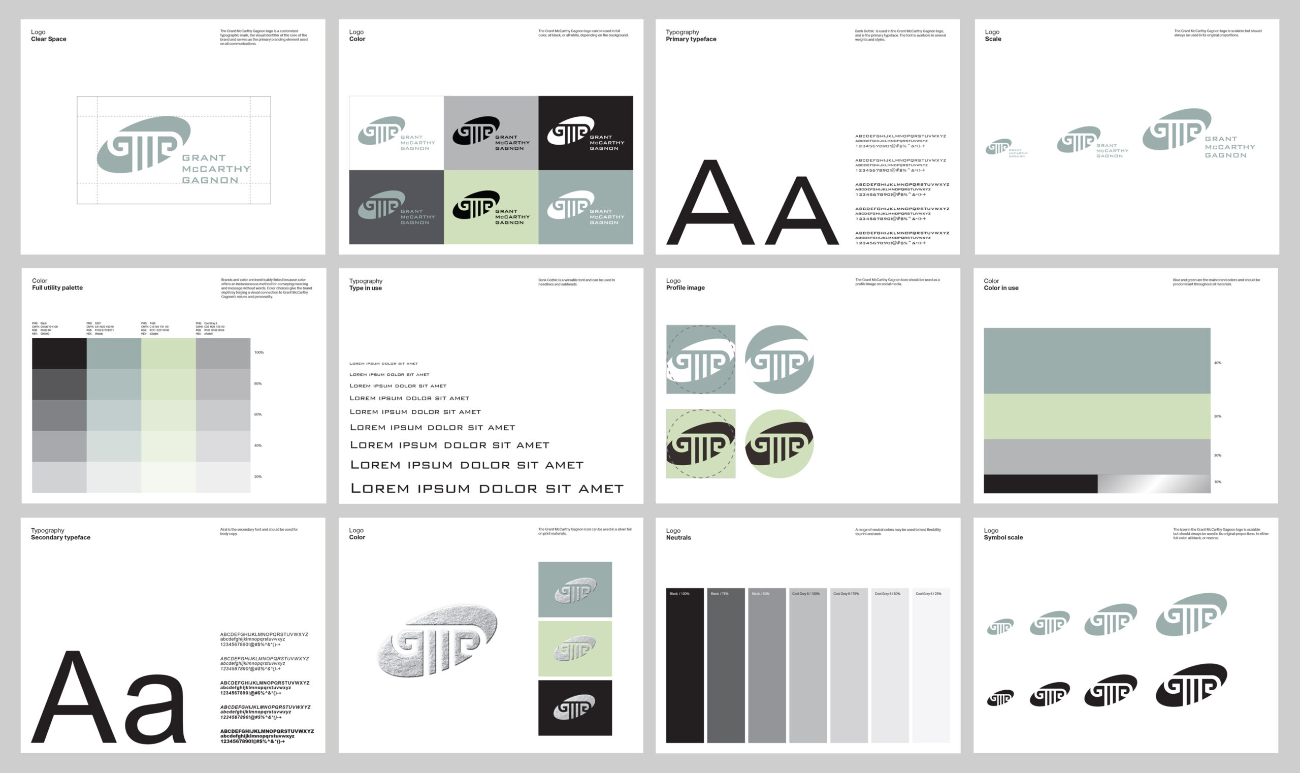
The mark blends classical architecture with clean modern geometry, forming a symbol that feels enduring, disciplined, and unmistakably tied to the practice of law.
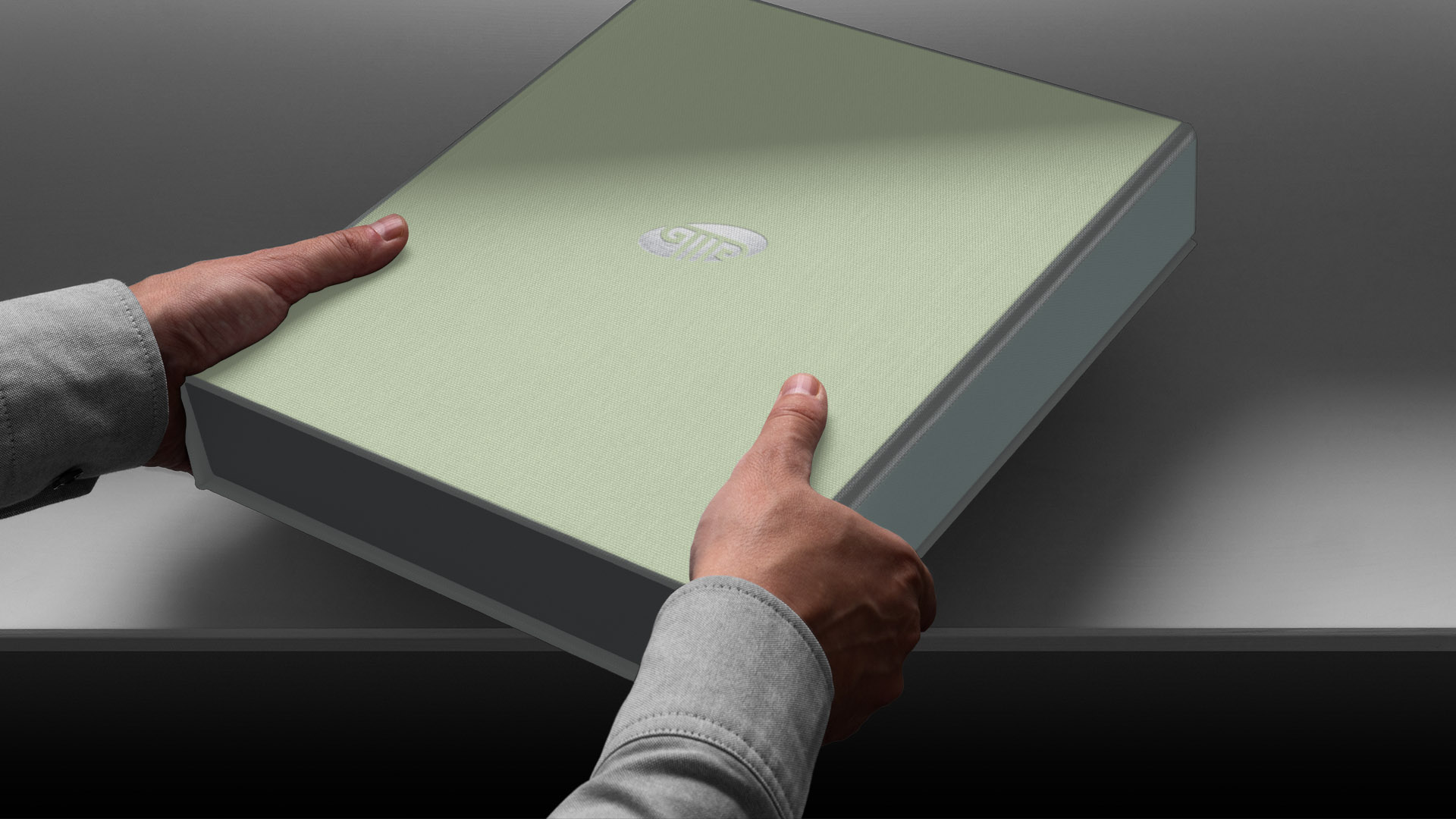
A tailored palette of soft greens, cool neutrals, and charcoal added restraint and sophistication, while a bold sans-serif typography system conveyed clarity and professionalism. The result was a unified visual language expressed across stationery, business cards, proposals, and branded documents, giving the firm a distinctive and credible presence.