We partnered with Aimco to create the name, logo, tagline and brand graphics for this apartment building for trendy millennials working in biotech.
Identity
Tagline
Illustration
Print
Signage
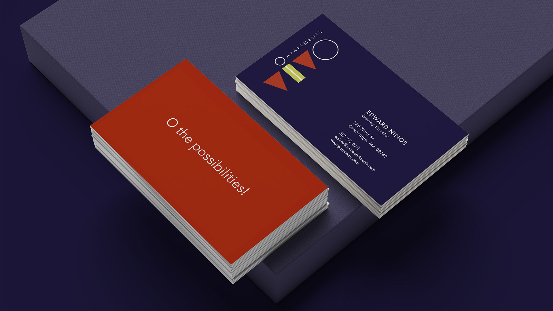
O the possibilities!
Our naming strategy focused on bridging the biotech context with Millennial sensibilities. Vivo, meaning ‘life’ and echoing lab vernacular, proved both authentic and memorable.
The logo uses bold orange-red, vibrant chartreuse, crisp white, and deep navy to create a bright, fresh, attention-getting identity that echoes the playful, geometric shapes inspired by medical flasks and beakers.
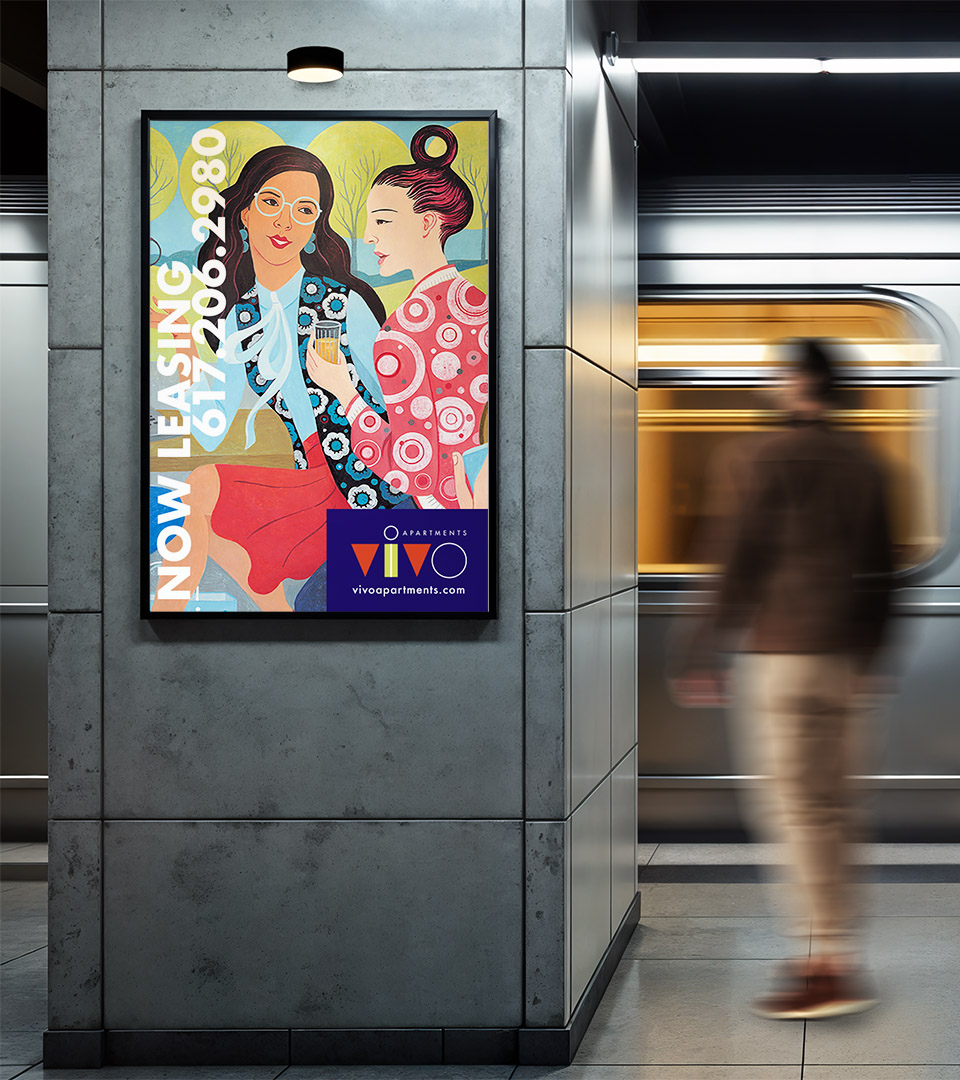
The tagline’s O becomes a defining element, repeated through the illustration patterns to anchor the brand’s visual language with clarity and intention.graphics.
The color palette uses bold orange-red, vibrant chartreuse, crisp white, and deep navy to create a bright, fresh, attention-getting identity that echoes the playful, geometric shapes inspired by medical flasks and beakers.
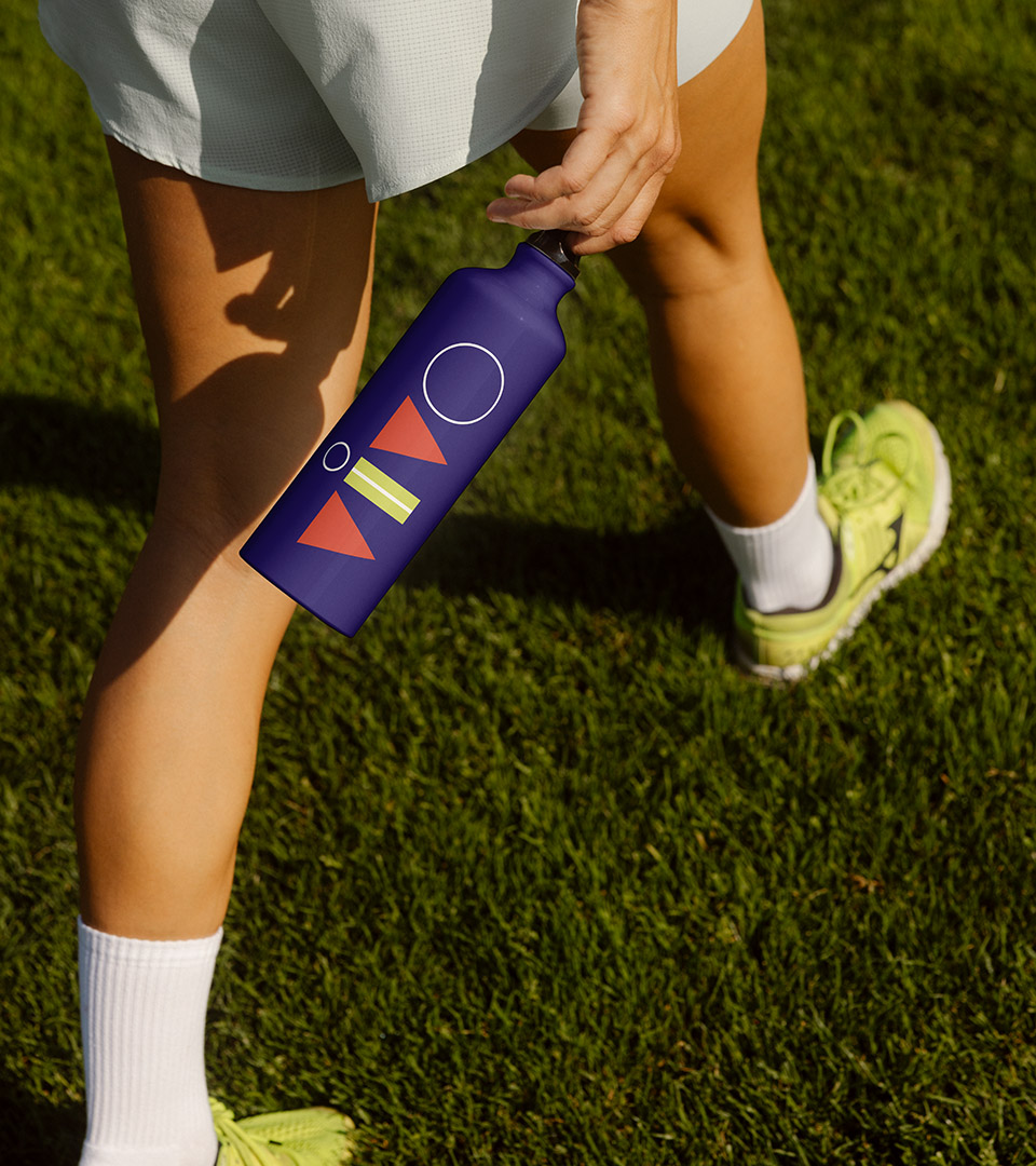
With bold patterns and adaptable logo positioning, the brand was able to evolve and extend across a wide range of applications.
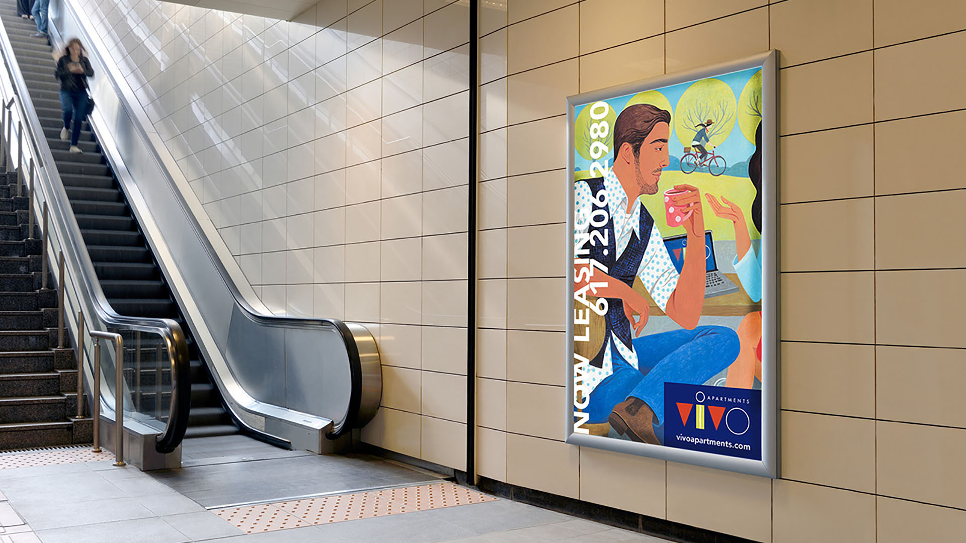
Award-winning illustrator Jody Hewgill developed a painting that captured the energy and lifestyle of the building as well as the international nature of the target audience.