We developed a brand identity rooted in clarity, structure, and adaptability. Inspired by architectural grids and planning frameworks, the logo system is built around a modular grid that reflects Hileman’s disciplined, methodical approach to real estate. The mark is simple but distinctive—designed to function as a foundation rather than a decorative flourish.
A bold, contemporary color palette brings energy and differentiation to the system, allowing individual applications to feel dynamic while remaining clearly connected.
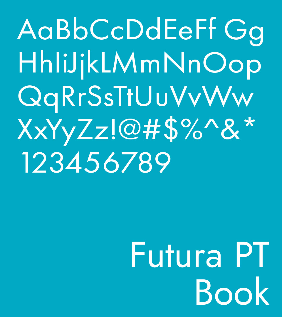
Typography was selected for its clean geometry and legibility, reinforcing the brand’s professional tone across print and digital environments. Together, these elements form a cohesive visual language that scales easily across marketing materials and the website.
A refreshed website completed the system, organizing Hileman’s portfolio with clarity and impact, making their breadth of work easily accessible to investors, tenants, and partners.