Hileman Real Estate Companies

We created a bold, vibrant brand for Hileman, a Beverly Hills developer redefining large-scale construction.

Hileman Real Estate Companies needed a unified brand that could stretch across a wide-ranging portfolio—from historic redevelopments to modern commercial spaces—while still expressing the company’s contemporary point of view. Our task was to create an identity that felt architectural, flexible, and unmistakably theirs..

Client
Hileman Real Estate Companies
Industry 
Commercial Real Estate
Scope of Work 
Brand Strategy, Brand Identity, Visual Language, Presentations, Website
Mobile website mockup showing Hileman Real Estate property page.
Exterior signage at a Hileman commercial property with illuminated red glass façade.

The Challenge

With commercial properties spanning multiple cities, uses, and eras, Hileman lacked a cohesive visual language and a website that lived up to his reputation.

The brand needed a system that was clear enough to unify the portfolio, yet adaptable enough to differentiate individual properties—without defaulting to a generic corporate look.

Grid-based Hileman logo printed on textured white cover.

The Solution

We developed a modular identity anchored by a grid-based logo—an abstract “H” composed of vibrant intersecting lines.

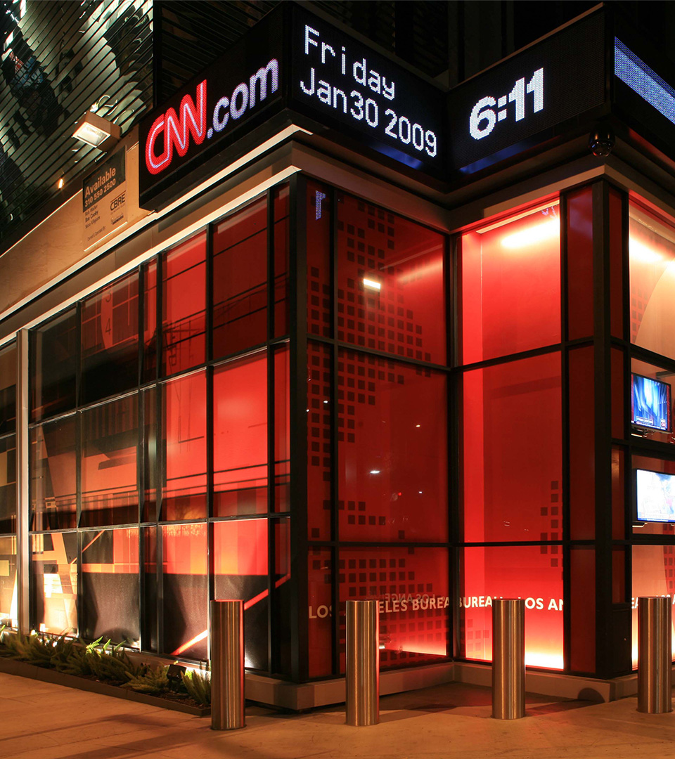
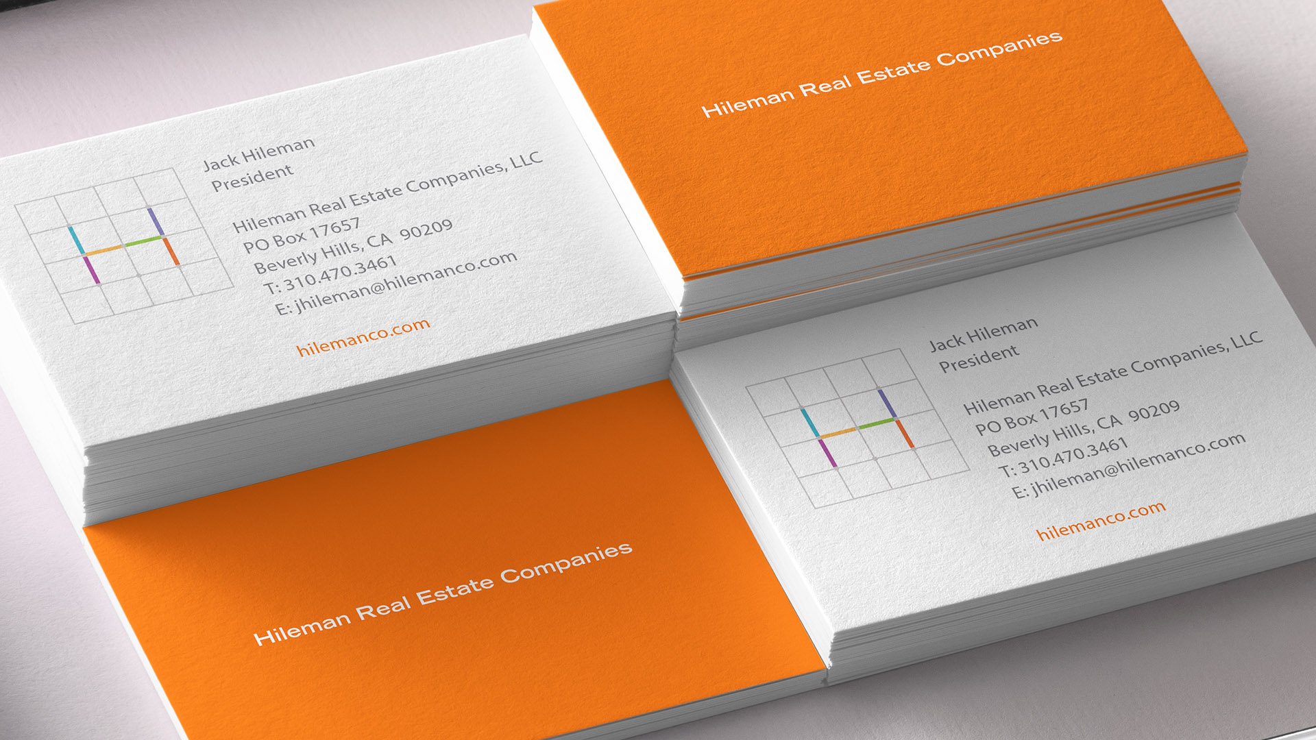
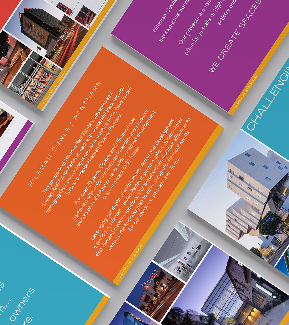
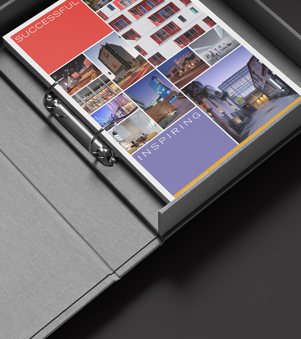
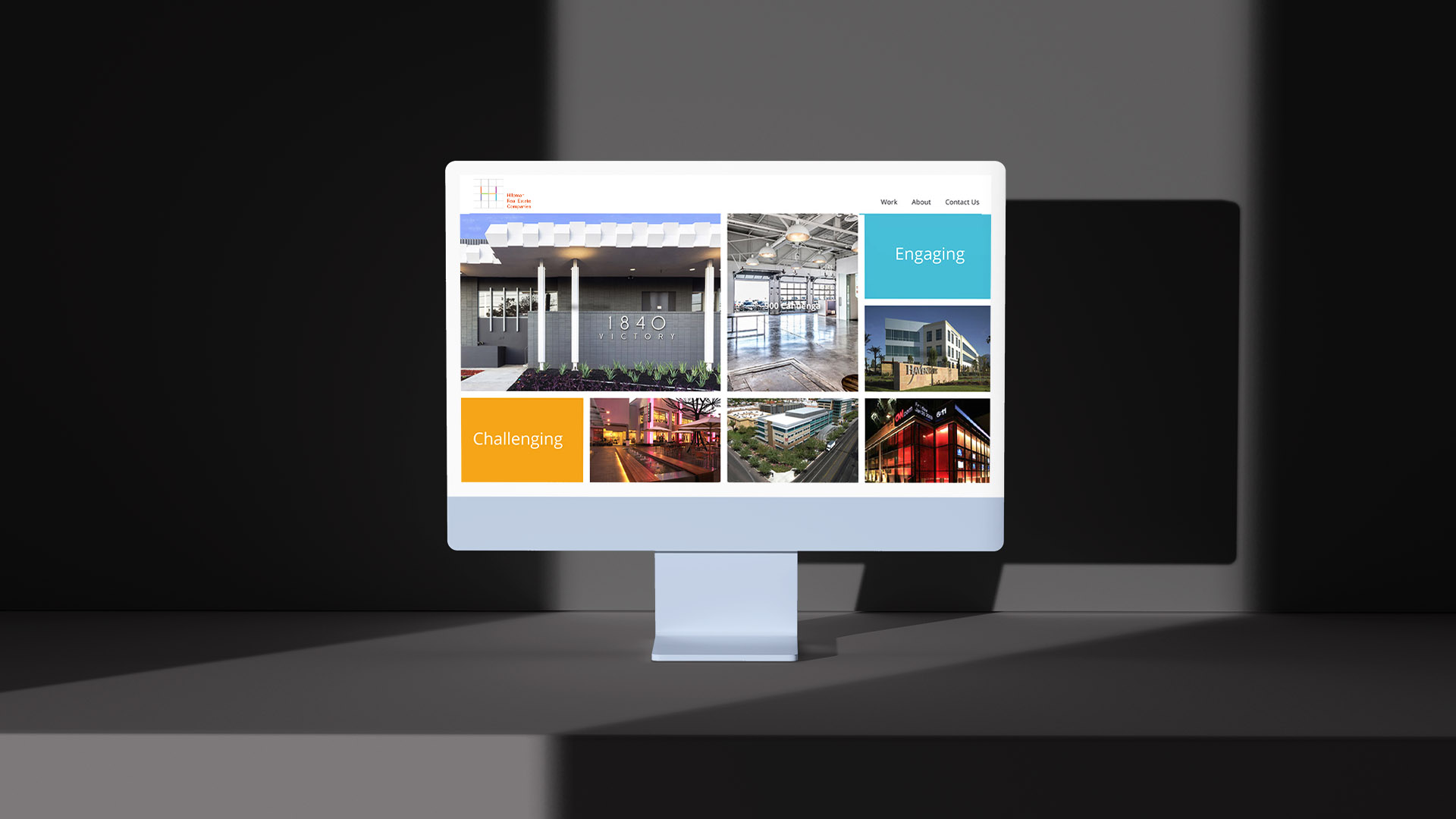
Its structure references architecture, planning, and adaptive reuse, while the bright color system brings warmth and dynamism to a category often dominated by neutral palettes.

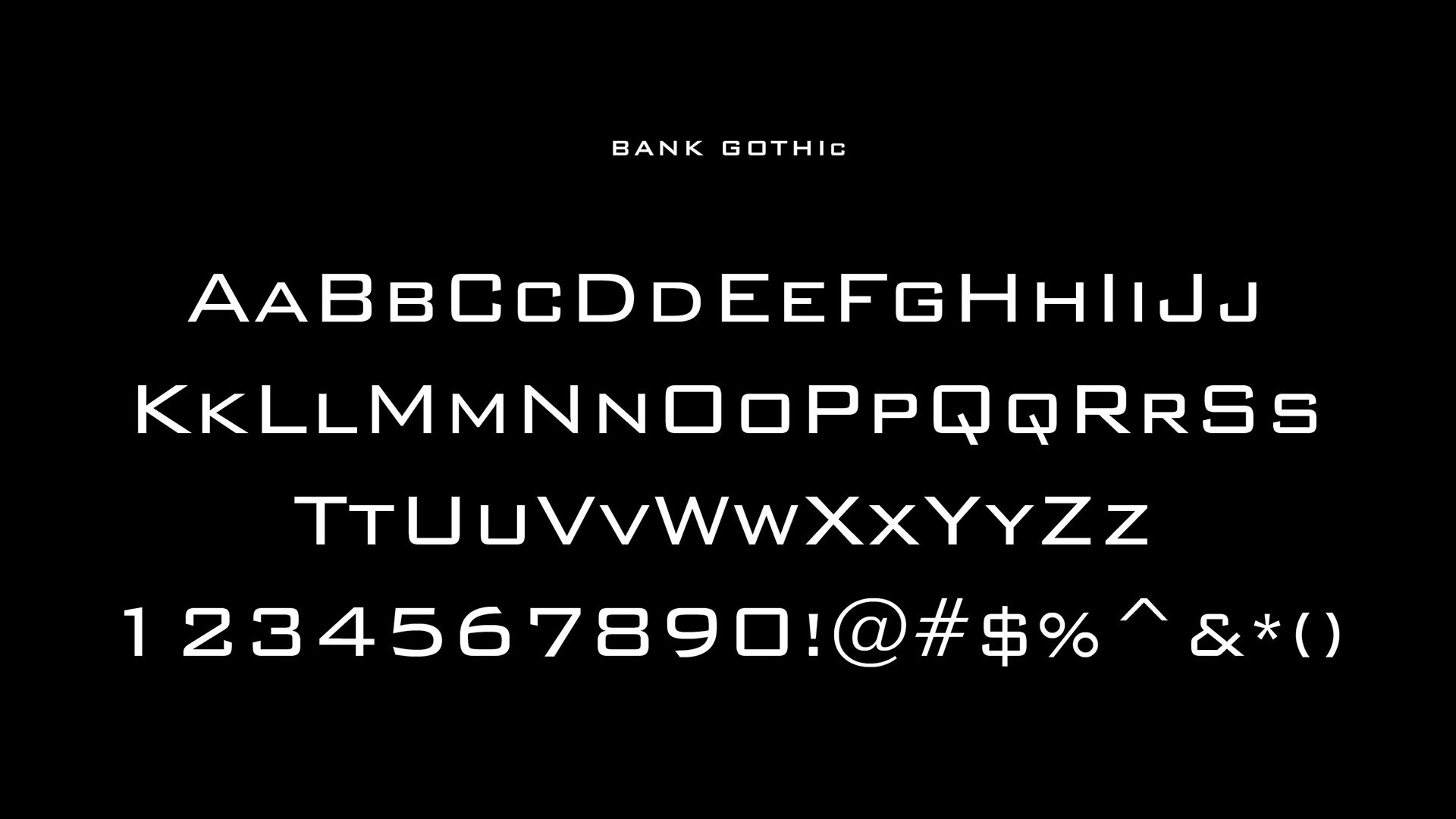
Bank Gothic typography complements the logo’s geometric precision, creating a crisp, modern tone across all communications. A flexible collateral system allowed each property to use the brand in its own way, while maintaining a consistent overarching style.

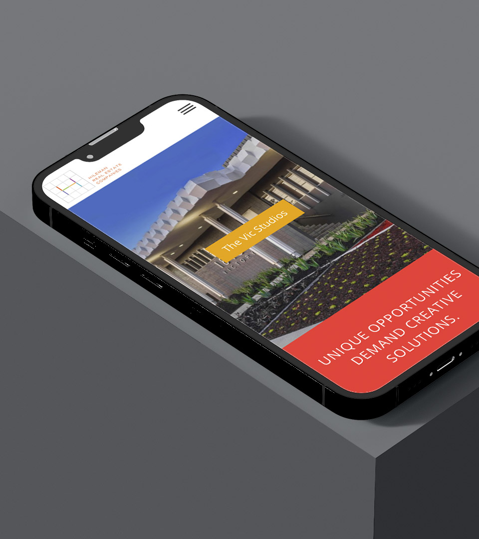
A refreshed website completed the system, organizing Hileman’s portfolio with clarity and impact, making their breadth of work easily accessible to investors, tenants, and partners.

The logo, inspired by an architect’s grid, symbolizes precision and collaboration. It reflects Hileman’s seamless partnerships, uniting diverse elements into a cohesive, dynamic design.

A bold, contemporary palette—orange, yellow, purple, berry, teal, and blue—signals energy and variety while supporting clear property segmentation.

A bold, architectural typeface chosen for its precision and strength, balancing the classical cues of the logo.

Bank Gothic’s geometric forms reinforce the architectural character of the brand and pair seamlessly with the logo’s structured grid.

Business cards featuring the Hileman grid logo and orange accent color.

Business cards and print materials use the grid and color system to create a cohesive, instantly recognizable visual language.

Architectural grid illustration showcasing the logo’s structure.
Interior and exterior photography of Hileman portfolio properties.
hileman real estate companies pitch book pages with orange, magenta and aqua
Brand collateral spread with colorful property sheets in a custom box.

A redesigned website organizes the full portfolio into an intuitive, image-forward interface, making navigation effortless for prospective tenants, partners, and investors.

Website homepage on desktop, displaying categorized property portfolio.

Explore how we've brought other identities to life


Adams Design
20 Park Plaza
Boston, MA 02116

Let's Talk!