This single geometric form anchors the entire brand system while flexing to differentiate each division.
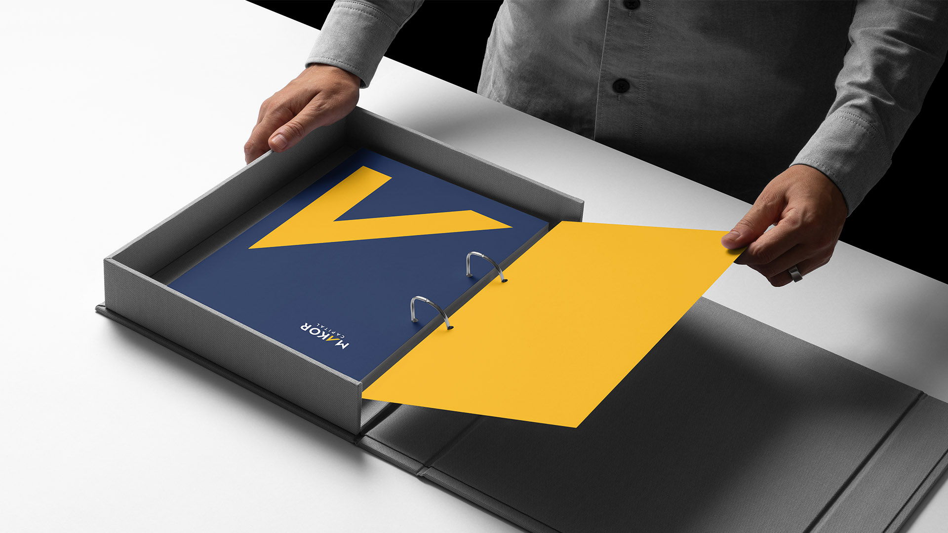
For Makor Capital, a deep navy field and vivid yellow accent express leadership, momentum, and high-level investment thinking.
For Makor Management, a black background and emerald-green stroke communicate operational strength, stability, and long-term stewardship.
The system extends to property-level identities, each adopting the core mark and typography while using custom palettes that reflect the personality of each building.
The result is a clean, scalable architecture that unites the companies under one strong visual language while giving every division—and every property—its own distinct voice.