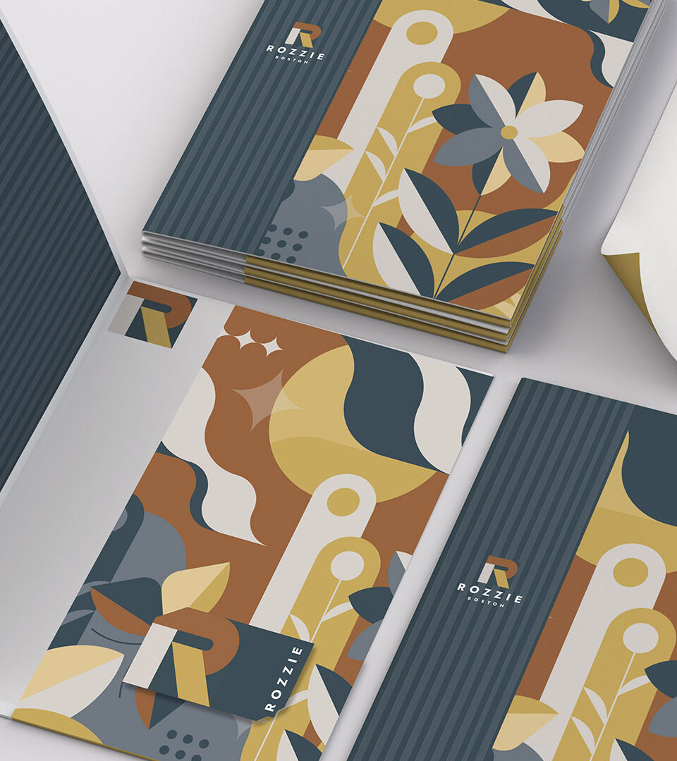
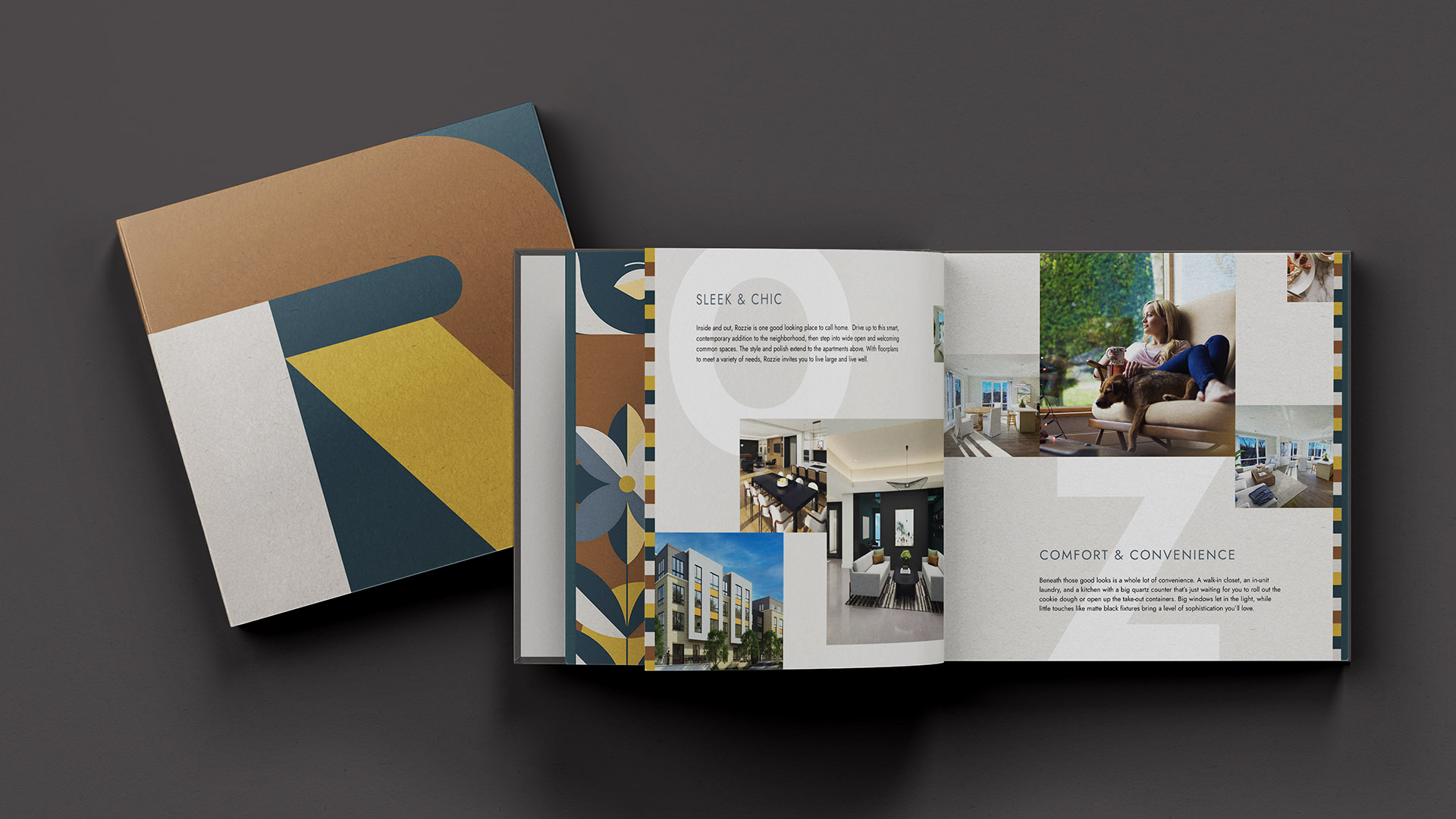
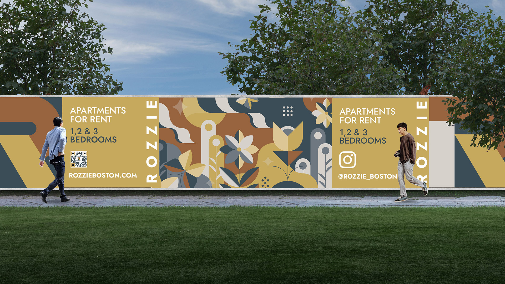
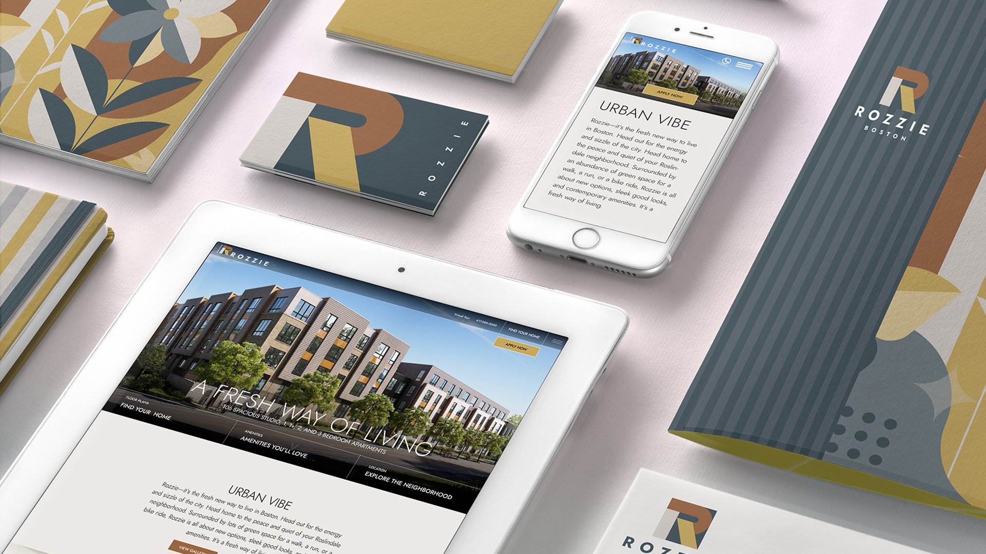
THE SOLUTION
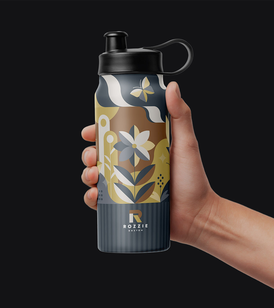
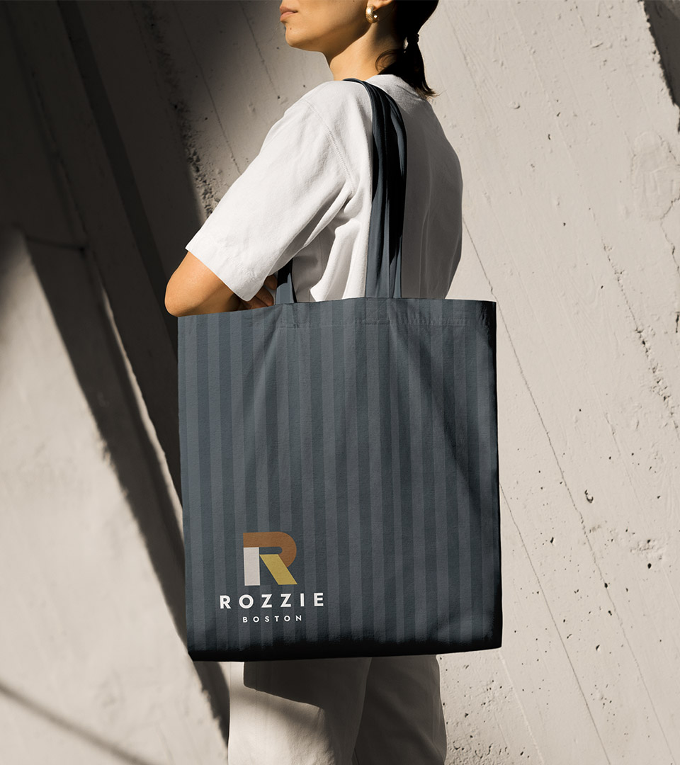
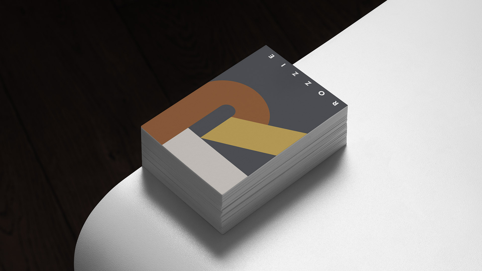
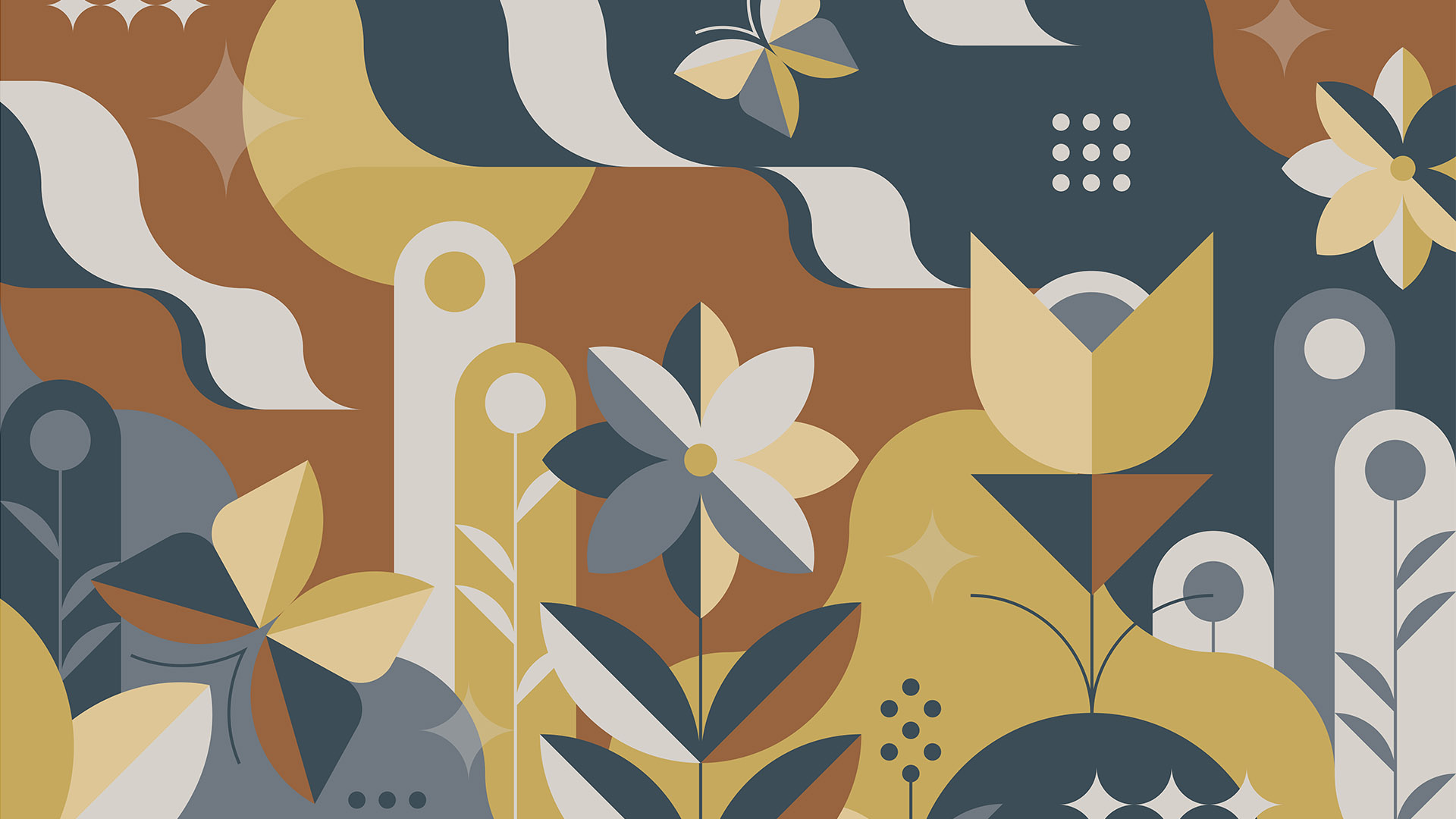
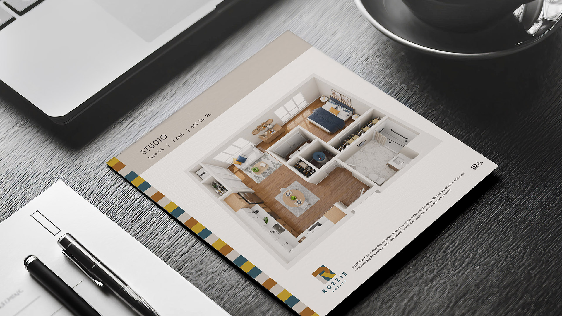
The identity is built around a modular “R” mark—geometric, friendly, and unmistakably tied to the building’s name. The form becomes a flexible graphic device, expanding into a system of patterns and shapes that animate marketing materials without overwhelming them.
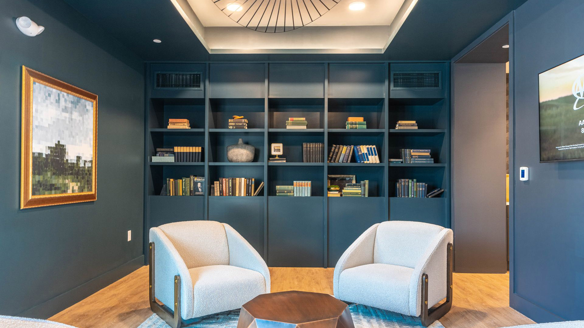
The color palette was developed directly from the interior designer’s material board. By echoing the building’s woods, tiles, fabrics, and accent colors, the identity becomes a natural extension of the interior experience. The palette strikes a balance between neutral foundations and bright, expressive highlights, mirroring the building’s blend of calm and vibrancy.
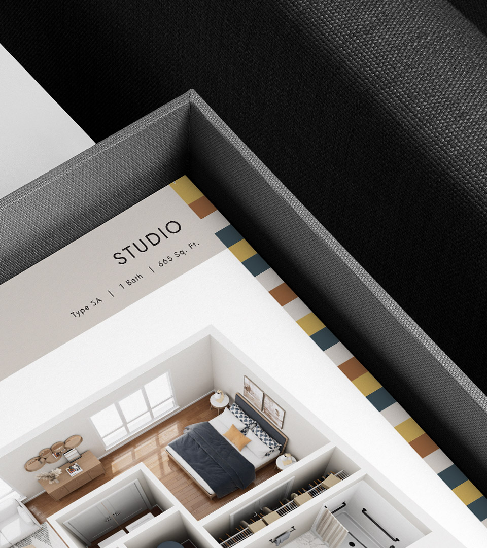
Typography is clean and geometric, supporting the system with clarity and legibility across leasing, signage, and digital use.
The result is a framework that is visually cohesive, easy to deploy, and full of personality—just like the residents it aims to attract.