
About this project
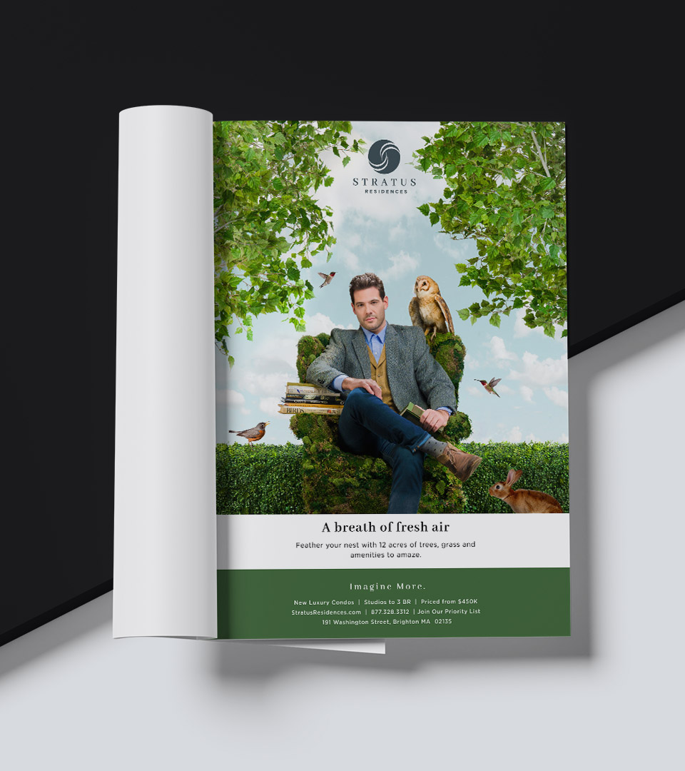
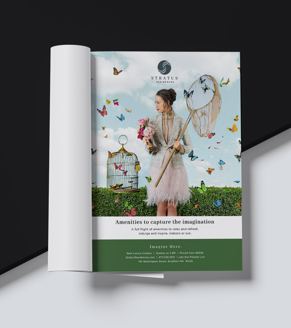
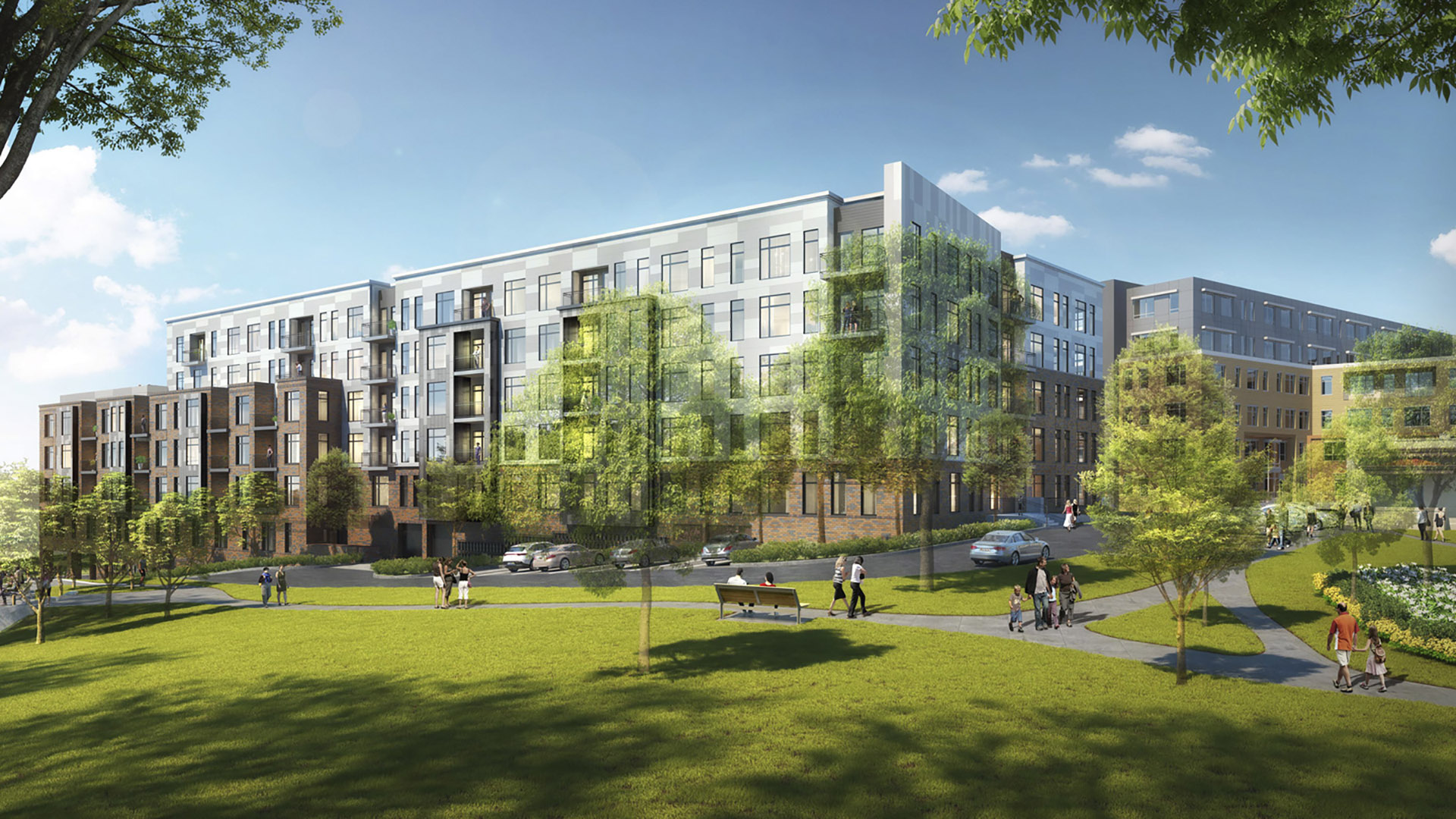
Stratus Residences sits atop rolling hills surrounded by open landscape, an unusually expansive setting for Boston-area condominiums. With panoramic views and 12 acres of green space, the project offered a rare opportunity to build a brand rooted in openness, light, and a strong connection to the natural environment.
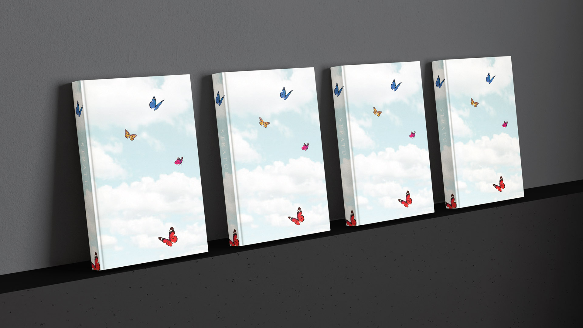
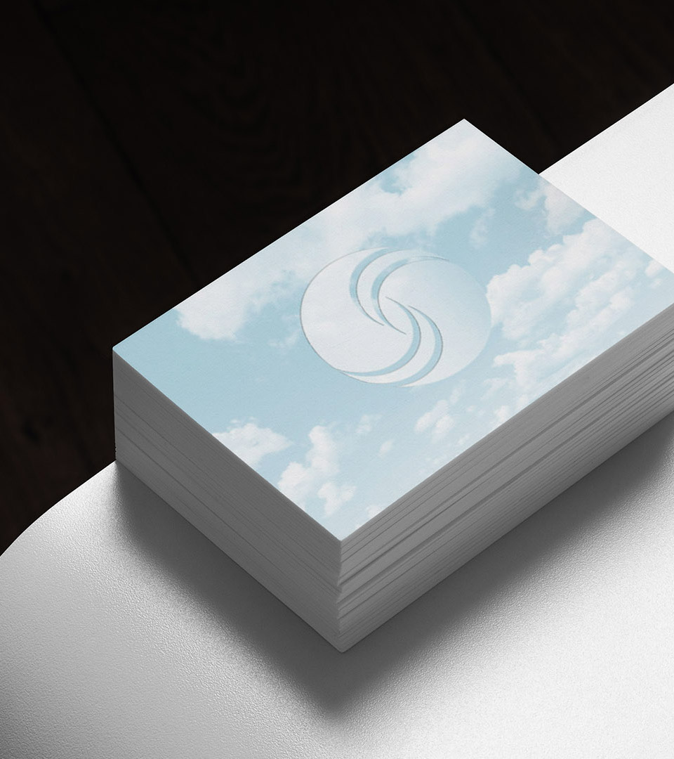
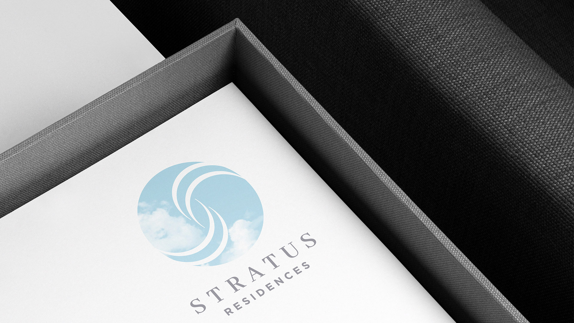
We were engaged to develop the name and full visual identity. The name was Inspired by the ever-shifting formations of the sky, Stratus captures both the lightness of the landscape and the architectural presence of the buildings themselves. The identity translates this relationship between land and sky into a calm, refined visual language that feels elevated without feeling distant.
A flowing “S” mark echoes layered cloud forms, while a nature-driven palette and restrained typography reinforce clarity, balance, and ease. Across print, signage, and digital applications, the system expresses a residential experience defined by openness, quiet confidence, and thoughtful design.
Explore our approach to Naming, Placemaking and Brand Identity for residential and mixed-use environments.