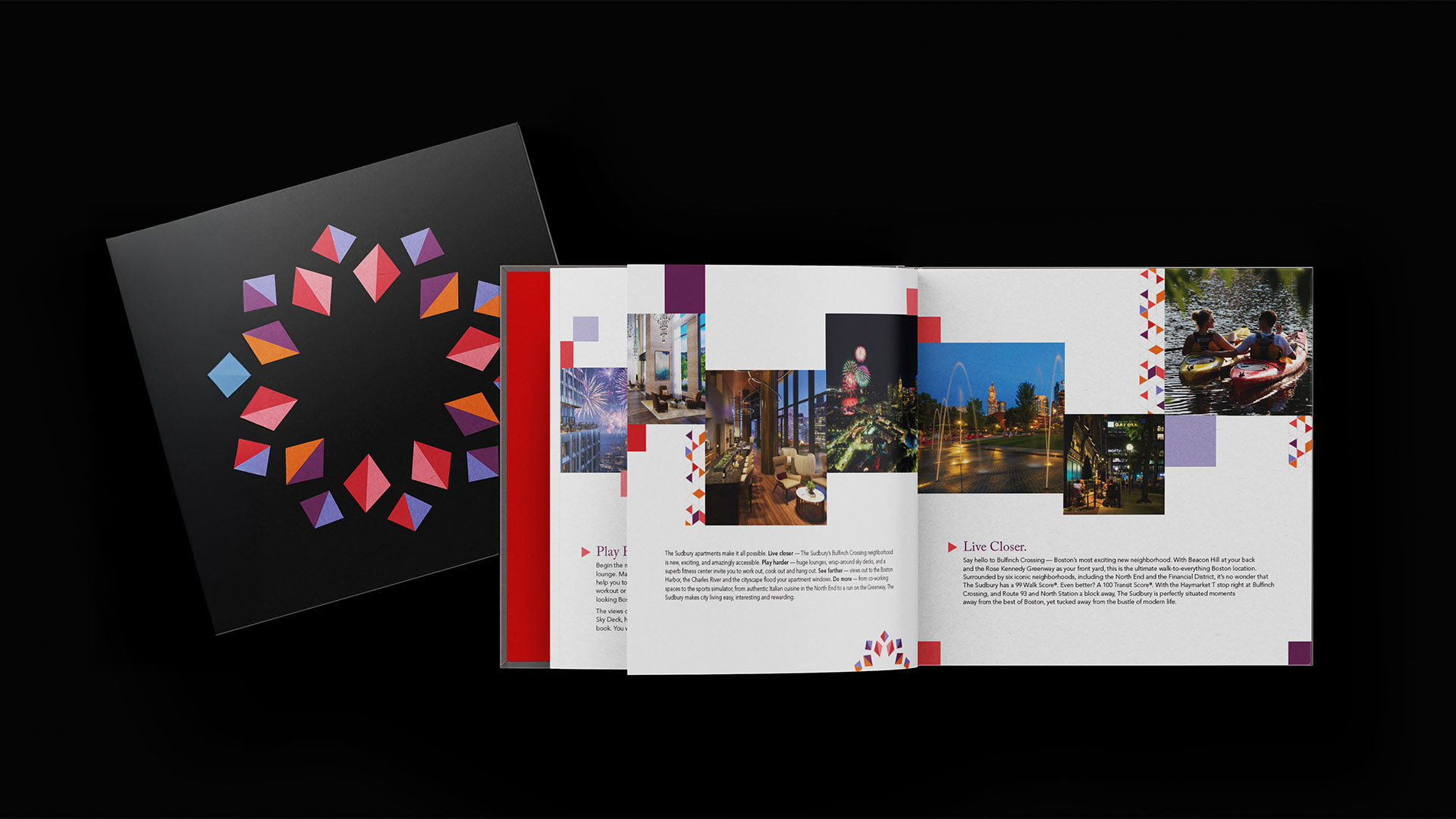
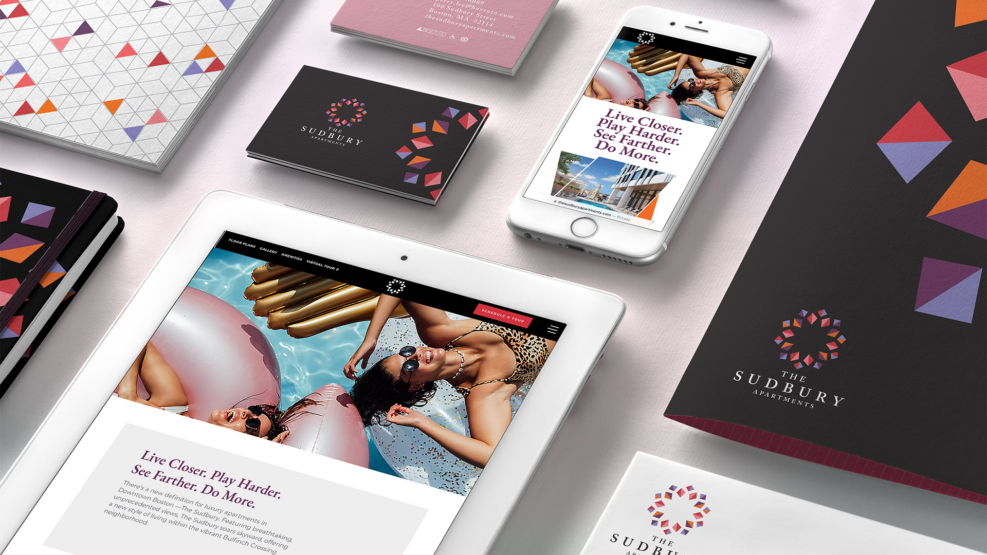
THE SOLUTION
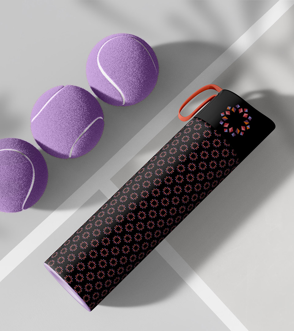
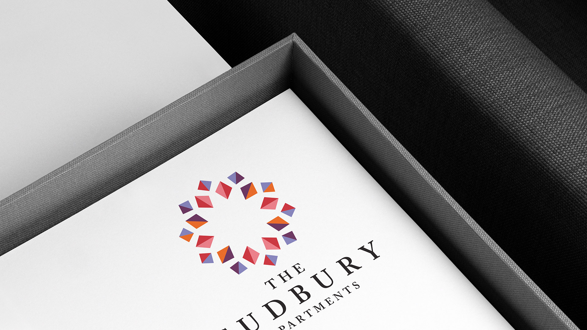
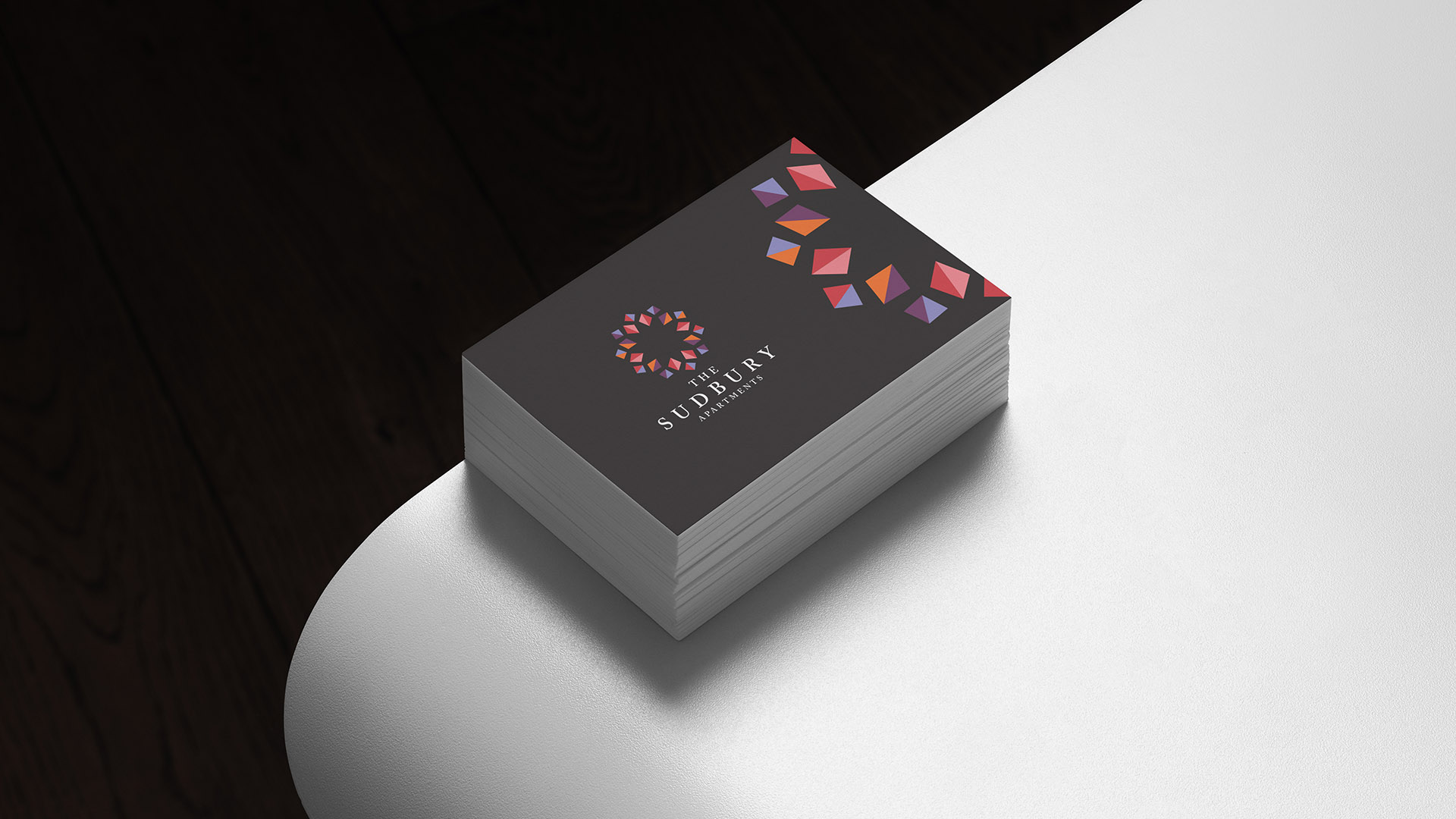
We developed a vibrant visual system inspired by the diversity and movement of the neighborhood—expressed through a kaleidoscope graphic language and a bold palette of orange, pink, red, and periwinkle. The identity conveys momentum and creativity, appealing directly to young renters working in nearby tech, biotech, and financial districts.
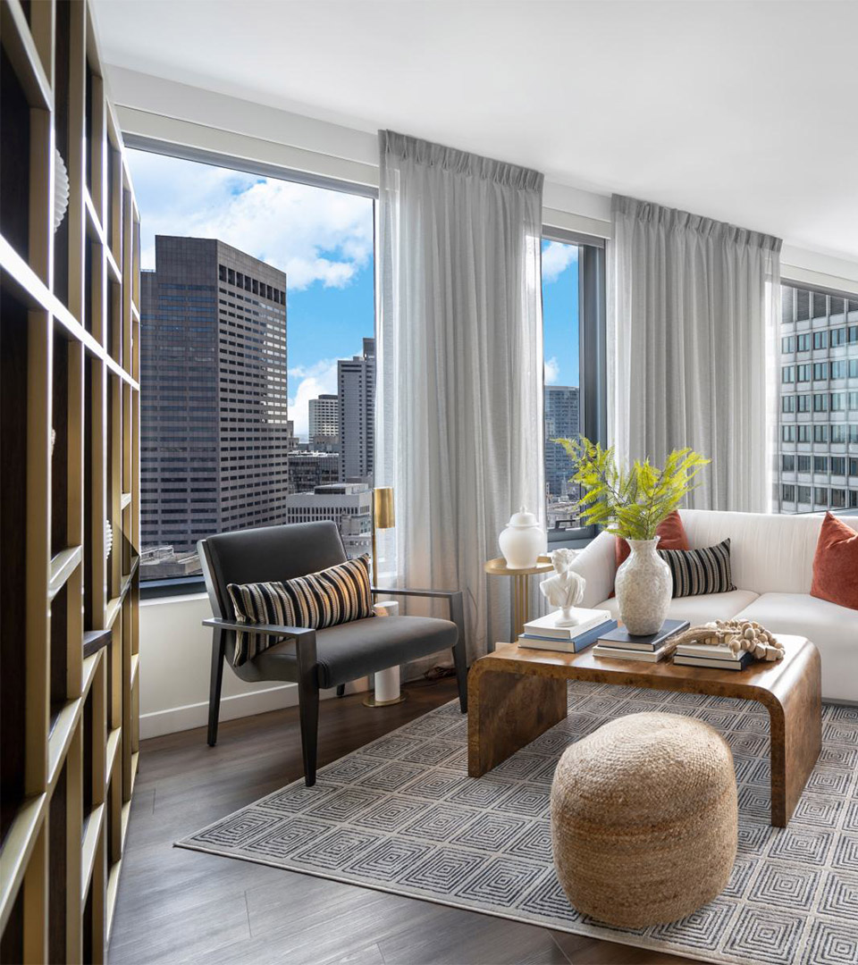
Placemaking informed much of the design direction. By highlighting the walkability, transit access, and nearby cultural districts—including the North End, Beacon Hill, and the West End—the brand positions The Sudbury Apartments as the center of an emerging, highly connected neighborhood.
Marketing materials, leasing collateral, and advertising use expressive layouts, lifestyle imagery, and energetic typography to reflect the building’s amenities and the area’s 24/7 vitality. Clear messaging and playful tone bring personality to the brand while maintaining a modern, polished look.