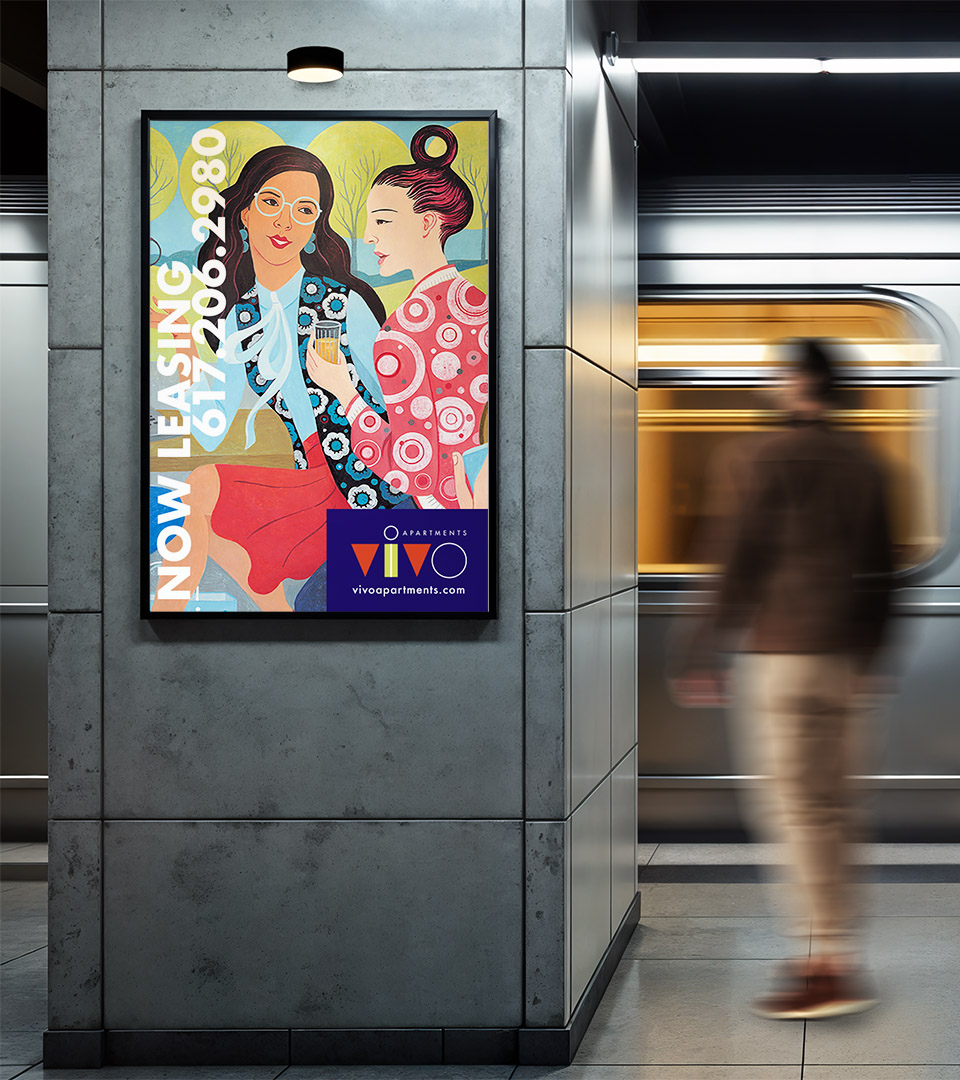
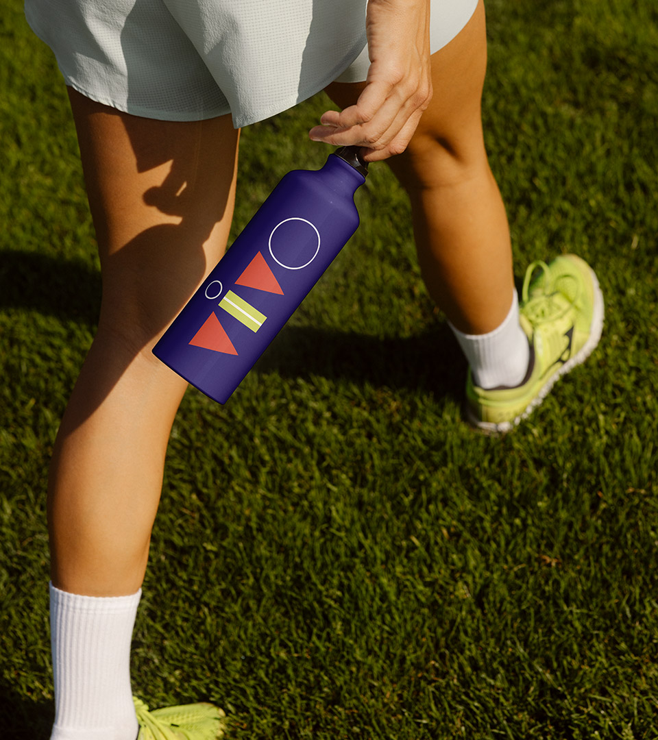
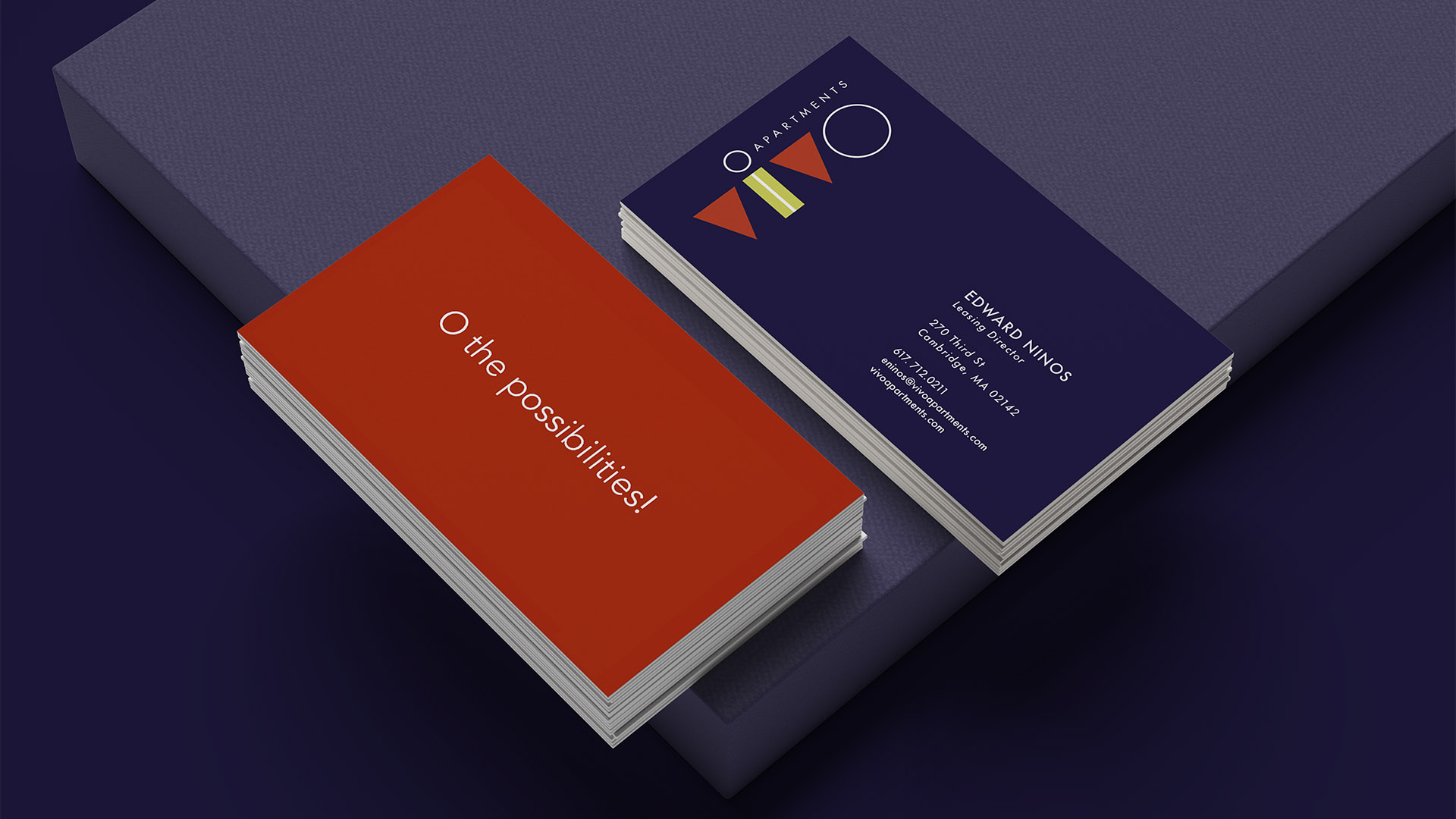
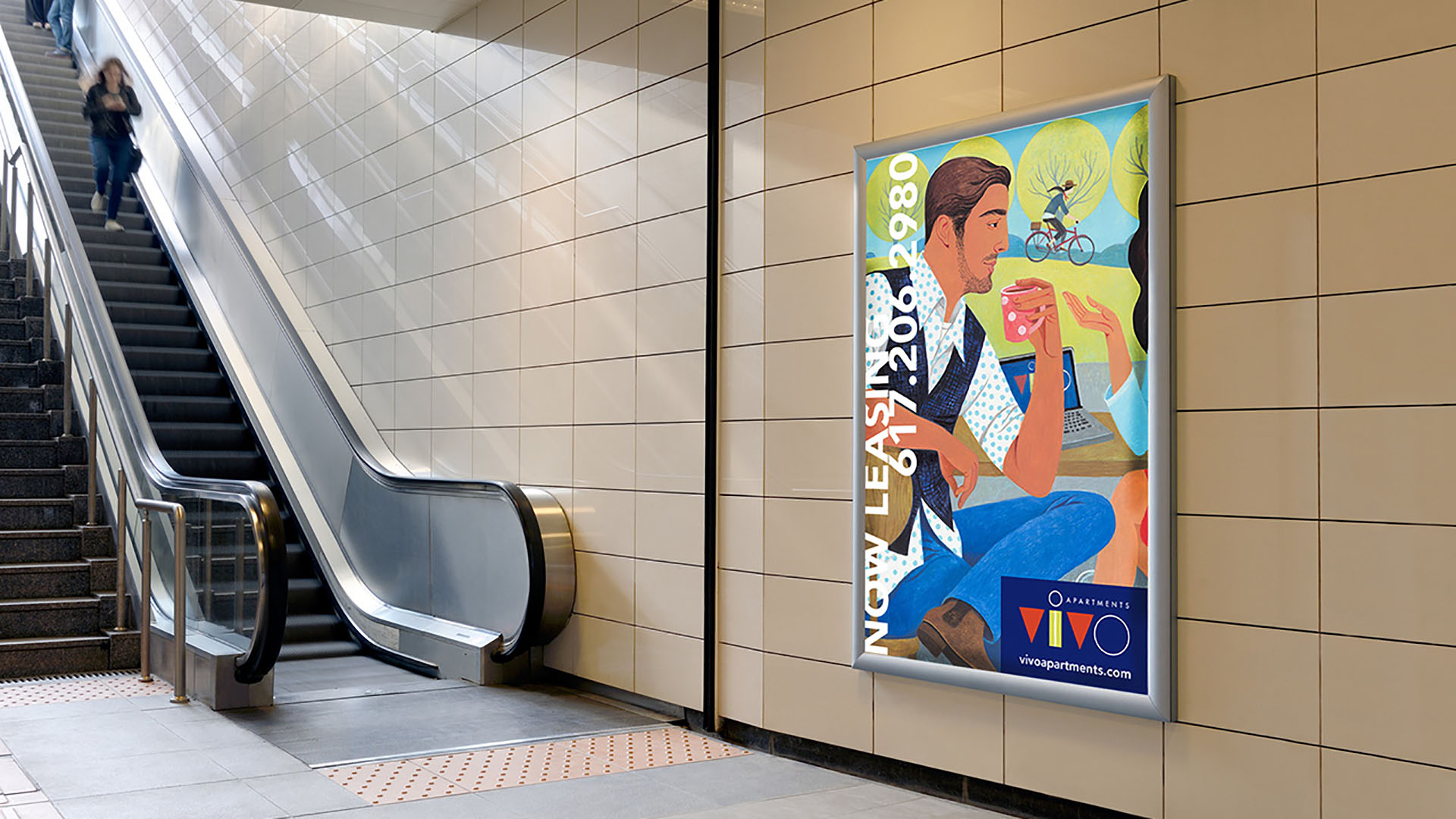
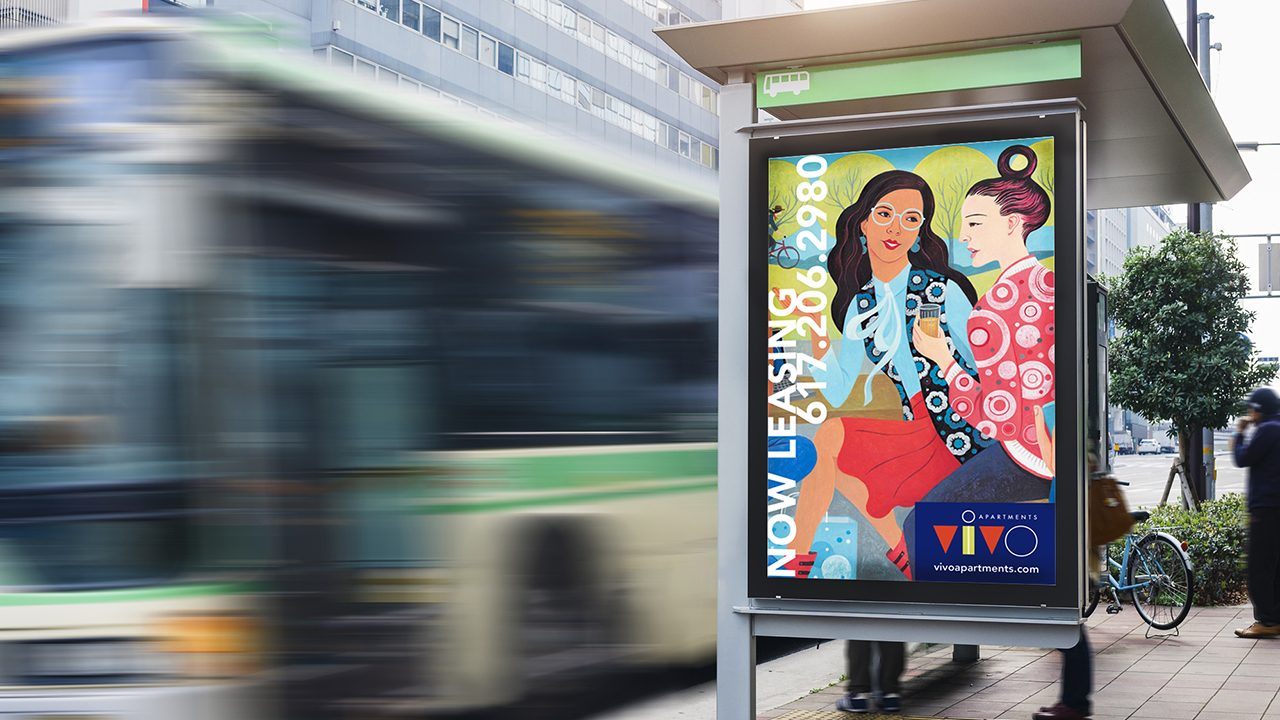
Vivo Apartments

Brand identity for Cambridge, MA apartments

We partnered with Aimco to create the name, logo, tagline, and brand graphics for ViVO Apartments—an energetic residential community in Cambridge designed for millennial professionals working in biotech. The identity captures a modern, youthful spirit with bold color, expressive type, and lively illustrations that reflect the vibrancy of the neighborhood and its residents.

Client
Aimco
Industry 
Residential Real Estate
Services 
Brand Strategy, Brand Identity, Visual System, Advertising, Print, Signage, Website
ViVO Apartments logo with bold, modern brand identity design.
Our naming strategy focused on bridging the biotech context with Millennial sensibilities. Vivo, meaning ‘life’ and echoing lab vernacular, proved both authentic and memorable.

The Challenge

ViVO needed a brand that would resonate with young biotech and tech-focused renters in a competitive Cambridge market—something modern, upbeat, and distinctive.

The Solution

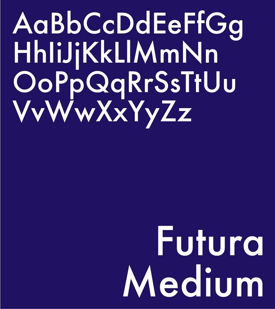
We developed a full identity system including naming, tagline, logo, and graphic elements built around bold color, geometric forms, and dynamic illustrations. The visual language brings a fresh, contemporary feel to signage, print, and environmental applications.

ViVO Apartments logo with bold, modern brand identity design.

The logo uses the shapes of medical flasks and beakers as an inspiration for the logo.

vivo apartments fonts on dark purple
vivo apartments fonts on yellow

Futura’s clean, geometric forms echo the bold shapes of the Vivo logo, reinforcing its modern, playful, and architectural character.

The color palette uses bold orange-red, vibrant chartreuse, crisp white, and deep navy to create a bright, fresh, attention-getting identity.

Colorful geometric illustration used in ViVO Apartments brand system.
vivo apartments logo vertical

With bold patterns and adaptable logo positioning, the brand was able to evolve and extend across a wide range of applications.

Print collateral for ViVO Apartments showcasing the brand’s bold color palette and graphic elements.
vivo yoga matt and bag vertical

Award-winning illustrator Jody Hewgill developed a painting that captured the energy and lifestyle of the building as well as the international nature of the target audience.

The tagline’s O becomes a defining element, repeated through the illustration patterns to anchor the brand’s visual language with clarity and intention.

ViVO Apartments tagline graphic reflecting youthful, energetic branding.
vivo building siganage with man in subway
The logo uses bold orange-red, vibrant chartreuse, crisp white, and deep navy to create a bright, fresh, attention-getting identity that echoes the playful, geometric shapes inspired by medical flasks and beakers.
Exterior signage for ViVO Apartments featuring the modern identity system.
The brand positioned ViVO as an energetic, standout residential offering in Cambridge—strengthening its appeal to millennial renters and creating a cohesive, memorable presence across digital, print, and onsite experiences.


Adams Design
20 Park Plaza
Boston, MA 02116

Let's Talk!