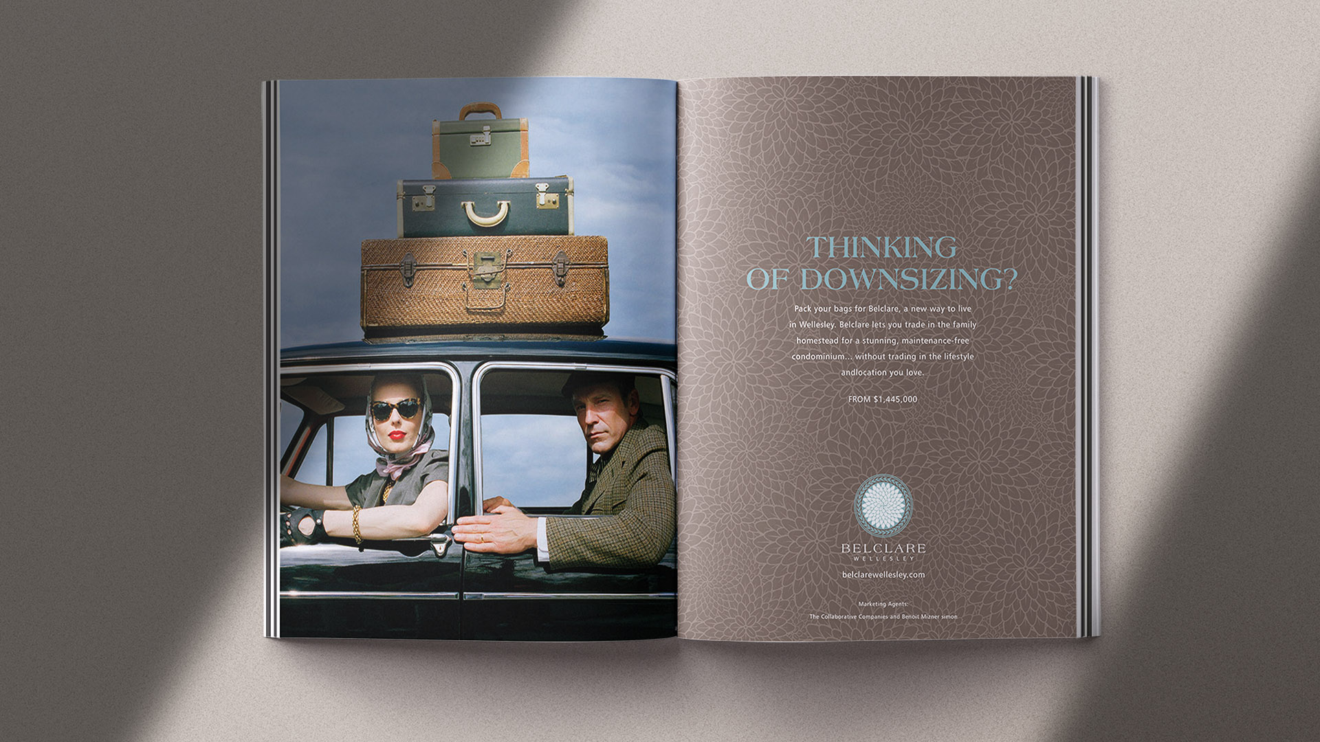
The western suburbs’ first condominium residences with a level of luxury, convenience, and exclusivity comparable to downtown Boston offerings, Belclare offered a refreshing change. Working with developer, The Noannet Group and TCC for sales and marketing, we promoted the project with print ads, signage, website, events, newsletters and direct mail. The 25 residences sold out within 6 months.
Brand Strategy
Naming
Identity
Advertising
Print
Signage
Website
The Garden Court served as the central inspiration for the identity. Drawing loosely from 18th-century floral motifs, we designed a custom mark that feels rooted in history yet fresh and timeless. Subtle neoclassical influences reference the building’s architectural details, creating a sophisticated visual connection between past and present. The result is a brand that feels elegant, restrained, and authentic to its environment.
A refined serif typeface was chosen for the wordmark, referencing classical inscriptional lettering but with clean, contemporary detailing. This pairing of tradition and modernity reinforced the brand’s positioning as both elegant and forward-looking.sult is a brand that feels elegant, restrained, and authentic to its environment.
Pantone Warm Gray 10
Pantone 5503
Pantone 543
Pantone Warm Gray 1
The Belclare Wellesley identity extended beyond marketing collateral into the interior and exterior signage, ensuring a seamless brand narrative from first impression to final walk-through. This holistic approach created a sense of place and exclusivity that resonated with the property’s target audience of discerning homeowners.
We turned to renowned photographer Rodney Smith to help us curate one of his existing provocative photographs for use in our campaign. The line used often in real estate became the base of a campaign that was hugely successful; all 25 condos sold out within six months.
To enhance the tactile experience, we used richly textured, high-quality papers and printing techniques such as embossing and spot varnish on key pieces like presentation folders and stationery. These subtle production details gave the materials a sense of weight and importance—communicating luxury without ostentation.