About this project
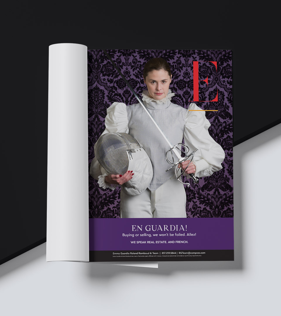
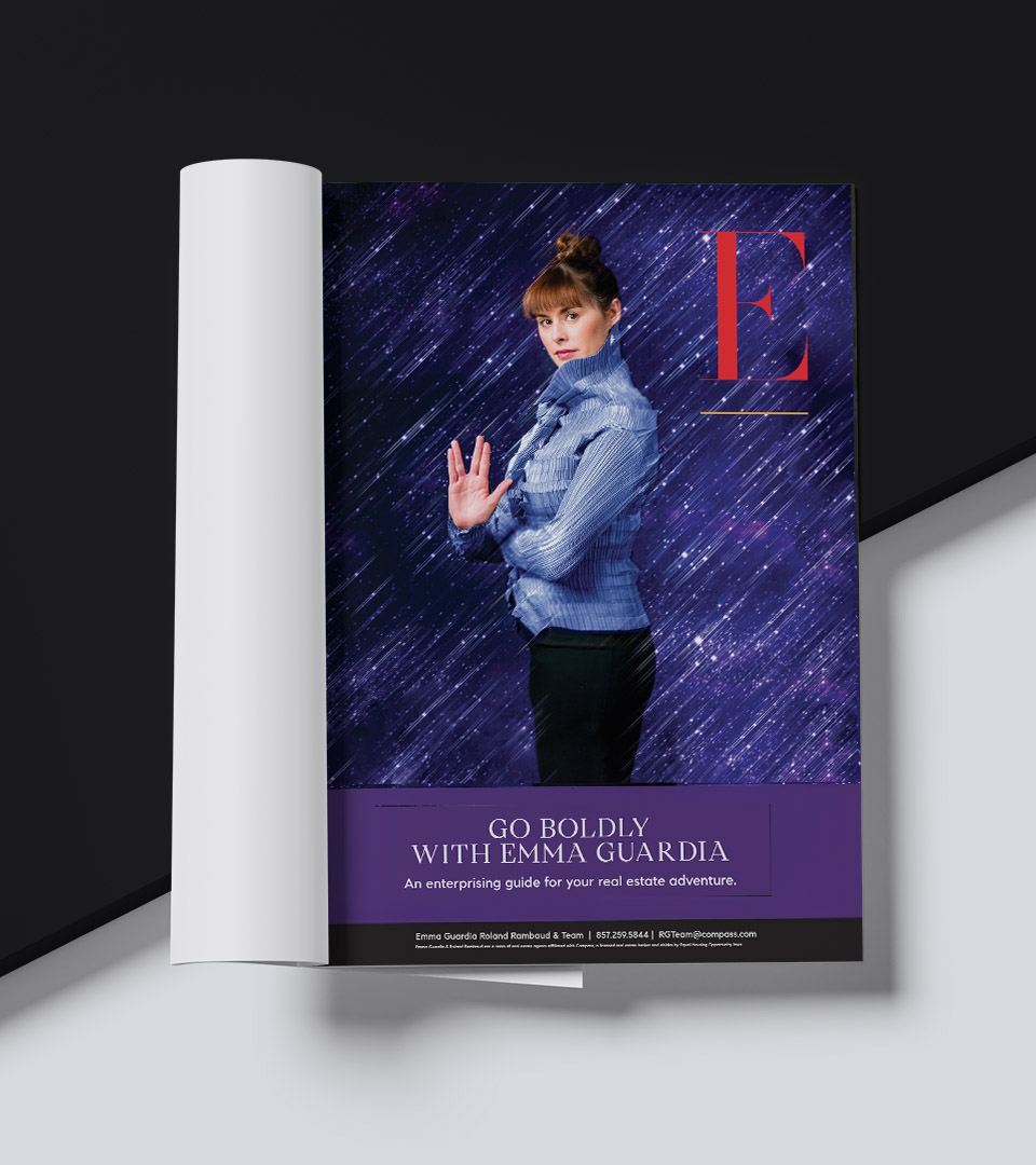
The Emma Guardia Team is a Millennial-led real estate group redefining how homes are bought and sold in Cambridge and greater Boston. In a market crowded with templated marks and generic lifestyle imagery, the brand needed a visual language with clarity, confidence, and immediate recognition.
We centered the identity on a single, unmistakable idea: the letter E. Drawn as a bold, architectural form, the mark is simple, reductive, and designed to read instantly at street scale. A restrained palette of red, black, and white reinforces precision and confidence, allowing the identity to feel graphic, modern, and highly legible across environments.
Rather than relying on conventional real estate photography, the campaign uses conceptual portraiture to make the agent the brand. Stylized portraits of Emma, paired with short, declarative language, create a system where logo, typography, and imagery work as one. The result is a brand that replaces cliché with personality and positions Emma Guardia as both subject and signature.