About this project
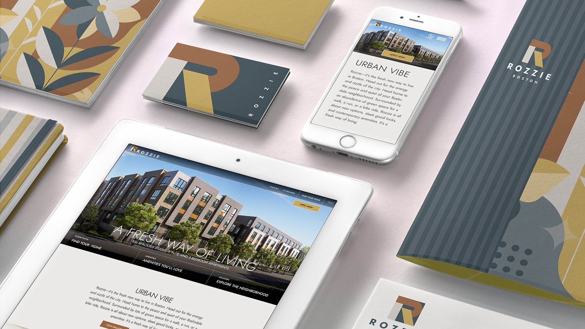
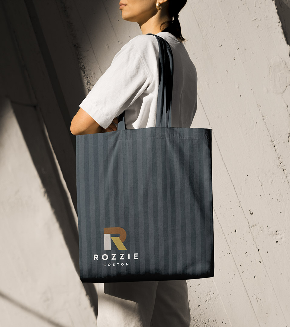
Rozzie is a new apartment community in Roslindale designed to feel local, approachable, and unmistakably of its neighborhood. As one of the area’s few modern residential buildings, the brand needed to speak to a wide mix of renters, young professionals, families in transition, longtime locals, without feeling generic or developer-driven.
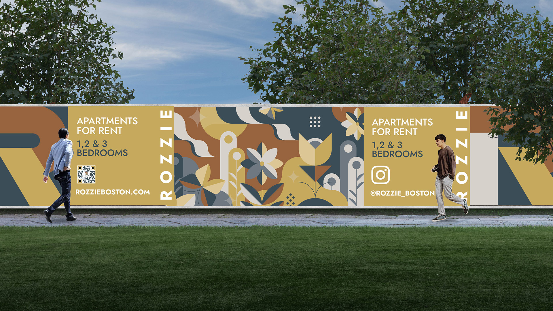
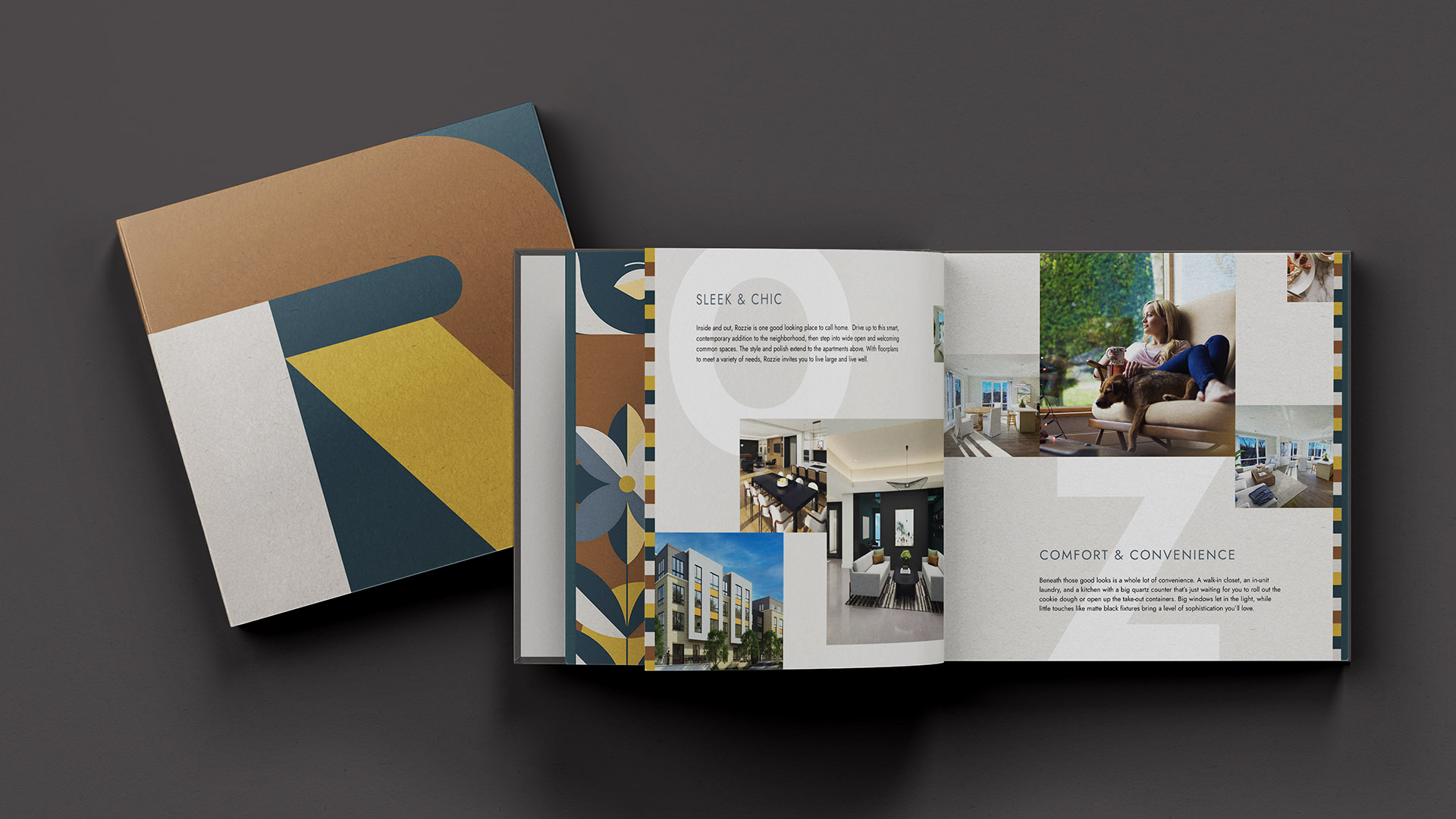
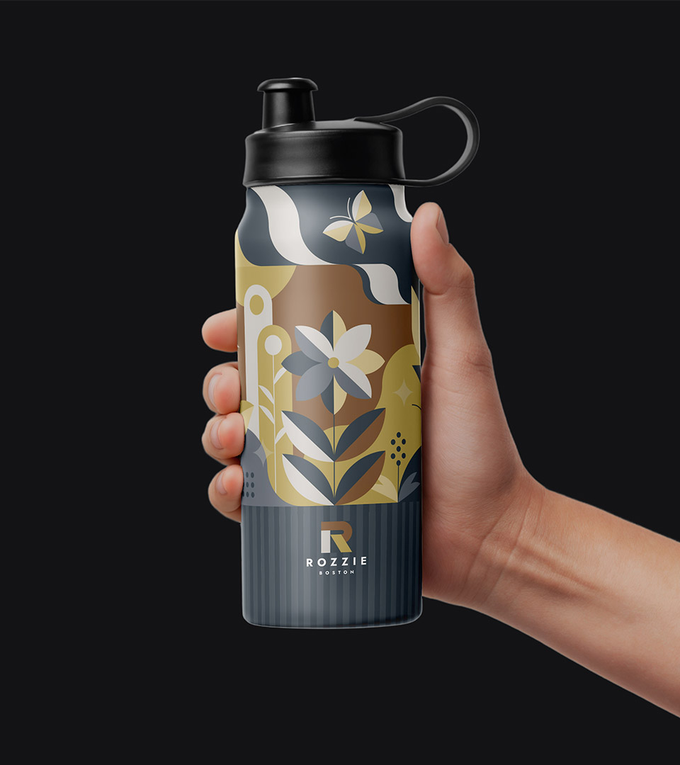
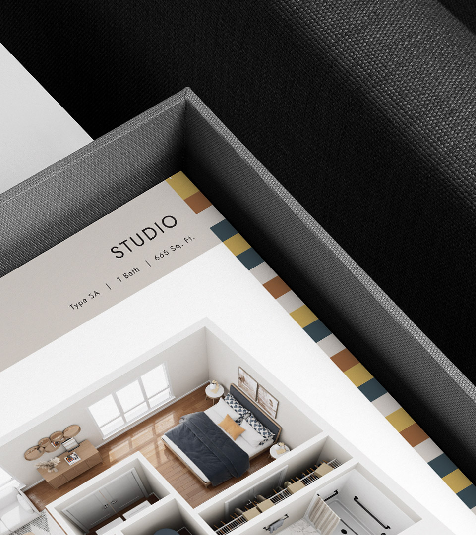
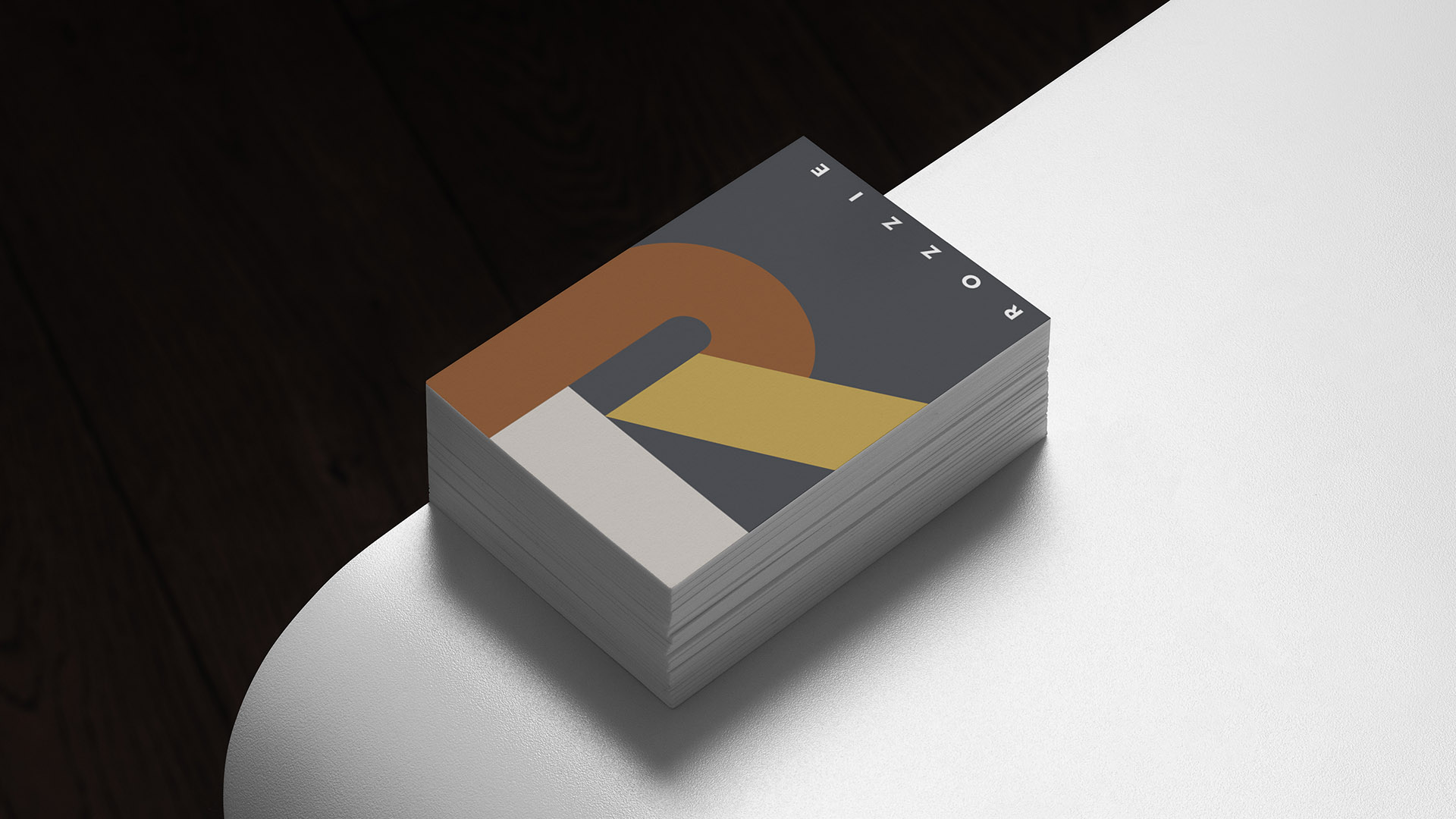
We built the identity around the name itself: Rozzie, a familiar nickname that carries instant warmth and recognition. The logo’s modular “R” is constructed from stacked geometric forms, reflecting the neighborhood’s diversity, layered character, and sense of movement. A grounded palette drawn from the building’s interiors, deep blues, warm golds, and earthy neutrals, creates continuity between brand and place.
Illustration and messaging reinforce Roslindale’s balance of city access and green space, positioning Rozzie as modern, welcoming, and rooted in community rather than trend.