Featherwinds

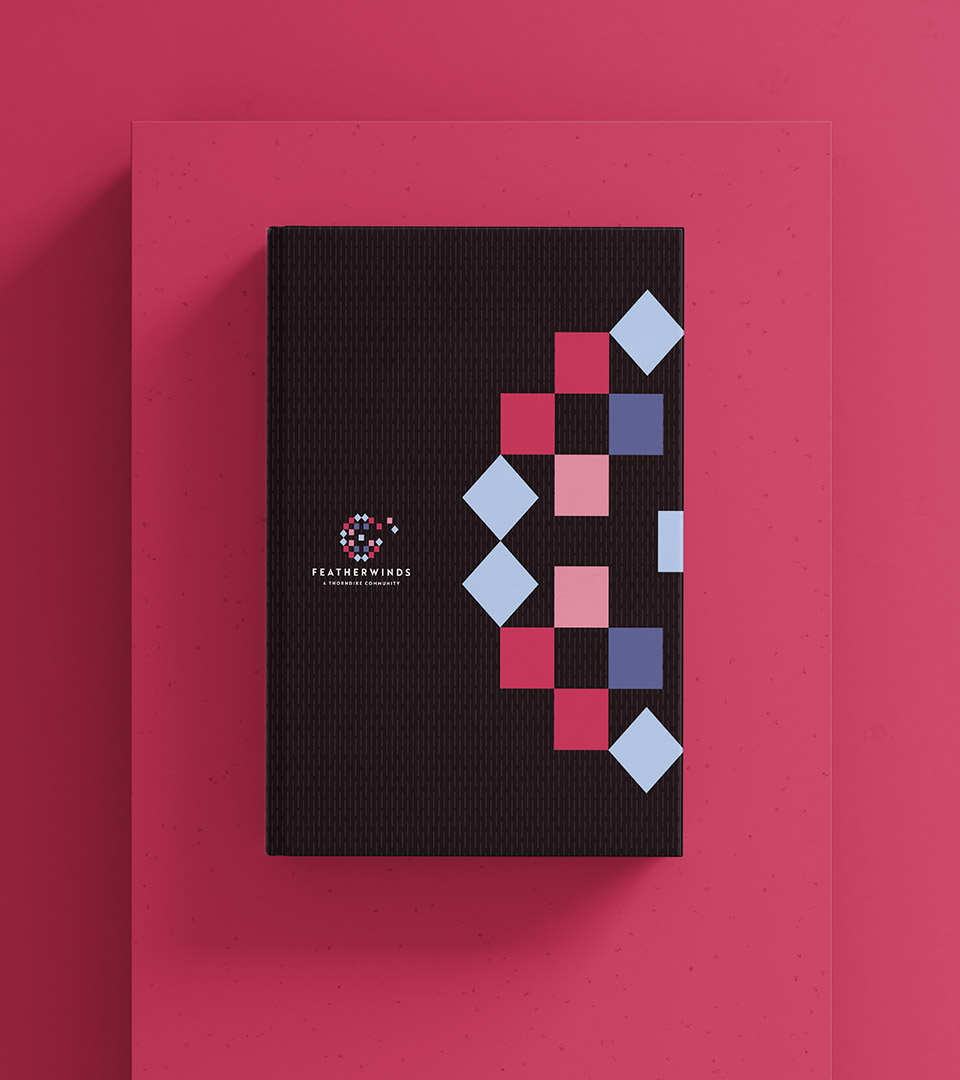
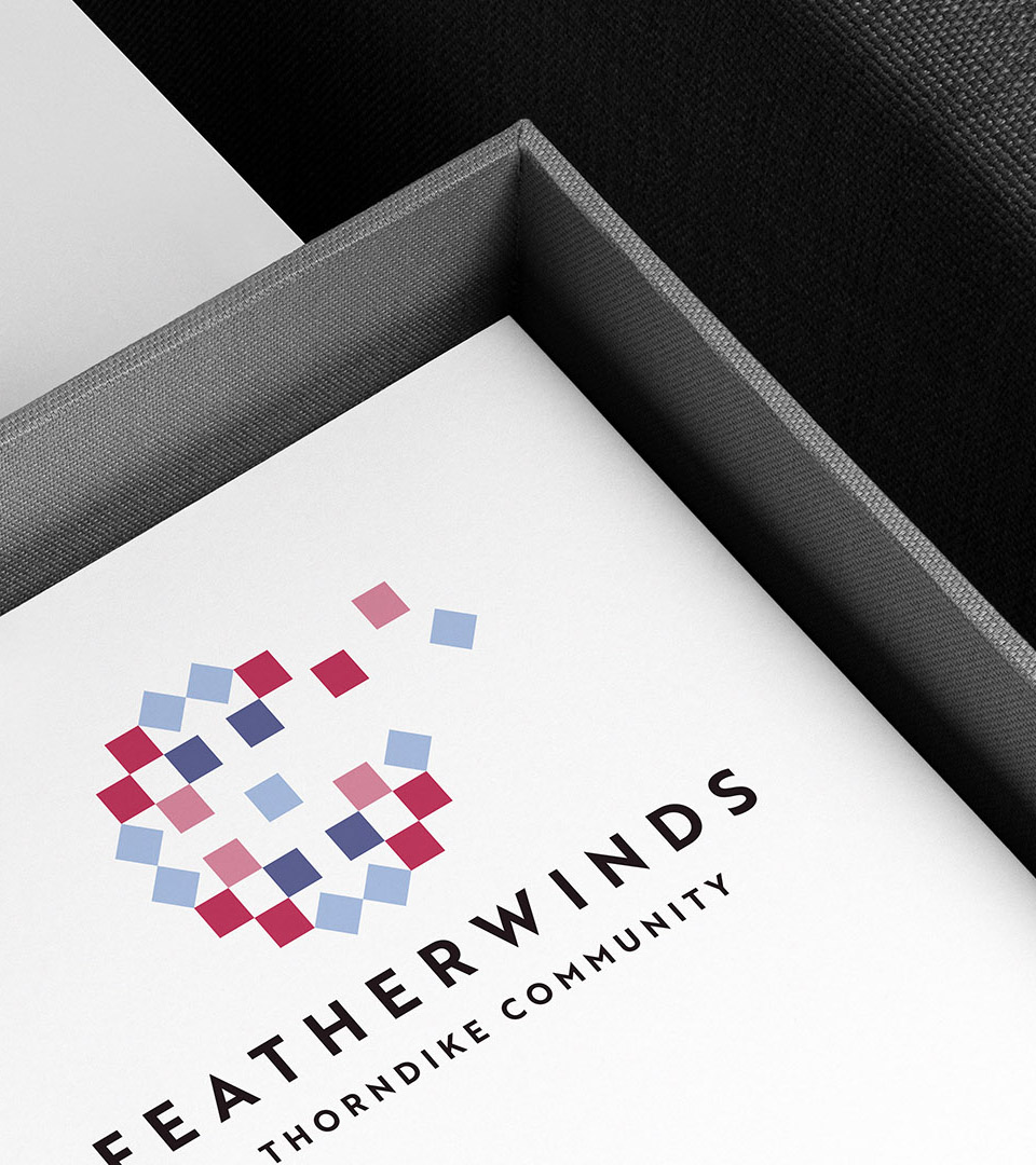
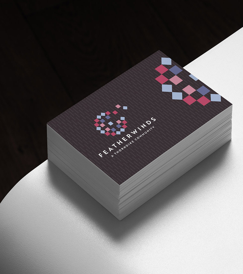
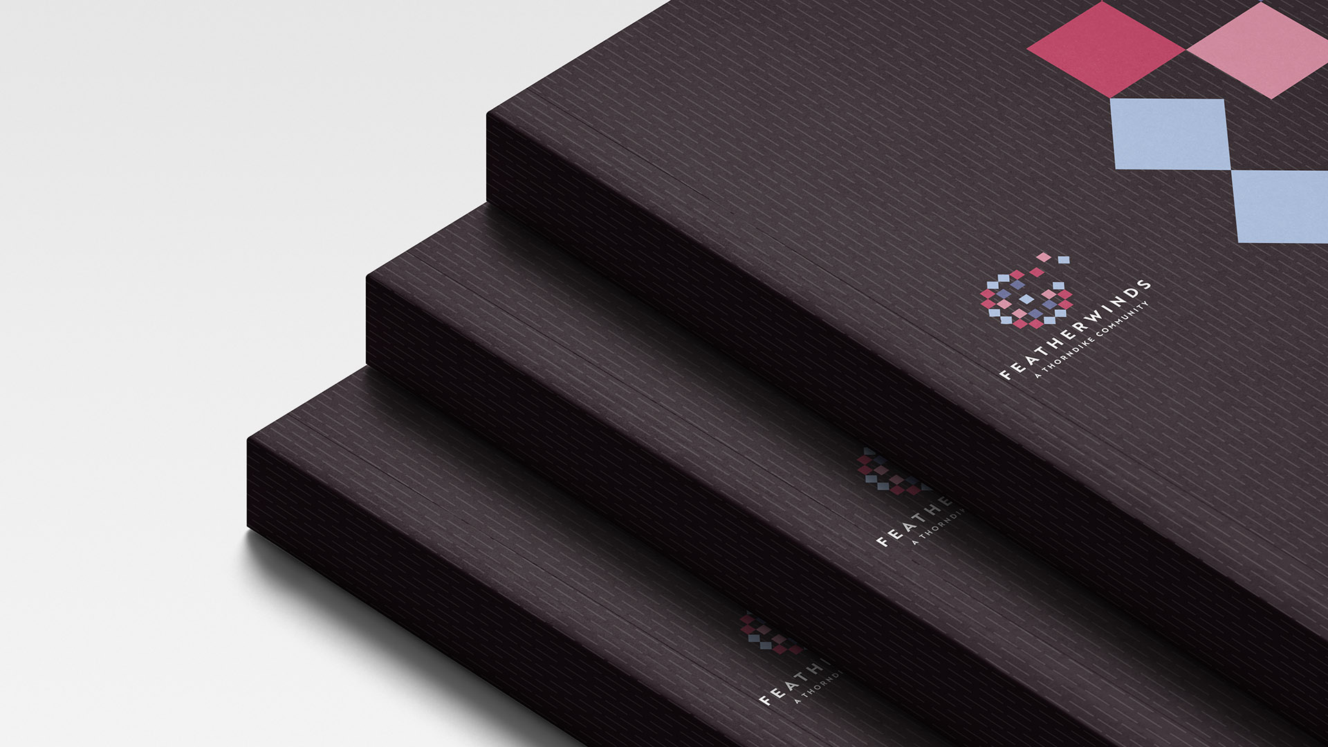
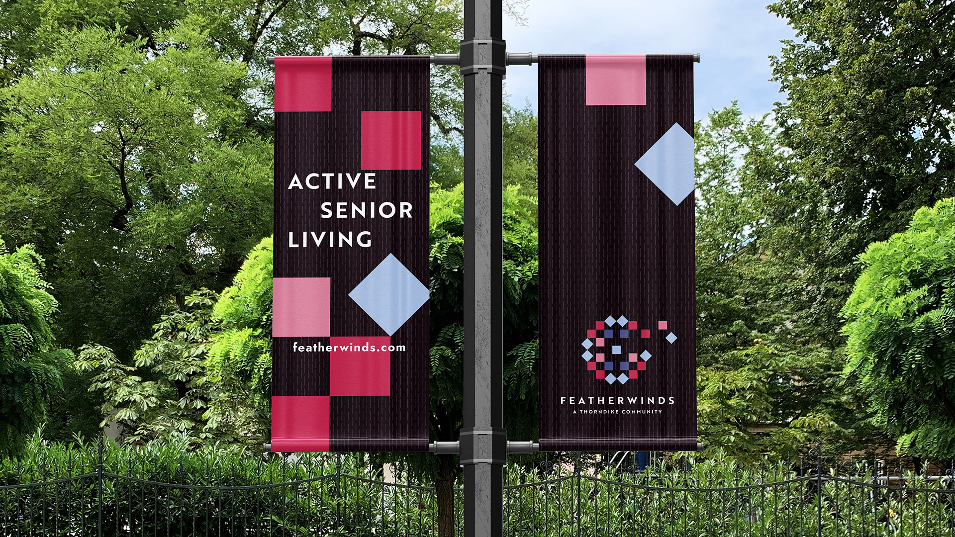
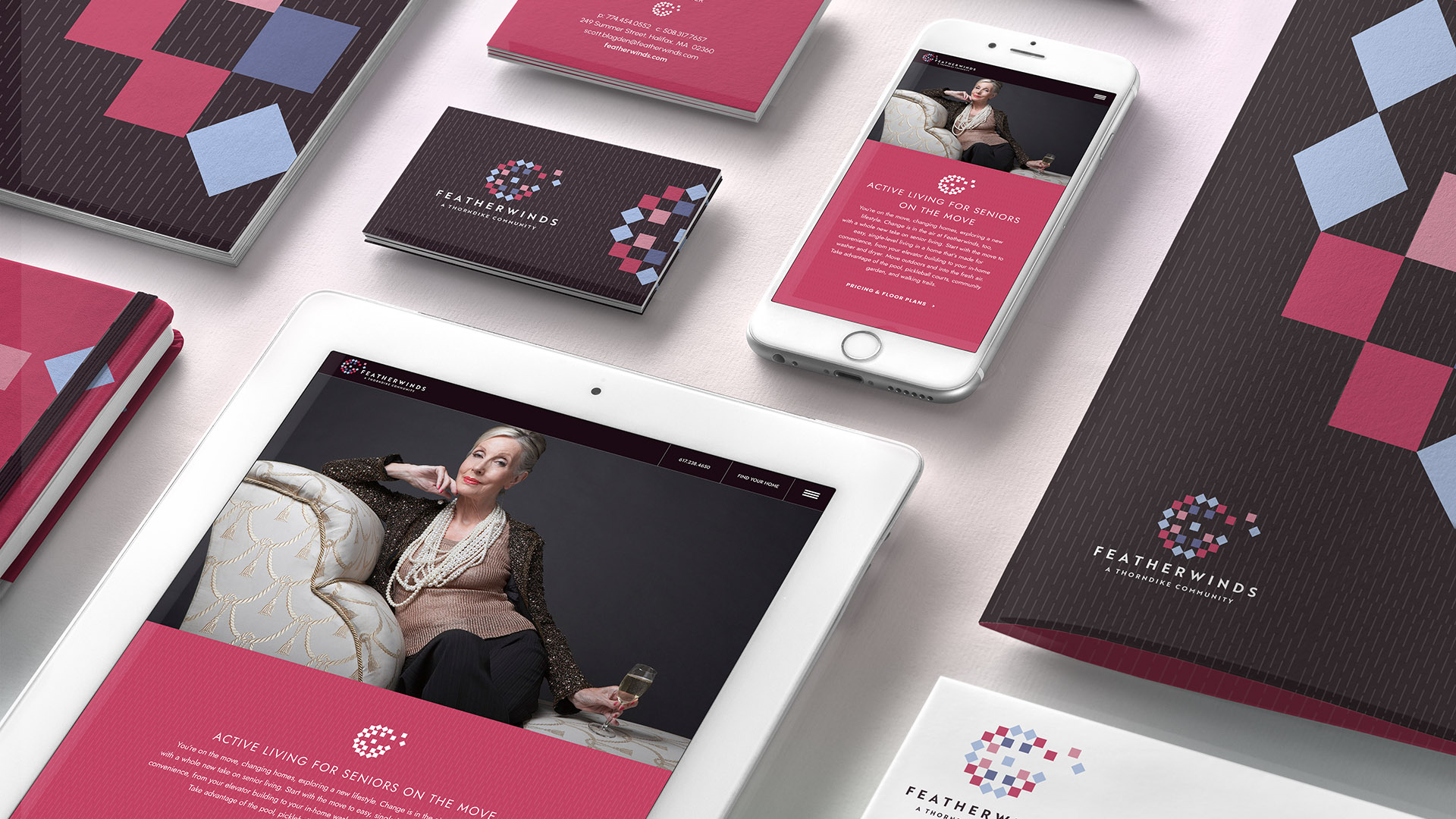
Creating a serene, uplifting brand identity for a countryside senior living community

We created the name and brand identity for Featherwinds, a senior living community designed around serenity, freedom, and effortless transitions. Inspired by the surrounding countryside, the identity expresses lightness, comfort, and a life lived with ease.

Client
Thorndike Development
Industry 
Senior living / residential community
Services 
Naming, brand identity, logo system, visual storytelling, messaging, placemaking
Quilt-patterned Featherwinds brand book designed for a countryside senior living community, highlighting the warm, handcrafted visual identity.
Featherwinds brand book with geometric quilt motif and textured black cover, showcasing the visual identity for the senior living community.
Our naming for Featherwinds was an inspired reflection of the tranquility of country living, the promise of progress, the strength of community, and the liberation found as senior adults streamline their lives.

THE CHALLENGE

The brand needed to appeal to seniors and families seeking a calm, reassuring environment—without leaning into dated or clinical visual cues. The challenge was to create a modern identity that felt warm, uplifting, and rooted in the traditions of rural American life.

THE SOLUTION

The Featherwinds identity draws from two symbolic artifacts: the quilt and the dandelion.

  • Quilt patterns — representing home, care, and shared craft — form the geometric foundation of the logo and brand pattern.

  • The dandelion motif introduces a sense of movement and airiness, symbolizing breezes, growth, and the freedom that defines life at Featherwinds. 

A soft, countryside-inspired palette supports this storytelling, while a subtle quilt-stitch background texture adds a quiet, historical reference without overwhelming the design.

For the digital experience, we created an elegant online showcase featuring floor plans and renderings — allowing prospective residents and families to explore the community with clarity and calm. 

The result is a gentle, uplifting identity that balances tradition with modern simplicity, giving Featherwinds a distinctive and emotionally resonant presence.

Quilts are a patchwork of American rural life—symbols of home, comfort, and shared craft. The dandelion lifts the story upward, evoking breezes, growth, and the spirit of Featherwinds.

Featherwinds typography showing the bold Brother 1816 headline paired with the light, modern Avenir typeface used for the senior living community’s brand system.

A harmonious blend of common quilt colors brings softness and approachability to the identity.

Subtle quilt-stitch background pattern used in the Featherwinds branding to reference tradition and handcrafted detail.

The background features a quiet, quilt-inspired stitch pattern—subtle texture that nods to tradition without distraction.

Quilt-inspired geometric artwork representing the Featherwinds senior living brand, symbolizing home, comfort, and rural craftsmanship.
Branded business card for Featherwinds senior living community showcasing the quilt-inspired logo and modern visual system.

The logo extends across the all marketing materials and signage, creating a calm, coherent system grounded in the project’s quilt-inspired geometry.

Featherwinds folder with geometric quilt motif and airy dandelion logo, reflecting the community’s warm, uplifting brand identity.
featherwinds active adult living pole flags

We developed an elegant digital showcase presenting floor plans and renderings for a new senior living community.

featherwinds.com

featherwinds senior living ipad and folder

The brand successfully positioned Featherwinds as a serene, thoughtfully crafted senior living community — offering an inviting identity that appeals to residents and families seeking comfort, beauty, and ease in their next chapter.


Adams Design
20 Park Plaza
Boston, MA 02116

Let's Talk!