Brand identity and placemaking for an ensemble of restaurants, retail spaces, and public walkways on Boston Harbor.
Overview
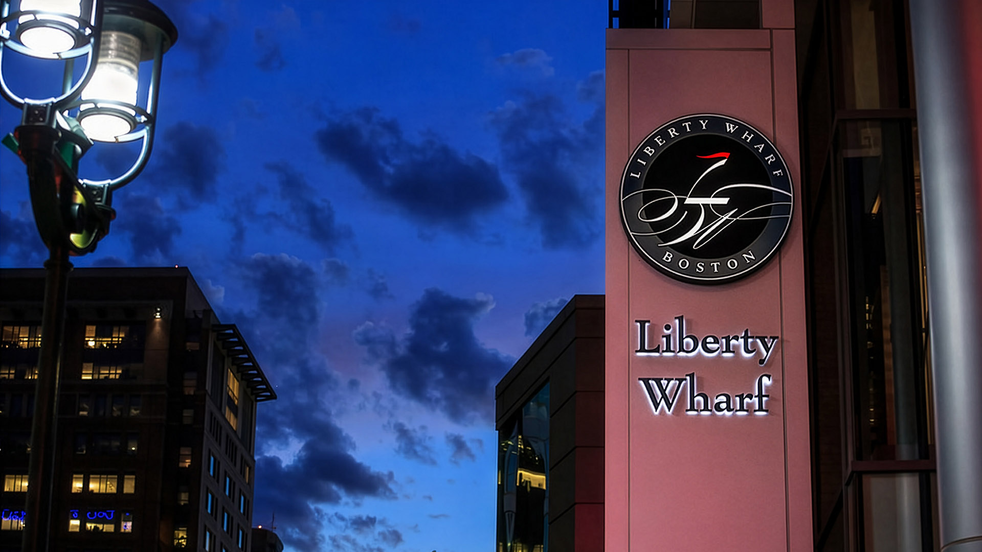
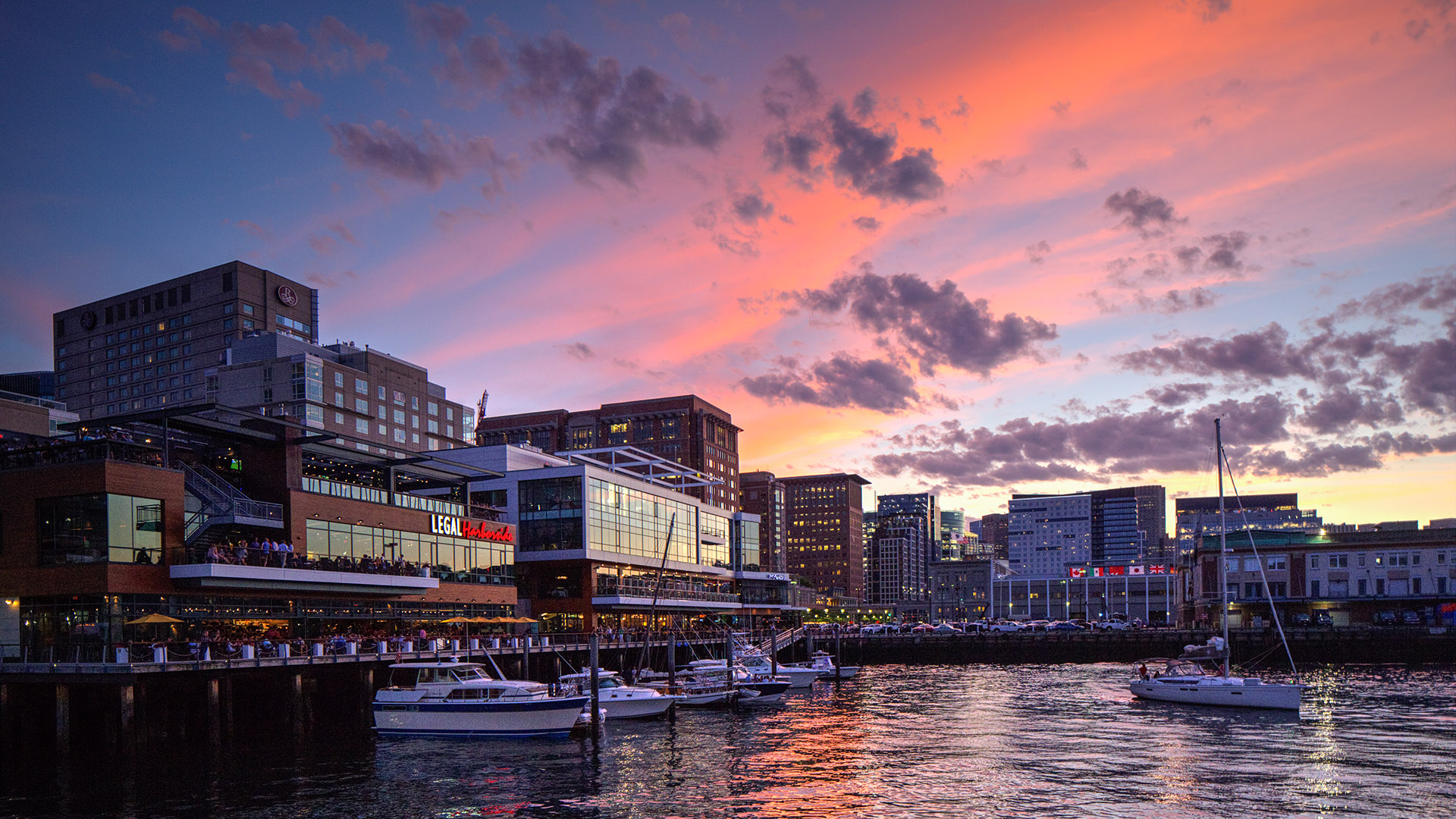
Liberty Wharf is a brand identity system crafted for a newly built waterfront destination in Boston’s Seaport, uniting restaurants, public spaces, and harborfront experience under a single visual language. From the outset, the identity was designed to give this place a distinct presence and sense of place in a fast-growing neighborhood.
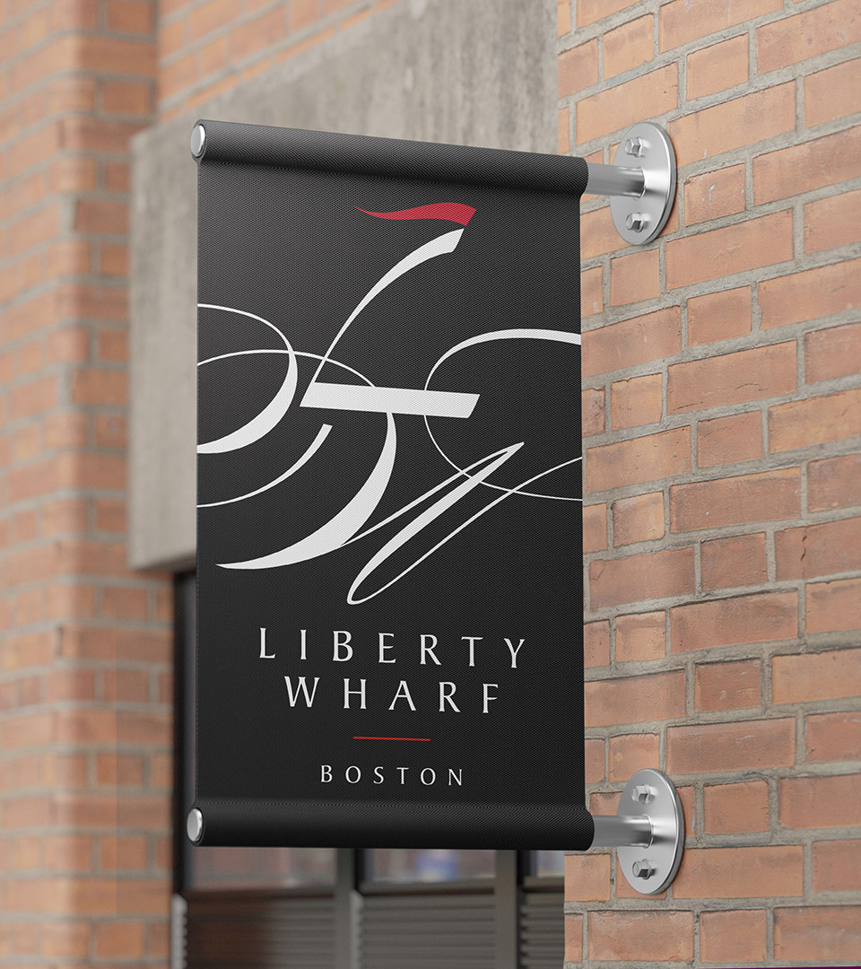
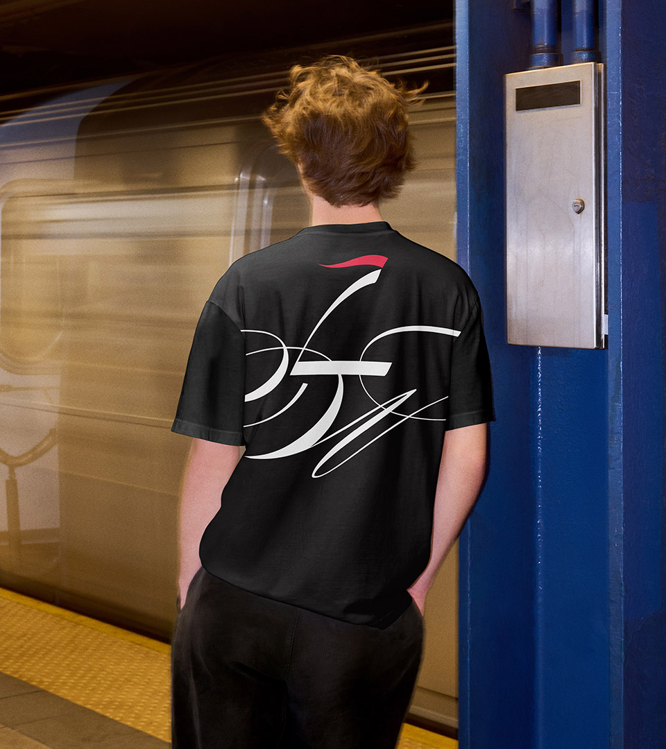
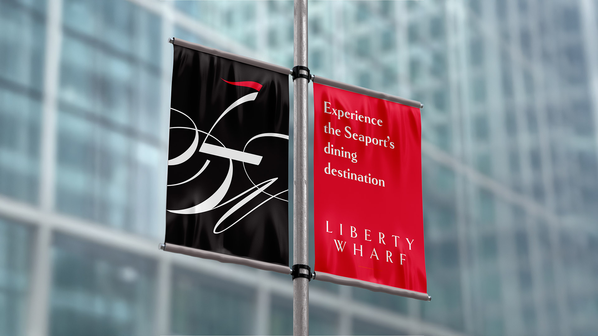
The identity was conceived as a graphic system rather than a fixed mark—one that could operate at multiple scales and unify a diverse mix of tenants without diluting the character of the site. A modular typographic wordmark forms the foundation of the system, its fluid geometry referencing movement, tide, and the working language of docks and piers.
Used across signage, environmental graphics, and marketing, the identity behaves like a navigational layer within the architecture, reinforcing Liberty Wharf as a cohesive place while remaining adaptable to the changing life of the harbor.
The Liberty Wharf identity transforms typography into place-making.
The vertical stroke of the ‘L’ rises like a sail catching the wind, while the flowing curves of the ‘W’ echo the movement of waves along the waterfront.
Outcome
The resulting identity established Liberty Wharf as a recognizable and enduring presence along the Boston waterfront. Flexible enough to support a wide range of tenants yet unified in tone and expression, the brand continues to anchor the development as a cohesive destination within the Seaport’s ongoing transformation.