Branding and marketing for a luxury waterfront condominium redefining contemporary living in Boston’s Fan Pier
Client The Fallon Company
Sector Mixed-use waterfront development
Location Boston Seaport
Discipline Brand Strategy, Brand Identity, Logo Design, Visual Language, Environment Graphics, Website and Development, Signage, Digital Advertising, Video
Collaborators Photography: Dave Desroches Signage: BBW Printing: Signature Impressions
About the project
Twenty Two Liberty was not conceived in isolation, it was the first residential expression of a much larger vision for Fan Pier, a 21-acre stretch of underutilized waterfront that would ultimately redefine Boston’s Seaport District.
Adams Design began working with The Fallon Company at the earliest stages of Fan Pier’s transformation, long before residential development was underway. Our role was to help introduce the site to the city, establishing awareness, identity, and momentum through branding for public events, concerts, international sailing races, and the initial wave of retail and restaurant openings.
This early placemaking work helped turn a formerly anonymous waterfront parcel into a recognizable destination and laid the groundwork for a new neighborhood to take shape.
As the first residential building at Fan Pier, Twenty Two Liberty needed to signal that this was not simply another condominium, but the beginning of a new waterfront address. The brand identity was designed to embody architectural confidence and modern urban living, while reinforcing Fan Pier’s emergence as a place defined by light, water, movement, and proximity to the city.
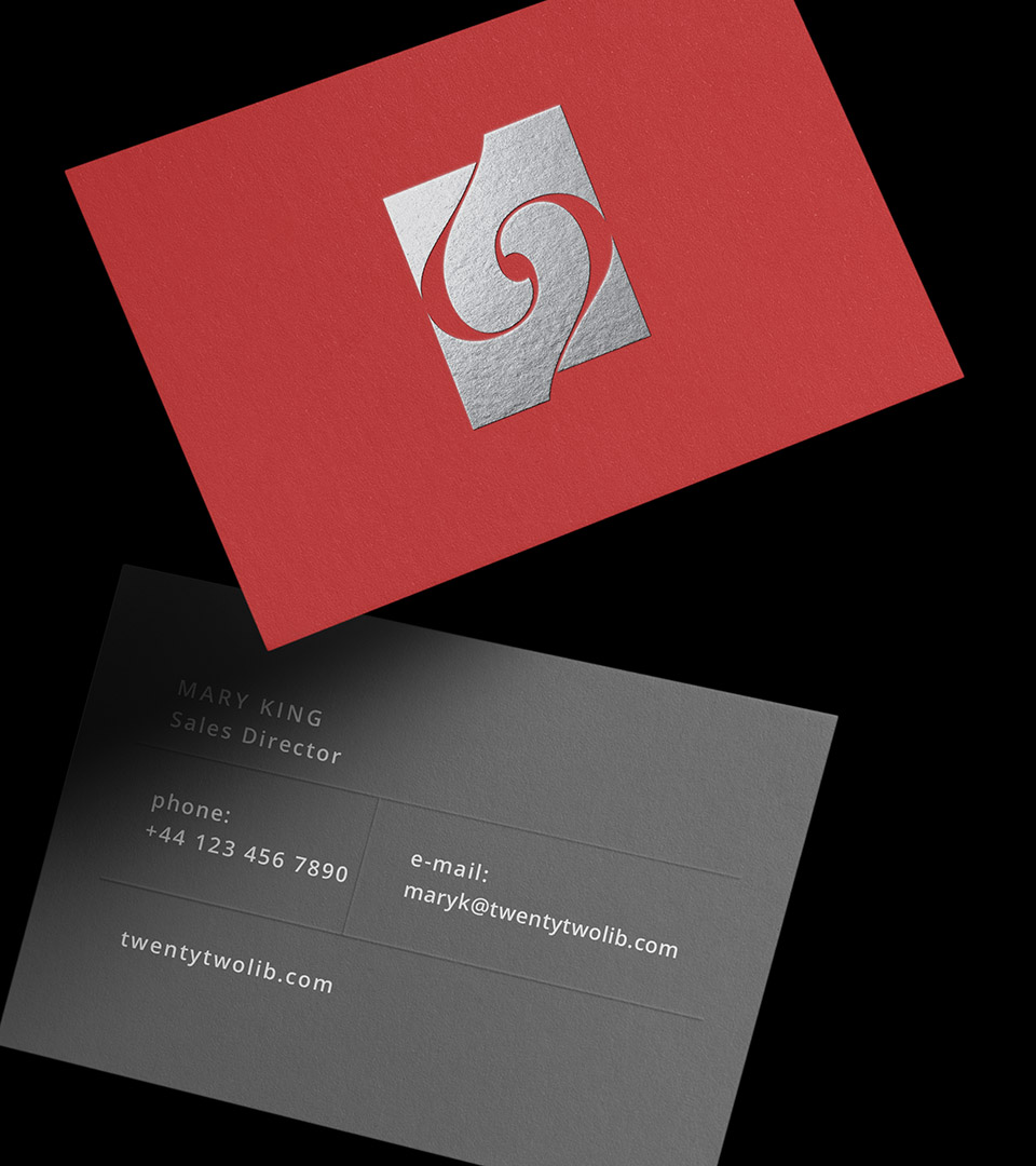
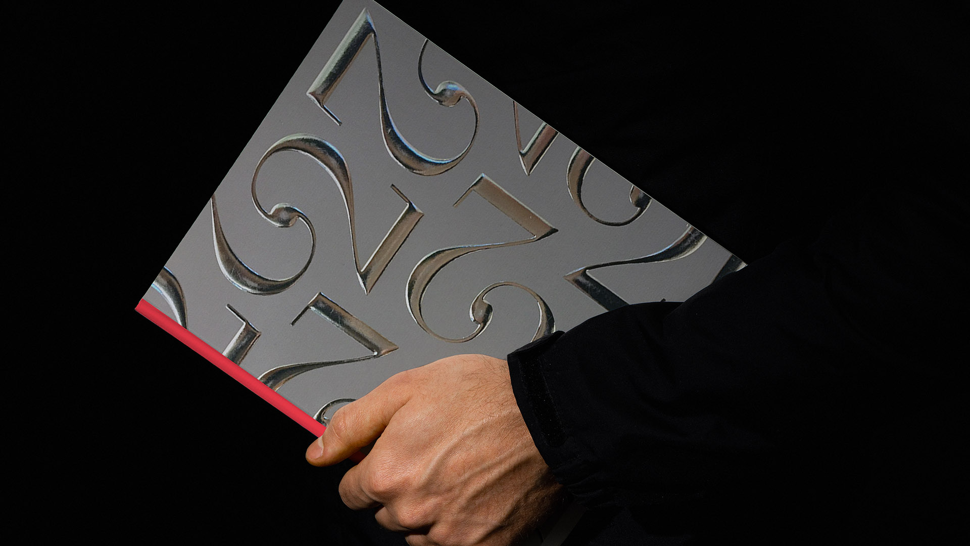
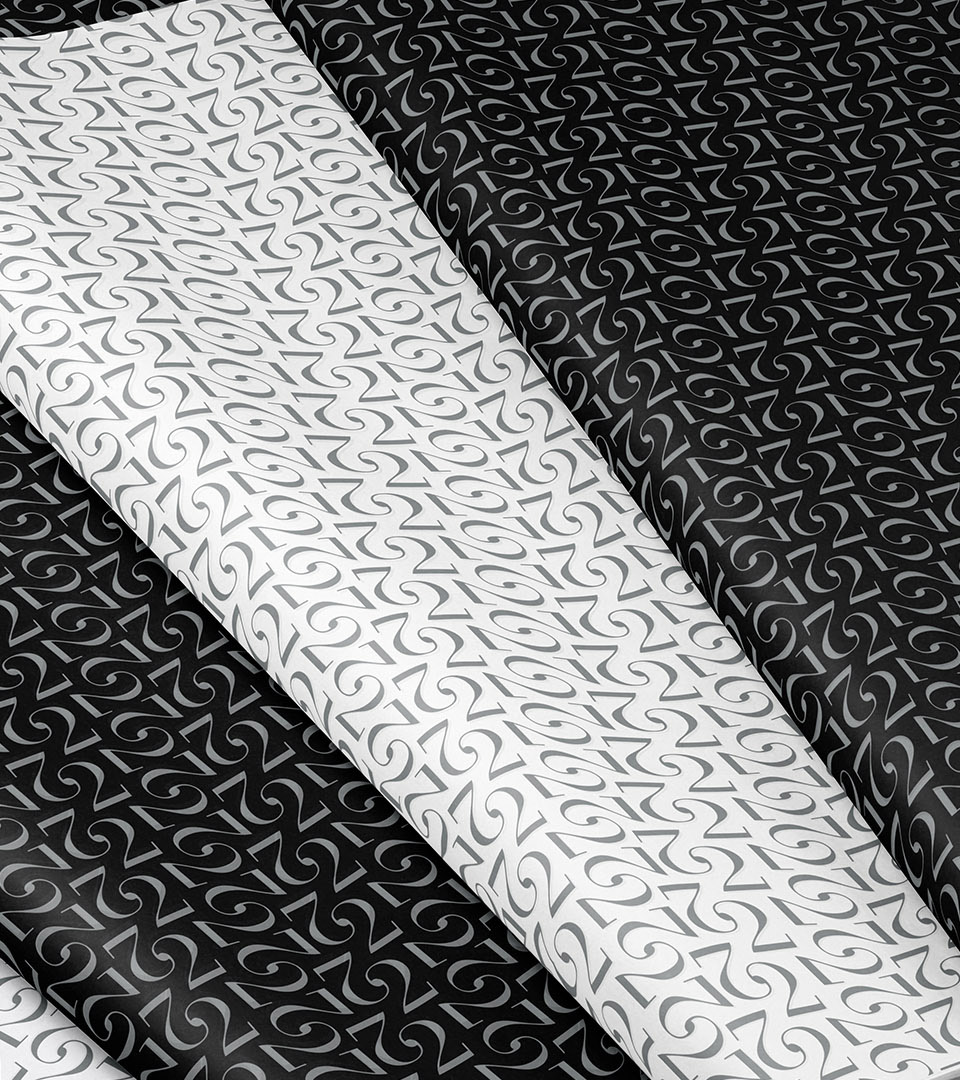
A sculptural mark derived from the number twenty-two, paired with a bold red and silver palette, created an identity that was both iconic and immediately legible, anchoring the building within the broader master plan while giving it a distinct presence of its own. Learn more about our thinking on placemaking and real estate branding.
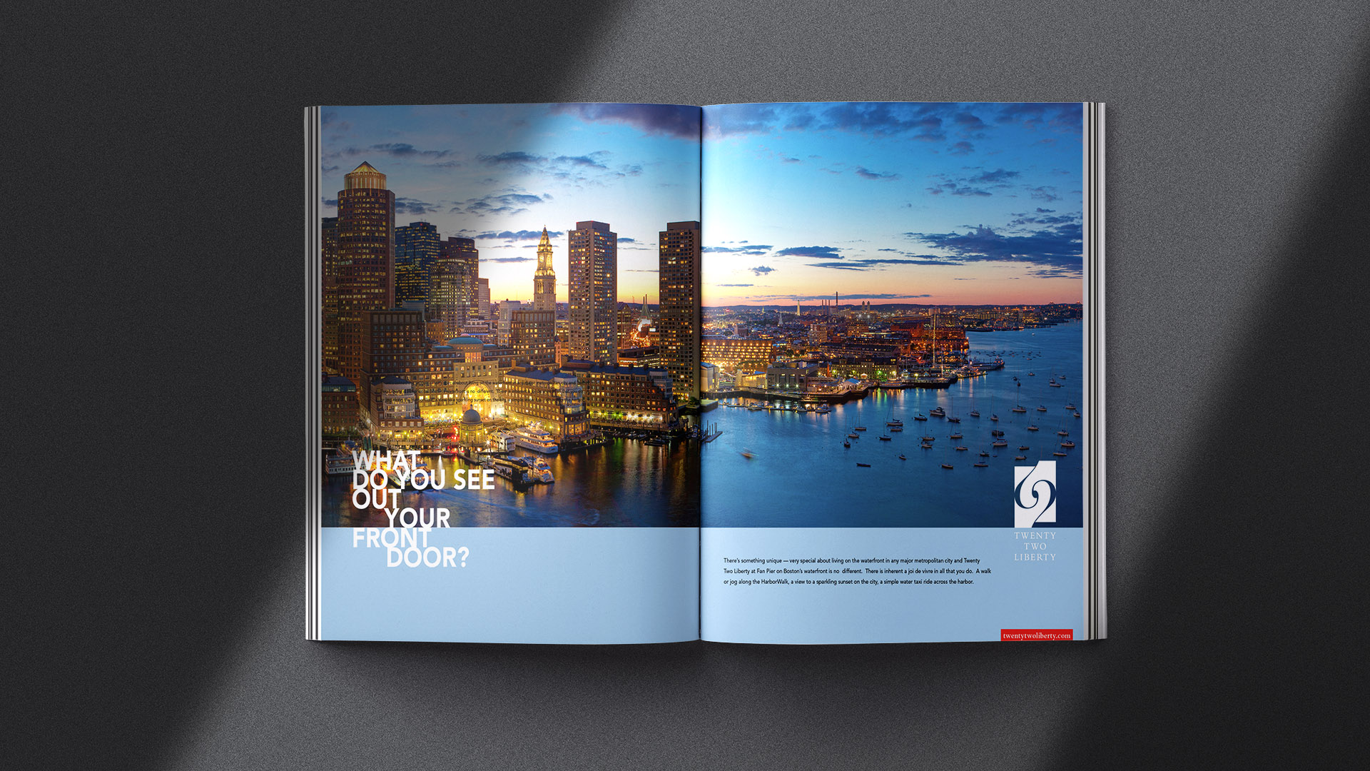
The brochure cover was matt silver foil stamped on silver paper. The interior pages were filled with rich imagery depicting life at your fingertips from the ICA to the working harbor.
Demand exceeded expectations, with all 118 residences at Twenty Two Liberty selling out prior to construction completion.
As the first residential building at Fan Pier, the project established a clear brand identity that translated years of placemaking and public-facing branding into a market-ready vision for waterfront living in Boston’s Seaport District. The identity helped shift perception, from a former expanse of parking lots to a credible, design-forward residential neighborhood along the harbor.
The success of Twenty Two Liberty set the foundation for subsequent residential development at Fan Pier, directly informing the branding and positioning of 50 Liberty and culminating with the site’s final residential expression, One Harbor Shore.
Together, these projects completed the residential narrative of Fan Pier, reinforcing a cohesive sense of place and establishing the district as one of Boston’s most fully realized urban waterfront communities.