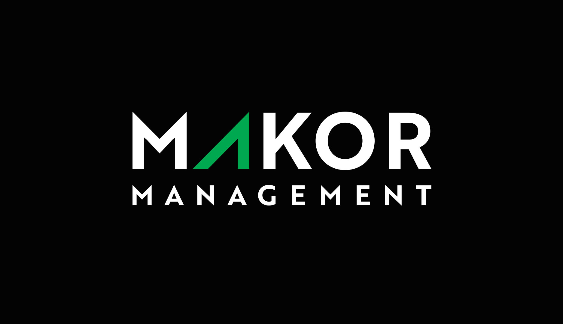
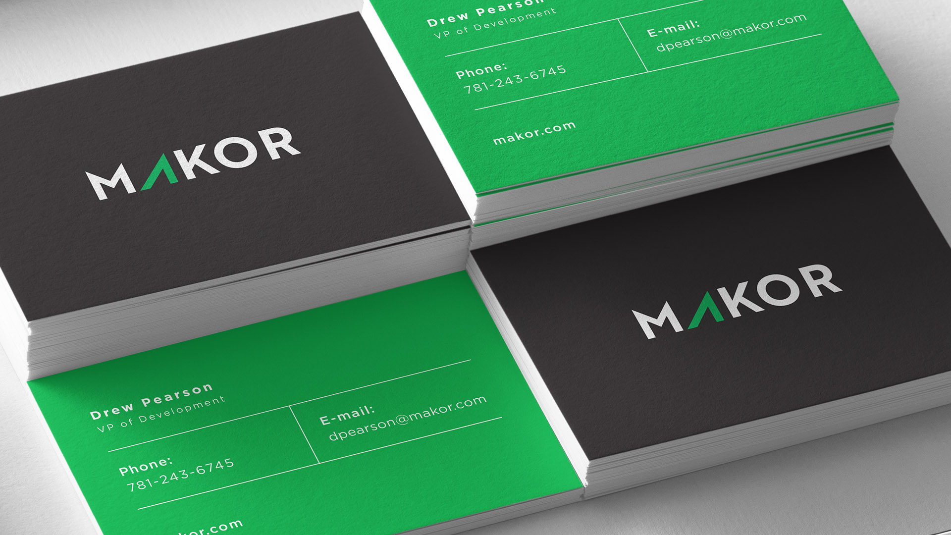
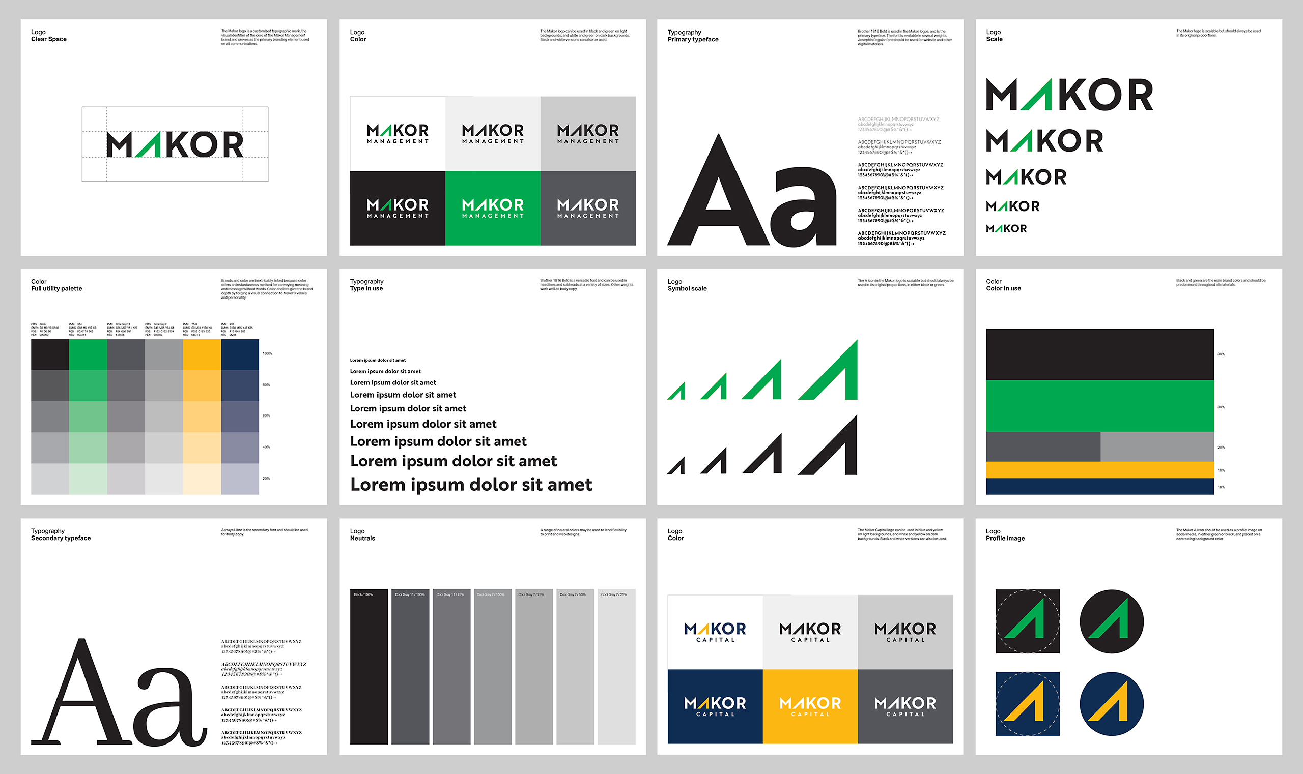
The mark for Makor had to work alone but also in conjunction with both Makor Management and Makor Capital. We used the color palette to differentiate the two entities. The arrow symbol and adaptable color palette also inspired individual logos for this real estate company's many properties.
Brand strategy
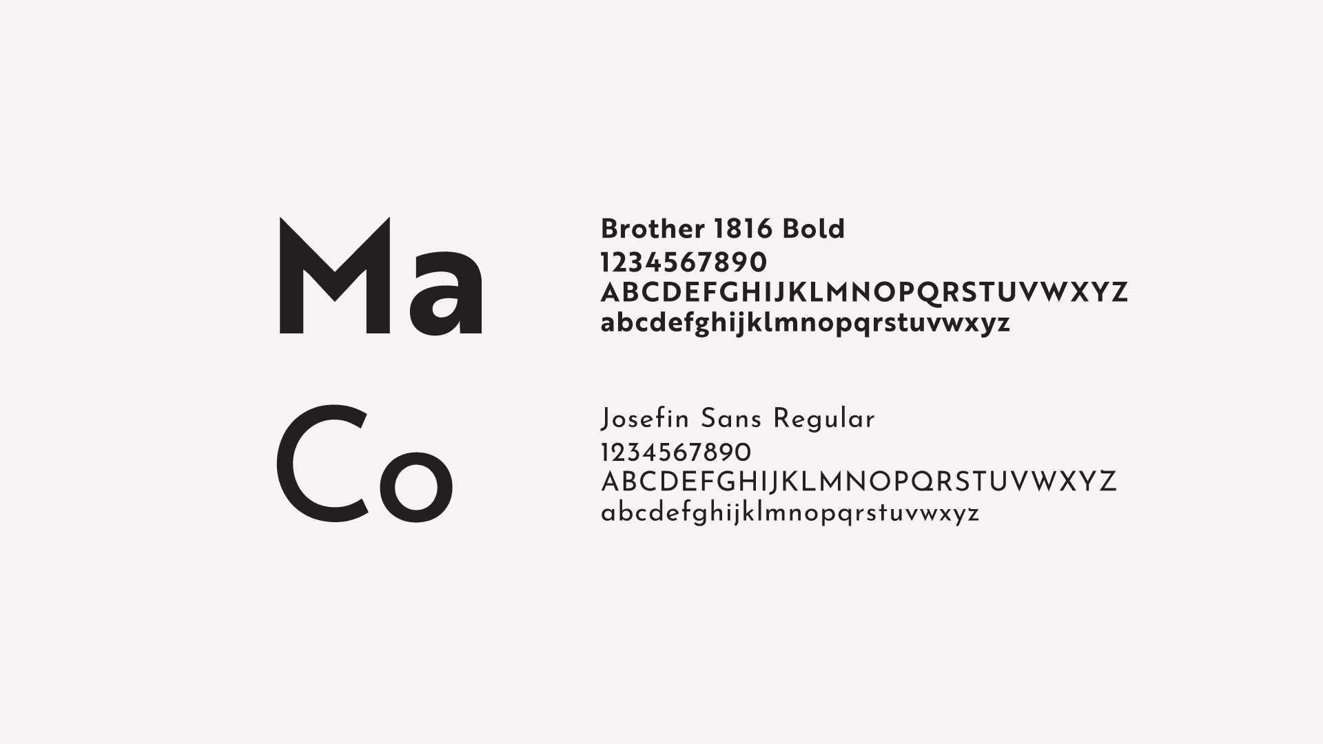
Identity
We incorporated the A arrow mark into individual marks and color palettes for each of the properties.