Penmark

Brand identity for a South End landmark with an academic past

Penmark blends historic South End architecture with the vibrancy of condominium living. Originally part of a 19th-century academic complex, the building carries a uniquely scholastic character—formal, storied, and full of personality. Our task was to create a brand identity that honored this legacy while appealing to today’s culturally curious urban buyers.

Client
RF Walsh, Otis & Ahearn
Industry 
Residential Real Estate
Scope of Work 
Brand Strategy, Brand Identity, Visual System, Advertising, Illustration, Print, Signage, Website
Colorful illustrated lifestyle scene used in Penmark marketing materials
The name Penmark was inspired by the building’s history as the 19th century home of Boston College High School, we devised a name that recalled the era of quills and penmanship, yet was distinctively crisp and contemporary.

The Challenge

Penmark needed an identity that balanced its academic heritage with the liveliness of its South End surroundings.

The building’s history as a former educational institution gave it character, but the brand also needed to feel sophisticated, contemporary, and relevant to today’s homebuyers. The challenge was to craft a system that felt richly layered—scholarly without being stuffy, artistic without losing clarity, and expressive enough to stand apart in a competitive condo market.

Penmark logo in black with gold decorative accents on dark background

The Solution

We built the identity around a custom-drawn logotype that channels vintage academic typography—refined serifs, unexpected flourishes, and a signature “P” with a curled terminal reminiscent of ornamental bookplates.

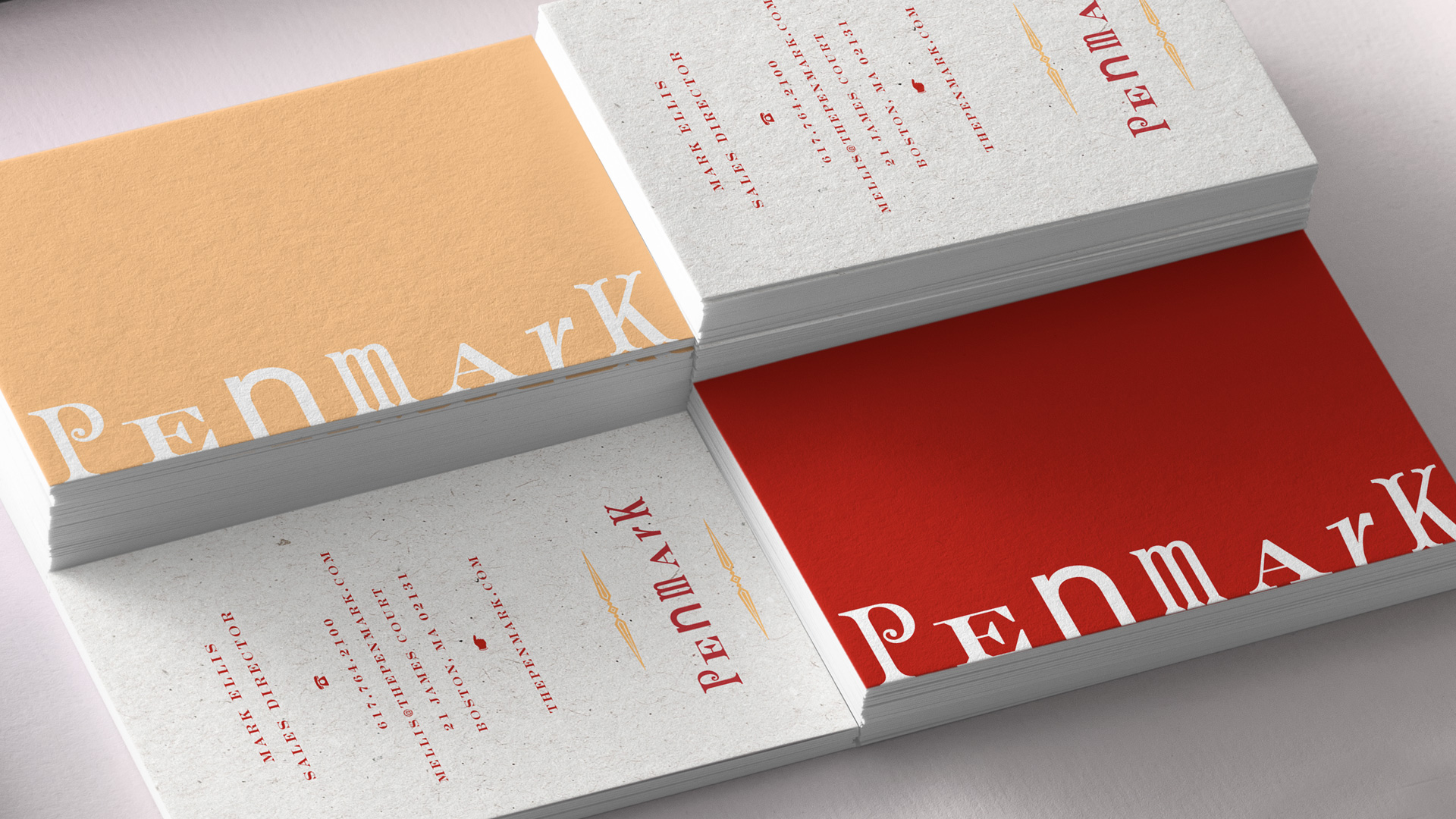
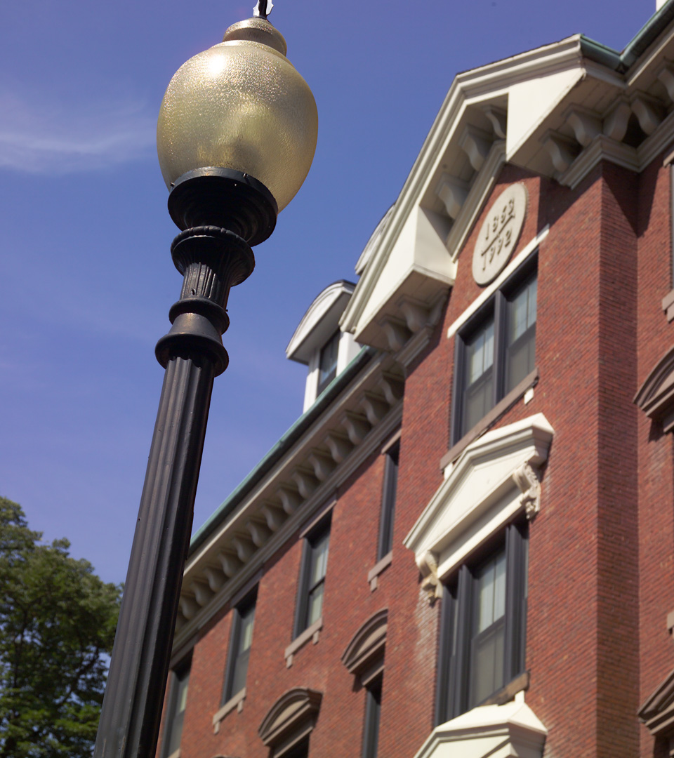
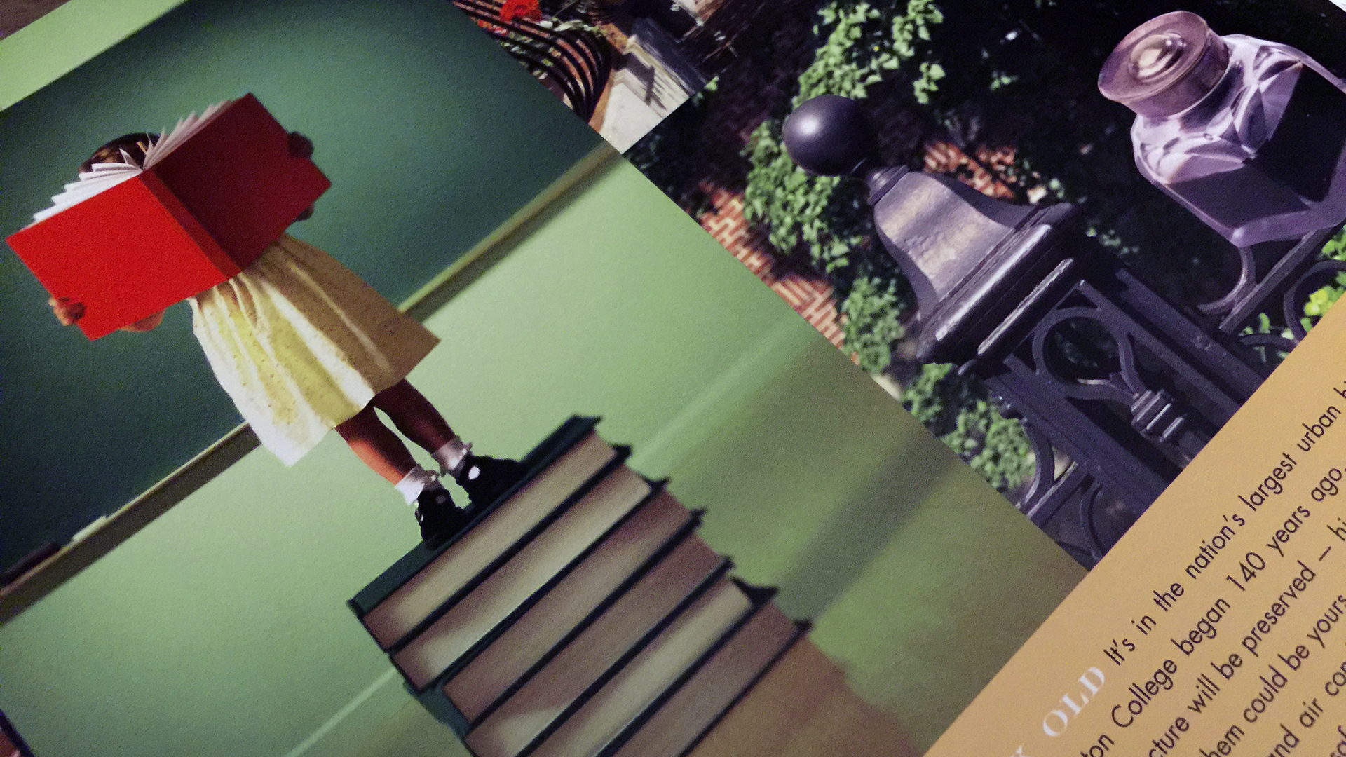
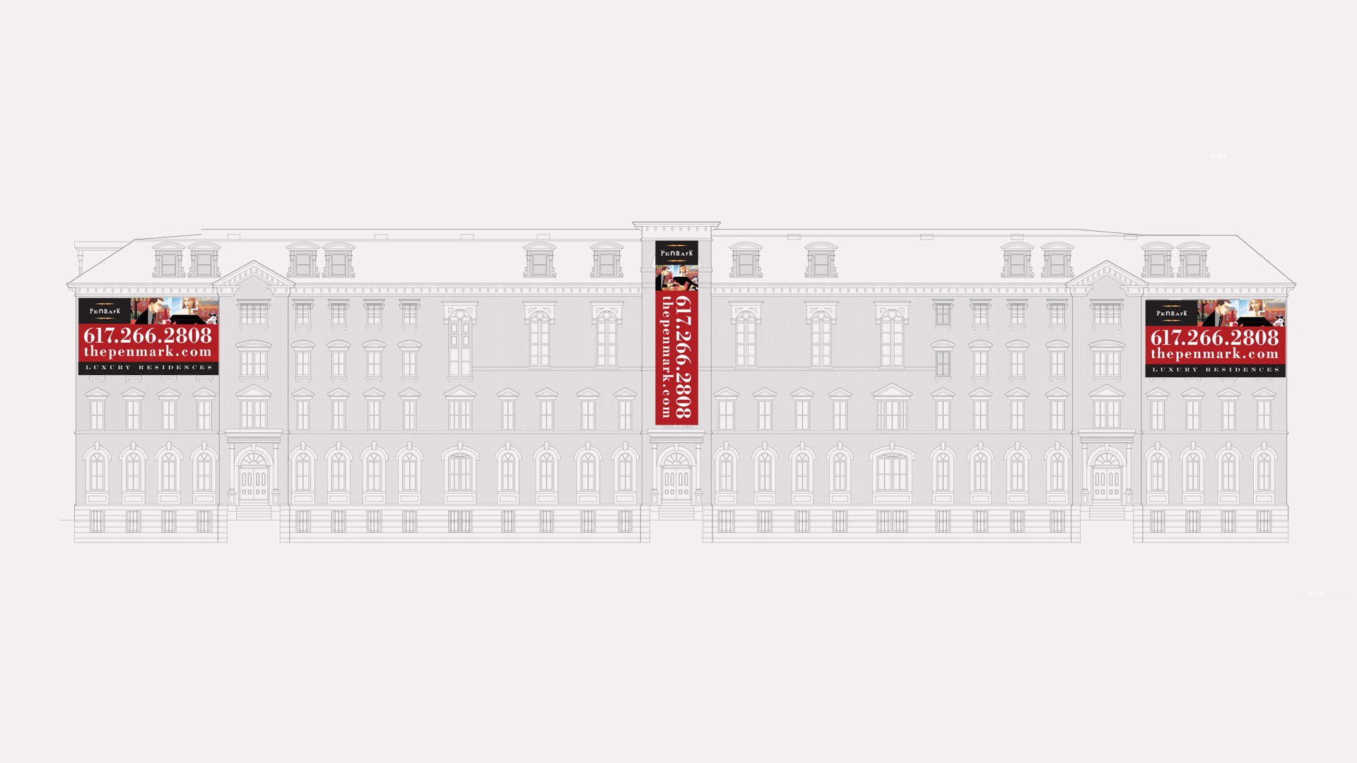
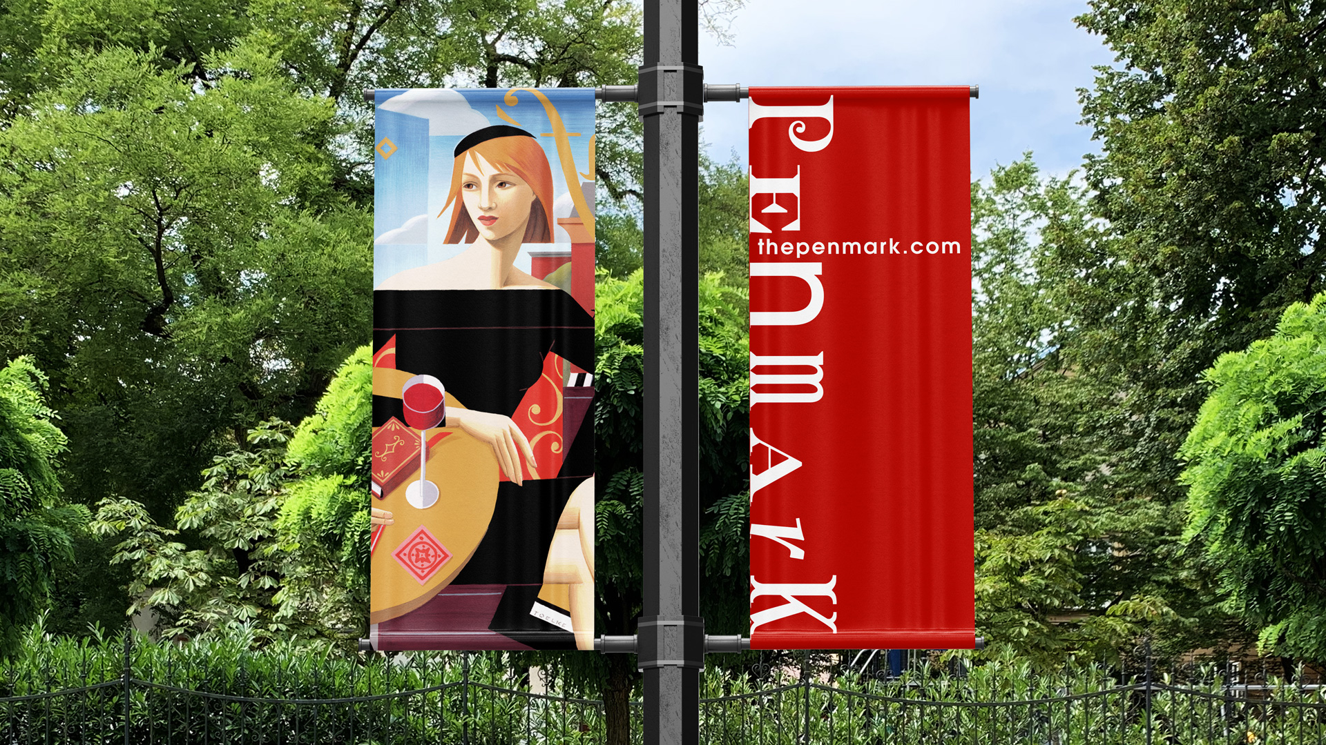
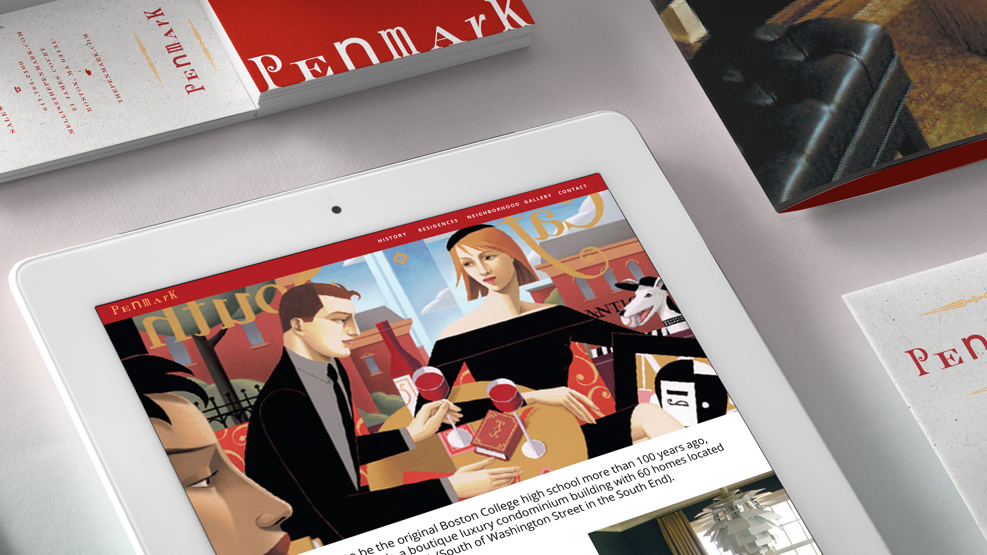
This academic note is reinforced by a palette of parchment, red, copper, and charcoal, each chosen to echo the tones of weathered brick, engraved plaques, and the warm patina of the building itself.

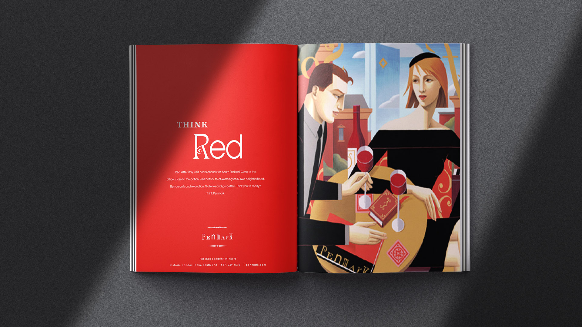
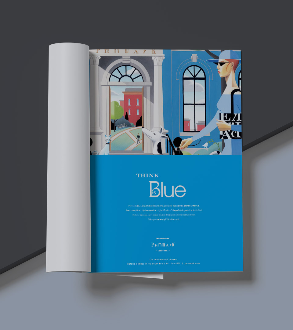
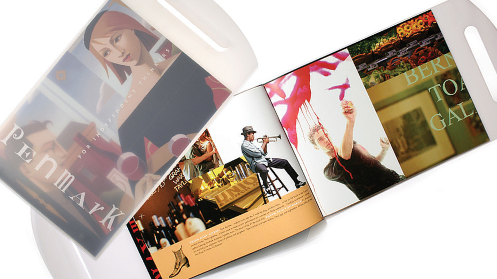
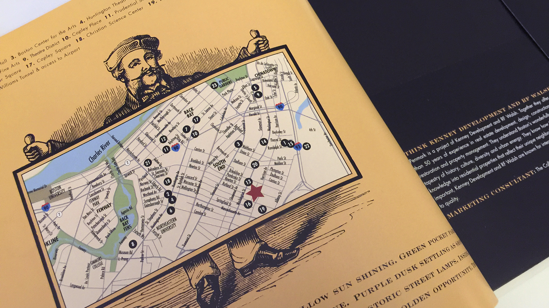
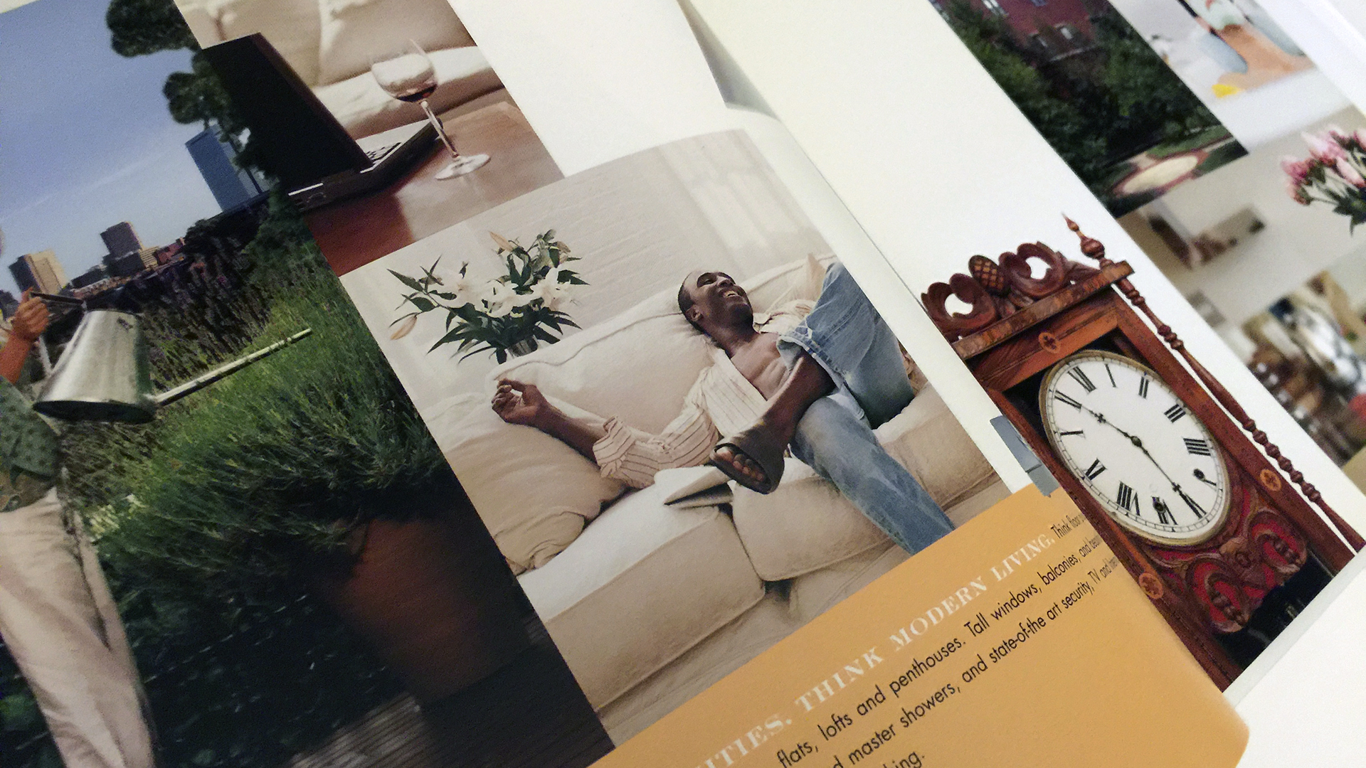
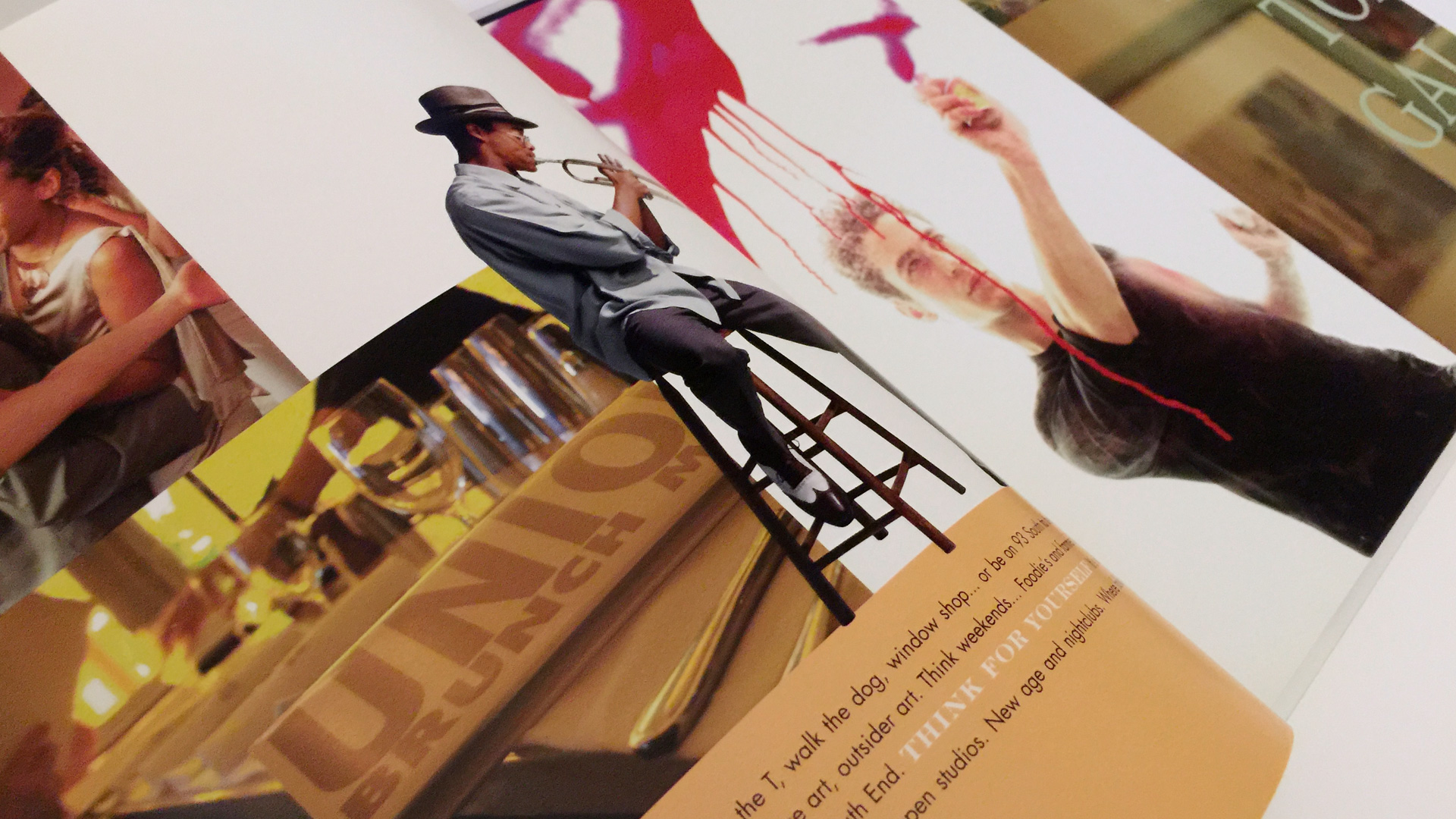
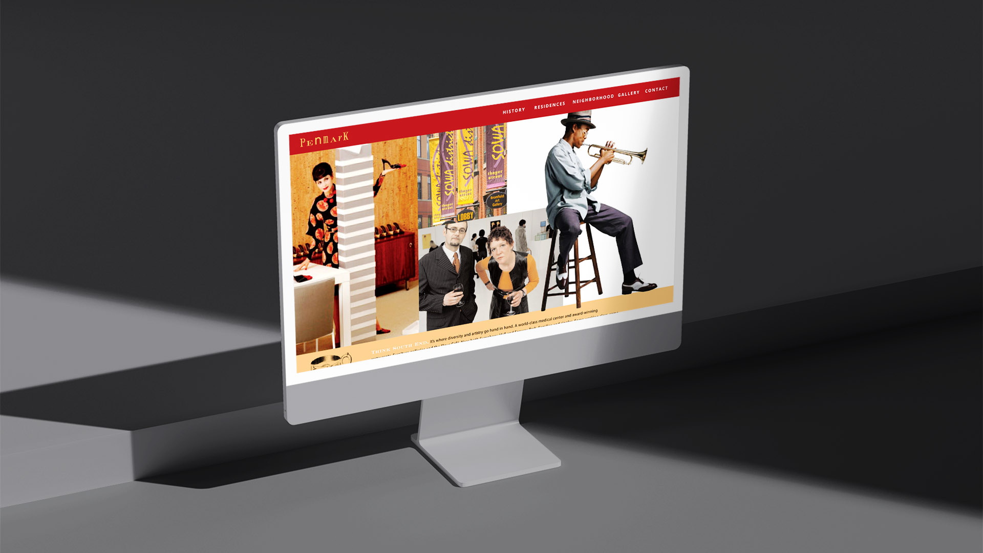
To bring the brand’s personality to life, we commissioned illustration-driven visuals—a lively, human counterpoint to the gravitas of the architecture. These illustrations frame Penmark not just as a residence, but as a lifestyle: cultured, social, smart. Photography and illustrated elements were woven together across brochures, advertising, and signage, creating a distinct visual rhythm that felt both playful and elevated.

The resulting system embraced contrast—heritage and modernity, rigor and whimsy—reflecting exactly what makes the Penmark building so compelling.

The Penmark logotype blends 19th-century scholastic typography with decorative flourishes, creating a distinctive wordmark rooted in the building’s past.

A palette of parchment, copper, charcoal, and red reflects Penmark’s architectural materials and the warm, historic character of the South End.

Penmark typography sample showing Avenir Light
Penmark typography sample showing custom victorian letters in a gif

Avenir Light pairs clean modern geometry with Penmark’s custom serif “P,” uniting old-world influence with crisp contemporary readability.

Penmark stationery system including business cards

The stationery system uses layered tones and tactile finishes to reinforce the refined yet expressive visual identity.

Think Red illustration and double page spread for Penmark

We partnered with illustrator Cathleen Toelke on a quirky campaign befitting the South End neighborhood. Bold, color-driven taglines captured the building’s creative spirit. The choice to use illustration pays homage to the artists and galleries of the South End.

Street-level photo of Penmark’s historic South End building facade
Think Blue single page magazine ad for Penmark
Open brochure with Penmark lifestyle photography and branding

The brochure, modeled after a classic book satchel and reimagined in transparent plastic with a built-in handle, blended function with nostalgia to reflect Penmark’s heritage-meets-modern spirit.

Open brochure with Penmark girl reading red covered book standing on books
Open brochure with Penmark lifestyle photography and branding
penmark brochure spread with african american on white sofa and clock
Open brochure with Penmark man playing saxophone and man painting

Illustrations and photography merge across brochures and signage, presenting Penmark as cultured, energetic, and unmistakably distinctive.

Construction banner with Penmark branding across full building elevation
Outdoor pole banners featuring Penmark illustrations and red logo panels

Outdoor banners combine illustration and brand color to create immediate street-level visibility and a sense of place along the Penmark frontage.

Penmark website on iMac
penmark red illustration on ipad

The Results

Penmark’s refreshed identity delivered a memorable market presence, distinguishing the property through its expressive visuals and richly historic tone.

The cohesive brand system supported sales efforts with a recognizable voice and a strong sense of place—positioning Penmark as one of the South End’s most character-rich condominium offerings.


Adams Design
20 Park Plaza
Boston, MA 02116

Let's Talk!