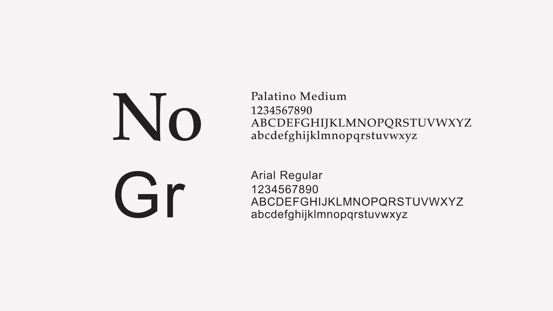
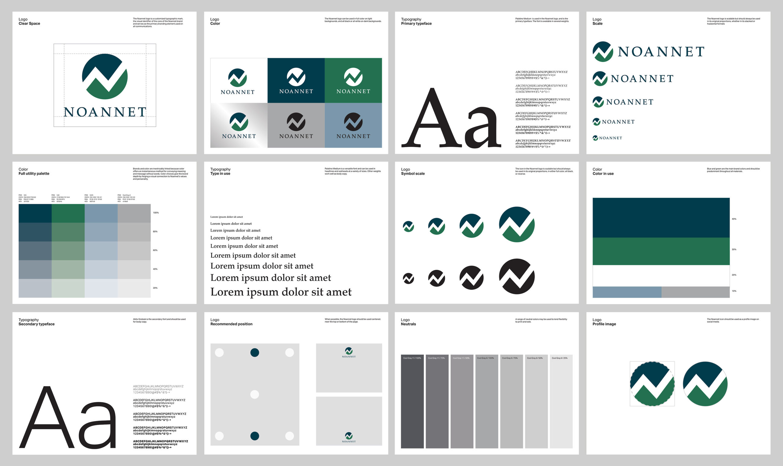
The logo was inspired by the Noannet Woodlands and surrounding mountains with their view of the Boston skyline. The abstract "N" serves as a symbol for mountains and upward movement as well as a separator for earth and sky.
Brand Strategy
Identity
Signage
Interactive
Our work for The Noannet Group included a template for presentations as well. Simple and minimalistic using the hints of brand color throughout the pages.