

About this project
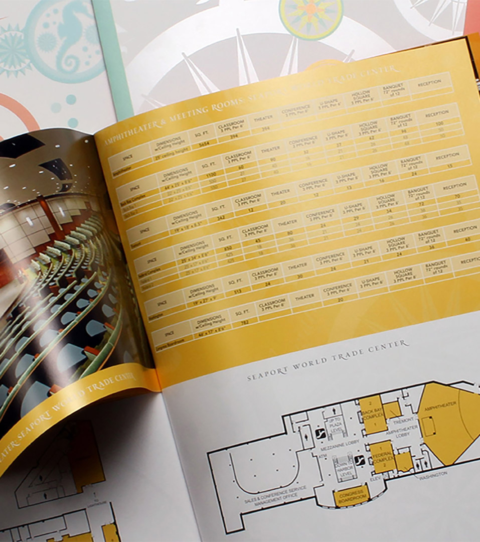
Located directly on Boston Harbor, the Seaport Hotel has long been known for its maritime setting, generous public spaces, and guest-first approach to hospitality. As the Seaport District evolved into one of Boston’s most dynamic neighborhoods, the hotel required a rebrand that could bring clarity and cohesion to a complex property—spanning lodging, dining, meetings, wellness, events, and waterfront experiences—while retaining its established logo.
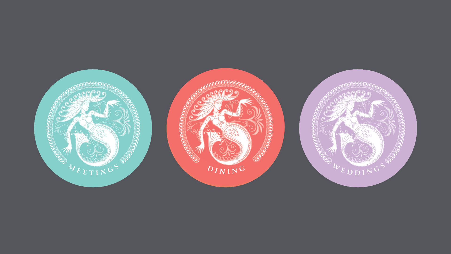
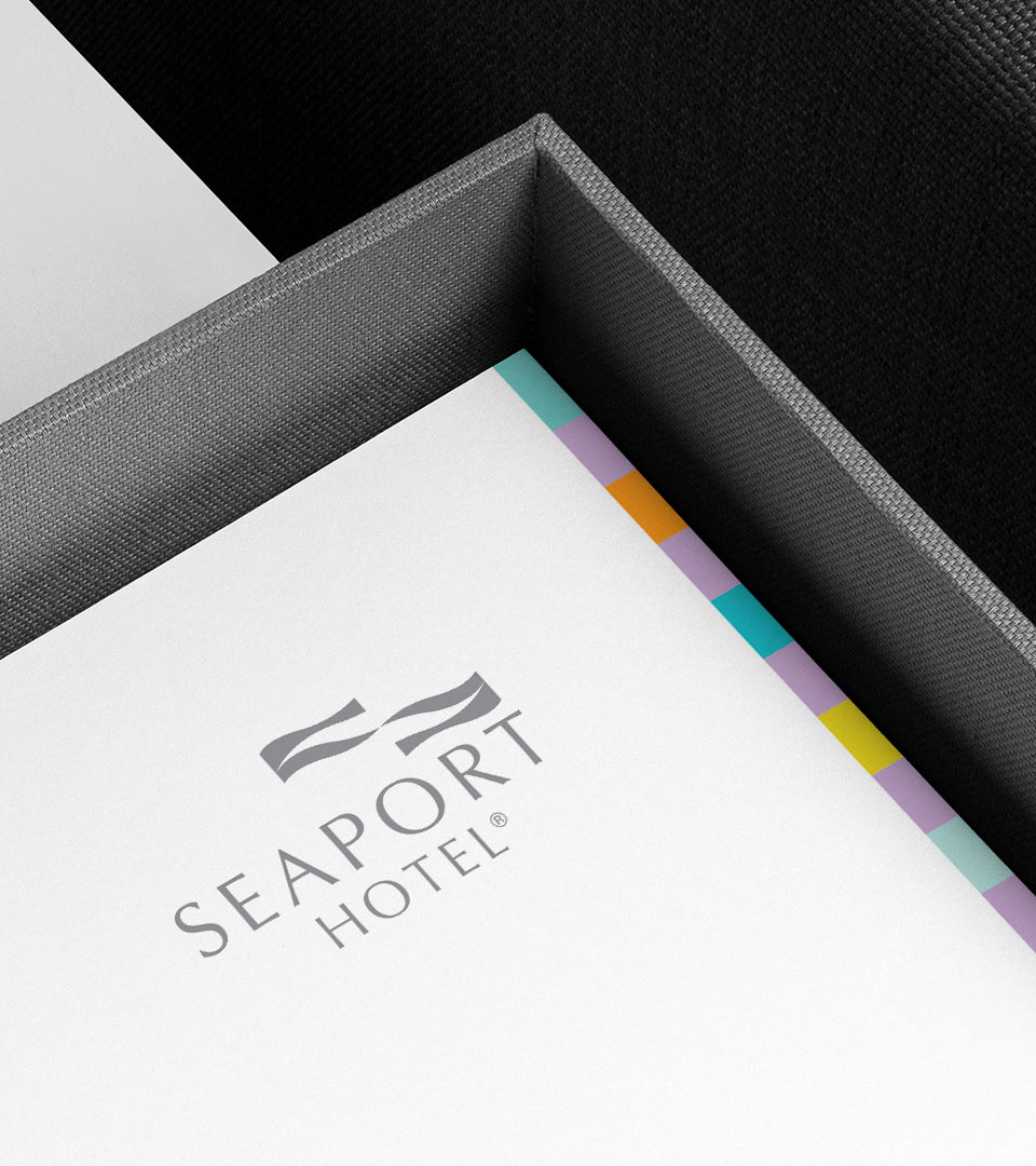
Our work focused on redefining the hotel’s visual language beyond the mark itself. Drawing from historic navigation charts, harbor mapping, and seafaring iconography, we developed a contemporary system that feels rooted in place rather than themed. A softened coastal palette, refined iconography, and tactile materials were introduced to distinguish the hotel’s many offerings while maintaining a unified, unmistakably Boston identity.
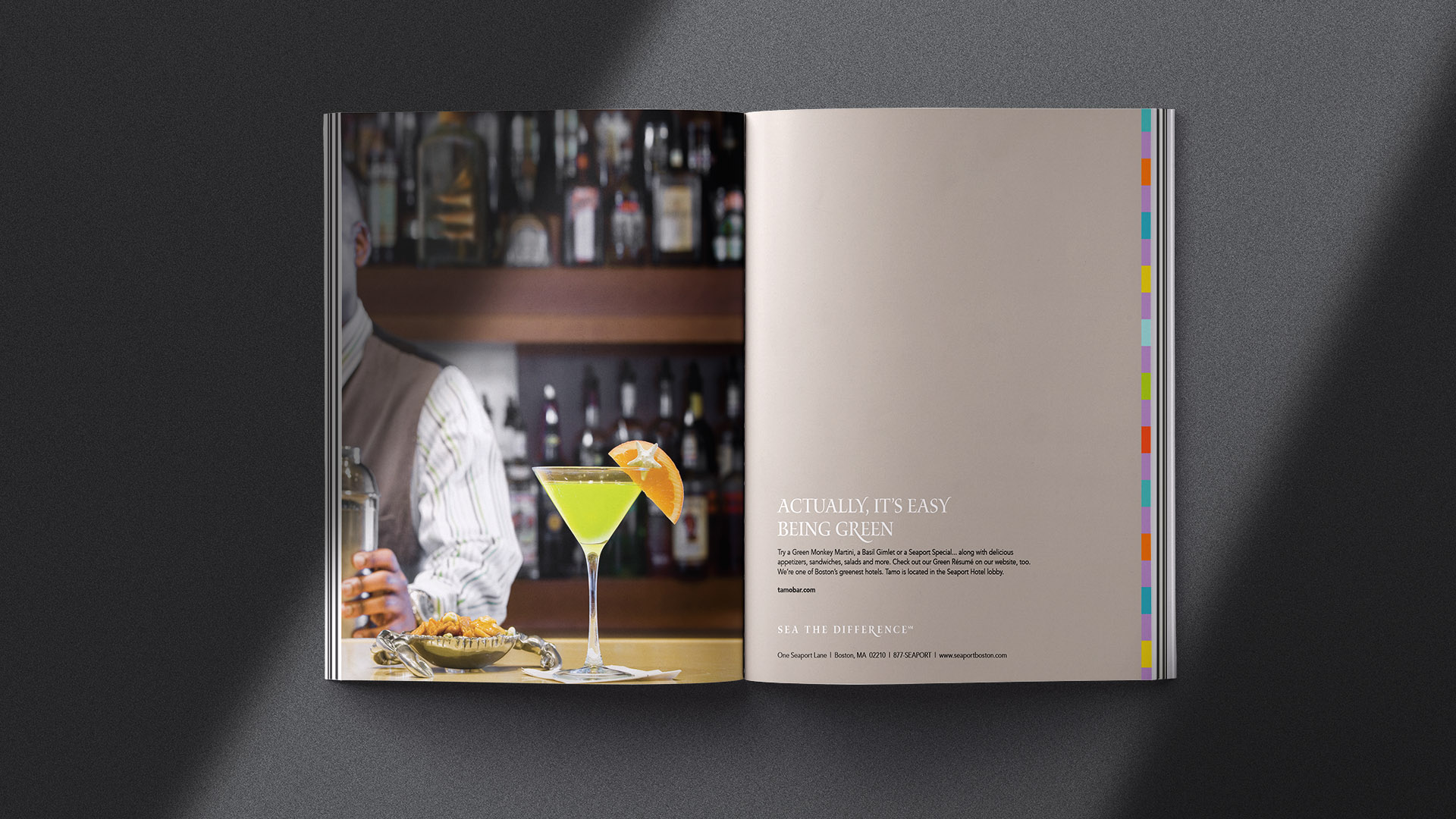
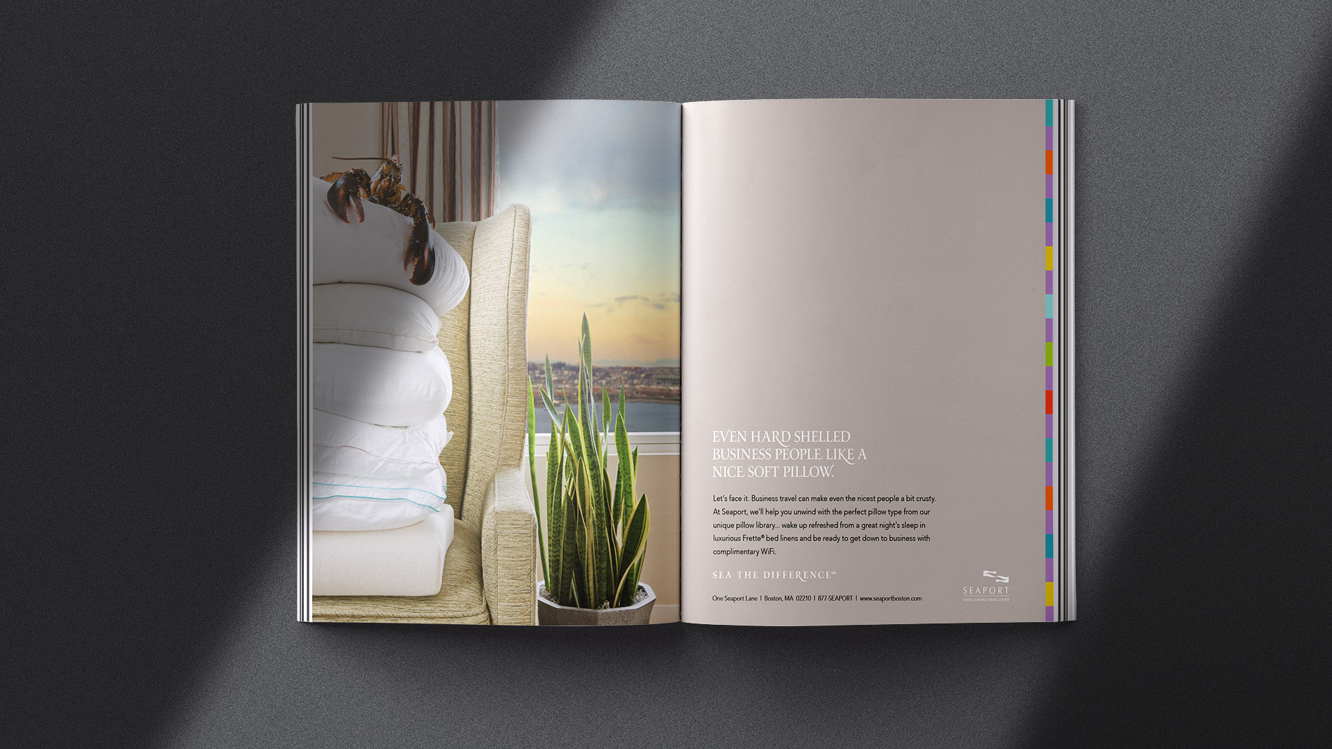
Photography and illustration work together to articulate the guest experience—from pre-dinner cocktails and harbor walks to weddings, conferences, and quiet moments of retreat—allowing the brand to feel warm, confident, and lived-in rather than aspirational or distant. The tagline “Sea the Difference” reinforces this balance of setting, service, and ease.