
About this project
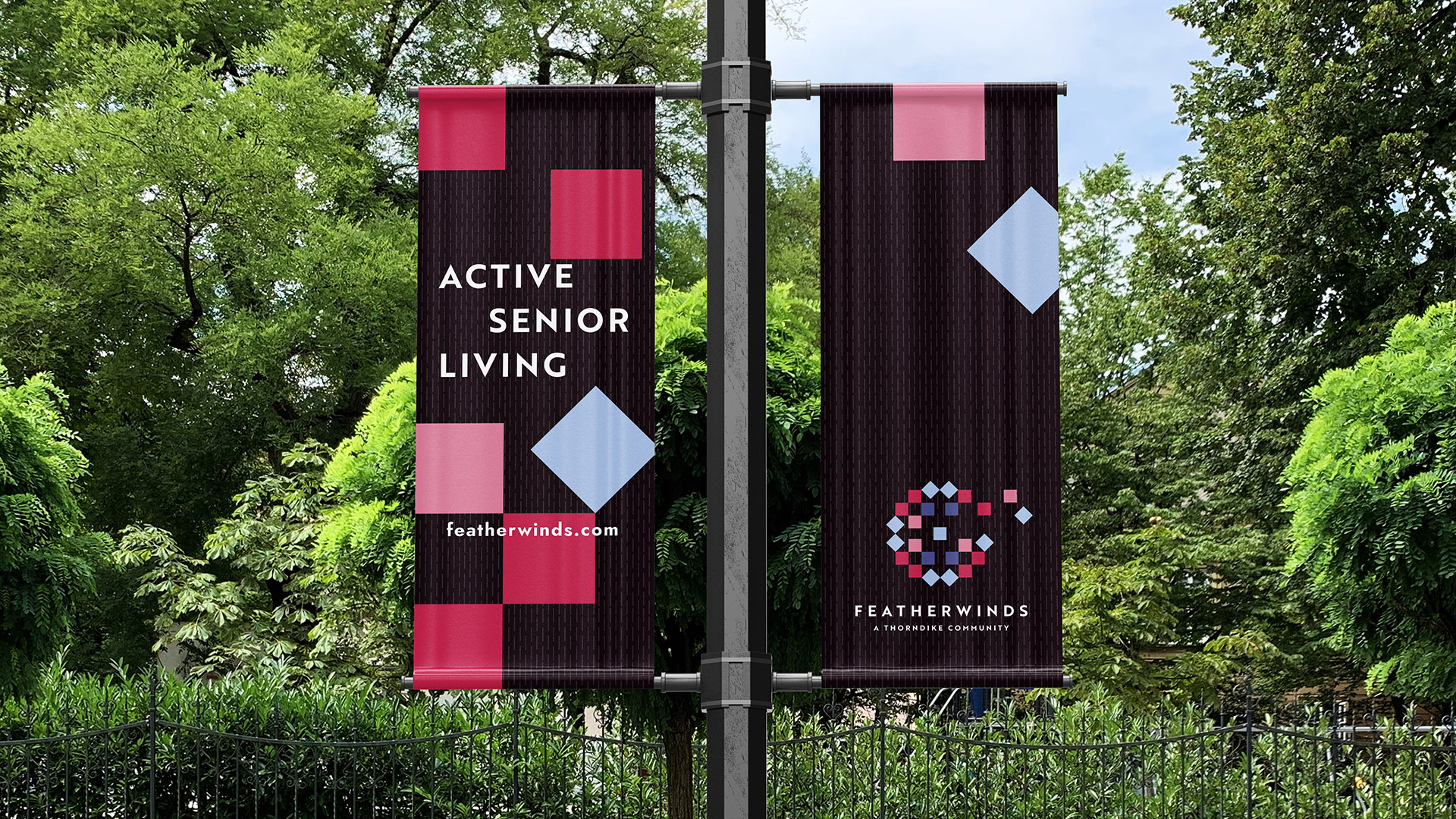
Featherwinds is a new 55+ condominium community in Halifax created for active adults who want comfort, connection, and ease, without leaving the town they’ve long called home. Set amid natural surroundings and close to new community amenities, the project needed a contemporary identity that felt warm, familiar, and quietly optimistic.
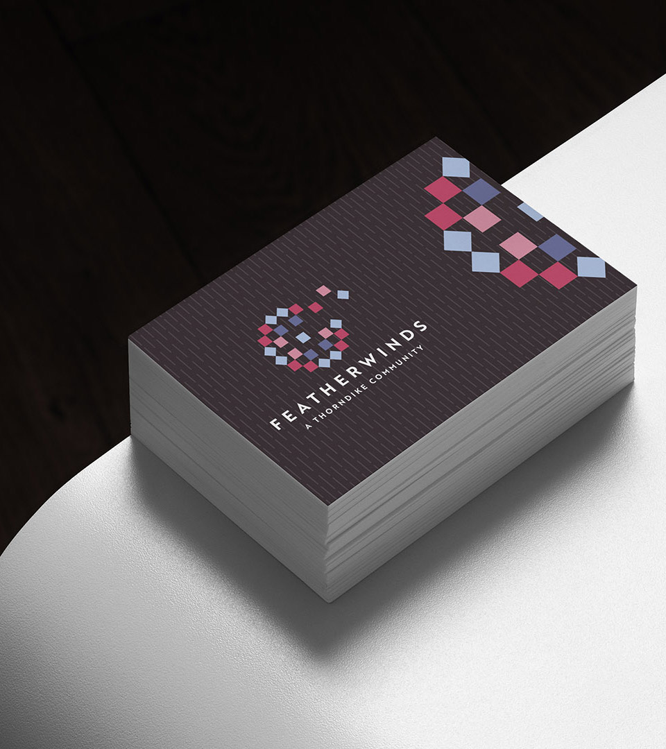
We began with naming. Featherwinds reflects the tranquility of country living, the promise of progress, and the sense of freedom that comes as residents streamline their lives. The name suggests lightness, movement, and relief, an idea that shaped the entire brand.
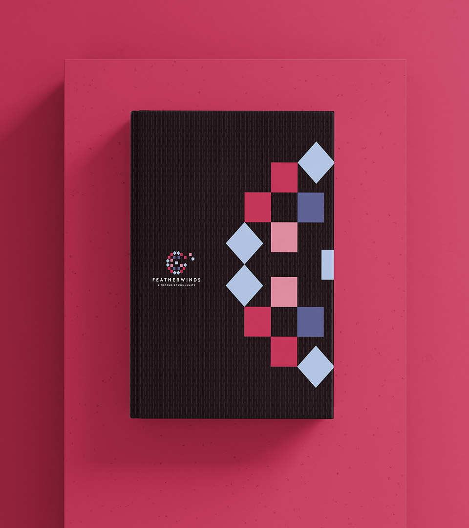
Visually, the identity draws from two symbolic touchstones: quilts and dandelions. Quilt patterns, long associated with home, comfort, and shared craft, form the geometric structure of the mark, grounding it in tradition and community. The dandelion lifts that structure into motion, reinterpreted as a gentle spray of quilt-like forms that evoke breezes, growth, and possibility.
A soft, countryside-inspired palette and subtle stitched textures extend the story across print, signage, digital, and environmental applications. Together, the system balances tradition and modernity, creating an identity that feels welcoming, optimistic, and deeply rooted in place.
Explore our approach to Placemaking and Brand Identity for residential and mixed-use environments.