
About this project
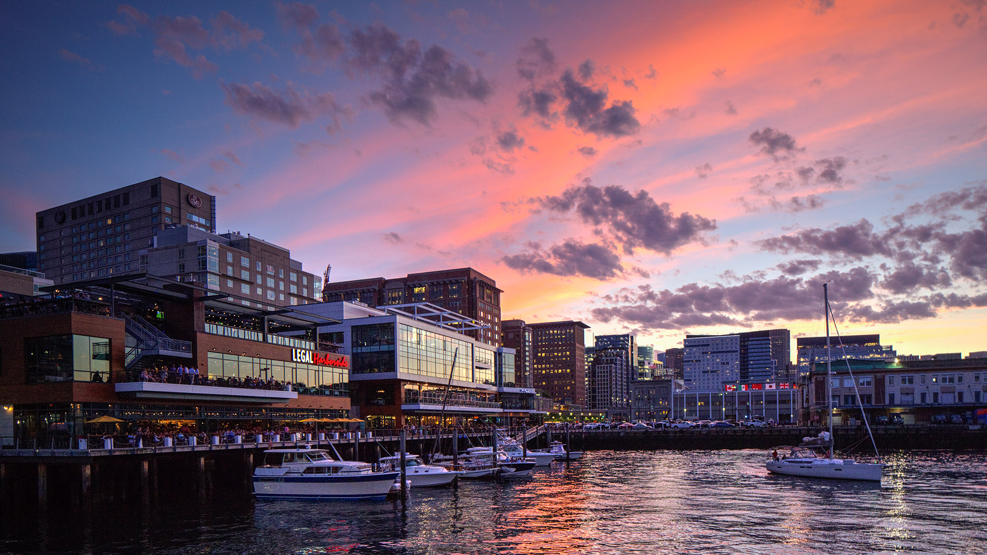
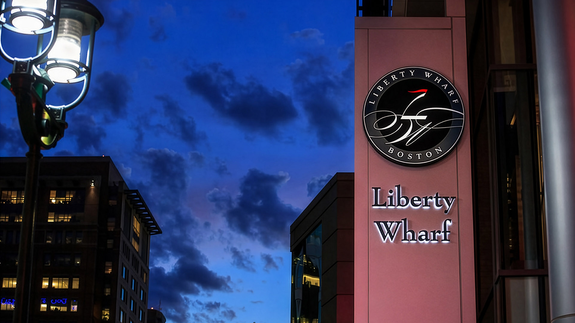
Liberty Wharf is a mixed-use waterfront destination in Boston’s Seaport District, developed at a formative moment in the neighborhood’s transformation. Built directly on the harbor, the project helped establish Liberty Wharf as both a civic gathering place and a recognizable anchor along the working waterfront.
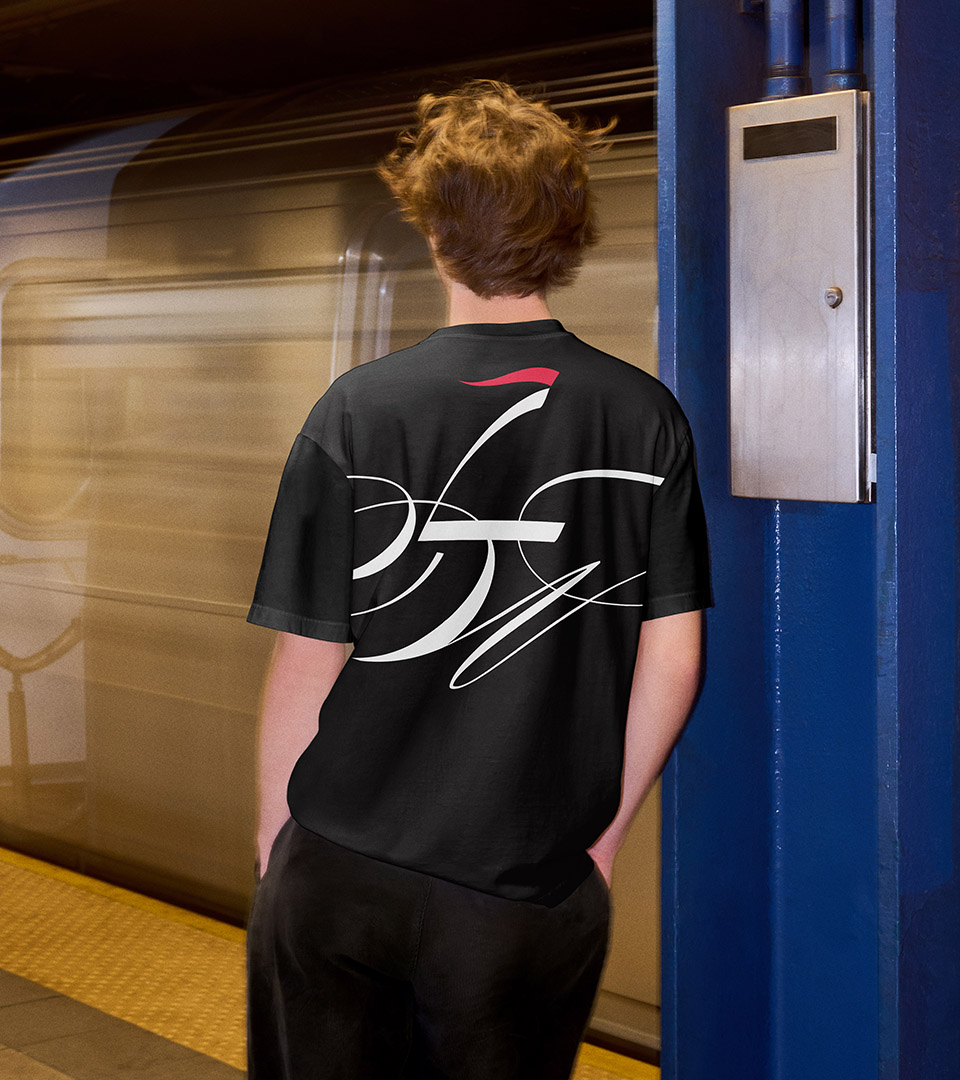
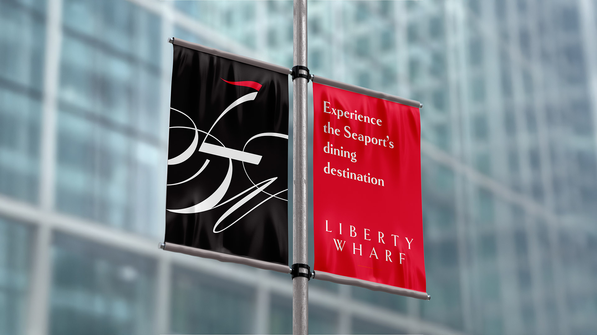
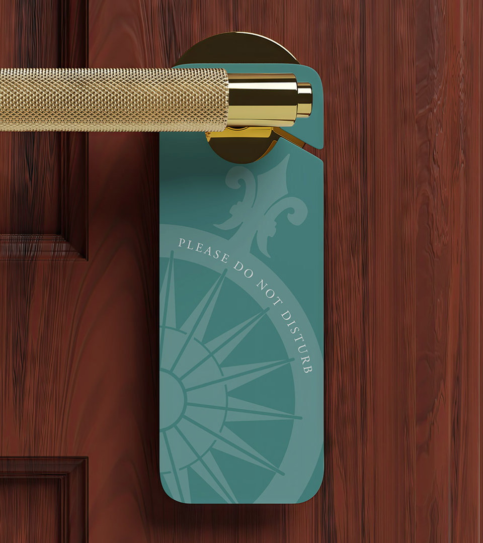
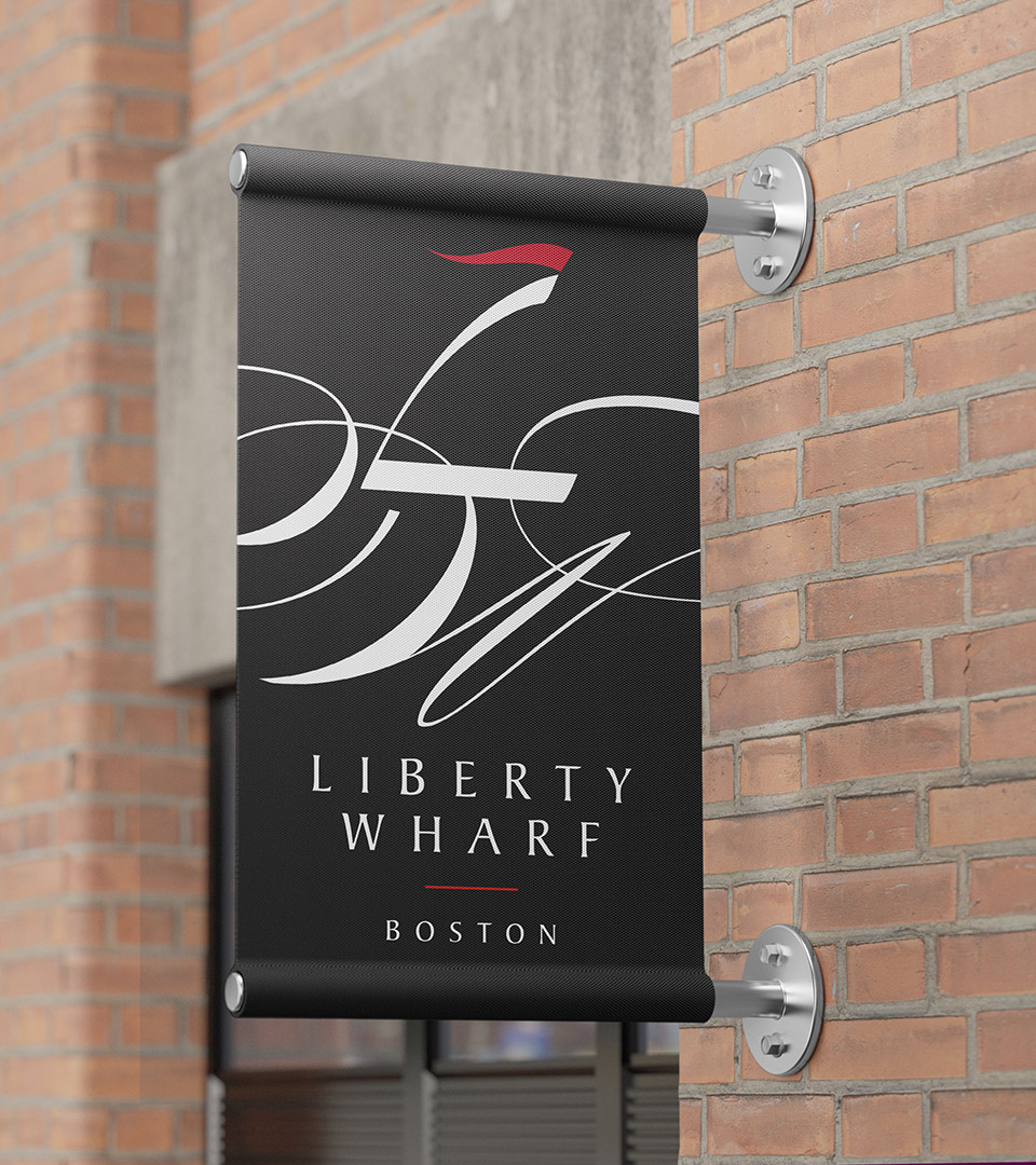
Our work focused on creating a unique brand identity that could unify a diverse mix of restaurants, retail spaces, and public environments under a single, coherent system. From visual identity to environmental graphics, the brand was designed to operate seamlessly across physical, digital, and experiential touchpoints.
Inspired by the harbor and the boats right by the site, the identity balances artistic interpretation with traditional expectations. The resulting system is flexible enough to support a wide range of tenants and uses while remaining consistent and recognizable, allowing Liberty Wharf to function as both a destination and a lasting part of Boston’s evolving waterfront.