We worked with the creator of the Gaila and her marketing department to create a brand identity for this beautiful and unique head scarf for women dealing with the ravages of cancer.
A gaila is a unique and eye-catching head wrap designed for women experiencing hair loss from chemotherapy. The name itself is a play on three words: gala (implying something happy), gele (the Nigerian head wrap on which the gaila is modeled) and Gail (the creator of the gaila).
Brand Strategy
Identity
Print
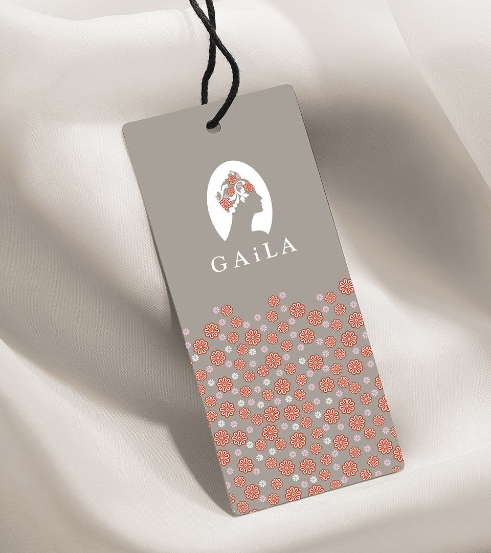
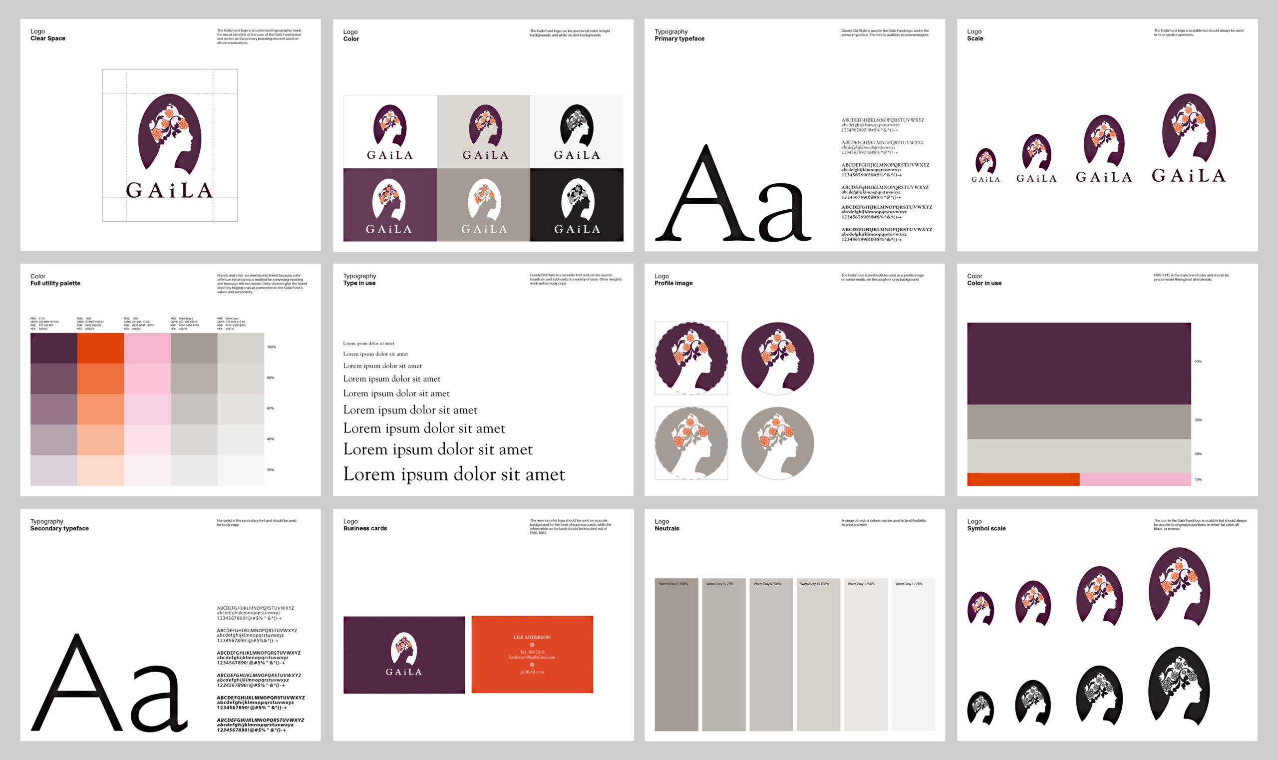
Our logo for The Gaila Fund was inspired by the cameo, a carved symbol of beauty that frequently focuses on a profile rather than a full-face image. This was important. as a gaila is about the entire head, not the face. By using a floral pattern for the scarf, the face of the logo can remain transparent, thus allowing the figure to be any color.
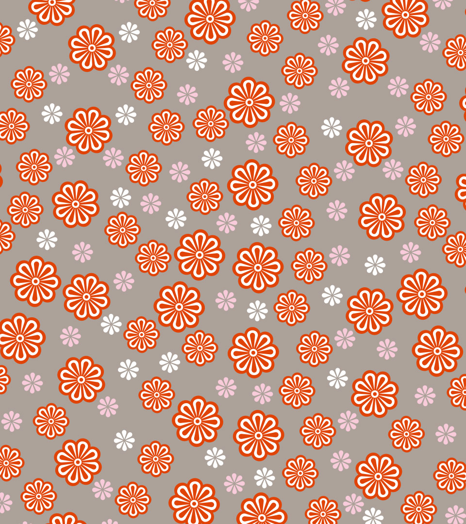
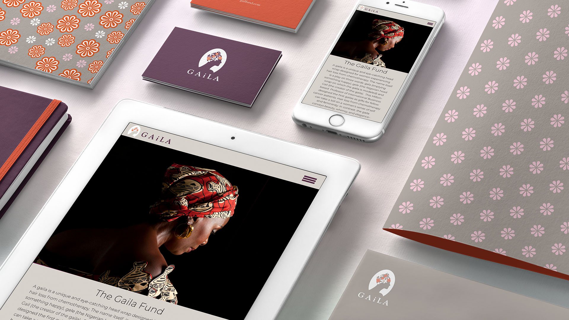
Unique patterns were created that could be used on any packaging and throughout the marketing materials.
The packaging was elegantly streamlined, featuring printed tissue paper paired with a paper label. Each label was printed in two distinct color combinations, adding a bespoke touch to every gift.
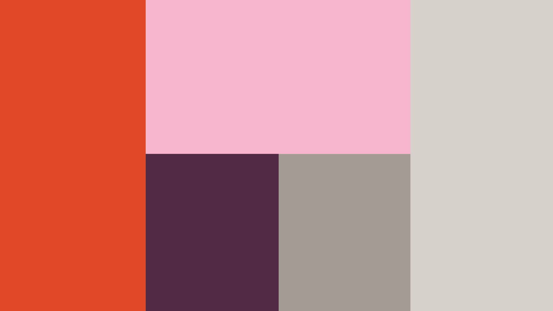
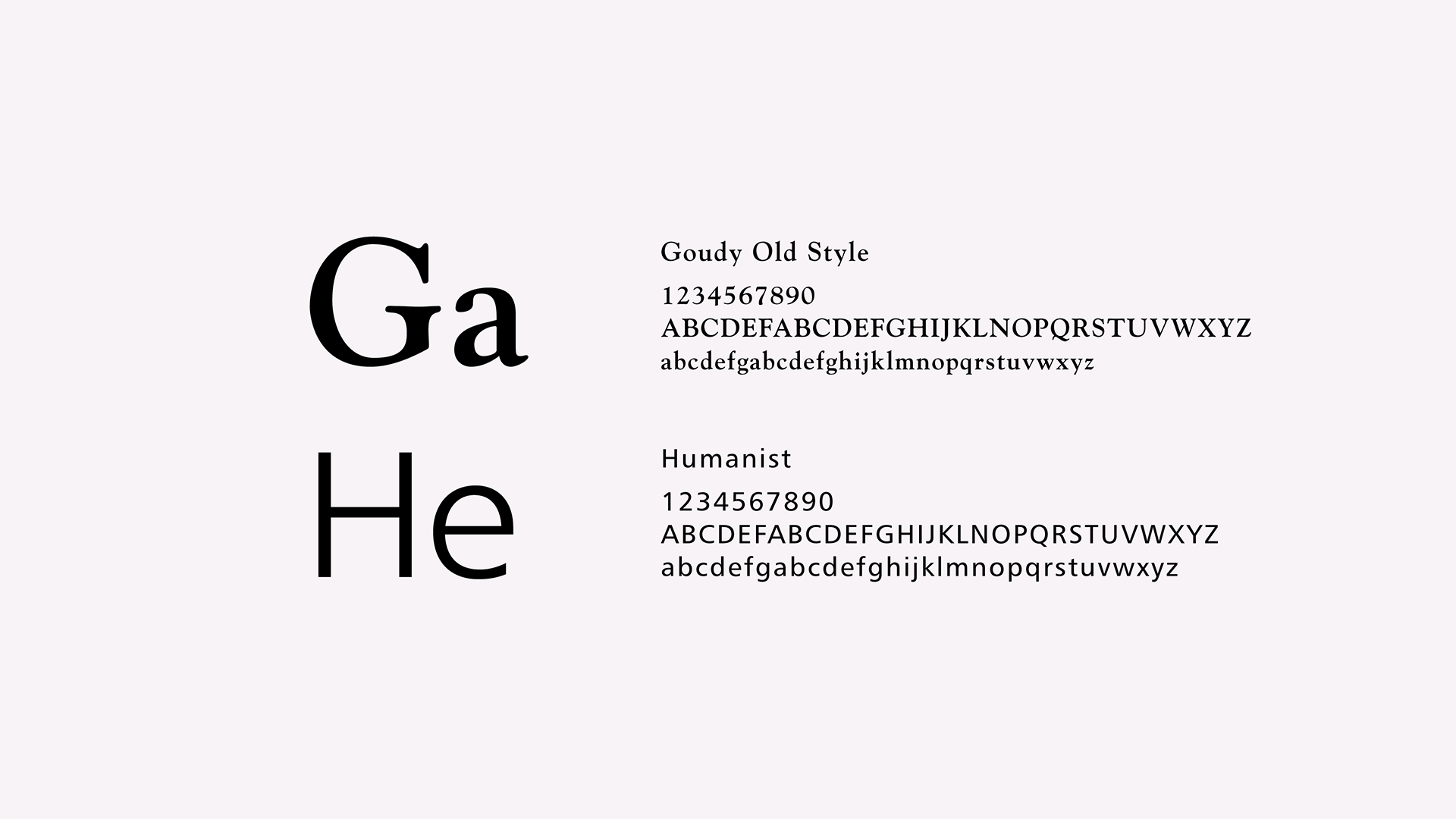
We created a brand identity style guide for the brand that details the color palette, fonts and logo uses.
When unified, every element of the brand identity and website contributed to a seamless and harmonious aesthetic for the project.