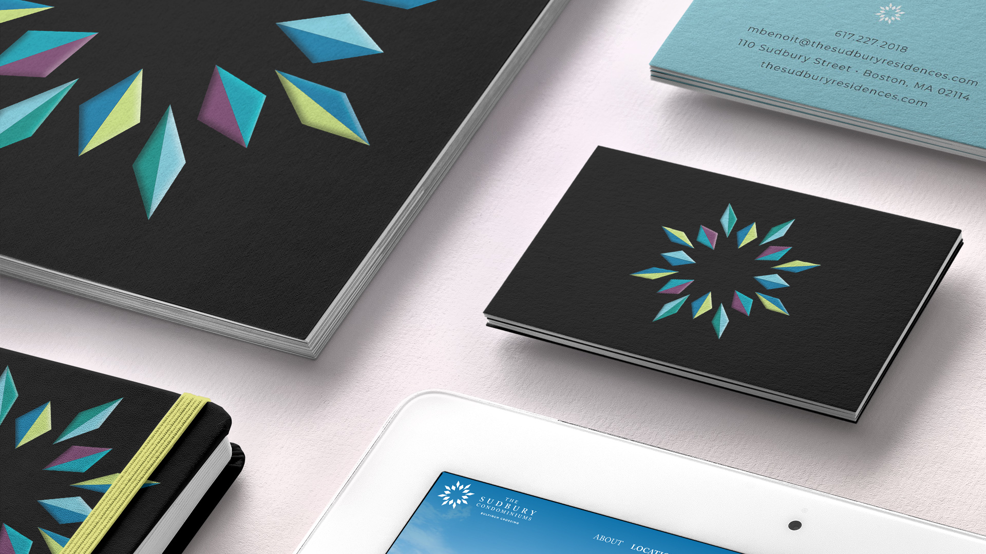
The logo for the condos (and it’s sister logo for the apartments) was inspired by the idea of a kaleidoscope, from ancient Greek kalós (beautiful) and eîdos (shape). It is a fitting metaphor for The Sudbury as it suggests not only multiple lifestyle choices and activities but also ongoing change and transformation at Bulfinch Crossing.
Brand Strategy
Identity
Tagline
Advertising
Print
Photography
Art Direction
Signage
Sales Center Graphics
Social Media
Website
We also developed a sister logo for the apartments by creating a slightly different shape and a different color palette. This logo is similar but with a different energy.