ViVO Apartments is a new construction residential building located in Cambridge’s Kendall Square, at the center of the region’s biotech and life sciences corridor. Developed for a predominantly young professional audience working in nearby research, technology, and innovation-driven fields, the project required a brand that could feel contemporary, intelligent, and rooted in its immediate context.
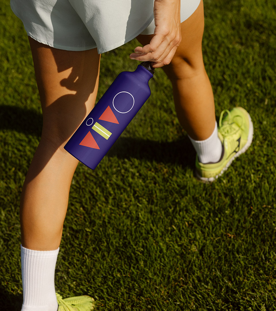
Our work focused on creating a complete brand system that translated the culture of Kendall Square into a livable, lifestyle-oriented identity. From naming and positioning to visual language and messaging, the brand was developed to bridge the world of science with everyday experience. The name ViVO, suggesting life, energy, and experimentation, draws from laboratory terminology, while the visual system references the forms, colors, and geometry of scientific tools without becoming literal.
The resulting identity balances precision with warmth, reflecting both the rigor of the surrounding biotech community and the human experience of living there. Designed to perform across marketing, digital, and environmental applications, the system establishes a clear point of view while remaining flexible, modern, and distinctly tied to its place.
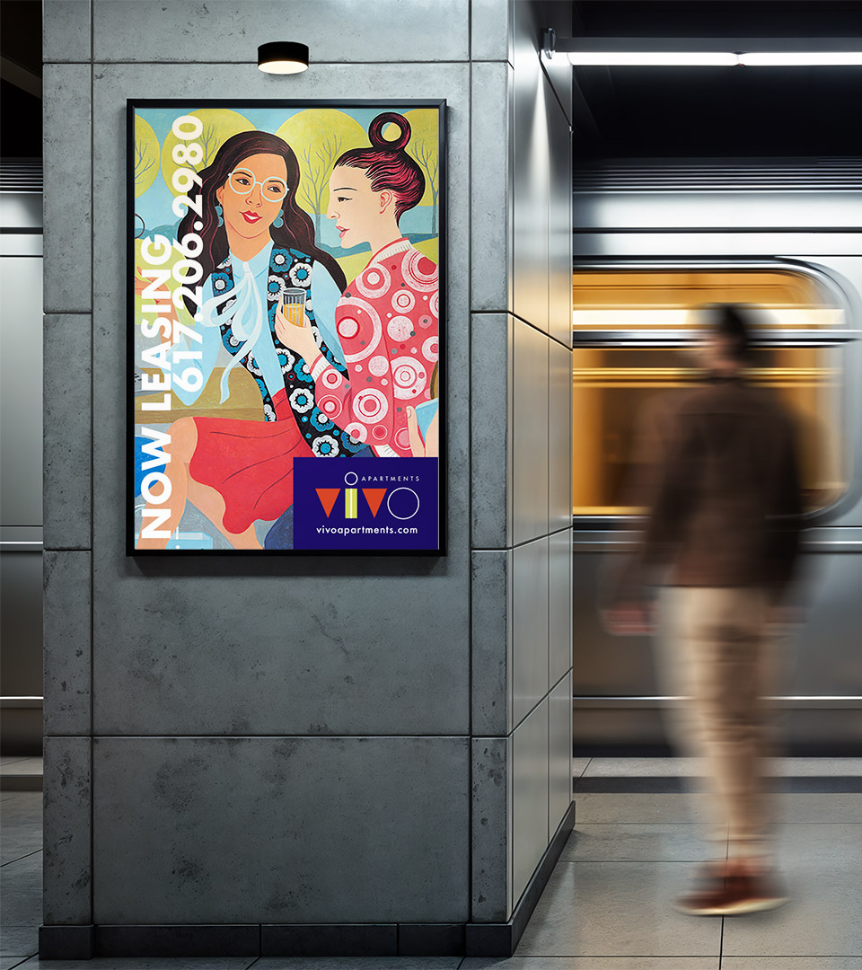
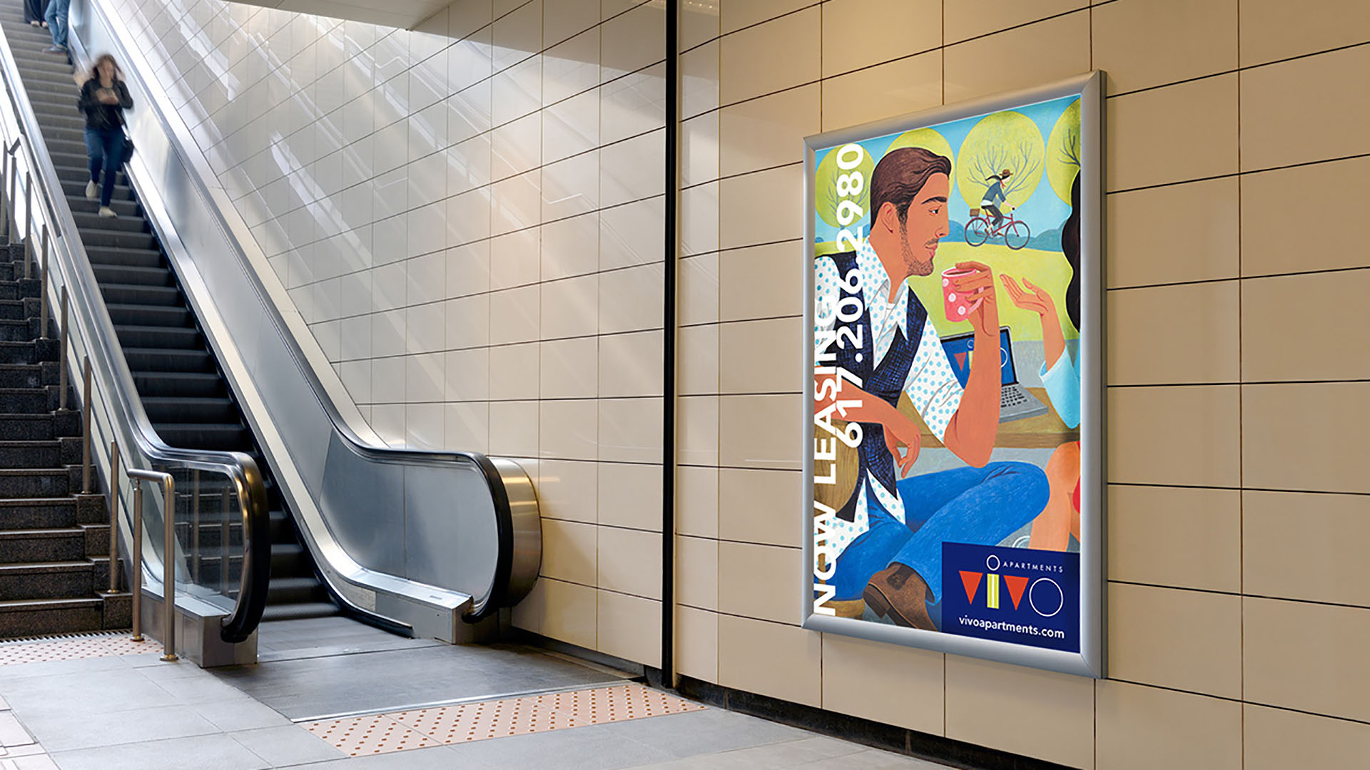
Creating personality
Working with illustrator Jody Hewgill, we developed artwork that reflects both the pace of Kendall Square and the international character of its residents. Messaging and graphic elements work together to position ViVO as a connected, lively community, one that mirrors the creative, social, and cultural energy of the district.
The completed identity positioned ViVO Apartments as a recognizable and vibrant presence within Cambridge’s innovation district. By aligning scientific context with human energy and lifestyle, the brand differentiated the property in a crowded market and resonated directly with young tech and biotech professionals, supporting visibility, connection, and leasing engagement.